
5 Tips for a Bold Dining Room Green Accent Wall
Green is arguably the most versatile color in the interior design spectrum, acting as a bridge between neutral calmness and dramatic flair. I often tell clients that green is nature’s neutral; it pairs as easily with warm wood tones as it does with cool marble or industrial metals. However, committing to a bold green accent wall in a dining room can feel intimidating if you have never worked with saturated color before.
I recently worked with a client who loved the idea of an “emerald moody vibe” but was terrified the room would end up looking like a dark cave. By carefully selecting the right wall, layering the lighting, and nailing the texture combinations, we transformed her generic builder-grade dining space into a sophisticated entertaining hub. It is all about balance and understanding how light interacts with pigment.
For a curated selection of visual inspiration, make sure to browse the Picture Gallery at the end of the blog post. Whether you are leaning toward a deep forest green or a dusty olive, the following tips will help you execute the look with professional precision.
1. Choose the Right Undertone and Finish
Selecting a paint color is never as simple as picking a chip off the rack. Green paints are notoriously tricky because they carry complex undertones that shift dramatically depending on the time of day. A shade that looks like sophisticated moss in the morning might turn into neon lime under your dinner party lighting.
If your dining room receives ample natural light, you can afford to go with cooler greens that have blue undertones, like a deep teal or spruce. These shades feel crisp and regal. However, if your dining room is north-facing or generally darker, I recommend greens with yellow or brown undertones, such as olive or army green. These warmer bases prevent the room from feeling cold or sterile.
The finish of the paint is just as important as the color itself. For a dining room accent wall, I almost always steer clients toward a matte or eggshell finish rather than satin or semi-gloss. Darker colors tend to show drywall imperfections more easily.
A matte finish absorbs light, which makes the color feel velvety and rich. If you have young kids or are worried about food splatters, a high-quality scrubbable matte or a low-sheen eggshell is the perfect compromise between durability and aesthetics.
Designer’s Note: The 24-Hour Test
Never buy gallons of paint based on a store swatch. I always insist that clients paint a large 2-foot by 2-foot square on the actual wall they plan to feature. Watch how the color changes at breakfast, lunch, and specifically at night with your artificial lights on.
Common Mistakes + Fixes
- Mistake: Picking a green that is too vibrant or high-chroma.
- Fix: Always choose a shade that looks slightly “muddy” or grayed out on the swatch. Once it covers an entire wall, it will look much brighter. Muted tones look more expensive and timeless.
2. Selecting the Best Wall for Impact
Not every wall in the dining room is a candidate for an accent wall. The general rule of thumb is to choose the wall that anchors the room. This is usually the solid wall that you see immediately upon entering the space, or the wall that runs parallel to the longest side of your dining table.
Avoid choosing a wall that has multiple windows or doors broken up by trim. These architectural breaks dilutes the impact of the color. You want a large, uninterrupted surface area to let the green breathe and establish a focal point. If your dining room is part of an open-concept living area, the accent wall helps visually zone the dining space without needing physical dividers.
If you are dealing with a small dining nook, consider the “color drenching” technique on the accent wall. This means painting the baseboards and crown molding the same green as the wall. This blurs the edges of the room and actually makes the ceiling feel higher and the space less cluttered.
For renters who cannot paint, removable wallpaper with a green texture or pattern is a fantastic alternative. Just ensure the pattern scale is appropriate for the wall size; large walls can handle large-scale botanical prints, while smaller walls benefit from tighter geometric patterns.
Architecture and Texture
A flat green wall is nice, but a textured green wall is high-design. Adding millwork like board-and-batten, wainscoting, or shiplap before painting adds shadow lines that make the green pop.
If you install wainscoting, a classic approach is to keep the bottom third of the wall (usually 30 to 36 inches high) white or a neutral wood tone, and paint the green above it. This keeps the room feeling airy while still providing that bold punch of color at eye level.
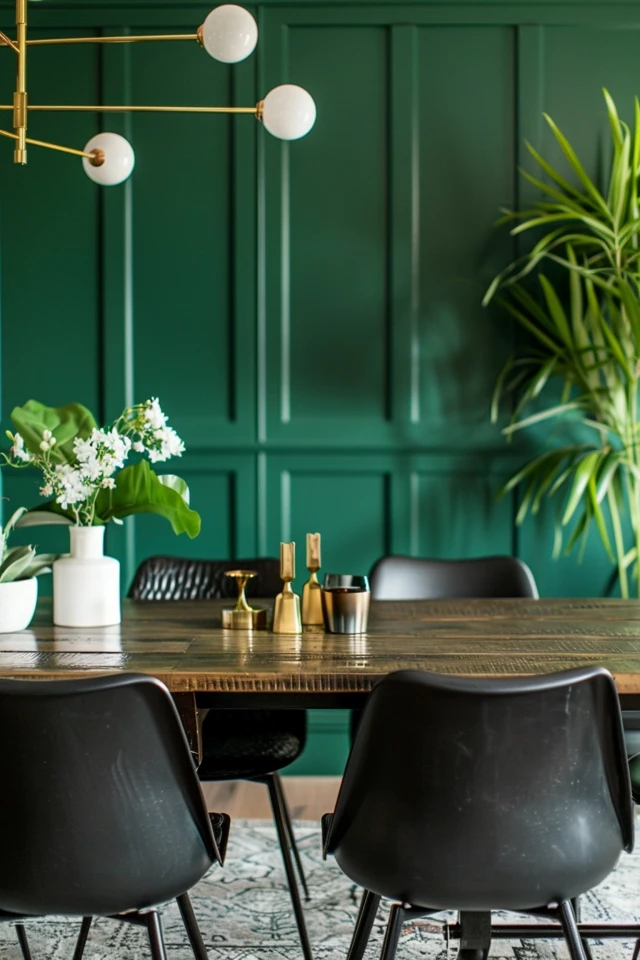
3. Mastering Wood Tones and Metal Finishes
Green is an organic color, so it naturally craves pairing with wood. The key is contrast. If you have chosen a deep, dark forest green, try to pair it with mid-tone woods like walnut or warm white oak. Avoid very dark espresso woods against dark green walls, as the furniture will disappear into the background.
If you have a lighter dining set, such as blonde maple or birch, a darker olive or hunter green wall provides a stunning backdrop that highlights the silhouette of your chairs. It is all about ensuring the furniture pops against the paint rather than blending in.
Metal finishes are the jewelry of the room. Green pairs exceptionally well with warm metals. Unlacquered brass, antique gold, and brushed bronze look luxurious against green because the yellow tones in the metal compliment the organic nature of the paint.
Polished chrome or silver can work, but it creates a much cooler, more modern aesthetic. If you go with silver tones, ensure your green paint has a blue undertone to match the temperature. For a more industrial or farmhouse look, matte black hardware is a safe and striking choice that creates a graphic outline against the green.
Fabric Coordination
Your dining chairs are likely sitting right in front of this accent wall. The upholstery needs to play nice with the green. Leather is a phenomenal choice; a cognac or saddle leather chair against a green wall is a classic, masculine, and sophisticated combination.
If you prefer fabric, oatmeal linen creates a breezy, casual contrast. For a moody, maximalist look, consider velvet in mustard yellow, rust orange, or navy blue. These jewel tones harmonize well with green without clashing.
Real Project Mini-Checklist
- Wood: Does the table finish stand out against the wall color?
- Metal: Are all metal finishes in the room (light fixture, cabinet hardware) consistent?
- Fabric: Is the upholstery durable enough for dining but soft enough to contrast the hard wall?
4. Lighting Temperature and Placement
Lighting will make or break your green accent wall. Darker colors absorb light, meaning you might need to increase the lumen output in your dining room to compensate. A single junction box in the center of the ceiling is rarely enough to light a moodier room effectively.
The color temperature of your bulbs is critical. I strictly recommend 2700K (warm white) or 3000K (soft white) for dining rooms. Do not use 4000K or 5000K (daylight) bulbs. These cooler bulbs will strip the warmth out of your green wall, making it look clinical or gray.
To truly elevate the wall, add secondary lighting. Wall sconces installed directly onto the green accent wall are a game-changer. The wash of light against the paint highlights the texture and nuances of the color. If you are renting or don’t want to hire an electrician, you can use plug-in sconces or battery-operated picture lights.
Specific Measurements for Lighting
If you are installing sconces on your accent wall, aim to mount them roughly 60 to 66 inches from the floor to the center of the fixture. If you are placing them on either side of a piece of art or a mirror, leave at least 6 to 10 inches of breathing room between the frame and the fixture.
For your main chandelier, the bottom of the fixture should hang 30 to 34 inches above the surface of your dining table. This creates an intimate pool of light that draws attention to the center of the room, allowing the green wall to act as a dramatic backdrop rather than the main light source.
5. Styling the Wall: Art, Mirrors, and Rugs
A bold green wall is a statement, but it shouldn’t be left entirely blank. Large-scale artwork looks incredible on a dark background. The green acts as a matting, making whites and bright colors in the artwork appear more vibrant.
If the room feels small or lacks windows, hang a large mirror on the green accent wall. This reflects the light from your chandelier and bounces it around the room, doubling the visual depth. A round or arched gold mirror is a timeless choice that breaks up the rectangular lines of the room.
Don’t forget the floor. The rug needs to ground the space and tie the accent wall to the rest of the room. You don’t need a green rug to match the wall—in fact, I advise against it. Instead, look for a rug that contains hints of the wall color within a pattern.
For example, a traditional Persian-style rug with reds, creams, and small flecks of green will harmonize the space beautifully. Alternatively, a neutral jute or sisal rug adds texture that complements the earthy feel of a green wall without competing for attention.
Rug Sizing Rules
Ensure your rug is large enough. The chairs should remain on the rug even when guests pull them out to sit down. A good rule is to add 24 to 30 inches to each side of your dining table to determine the minimum rug size. Skimping on the rug size makes the room feel disjointed.
Designer’s Note: Handling Outlets
If you have white outlet covers on a dark green wall, they will stick out like a sore thumb. Swap them out for paintable outlet covers and paint them the same shade as the wall, or switch to dark brown or black covers to help them blend in. It is a ten-dollar fix that makes the room look custom-designed.
Final Checklist: Executing the Look
Before you crack open that paint can, run through this final list to ensure you have covered all your bases. This is the exact mental checklist I use before finalizing a design plan for a client.
- Sample Confirmation: Have you viewed your painted 2×2 sample patch at night with the lights on?
- Finish Selection: Do you have the correct sheen? (Matte or eggshell is preferred for deep colors).
- Prep Work: Have you filled nail holes and sanded the wall? Dark paint highlights texture imperfections.
- Lighting Check: Are your bulbs 2700K or 3000K to keep the green warm?
- Contrast Plan: Do you have wood, brass, or art elements ready to break up the solid color?
- Outlet Covers: Do you have a plan to hide or paint the electrical plates?
FAQs
Can I use a green accent wall in a small dining room?
Absolutely. Dark colors recede visually, meaning they can actually add depth to a small room. The key is to keep the ceiling light and use mirrors to bounce light around. Don’t be afraid of the dark; it creates intimacy which is perfect for dining.
Should I paint the trim green as well?
This is a stylistic choice. Painting the trim white creates a traditional, crisp frame around the color. Painting the trim (and even the door) the same green as the wall creates a modern, seamless look that feels more high-end. If your trim is standard builder-grade, painting it green helps hide it.
Does a green wall work with an open floor plan?
Yes, but you need to repeat the color elsewhere. If your dining wall is green, add green throw pillows to the living room sofa or use green lush plants in the kitchen. This creates a “red thread” of color that connects the open zones.
What is the best curtain color for a green room?
If the window is on the green wall, I prefer curtains close to the wall color for a monochrome look, or a neutral oatmeal linen for contrast. If the window is on an adjacent white wall, you can use a patterned curtain that incorporates the green from the accent wall to tie the room together.
Conclusion
Creating a bold dining room with a green accent wall is one of the most effective ways to inject personality into your home. It creates an atmosphere that is simultaneously cozy for family dinners and dramatic for hosting guests. By paying attention to the undertones, layering your lighting, and choosing the right complementary materials, you elevate the space from a simple paint job to a designed experience.
Remember that paint is the least expensive renovation tool with the highest return on investment. If you do your prep work and follow the rules of lighting and scale, your dining room will feel like a boutique restaurant every night of the week.
Picture Gallery


