
5 Tips for Adding a Pop of Yellow to Your Ceiling Design
The ceiling is often referred to in the design world as the “fifth wall,” yet it is frequently the most neglected surface in a home. Most homeowners default to a standard flat white without considering the transformative power of color overhead. When you choose a bold hue like yellow, you aren’t just painting a surface; you are altering the perceived volume and temperature of the room.
I recall a specific project where a client felt their north-facing breakfast nook felt perpetually cold and dreary, regardless of the time of day. We decided against painting the walls and instead applied a buttery, warm yellow to the ceiling. The effect was immediate; the light bouncing off the ceiling mimicked sunlight, washing the room in a warm glow that completely changed the psychological feel of the space.
If you are ready to take this design risk, you need to execute it with precision to avoid the room looking like the inside of a school bus. I have compiled a picture gallery at the end of this blog post to inspire your next renovation.
1. Master the Undertones and Light Reflectance Value (LRV)
Yellow is arguably the most difficult color to get right because it is highly reactive to light. A swatch that looks like a subtle cream on a card can look like neon lemon once applied to a large surface area like a ceiling. This happens because ceilings receive light differently than vertical walls.
When choosing your yellow, you must look at the Light Reflectance Value (LRV). This number, found on the back of most paint chips, tells you how much light the color bounces back. For a ceiling, a yellow with a high LRV (over 75) will act as a secondary light source. This is excellent for dim rooms but can be blinding in a room with floor-to-ceiling windows.
You also need to identify the undertone. Green-based yellows (think chartreuse or citron) feel modern and sharp, but they can cast a sickly hue on skin tones if the room lacks natural light. Orange-based yellows (ochre, mustard, gold) are much warmer and generally safer for living rooms and dining areas.
Designer’s Note: The “Vertical” Test
A common mistake is taping the paint swatch to the wall to test it. This is inaccurate for ceiling design. You must tape the swatch—or better yet, a painted 2×2 foot poster board—to the actual ceiling. Gravity and the angle of light shift the color perception dramatically. A yellow that looks cheerful on a wall often looks two shades darker and “muddier” on a ceiling due to shadows.
2. Balance the Visual Weight with the “Echo Rule”
A yellow ceiling is a massive visual statement. If the rest of the room is entirely neutral, the ceiling can feel disconnected, as if it is floating away from the rest of the design. To fix this, we use the “Echo Rule.”
The Echo Rule states that the ceiling color must be repeated at least twice elsewhere in the room to ground the design. This doesn’t mean you need a matching yellow sofa. Instead, look for smaller, purposeful repetitions.
You might choose a rug with golden threads running through it, or a piece of art that features the same citron tone. Throw pillows, a vase, or even the spine of a book on a coffee table can serve as these anchors.
Common Mistakes + Fixes
- The Mistake: Painting the ceiling yellow and leaving walls stark white with gray furniture.
- The Fix: Add texture. If you can’t add more yellow, incorporate warm wood tones (oak or walnut) or brass hardware. The warmth of wood and metal bridges the gap between a cold gray room and a warm yellow ceiling.
3. Selecting the Correct Sheen for Surface Imperfections
The finish (sheen) of the paint is just as important as the color itself. Yellow is a high-visibility color, meaning it draws the eye. If your ceiling has texture (like a subtle orange peel) or imperfections from bad drywall taping, a yellow paint with a sheen will highlight every single flaw.
For 90% of residential projects, I recommend a flat or matte finish for yellow ceilings. Flat paint absorbs light rather than reflecting it, which helps hide bumps, waves, and roller marks. It creates a velvety look that feels sophisticated.
However, if you are working with a historic home that has perfectly smooth plaster, or if you have invested in a Level 5 drywall finish (which is perfectly smooth), you can risk a satin or eggshell finish. A slight sheen helps bounce light around a dark room, making the yellow feel energetic and glowing.
What I’d do in a real project:
- For textured ceilings (popcorn/stucco): Do not paint them yellow. The color highlights the texture. Scrape the ceiling first or stick to white.
- For standard drywall: Use a high-quality “ceiling flat” paint. It is thicker and formulated to minimize splatter.
- For wood-paneled or beadboard ceilings: Use a satin or semi-gloss finish. The sheen highlights the architectural detail of the wood grooves, which is a desirable effect.
4. Managing the Transition Line
The point where the yellow ceiling meets the wall is critical. If your lines are messy, the bold color will draw attention to the poor craftsmanship. How you handle this transition depends on your architecture.
If you have crown molding:
This is the easiest scenario. Paint the molding a crisp white (or the same color as your trim). This creates a visual frame that separates the yellow ceiling from the wall color. It acts as a buffer, allowing you to pair the yellow ceiling with a wider variety of wall colors.
If you do not have molding:
You need a razor-sharp line. I rarely trust painter’s tape alone for this. I recommend “cutting in” by hand if you have a steady brush, or using high-grade edge-lock tape.
The “Lid” Technique:
If your room feels too tall or cavernous, bring the yellow ceiling paint down the wall about 12 to 18 inches. This creates a “lid” effect that makes the room feel cozier. You can finish the transition point with a simple piece of picture rail molding to make it look intentional.
Designer’s Note: The Renter’s Hack
If you are renting and cannot paint the ceiling, or if you are terrified of commitment, look for yellow peel-and-stick wallpaper. A solid yellow texture or a subtle yellow geometric pattern can achieve the same effect. Wallpapering a ceiling is physically demanding—you will need two ladders and a friend—but it is completely reversible.
5. Adjust Your Lighting Temperature
Paint color does not exist in a vacuum; it is entirely dependent on the light source. Yellow is uniquely sensitive to the “color temperature” of your light bulbs, measured in Kelvins (K).
If you have “Daylight” bulbs (5000K), they emit a blueish light. When blue light hits a yellow ceiling, it can create a greenish cast. Your beautiful sunny ceiling might end up looking like a bruise.
Conversely, if you have very warm “Soft White” bulbs (2700K), they emit an orange glow. This will intensify the yellow, potentially turning a soft cream into a chaotic orange.
My Lighting Recommendation:
For a room with a yellow ceiling, aim for bulbs in the 3000K to 3500K range. This is a neutral white light that renders color accurately.
Also, pay attention to the CRI (Color Rendering Index) of your bulbs. Look for a CRI of 90 or higher. This ensures that the yellow you see at night looks the same as the yellow you see during the day.
Final Checklist: Executing the Design
Before you open the paint can, run through this checklist to ensure you are ready for the commitment of a yellow ceiling.
1. The Swatch Test
- Paint a 2×2 foot board.
- Tape it to the ceiling near a window.
- Tape it to the ceiling in a dark corner.
- Observe it for 24 hours (morning, noon, and night).
2. The Prep Work
- Dust the ceiling thoroughly. Spiderwebs will ruin your finish.
- Prime any water stains with an oil-based primer, or the yellow water stain will bleed through the yellow paint.
- Ensure you have a roller extension pole. Never paint a ceiling standing on a ladder if you can avoid it; it leads to uneven pressure and roller marks.
3. The Palette Check
- Does the yellow clash with the floor tone? (Be careful with honey-oak floors; too much yellow can be overwhelming).
- Have you selected a contrasting wall color? (Cool grays, crisp whites, and navy blues look best with yellow ceilings).
FAQs
Does a yellow ceiling lower the resale value of my home?
Bold design choices can polarize buyers. However, paint is the cheapest renovation to fix. If you are selling in the next six months, stick to white. If you plan to live there for years, design for your joy, not for a hypothetical buyer.
Can I paint a low ceiling yellow?
Yes, but stick to lighter, cooler yellows (like a soft lemon chiffon). Cool colors recede visually, making the ceiling appear higher. Avoid heavy ochres or golds on ceilings lower than 8 feet, as they can make the room feel oppressive.
What wall colors work best with a yellow ceiling?
White: Creates a fresh, gallery-like feel.
Navy Blue: A classic, high-contrast nautical or regal look.
Pale Gray: Tones down the energy of the yellow for a balanced, modern aesthetic.
Duck Egg Blue: Creates a charming, French Country vibe.
Conclusion
Painting your ceiling yellow is a declaration of confidence. It signals that you view your home as a space for energy and warmth, rather than just a neutral box for existing. While it requires more thought regarding lighting, undertones, and application than a standard white job, the payoff is immense.
When done correctly, a yellow ceiling captures the optimism of sunlight and holds it in your room permanently. Start with your swatches, check your lighting, and don’t be afraid to let the fifth wall do the heavy lifting in your design.
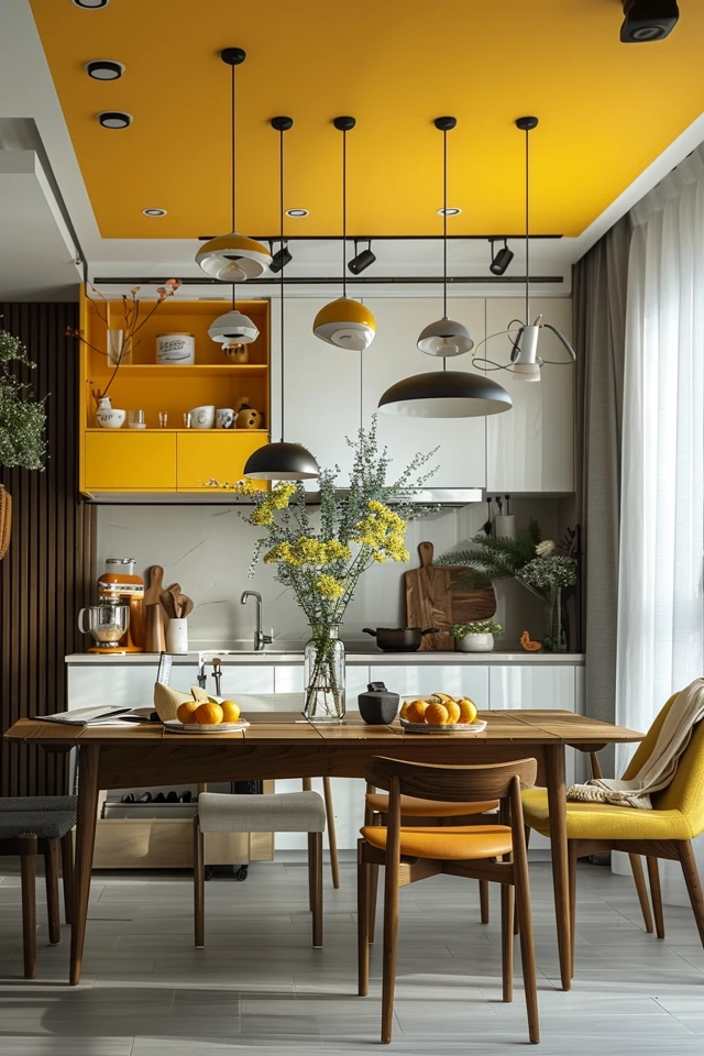
Picture Gallery


