
5 Tips for Creative Dining Room Hutch Decor Ideas
The dining room hutch is often the unsung hero of home furniture. It stands as a substantial focal point, offering a unique blend of practical storage and artistic opportunity. Unlike a sideboard or a console table, a hutch demands vertical attention, drawing the eye upward and setting the tone for the entire dining space.
For many of my clients, the hutch becomes a source of anxiety rather than joy. They often inherit these pieces or buy them for storage, only to realize they have no idea how to fill the shelves without making them look cluttered. The result is often a hutch filled with mismatched papers, stray wine glasses, and dust. However, with a few structural rules and a designer’s eye for composition, this piece can become the jewel of your dining room.
In this guide, I am going to walk you through the exact process I use when styling hutches for high-end residential projects. We will cover everything from lighting and background colors to the mathematics of object placement. If you are looking for visual inspiration, you can jump right to our curated Picture Gallery at the end of this blog post.
1. Treat the Back Panel as a Canvas
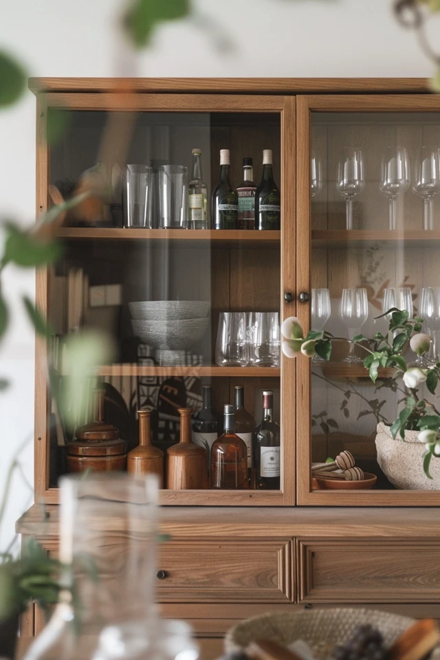
Before you place a single plate or vase on a shelf, you must address the backdrop. In many standard hutches, the back panel is made of dark wood or a simple plywood veneer that sucks the light out of the cabinet. If the interior is dark, anything you display inside will disappear into the shadows.
To create professional depth, you need to create contrast. If your display items are mostly white china, a dark background works beautifully. However, if you have a mix of glass and colorful ceramics, a lighter background is essential to make those items pop.
Paint and Wallpaper
The easiest way to update a hutch is to paint the back panel. I typically recommend using a finish with a slight sheen, such as eggshell or satin. Flat paint tends to look chalky and shows scuffs easily when you move items around. A slight sheen will also help bounce light around the cabinet interior.
If you are renting or afraid of commitment, peel-and-stick wallpaper is a fantastic solution. Choose a subtle texture like a grasscloth or a small-scale geometric print. Large patterns often get cut off by the shelves and items, making the display look chaotic.
Designer’s Note: The Mirror Dilemma
Many vintage hutches come with mirrored backs. While this was popular in the 1980s to reflect light, it can feel dated in a modern context. If you have a mirrored back, you don’t necessarily have to remove it.
You can soften the look by applying a removable matte film over the glass. Alternatively, lean large artwork or trays against the back mirror to break up the reflection. This keeps the light-bouncing benefits without the harsh “funhouse” effect.
2. Master the Triangle and Zig-Zag Method
The most common mistake homeowners make is lining items up in straight rows like soldiers. This creates a static, grocery-store appearance that lacks visual interest. In interior design, we use geometric principles to guide the eye through a display.
The most effective technique for shelves is the “visual triangle.” This means arranging objects so that the tallest item creates the peak of a triangle, and shorter items widen out at the base. You want to group items in odd numbers—threes and fives are the magic numbers in design—to create these triangular compositions.
The Zig-Zag Flow
Once you have your groupings, you need to arrange them across the height of the hutch. Imagine a zig-zag line running from the top shelf to the bottom.
If you place a large, heavy item (like a soup tureen) on the left side of the top shelf, place the next heavy item on the right side of the middle shelf, and the final heavy item on the left side of the bottom shelf. This forces the viewer’s eye to travel back and forth, taking in the entire piece rather than getting stuck on one heavy spot.
Visual Weight vs. Actual Size
Visual weight is different from physical size. A small, black iron sculpture has more visual weight than a large, clear glass vase.
When balancing your shelves, distribute visual weight evenly. Do not put all your dark, solid items on one side and all your clear, delicate items on the other. Mix them thoroughly to maintain equilibrium.
Common Mistakes + Fixes
Mistake: Placing small knick-knacks individually along a shelf.
Fix: Group small items on a tray or stack them on top of horizontal books. Small items need a “friend” to ground them, otherwise, they look like clutter.
Mistake: Pushing everything to the very back of the shelf.
Fix: Pull items forward. Create depth by overlapping objects slightly. A plate leaning against the back, with a bowl in front of it, and a small cup in front of that creates a rich, layered look.
3. Mix Texture and Height for a Curated Look
A hutch filled exclusively with white plates can look clean, but it can also look sterile. To achieve a high-end “collected” look, you must introduce variety in texture and height. This is where you bridge the gap between a storage unit and a display case.
The Rule of Varied Heights
If every item on a shelf is 8 inches tall, the display will look flat. You need vertical variance. I always keep a stash of “risers” in my styling kit. These can be actual acrylic risers, or more commonly, stacks of books or small wooden boxes.
Use these risers to lift specific objects. For example, if you have a collection of three pitchers, place one on a stack of two cookbooks to vary the silhouette.
Introducing Organic Materials
Dining rooms are full of hard surfaces: wood tables, glass windows, ceramic floors. Your hutch is the perfect place to introduce warmth.
Wood: Add wooden cutting boards, salad bowls, or chargers. Lean a rectangular cutting board behind a round white platter to introduce contrast in shape and material.
Woven textures: Small wicker baskets are excellent for hiding unappealing necessities like napkin rings or tea lights. They add a natural texture that breaks up the shininess of glass and china.
Metals: Incorporate brass, copper, or silver. A tarnished silver creamer adds a sense of history, while polished brass candlesticks add glamour. Try to stick to one or two metal finishes to keep the look cohesive.
What I’d Do in a Real Project
If I were styling a farmhouse hutch, I would use the following formula:
- 60% Ceramics: White stoneware plates and bowls.
- 20% Wood: A large bread board leaning in the back and a wooden bowl holding fruit.
- 10% Glass: Clear stemware to catch the light.
- 10% Natural/Greenery: A dried boxwood wreath or a small pot of ivy.
4. Functionality Meets Aesthetics
We must not forget that a hutch is a functional piece of furniture. In many homes, this is the primary storage for dinnerware. The challenge is making that storage look intentional rather than accidental.
Stacking Logic
When storing stacks of plates, do not stack them more than 6 to 8 plates high. Visually, a tower of 20 plates looks precarious and heavy. If you have a large set, split the stack in two.
Place one stack on the left and one on the right. Alternatively, place a shorter stack of salad plates on top of the dinner plates creates a pyramid effect that is pleasing to the eye.
Hiding the “Ugly” Stuff
Most hutches have a closed cabinet section at the bottom and open or glass shelving on top. Be ruthless about this division.
The top is for items that are in good condition and fit your color story. The bottom is for the plastic kid cups, the chipped mugs you can’t part with, and the holiday linens that are a chaotic mix of colors. If your hutch is glass all the way down, you will need to use opaque baskets or bins on the lower shelves to conceal these items.
Clearance and Spacing Rules
As a general rule of thumb, you want about 2 to 3 inches of clearance above the tallest item on a shelf. If an item touches the shelf above it, the space feels cramped.
Conversely, if you have 12 inches of empty space above an item, the object looks lost. If you have adjustable shelves, move them to fit your tallest items. If the shelves are fixed, fill the vertical void with tall candlesticks, vases with branches, or artwork leaning against the back.
5. Lighting is the Secret Ingredient
You can have the most beautiful collection of ironstone in the world, but if it is sitting in a dark wooden cave, no one will appreciate it. Lighting is what separates a amateur display from a professional one.
Puck Lights and LED Strips
In the past, lighting a hutch required drilling holes and running messy wires. Today, battery-operated LED puck lights are a game-changer. You can adhere them to the underside of each shelf to cast a glow downward onto your display.
For a more seamless look, I prefer rechargeable LED light bars with motion sensors or remote controls. These are thin and virtually invisible when installed behind the face frame of the hutch.
Color Temperature Matters
When buying lights, pay attention to the Kelvin (K) rating. This determines the color of the light.
Avoid 5000K or “Daylight” bulbs, which cast a blue, sterile light that makes a dining room feel like a hospital. Look for “Soft White” or “Warm White” in the 2700K to 3000K range. This warmth complements wood tones and makes food-related items look appetizing.
Placement Strategy
Do not just put one light at the very top. Shadows will cast down through the shelves, leaving the bottom display in the dark. Ideally, you want a light source on every level.
If you have glass shelves, the light will travel through, so you may only need lights at the top. If you have wooden shelves, you absolutely need a light source for each individual cubby or shelf section.
Final Checklist: The Designer’s Styling Protocol
Before you consider your hutch “done,” run through this checklist. This is the mental list I use before photographing a project.
1. The “Step Back” Test: Stand 10 feet away. Squint your eyes. does one side feel heavier or darker than the other? If so, move a large object to the lighter side.
2. The Negative Space Check: Is there empty space? Good styling requires breathing room. If every inch is covered, remove 20% of the items.
3. The Color Thread: Pick one accent color (e.g., navy blue or sage green). Is it repeated at least three times throughout the hutch in a triangle pattern?
4. The Anchor Check: Is the hutch anchored to the wall? This is not a decor tip, but a safety non-negotiable. Once you load a hutch with heavy ceramics, the center of gravity shifts.
5. The Texture Audit: Do you have at least three different materials (ceramic, wood, metal, glass, paper)?
FAQs
What should I put on the very top of the hutch?
Styling the space above the hutch can be tricky. If you have high ceilings (more than 2 feet above the hutch), you can place a collection of large baskets, ceramic vases, or a trio of oversized ginger jars. However, if you have standard 8-foot ceilings and the hutch is tall, it is often best to leave the top empty. Cluttering the gap near the ceiling can make the room feel smaller.
How do I style a hutch if I don’t have a full set of china?
You absolutely do not need a matching set. In fact, a “curated” mix is more modern. Combine thrifted pieces with new items. Stick to a cohesive color palette (like cream, white, and terra cotta) to unify mismatched shapes. Fill in gaps with books, framed family photos, or sculptural art pieces.
Can I put books in a dining room hutch?
Yes, books add tremendous warmth to a dining room. I recommend using cookbooks, coffee table books on art or travel, or vintage hardcovers. To keep the look cohesive, you might want to remove the paper dust jackets to reveal the solid-colored binding underneath. Stack them horizontally to act as risers for bowls or small objects.
My shelves are bowing under the weight. What do I do?
This is a common issue with vintage pieces or particle board shelves. If the span of the shelf is wider than 30-36 inches, it will sag under heavy plates. You can flip the shelf over (if the finish allows) to let gravity correct the bow over time. For a permanent fix, visit a hardware store and have them cut a piece of 1/4-inch plywood to fit the back of the shelf for reinforcement, or add a small vertical support block in the center between shelves.
Conclusion
Styling your dining room hutch is an exercise in balance. It requires you to weigh function against form, and dark spaces against light. By treating the back panel, utilizing geometric grouping principles, and ensuring proper lighting, you can transform a looming storage unit into a captivating display.
Remember that styling is rarely perfect on the first try. It involves placing an item, stepping back, adjusting, and trying again. Do not be afraid to shop your own home, moving items from the living room or kitchen into the hutch to see how they look in a new context. Your hutch should tell the story of your home, layered with memories, textures, and light.
Picture Gallery


