
5 Tips for Dining Room Gallery Wall Ideas
There is something intimidating about a blank dining room wall. Unlike the living room, where the television often dictates the focal point, the dining room usually offers a vast, empty expanse that begs for attention. I have walked into countless homes where the dining table is set beautifully, but the walls feel cold and unfinished because the homeowner was paralyzed by the idea of making a mistake with a hammer.
Gallery walls are the perfect solution for this space, bringing personality, conversation starters, and warmth to the area where you break bread. However, they require a bit more math and planning than simply tossing a canvas up at eye level. For a dose of inspiration before you start hammering, be sure to check out our curated Picture Gallery at the end of this blog post.
In this guide, I am going to walk you through the specific techniques I use when styling client homes. We will cover everything from the “grid vs. organic” debate to the exact measurements you need to know so your art doesn’t end up looking like a floating postage stamp. Let’s turn that blank slate into your favorite view in the house.
1. Choose Your Layout Strategy: The Grid vs. The Organic Cloud
Before you buy a single frame, you must decide on the “vibe” of the room. The layout of your gallery wall dictates the formality of the dining experience. In design school, we learn that symmetry creates calm and formality, while asymmetry creates energy and movement.
The Formal Grid
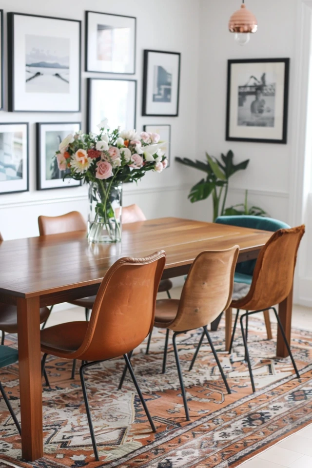
A grid layout consists of identical frames hung in precise rows and columns. This is my go-to for traditional dining rooms or spaces where you want a clean, architectural feel. It works exceptionally well above a long buffet or sideboard.
For a grid to work, the math has to be perfect. You generally want the spacing between the frames to be tight—usually between 1.5 to 2.5 inches. If the gaps are too wide, the installation loses its impact as a single cohesive unit.
The Organic Cloud
This is a collected, eclectic approach where frames of different sizes and finishes are puzzled together. It feels more casual and lived-in. This style is much more forgiving if you are a renter or plan to add to the collection over time.
Designer’s Note: The Template Trick
Never start nailing without a map. I always use Kraft paper or even old wrapping paper to trace the size of every single frame. I cut these shapes out and tape them to the wall using painter’s tape.
This allows me to move the “frames” around for hours until the balance feels right. It also lets you step back and see how the arrangement looks from the dining chair, which is the most important vantage point in the room.
Common Mistakes + Fixes
Mistake: Making the layout too wide for the furniture below it.
Fix: Keep the total width of your gallery wall layout at about two-thirds to three-quarters the width of the buffet or dining table. If it extends past the edges of the furniture, it will feel top-heavy and unbalanced.
2. Master the Vertical Spacing and “The Gap”
The biggest error DIYers make in dining rooms is hanging art too high. In a dining room, people are sitting down for the majority of the time. If you hang art at standard standing eye level, it might feel disconnected from the seated experience.
The 60-Inch Rule
The standard museum rule is to hang art so the center of the composition is 57 to 60 inches from the floor. However, in a dining room, you have to account for furniture.
If you have a sideboard or buffet, you need to mind “the gap.” This is the negative space between the top of your furniture and the bottom of your lowest frame.
Specific Measurements to Follow
In most residential projects, I aim for a gap of 4 to 8 inches between the buffet surface and the bottom of the frame. This connects the art to the furniture, creating one visual vignette rather than two separate floating objects.
If you hang it 12 inches or higher above the buffet, the art will feel like it is floating away. You want the eye to travel seamlessly from the table setting to the buffet decor and up to the art.
What about wainscoting?
If your dining room has chair rails or wainscoting, treat the top of the molding as your “floor” or anchor point. Leave at least 3 to 4 inches of breathing room between the top of the wainscoting and the bottom of your frames.
3. Scale and Proportions: Go Big or Go Home
One of the most frequent issues I diagnose in client consultations is “dinky art syndrome.” This happens when small frames (think 4×6 or 5×7) are used on a large wall without enough volume to back them up.
In a gallery wall, the individual frames matter less than the total mass of the collection. You need the entire grouping to read as one large installation.
Using Mats to Increase Volume
If you have smaller photos or prints that you love, do not just pop them in a frame that fits them perfectly. Buy a larger frame and use an oversized mat.
For example, take a 5×7 photo and put it in an 11×14 frame with a thick white mat. This adds instant luxury and expands the visual footprint of the piece without costing a fortune.
Visual Weight Balance
When arranging an organic layout, imagine a vertical line down the center of the wall. You want the visual weight to be roughly equal on the left and right sides.
This doesn’t mean it needs to be symmetrical. A large poster on the left can be balanced by two medium-sized drawings and a small mirror on the right.
Designer’s Note: The Squint Test
Once your paper templates are up, stand back 10 feet and squint your eyes until everything goes blurry. You aren’t looking for details; you are looking for dark and light blobs.
If one side feels “heavier” or darker than the other, you need to rearrange. This helps ensure your dining room doesn’t feel like it is tilting to one side.
4. Mix Your Mediums for a High-End Look
A gallery wall that looks like it was bought entirely from a single catalog page can feel flat and impersonal. The most successful dining room walls mix textures, depths, and materials.
Incorporate Three-Dimensional Objects
Don’t limit yourself to just framed paper. I love mixing in wall brackets, ceramic plates, or even architectural salvage.
For a dining room, a shallow wall planter or a collection of antique breadboards can break up the monotony of glass and square corners. This adds texture and softens the acoustics of the room, which is helpful during loud dinner parties.
Mixing Frame Finishes
You do not need to match all your frames, but they should be cousins, not strangers. A good rule of thumb is to stick to two or three finish types.
For example, you might mix thin black metal frames with warm walnut wood frames. Or, mix antique gold ornate frames with clean white modern ones.
Linking Through Color
If your frames are all different, try to have a cohesive color palette within the art itself. If your dining room features navy blue upholstery, ensure a few pieces of art have touches of blue.
Conversely, if the art is wildly colorful and disparate, uniform framing (like all black or all white) can act as a unifying element that calms the chaos.
Common Mistakes + Fixes
Mistake: Using only glass-covered art in a room with a chandelier.
Fix: Glare can be a nightmare in dining rooms due to overhead lighting. Mix in canvas art (no glass) or matte-finish prints. If you must use glass, try to position picture lights so they don’t create a blinding reflection for the person sitting opposite the wall.
5. Installation and Security (Earthquake Proofing)
Dining rooms are high-traffic areas. Chairs get pushed back, and buffets get bumped. A crooked picture frame can drive a detail-oriented person crazy during a meal.
Two Hooks Are Better Than One
For any frame wider than 12 inches, I never use a single nail in the center. It acts like a pivot point, and the picture will swing every time a door slams.
Instead, use two hooks spaced apart. This keeps the frame level and creates a much more stable connection to the wall.
The Secret Weapon: Museum Putty
This is the one tool I carry to every install. Once the picture is hung and leveled, I place a small ball of museum putty (or “quake wax”) on the bottom corners of the frame.
Press the frame gently against the wall. This locks the frame in place so it won’t shift when you are dusting or when the kids run past the table. It is easily removable but keeps your grid lines razor-sharp.
Lighting the Collection
A gallery wall in a dark dining room is a missed opportunity. If you don’t have hardwired sconces, consider battery-operated picture lights.
There are many remote-controlled options now that look high-end. Mounting a picture light over the central piece of your gallery wall creates a focal point and adds a lovely ambient glow during dinner service.
What I’d Do in a Real Project (The Mini Checklist)
If I were hired to design your dining room wall tomorrow, this is the exact workflow I would follow to ensure success:
1. Measure the furniture: I would measure the width of your buffet. I’d calculate 75% of that width to determine my “gallery boundary.”
2. Curate the art: I would pull all your art onto the dining table. I’d check if we have enough to fill the boundary. If not, I’d source 2-3 larger distinct pieces to anchor the collection.
3. Check the mats: I would replace any standard thin mats with custom-cut 3-inch or 4-inch mats to make the art feel expensive.
4. Template phase: I would spend about an hour cutting paper templates and taping them up, adjusting until the spacing is roughly 2.5 inches between frames.
5. The anchor hang: I would hang the largest, most central piece first. I’d ensure the bottom of this frame is 6 to 8 inches above the buffet.
6. Expansion: I would hang the remaining pieces spiraling outward from that center anchor.
7. Secure: I would check everything with a level, then secure the bottom corners with putty.
Frequently Asked Questions
My dining room is small. Will a gallery wall make it feel cluttered?
Not if you use the “floor-to-ceiling” trick. In small spaces, taking a gallery wall all the way up to the ceiling molding can actually draw the eye up and make the room feel taller. Keep the frames lighter in color (white or light wood) to avoid a “closing in” effect.
Can I do a gallery wall without a buffet underneath?
Absolutely. In fact, floor-to-ceiling gallery walls are a stunning statement in a dining room. If you don’t have furniture to anchor it, just ensure your lowest row of art doesn’t start too low. Keep the bottom frames at least 24 to 30 inches off the floor to avoid them getting kicked or looking like an afterthought.
How do I handle a thermostat or light switch in the middle of the wall?
Incorporate it! Treat the switch or thermostat as part of the “negative space” in your organic layout. Don’t try to hang a picture over it (which is a fire hazard and annoying to use). Instead, arrange your frames so the switch falls naturally in the gap between two pictures.
I’m renting. How can I do this without ruining the walls?
Command strips are the obvious answer, but they require prep. You must clean the wall with rubbing alcohol first, or they will fail. For heavier items, “monkey hooks” or Oook hooks make tiny pinholes that are much easier to patch with a dab of spackle than traditional anchors.
Conclusion
Creating a gallery wall in your dining room is one of the most high-impact design moves you can make. It transforms a utilitarian eating space into a room that tells the story of who you are.
Remember that perfection is not the goal—balance is. Whether you choose a rigid grid or a flowing cloud of memories, the key is to respect the scale of your furniture and secure your work so it stays sharp.
Don’t be afraid to start small and let the collection grow as you travel and collect more pieces. The best homes are collected, not decorated. Now, grab your tape measure, clear off the dining table, and get started.
Picture Gallery


