
5 Tips for Dining Room Gallery Wall Inspiration
Dining rooms are often the most intimidating spaces to decorate. Unlike a living room where the TV or fireplace dictates the focal point, a dining room usually consists of a table, chairs, and four large, blank walls staring back at you. I recall one of my first client projects involved a dining room that felt cold and echoing; no amount of plush rugs could fix it until we addressed the vertical space.
A gallery wall is the perfect solution because it introduces personality, color, and acoustic dampening all at once. It turns a static room into a conversation starter, giving your guests something to discuss during lulls in dinner conversation. However, hanging art in a room where people spend most of their time sitting requires a different approach than hanging art in a hallway.
In this guide, I will walk you through the technical and aesthetic rules I use to create balanced, beautiful gallery walls. For a visual feast of specific layouts and framing styles, be sure to scroll to the Picture Gallery at the end of this post.
1. Adjust Your Height for a Seated Audience
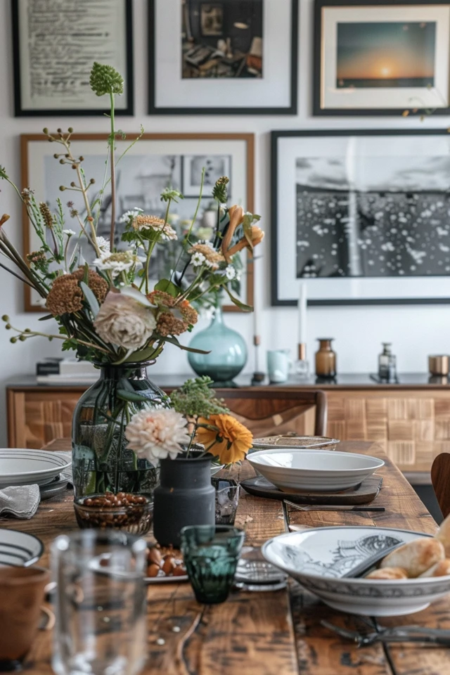
The number one mistake I see in DIY gallery walls is hanging the art too high. In a hallway or foyer, you hang art for a standing viewer, typically with the center of the piece at 57 to 60 inches from the floor. However, the dining room is a sedentary space.
When you and your guests are seated, your eye level drops significantly. If you hang your gallery at standing height, everyone at the table will be craning their necks to look up at the art. This creates a subconscious feeling of disconnection, making the room feel taller and colder than it actually is.
The Golden Rule of Dining Height
In a dining room, I generally lower the “center point” of the gallery to about 54 to 56 inches from the floor. If the gallery wall is situated above a sideboard or buffet, the bottom frame should hover 4 to 8 inches above the top of the furniture. This visual connection anchors the art to the furniture, creating a cohesive vignette rather than floating squares.
Dealing with Wainscoting and Chair Rails
Many dining rooms feature architectural details like wainscoting or chair rails.
- If you have wainscoting: Treat the space above the rail as the “whole wall.” Center your arrangement vertically within that upper section, but be careful not to crowd the ceiling.
- If the wainscoting is high (over 60 inches): Lean your larger pieces on the rail ledge if it’s deep enough, and layer smaller pieces on the wall above.
Designer’s Note: The Volume Check
What usually goes wrong: People hang art so high that when they place candlesticks or a tall vase on the buffet, the decor blocks the bottom third of the pictures.
How to prevent it: Before hammering a single nail, style your buffet. Put your lamps, vases, and serving platters in place. Then, measure your 4-to-8-inch gap starting from the top of the tallest permanent object (like a lamp) or ensure the layout weaves around them.
2. Choose the Layout: The Grid vs. The Salon
The “vibe” of your dining room is largely dictated by the structure of the gallery wall. You generally have two choices: the formal Grid or the organic Salon style. Choosing the wrong one for your lifestyle can lead to frustration.
The Formal Grid
A grid layout consists of matching frames of the exact same size, hung in precise rows and columns. This creates a sense of order, calm, and high-end sophistication.
- Best for: Modern, minimalist, or traditional formal dining rooms.
- The Challenge: This requires mathematical precision. If one frame is a quarter-inch off, the whole wall looks messy.
- Spacing Rule: Keep the space between frames tight and consistent. I usually aim for 2 to 3 inches between frames. Anything wider destroys the illusion of the grid acting as one large piece of art.
The Organic Salon
A salon wall mixes frame sizes, orientations (landscape and portrait), and finishes. It feels collected, cozy, and dynamic.
- Best for: Bohemian, farmhouse, eclectic, or family-friendly spaces.
- The Benefit: It is incredibly forgiving. If you buy a new piece of art later, you can usually add it to the edge of the arrangement without redoing the whole wall.
- Spacing Rule: While organic, it still needs rules. Keep spacing relatively consistent, roughly 3 inches between items.
Common Mistakes + Fixes
Mistake: The “Floating Satellite.” This happens when small frames drift too far away from the main grouping, making them look lost.
The Fix: Imagine a large rectangle drawn on the wall. All your frames should fit somewhat neatly within that imaginary boundary. Keep the outer edges defined, even if the interior arrangement is chaotic.
3. Curating the Content: Beyond Family Photos
A dining room gallery wall serves a different purpose than a hallway of school portraits. While family photos are lovely, an entire wall of smiling faces staring at guests while they eat can sometimes feel overwhelming or slightly awkward in a formal setting.
Mix Your Mediums
For a designer-look gallery, variety is key. I aim for a mix of 40% photography, 40% art prints (abstract, landscape, or botanical), and 20% objects. “Objects” can include:
- Vintage mirrors (great for reflecting candlelight).
- Wall brackets with small plants.
- Ceramic plates or woven baskets.
- Architectural salvage pieces.
Color Coordination Strategy
To prevent the wall from looking like a garage sale, you need a unifying thread. This is usually color. Look at your dining room rug or your upholstery. Pick two or three secondary colors from those fabrics and ensure every piece of art on the wall contains at least one of those colors.
If your art collection is wildly colorful and mismatched, you can unify them through framing. Using the exact same frame style (e.g., all slim gallery black frames with white mats) acts as a visual “glue” that holds different art styles together.
What I’d do in a real project
If I am designing for a client who rents or moves frequently, I avoid a complex grid. I would curate a “Salon style” wall using mixed vintage gold and wood frames. Why? Because if they move to a house with a smaller wall, we can easily condense the arrangement. If the new wall is larger, we just add two more mirrors to the outside. It is future-proof design.
4. Mastering the Mechanics: Templates and Hardware
This is the step where most homeowners give up or end up with a wall that looks like Swiss cheese. The execution phase is critical. You cannot “eyeball” a gallery wall, no matter how good your spatial awareness is.
The Paper Template Method
This is non-negotiable for a professional result.
- Trace every single frame onto Kraft paper or old wrapping paper.
- Cut out the shapes.
- Mark the exact location of the hanging hardware (the wire peak or the D-ring) on the paper.
- Tape these paper shapes to the wall using painter’s tape.
- Step back, squint, and rearrange. Leave them up for 24 hours to see how they feel in different lighting.
Hardware Selection
For drywall, I rarely use heavy anchors unless the item is a heavy mirror. Standard picture hooks (the kind where the nail goes in at a steep angle) are incredibly strong and leave tiny holes.
For a dining room specifically, I highly recommend using “bumper pads” or a small dab of museum wax (also known as earthquake putty) on the bottom corners of every frame. Dining rooms are high-traffic areas. Every time someone walks by briskly or bumps a chair, pictures can shift. The wax keeps them perfectly level forever.
Designer’s Note: The Renter’s Dilemma
If you are renting and cannot put 20 holes in the wall, you have two options:
1. Command Strips: They work well, but you must clean the wall with alcohol first and press firmly for 30 seconds.
2. Picture Rails: If you have molding near the ceiling, install a picture rail system. You hang wires from the molding and suspend art on hooks. It is a very classic, “old world” dining room look that saves your drywall.
5. Lighting Your Gallery
You can have the most expensive art collection in the world, but if it is in a shadow, it adds no value to the room. Dining rooms often rely on a central chandelier which casts downward light, leaving the walls dark.
Picture Lights
Installing picture lights above your artwork elevates the room immediately. It signals to the eye that “this is important.”
- Hardwired: Requires an electrician and planning during renovation.
- Plug-in: Can look messy with cords, unless you use cord covers painted to match the wall.
- Battery Operated: My favorite solution for retrofits. Many modern LED picture lights are battery-powered and remote-controlled. You simply screw them into the wall above the frame.
Glare Management
In a dining room, you likely have a chandelier. If your gallery wall faces the chandelier directly, standard glass frames will act like mirrors, reflecting the light bulb rather than showing the art.
If your budget allows, upgrade to non-glare or “museum glass” for your key pieces. If that is too expensive (it can be pricey), try to remove the glass entirely for canvas pieces or oil paintings. For prints, matte finish photo paper reflects less light than glossy paper.
Common Mistakes + Fixes
Mistake: Buying frames with cheap plastic fronts (styrene) instead of glass.
The Fix: Styrene scratches easily and warps over time, distorting the image. Always opt for real glass. If you buy a budget frame, take it to a local glass shop and have them cut a piece of real glass to fit. It usually costs less than $10 per frame and makes a $20 Target frame look like a custom $200 job.
Final Checklist: Ready to Hang?
Before you grab the hammer, run through this quick checklist to ensure you have covered all the bases.
- Scale Check: Does the arrangement span at least 2/3 the width of the furniture below it?
- Height Check: Is the center of the arrangement at seated eye level (approx. 54-56 inches from floor)?
- Clearance Check: Is there at least 4-8 inches of breathing room between the buffet/chairs and the bottom frames?
- Safety Check: Have you used earthquake putty or bumpers to keep frames straight?
- Lighting Check: Will the chandelier glare obscure the art? Have you considered battery sconces?
- Tool Check: Do you have a level, painter’s tape, kraft paper, and the correct weight-rated hooks?
Frequently Asked Questions
Should I use all black and white photos or color?
This depends on the room size. In a small dining room, black and white photography can make the space feel less cluttered and more expansive. In a large, neutral dining room, color art brings necessary energy. If you mix them, try to frame the black and white photos in colored frames (like wood or gold) and the color photos in neutral frames (white or black) to balance the visual weight.
Can I mix metal finishes in my frames?
Absolutely. Mixing metals feels more organic and high-end than matching everything perfectly. A good rule of thumb is the 80/20 rule. Make 80% of the frames one metal (e.g., black) and 20% an accent metal (e.g., gold). This looks intentional rather than accidental.
What if my wall is huge and my art is small?
This is a scale issue. You have two fixes. First, use oversized mats. You can put a 5×7 photo in an 11×14 or even 16×20 frame with a large white mat. This increases the physical footprint of the art without needing a larger image. Second, combine your small art with wall sconces or floating shelves to eat up more horizontal wall space.
Conclusion
Creating a dining room gallery wall is one of the most rewarding weekend projects you can undertake. It transforms a utilitarian eating space into a room rich with narrative and warmth. By respecting the unique scale of a dining room—hanging art lower for seated guests and managing glare from chandeliers—you ensure the space feels comfortable rather than chaotic.
Remember that a gallery wall is never truly “finished.” It is a living collection that can evolve as your tastes change, as you travel, and as your family grows. Start with the paper templates, commit to a layout that suits your personality, and don’t be afraid to mix high-end art with personal mementos.
Picture Gallery


