
Backsplash Ideas for Cherry Cabinets: My Top Picks
Cherry cabinets are a timeless feature in many homes, known for their rich warmth and durability. However, they can also be one of the most challenging finishes to work with when it comes to updating a kitchen. The deep red and orange undertones often intimidate homeowners, leading many to believe their only option is to paint over the wood.
In my years as an interior designer, I have saved countless cherry kitchens simply by changing the surrounding elements. The backsplash is arguably the most critical component in this equation. It acts as the bridge between your countertops and cabinets, and the right choice can instantly modernize the space while respecting the integrity of the wood.
If you are struggling to find the perfect tile to complement your wood tone, you are in the right place. For plenty of visual inspiration to guide your renovation, be sure to check out the curated Picture Gallery included at the end of this blog post.
Understanding the Undertones of Cherry Wood
Before we look at specific tile samples, we have to talk about color theory. Cherry wood is distinct because of its red, orange, and sometimes violet undertones. Unlike white oak or walnut, cherry commands attention and dictates the color palette of the room.
One thing I always tell my clients is that cherry wood changes over time. It oxidizes and darkens, becoming richer and redder as it ages. If your cabinets are brand new, they might look lighter and pinker now, but they will deepen. Your backsplash choice needs to account for what the wood looks like now and what it will look like in five years.
The goal is usually one of two things: neutralize the red or complement it. To neutralize it, we lean toward cool tones that provide relief from the warmth. To complement it, we use warm neutrals that bridge the gap without competing.
Designer’s Note: The Lighting Lesson
I once worked on a project where the client selected a beautiful gray glass tile for their cherry kitchen. In the showroom, it looked sleek. However, once installed in their kitchen which had warm 2700K recessed lighting, the gray turned a muddy purple against the orange cabinets.
Always test your samples vertically (propped up on the counter) in your actual kitchen lighting. The temperature of your bulbs—measured in Kelvins—will drastically change how the tile interacts with the wood.
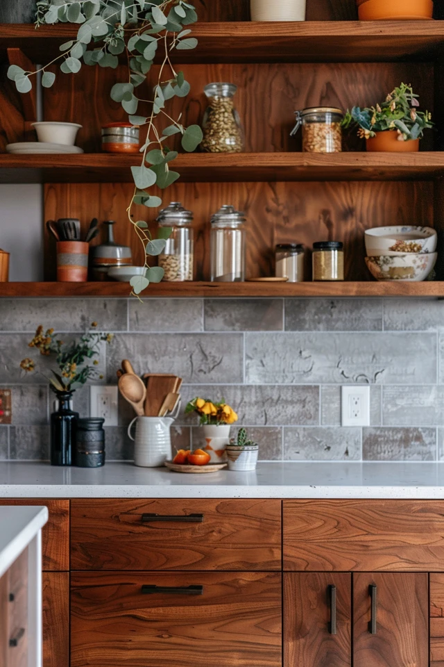
The Power of Crisp Whites and Soft Creams
When in doubt, white is the most effective tool for modernizing cherry cabinets. It provides a high-contrast look that feels fresh and intentional. However, “white” is a broad category, and picking the wrong shade can be disastrous.
Stark, cool white can sometimes make cherry wood look outdated or overly orange by contrast. Instead, I usually steer clients toward soft whites, heavy creams, or off-whites. These shades contain just enough yellow or brown pigment to harmonize with the wood without looking yellow themselves.
If you want a transition style that feels current, a handmade ceramic subway tile in a “cloud” or “milk” finish is ideal. The undulation in the surface reflects light differently, adding texture that flat cherry cabinets often need.
Common Mistakes + Fixes: The White Tile Trap
Mistake: Using bright white grout with white tile against dark cabinets. This creates a busy grid pattern that draws the eye away from the cabinetry and can look clinical.
Fix: Use a warm gray or “biscuit” colored grout. This softens the transition between tiles and reduces visual clutter. It also hides grease splatter much better than bright white grout.
Cooling It Down with Blues and Greens
If you look at a color wheel, the direct opposite of red and orange is blue and green. This makes them complementary colors, meaning they naturally look good together. Using these cool tones creates a balance that prevents the kitchen from feeling like a sauna of warm tones.
I love pairing cherry cabinets with a slate blue or a deep sage green. These colors are found in nature, just like the wood, so the combination feels organic rather than forced.
For a sophisticated look, consider a glass tile in a pale mist green. The translucency of the glass adds depth and lightness, which helps counteract the visual heaviness of dark cherry wood. If you prefer a farmhouse or traditional aesthetic, a matte ceramic tile in navy blue provides a striking, regal contrast.
Design Rules: Scale and Proportion
When introducing color, you must consider the scale of the room.
- Small Kitchens: Stick to lighter shades of blue or green (like seafoam or sky blue) to keep the room feeling open.
- Large Kitchens: You can afford to go with deep hunter greens or midnight blues for a dramatic, moody effect.
- Tile Size: For standard 18-inch tall backsplashes, a 3×6 inch tile is classic. However, I often use a 2×8 or 2×10 inch tile for a more modern, linear look.
Embracing Drama: Slate and Natural Stone
For those who want to lean into the richness of the wood rather than contrast it, natural stone is a phenomenal choice. Slate, soapstone, or a matte black granite backsplash can make cherry cabinets feel incredibly high-end and furniture-like.
Slate, in particular, often has natural clefting and color variation—greens, grays, and rusts—that ties perfectly into the cherry undertones. It creates a rustic, earthy vibe that is very forgiving of dirt and splashes.
If you choose a dark backsplash, you must ensure your under-cabinet lighting is sufficient. Dark stone absorbs light. Without proper LED strips installed under your upper cabinets, your workspace will feel like a black hole.
What I’d Do in a Real Project: The Stone Checklist
If a client wants a stone backsplash with cherry cabinets, here is my workflow:
1. Verify Countertops: If the countertop is busy (like a speckled granite), the backsplash must be quiet. A solid slate tile works well here.
2. Check the Finish: I prefer honed or matte finishes for stone against cherry. Polished stone plus polished wood can look too shiny and dated.
3. Sealant Plan: Natural stone is porous. I ensure the client understands it needs to be sealed upon installation and resealed annually to prevent oil stains.
Glass Tile: The Modernizer
Glass tile had a boom in the early 2000s, then fell out of favor, but it is back in a new way. We aren’t talking about the busy, multi-colored mosaic skinny sticks anymore. We are talking about large-format glass subway tiles or solid glass sheets.
Glass is excellent for cherry kitchens because it offers a break in texture. Wood is solid and opaque; glass is light and reflective. This contrast adds a layer of sophistication.
I recommend sticking to solid colors for glass tile. A large 4×12 glass tile in a “smoke” or “taupe” color can bridge the gap between a dark countertop and reddish cabinets. The reflective quality also helps bounce light around the room, which is helpful since cherry cabinets can sometimes darken a space.
Installation Alert: The Ghosting Effect
Glass tile is tricky because you can see through it.
- Adhesive Color: You must use a bright white thin-set adhesive. If the installer uses gray, the gray will show through the glass and ruin the color.
- Cutting: Glass chips easily. Ensure your installer has a fresh diamond blade specifically for glass to avoid jagged edges.
Final Checklist: Before You Buy
Ready to make a purchase? Run through this checklist to ensure you are making a decision you won’t regret.
- The “Prop” Test: Have you propped the sample tile up vertically on your counter for at least 24 hours?
- The Time Check: Have you looked at the sample in the morning, afternoon, and night (artificial) light?
- The Countertop Coordination: Does the tile clash with the veining in your countertop? (Rule of thumb: One star of the show. If the counter is loud, the tile should be quiet).
- The Hardware Factor: Have you held your cabinet hardware (knobs/pulls) against the tile? Brushed nickel cools things down; oil-rubbed bronze warms them up.
- The Outlet Plan: Have you planned for outlet covers? I recommend color-matching them to the tile or placing them horizontally near the bottom of the cabinet to hide them.
FAQs
Should I match the backsplash to the floor or the cabinets?
Neither, strictly speaking. The backsplash should coordinate with the countertop first, as they physically touch. However, the floor and backsplash should be “friends.” If you have a warm beige tile floor, a cool gray backsplash will likely clash. Keep the undertones consistent.
Can I use peel-and-stick tile on a rental with cherry cabinets?
Absolutely. In fact, it’s a great way to neutralize a dated rental kitchen. Look for “gel” versions that mimic the look of real glass or ceramic. Stick to a simple white subway pattern; faux stone usually looks fake and cheapens the real wood cabinets.
My cherry cabinets look very orange. What is the best color to tone that down?
Avoid yellow-based creams or beige. Go for a “greige” (gray-beige) or a soft cool gray. The coolness of the gray will neutralize the orange. Alternatively, a crisp white with a cool undertone works wonders.
Is subway tile too boring for a high-end kitchen?
Not if you do it right. “Boring” subway tile is usually a result of standard sizing (3×6) in standard white with standard layout. Try a longer format (2×8), a different layout (herringbone or vertical stack), or a handmade texture. The pattern and texture add the interest, not just the color.
What is the standard height for a backsplash?
The standard distance between the countertop and the bottom of the upper cabinets is 18 inches. However, if you have a range hood, I highly recommend tiling all the way up to the ceiling behind the hood. It draws the eye up and makes the ceilings feel taller.
Conclusion
Updating a kitchen with cherry cabinets doesn’t require a demolition crew or a can of paint. By carefully selecting a backsplash that respects the wood’s strong personality, you can completely transform the feel of the room.
Whether you choose to cool things down with a slate blue, modernize with a crisp white, or embrace the moodiness with natural stone, the key is balance. Remember to test your samples, watch your lighting, and keep the rest of the palette cohesive. Your cherry cabinets are a feature worth highlighting, not hiding.
Picture Gallery


