
Beige and Grey Bathroom Ideas for Chic Spaces
Designing a bathroom with a neutral palette sounds deceptively simple. Many homeowners assume that because beige and grey are subdued colors, they will automatically work well together. However, combining these two distinct neutrals is actually one of the trickiest balancing acts in interior design.
I recall a project where a client insisted that “grey is modern” and “beige is traditional,” and they wanted a transitional mix. Without careful planning, the first round of samples looked muddy and uninspired. It wasn’t until we focused on texture, lighting temperature, and specific undertones that the space transformed from bland to a high-end sanctuary. For plenty of visual inspiration, don’t miss the curated Picture Gallery at the end of this blog post.
In this guide, I am going to walk you through exactly how I execute this color combination for my clients. We will move beyond basic color matching and discuss the technical details of tile selection, grout logic, lighting specifications, and hardware finishes that make a beige and grey bathroom feel intentional and chic.
1. Mastering the Undertones: The Foundation of the Palette
The success of a beige and grey bathroom hinges entirely on undertones. If you pick a cool, blue-based grey and pair it with a yellow-based beige, the room will feel disjointed. The eye perceives this clash even if you cannot quite put your finger on why it looks “off.”
To create a cohesive look, I usually recommend one of two strategies. The first is the “Tone-on-Tone” approach, where you select a “greige” (a warm grey) and pair it with a cool beige. This keeps the temperatures relatively close, creating a seamless, spa-like envelopment.
The second strategy is “High Contrast.” This involves using a very pale, creamy beige (almost white) against a dark, charcoal grey. The distance between the two colors on the spectrum eliminates the risk of clashing undertones because they aren’t fighting for the same visual space.
Designer’s Note: The “Daylight” Lesson
I once specified a beautiful limestone tile that looked perfectly greige in the showroom. However, once installed in the client’s north-facing bathroom, the lack of direct sunlight pulled the blue undertones out of the stone, making it look like concrete. The beige vanity ended up looking pink in comparison.
The Lesson: Always test your tile and paint samples in the specific room they will live in. Check them in the morning, afternoon, and especially at night with artificial lighting. A north-facing room will cool down your colors, while a south-facing room will warm them up.
How to Test Your Palette
- Isolate the samples: Place your grey tile sample next to your beige paint chip against a pure white sheet of paper. This helps your eye see the true underlying colors.
- Check for the “Pink” trap: Many taupe or beige tiles lean pink when placed next to green-based greys. Avoid this unless pink is your desired accent color.
- The 60-30-10 Rule: In a dual-neutral space, decide which color is dominant. Let beige be 60% (walls, floor), grey be 30% (vanity, shower accent), and metals be 10%. Splitting it 50/50 often creates a visual stalemate.
2. Material Selection: Texture Over Color
When you remove bold colors from a bathroom design, texture must do the heavy lifting. A flat beige wall next to a flat grey floor reads as “builder-grade” or institutional. To achieve that “chic” factor, we need variation in surface finishes.
I prioritize natural materials in these spaces. Natural stone, such as Travertine or Limestone, naturally contains both grey and beige flecks. Using a material that already bridges the two colors is the easiest way to guarantee a match.
The Power of Zellige and Handmade Tiles
Uniformity is the enemy of a neutral bathroom. I frequently use Zellige-style tiles (Moroccan handmade tiles) for shower walls or vanity backsplashes. Their uneven surface reflects light in different directions, creating movement.
Even if the tile is a solid beige, the variation in glaze thickness creates shadows that read as grey. This adds depth without requiring you to introduce a new material.
Flooring Considerations
For flooring, consider large-format porcelain tiles that mimic stone. They are durable and often come in “warm grey” tones.
- Scale matters: In small bathrooms, I prefer 12×24 inch tiles or larger to minimize grout lines.
- Finish: Always choose a matte or honed finish for floors. Polished beige tiles can be a slip hazard and show water spots instantly.
- Safety spec: Look for a DCOF (Dynamic Coefficient of Friction) rating of 0.42 or greater for wet areas.
Common Mistakes + Fixes: The Grout Grid
The Mistake: Using a high-contrast dark grey grout on a light beige subway tile. This creates a busy grid pattern that makes the room feel smaller and more chaotic.
The Fix: Choose a grout color that matches the tile as closely as possible, or is just one shade darker. This makes the surface look like a continuous texture rather than a checkerboard. For a beige and grey room, “Warm Grey” or “Alabaster” grout is usually the sweet spot.
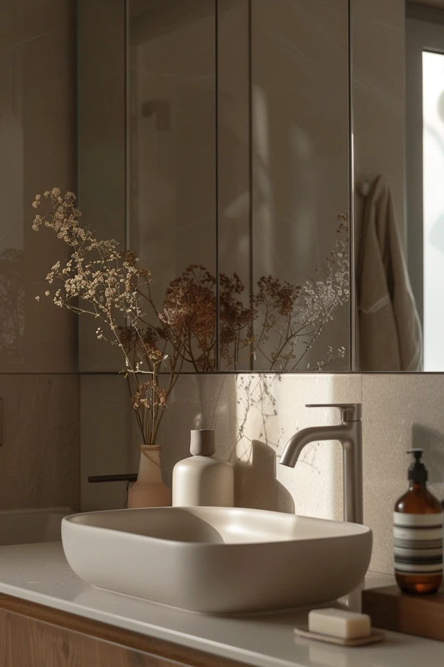
3. Selecting Hardware and Fixtures: The Jewelry of the Room
In a beige and grey bathroom, your choice of metal finish dictates the final “vibe” of the space. Because you are mixing warm (beige) and cool (grey), you have the freedom to lean into either direction with your hardware.
My go-to finish for this palette is Polished Nickel. Unlike Chrome, which is very blue and cold, Polished Nickel has a warm, golden undertone. It bridges the gap perfectly, complementing the beige while harmonizing with the grey.
The Case for Matte Black
If you want a more modern, industrial, or farmhouse look, Matte Black is the answer. Black acts as a grounding element. It creates a silhouette that pops against both beige stone and grey cabinetry.
However, use black sparingly. If you choose black faucets, consider softer lighting fixtures or cabinet pulls to avoid the room feeling too harsh.
Mixing Metals
Yes, you can mix metals, but follow a hierarchy. Choose a dominant metal for the plumbing fixtures (shower controls, faucets) and a secondary metal for lighting and mirrors.
- A winning combo: Matte Black faucets with Aged Brass lighting. The brass pulls out the warmth in the beige, while the black ties into the darker greys.
- Avoid: Mixing Chrome and Nickel. They are too similar but just different enough to look like a mistake.
Vanity Considerations
If your walls are beige, a grey vanity provides excellent contrast. Look for a “greige” or “mushroom” colored cabinet if you want a subtle look, or a charcoal grey for drama.
Ensure the countertop provides relief. If the vanity is dark grey, a creamy quartz top brightens the area. If the vanity is light oak (a form of beige), a dark grey soapstone counter looks incredible.
4. Lighting: The Make-or-Break Factor
I cannot stress this enough: bad lighting will ruin a beige and grey bathroom. Low-quality bulbs can turn a sophisticated beige into a sickly yellow or a muddy green. The technical specifications of your light bulbs are just as important as the fixture style.
Kelvin Temperature
For bathrooms, I strictly use 3000K bulbs. This temperature is a crisp, bright white that doesn’t cast the blue hue of “Daylight” (5000K) or the orange hue of “Soft White” (2700K).
3000K is the most neutral light. It allows the grey to stay true and the beige to stay warm without clashing. If you go to 2700K, your grey tiles may start to look brown.
Placement Rules of Thumb
To ensure the room feels chic and functional, layer your lighting. Do not rely solely on a ceiling grid.
- Sconce Height: Mount side sconces so the center of the bulb is roughly at eye level, generally 60 to 66 inches from the finished floor. This provides flattering cross-lighting for applying makeup or shaving.
- Recessed Cans: Place these primarily over functional areas like the toilet and shower. Avoid placing a can light directly over the standing area at the vanity, as it casts harsh shadows under the eyes (the “raccoon effect”).
- Dimmers: Every light in a bathroom should be on a dimmer. A beige and grey palette looks incredibly luxurious when dimmed low for a bath.
5. Styling, Soft Goods, and Real-Life Constraints
Once the hard finishes are in, styling brings the room to life. This is also where we address practical constraints like rentals, kids, and pets.
Textiles and Soft Goods
Towels and rugs are the easiest way to manipulate the color balance. In a predominantly grey room, use fluffy, cream-colored towels to soften the look. In a beige room, charcoal waffle-weave towels add a masculine, structural edge.
For rugs, I advise against the standard small bath mat. If space permits, use a vintage-style runner. A runner that incorporates muted reds, olives, or navy blues can ground the beige and grey, making them feel like a neutral backdrop rather than the main event.
Renters and Budget Updates
If you are renting or on a tight budget, you might be stuck with ugly grey tile or beige walls you can’t paint. Here is how I handle those constraints:
- The Shower Curtain: Get an extra-long shower curtain (floor to ceiling). A heavy linen curtain in a “natural” flax color immediately elevates a dated grey bathroom.
- Peel-and-Stick: Cover a generic vanity top with high-quality marble-effect contact paper. It breaks up the monotony.
- Replace Hardware: Swapping out cabinet knobs is reversible. If the rental has dated chrome, swap it for modern matte black pulls to modernize the beige/grey mix.
Maintenance Realities
Beige and grey are generally forgiving, but texture traps dirt. If you choose a rough-hewn slate (grey) or a tumbled travertine (beige), be aware that soap scum loves these crevices.
For families with kids, I recommend large format porcelain tiles that look like stone but are smooth to the touch. It gives you the chic aesthetic without the scrubbing nightmare.
What I’d Do in a Real Project: A Mini-Checklist
If I were designing a master bathroom today with this palette, here is exactly what I would specify to guarantee success:
- Walls: A lime-wash paint in a pale “Putty” color (adds texture instantly).
- Floor: 12×24 Honed Limestone in a warm grey, laid in a herringbone pattern.
- Vanity: White Oak with a custom stain to remove yellow tones, making it read as a neutral beige wood.
- Countertop: A grey-veined quartz that pulls the floor color up to the vanity.
- Metals: Polished Nickel for faucets; a simple vintage rug with warmer earth tones.
Final Checklist for Your Renovation
Before you purchase materials, run through this list to ensure your beige and grey bathroom will be a success:
- Undertone Check: Have you held your grey and beige samples together in natural and artificial light?
- Texture Audit: Do you have at least three different textures (e.g., smooth glass, matte stone, fluffy cotton)?
- Metal Cohesion: Have you limited your metal finishes to two types maximum?
- Lighting Spec: Are you buying 3000K bulbs with a high CRI (90+)?
- Grout Color: Have you selected a grout that blends rather than contrasts?
- Scale Check: Are your floor tiles proportional to the room size?
FAQs
Is grey still in style for bathrooms?
Cool, flat “flipper grey” is on its way out, but warm, organic greys (like stone, clay, and mushroom tones) are timeless. The key is moving away from the sterile, blue-grey look and embracing greys that have brown or green undertones.
What color vanity goes with beige tile?
A charcoal grey or soft dove grey vanity looks beautiful against beige tile. It provides necessary contrast. Alternatively, a natural wood vanity (white oak or walnut) acts as a neutral texture that complements beige perfectly.
Can I mix warm beige and cool grey?
Yes, but you need a “bridge” element. Use natural wood, white marble with both gold and grey veining, or a multi-colored rug to tie the two temperatures together. Without a bridge, they may look disconnected.
What is the best paint color for a beige and grey bathroom?
I often recommend “Greige” paints. Colors like Benjamin Moore’s “Revere Pewter” or Sherwin Williams’ “Accessible Beige” sit right in the middle. They shift depending on the light and furniture, making them the perfect backdrop for this palette.
Conclusion
Creating a chic beige and grey bathroom is less about picking two colors and more about curating a feeling. It requires a thoughtful mix of temperatures, textures, and lighting to ensure the space feels wrapped in luxury rather than stuck in indecision.
By focusing on natural materials, layering your lighting, and paying attention to the subtle undertones of your finishes, you can design a space that is both soothing and visually interesting. Remember to test your materials in your specific environment, and don’t be afraid to use texture to add the depth that color usually provides.
Picture Gallery


