
Title: Best Front Door Colors for Sage Green Houses
Introduction
Sage green has become one of the most requested exterior colors in my design practice over the last five years. It manages to be both earthy and sophisticated, acting as a neutral that blends beautifully with natural landscapes while still providing distinct character. However, because sage contains complex undertones of gray and yellow, choosing the right accent color for your front entry can be tricky.
I recently worked on a 1920s bungalow where the client loved their new sage siding but felt the existing bright white door made the house look “washed out.” We tested six different colors over three days to see how the changing sunlight altered the curb appeal. If you want to see exactly how these combinations look in real life, be sure to check out the Picture Gallery at the end of this blog post.
The front door is the handshake of your home; it sets the expectation for the interior design. When working with sage, you generally have three successful paths: high contrast (blacks and dark navies), complementary warmth (terracottas and woods), or tonal harmony (darker greens). In this guide, I will break down the specific rules I use to pair colors with sage cladding, ensuring you avoid clashing undertones.
1. Understanding Undertones and Light Exposure
Before buying a quart of paint, you must identify the specific variation of sage you have. Not all sage greens are created equal; some lean heavily toward gray (cool), while others have a strong yellow or olive base (warm).
If your siding looks more like a dusty gray in the shade, you likely have a cool sage. If it glows slightly golden in the afternoon sun, you are dealing with a warm, olive-leaning sage. Understanding this temperature is critical because it dictates which door colors will harmonize and which will clash.
Designer’s Note: The Daylight Test
I learned this the hard way early in my career: never pick an exterior color based on a swatch looked at indoors. Indoor lighting is artificial and static, while exterior light changes constantly.
To get it right, paint a large sample board (at least 2×2 feet) of your potential door color. Tape it to your existing door and view it at three specific times: 8:00 AM (cool morning light), 12:00 PM (harsh overhead light), and 5:00 PM (warm “golden hour” light). You will be surprised at how a color like “Midnight Blue” can look purple in the morning and black in the evening.
North vs. South Facing Houses
The direction your house faces changes how sage green appears.
- North-facing light: This light is cool and bluish. It will pull the gray tones out of your sage siding. Avoid cool gray doors here, as the whole house can look dreary. Opt for warmer door colors like wood stains or terracotta to counterbalance the blue light.
- South-facing light: This is warm, intense light. It will highlight the yellow/olive notes in sage. You can get away with cooler door colors like charcoal, navy, or crisp white to provide visual relief.
2. The Power of Natural Wood Stains
In my professional opinion, a natural wood door is often the absolute best choice for a sage green house. The organic texture of the wood grain complements the earthy nature of the green, creating a look that feels grounded and expensive.
Wood brings immediate warmth to the palette. Since sage is a color found abundantly in nature, pairing it with timber feels instinctively “right” to the human eye. It works particularly well for Craftsman, Mid-Century Modern, and Farmhouse architectural styles.
Choosing the Right Stain
You have to be careful with the undertones of the wood stain just as you are with paint.
- Walnut and Dark Oak: These are my top recommendations. Dark, rich browns provide enough contrast against the medium value of sage green. They ground the entryway and look very high-end.
- Cedar and Mahogany: These woods have red or orange undertones. Because red is the complementary color to green on the color wheel, these create a vibrant, high-energy look. This works well if you want the door to pop, but ensure the orange isn’t too neon.
- White Oak / Driftwood: A lighter, bleached wood look can work for coastal properties, but be careful. If there isn’t enough contrast between the lightness of the sage and the lightness of the door, the entry can disappear.
Common Mistakes + Fixes
Mistake: Using a glossy, faux-wood fiberglass door that looks plastic against the matte sage siding.
Fix: If you must use fiberglass for durability, invest in a high-quality “stainable” skin. Use a gel stain rather than a penetrating stain to mimic real grain, and finish with a satin spar varnish, not high gloss. Real wood absorbs light; plastic reflects it.
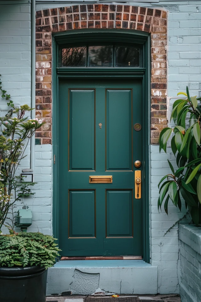
3. High Contrast Neutrals: Black and Charcoal
If you want a look that is modern, sharp, and defines the architecture, you cannot go wrong with black or deep charcoal. This is the “little black dress” of exterior design.
Sage green is a mid-tone color. To create visual interest, you need contrast. A deep black door creates a focal point that draws the eye immediately to the entrance. This is particularly effective if you have black window sashes or black light fixtures.
The “Soft Black” Approach
Stark, jet black (like the color of a tire) can sometimes feel too harsh against a soft, organic sage. I often steer clients toward “Soft Blacks” or “Off-Blacks.” These are colors that read as black from the street but have subtle undertones when viewed up close.
- Green-Blacks: A black with a very deep green undertone is incredibly sophisticated. It looks monochromatic but provides the necessary contrast.
- Warm Charcoals: These are dark grays with a bronze or brown undertone. They feel softer and more welcoming than a cold, blue-based gray.
What I’d Do in a Real Project
If I am designing a Modern Farmhouse with sage siding:
- Door Color: Tricorn Black or Iron Ore (Sherwin Williams) in a semi-gloss finish.
- Trim: I would paint the door casing (the trim immediately surrounding the door) in the same black as the door, rather than white. This makes the door opening feel larger and more grand.
- Hardware: I would contrast the dark door with Satin Brass hardware. The gold tones pop beautifully against black and harmonize with the green siding.
4. Complementary Colors: Terracotta, Red, and Coral
Using red on a green house is a classic choice rooted in color theory, but it requires a very delicate hand. If you choose a bright fire-engine red, your house will look like a permanent Christmas decoration.
The secret is to use muted, earthy variations of red. Think terracotta, brick, rust, or coral. These colors share the same “muddy” quality as sage, which makes them feel like a cohesive family rather than a jarring collision.
Architectural Suitability
This combination is highly specific to certain home styles.
- Cottage / Bungalow: A soft, dusty coral or pink door on a sage cottage is charming and whimsical. It suggests an English garden aesthetic.
- Mid-Century Modern: A brighter, burnt orange door works perfectly here. It plays into the retro vibe and stands up well against the clean lines of sage siding.
- Traditional / Colonial: A deep, brownish-red (brick) is the standard here. It feels historic and established.
The 60-30-10 Rule
When introducing a bold color like terracotta, remember the interior design rule of 60-30-10.
- 60% Main Color: Your sage green siding.
- 30% Secondary Color: Your trim (usually white, cream, or black) and roof.
- 10% Accent Color: Your front door.
Do not repeat the door color on the shutters or the garage door. Let the front door stand alone as the jewel of the exterior. If you paint the garage door terracotta, it will overwhelm the facade and look cheap.
5. Hardware, Lighting, and Accessories
You can pick the perfect paint color, but if the hardware is wrong, the look will fall flat. Accessories are the jewelry of the exterior. With sage green, you have specific metal finishes that work best.
Metal Finishes
- Unlacquered Brass / Antique Gold: This is my number one choice for sage houses. Green and gold are a natural pairing. The warmth of the brass cuts through the coolness of the green. Over time, unlacquered brass develops a patina that looks historic and authentic.
- Matte Black: This is the safe, modern choice. It works best if you also have a black roof or black gutters. It creates a graphic outline that feels tidy.
- Oil-Rubbed Bronze: This works well for rustic or traditional homes. It blends in more than black, offering a softer, more “lived-in” feel.
- Avoid: Polished Chrome or Bright Silver. These cold metals often look sterile and cheap against the warmth of sage green. If you want silver, choose a Brushed Nickel or Pewter, which has more depth.
Lighting Scale and Placement
A common mistake I see is exterior lights that are too small.
Rule of Thumb: Your porch lights should be approximately 1/3 to 1/4 the height of your front door. If you have a standard 80-inch door, your lantern should be roughly 20 to 26 inches tall. Most people buy 10-inch lights, which look dinky and out of scale.
If you have a single light to the side of the door, place it on the handle side (not the hinge side) at eye level, roughly 66 inches from the ground to the center of the fixture.
Rug Sizing Logic
Do not use a tiny doormat. It makes the entry feel pinched.
Designer Tip: Layer your rugs. Start with a larger, flat-weave outdoor rug (typically 3×5 feet or larger) to frame the space. Then, layer a standard coir doormat on top. This adds texture and ensures the mat doesn’t look like a postage stamp on your porch.
Final Checklist: The Selection Process
When I am finalizing a door color for a client, I run through this specific mental checklist to ensure we haven’t missed anything.
- Check the Fixed Elements: Look at your roof color and stone/brick work. If your roof is brown, a gray-blue door might clash. If you have red brick skirting, a red door might fight for attention. The door must coordinate with these unchangeable elements first.
- Test the Sheen: For exterior doors, I almost always specify a Semi-Gloss or Satin finish. High Gloss is beautiful but shows every imperfection in the wood. Flat or Eggshell is too hard to clean and will hold onto dirt and pollen.
- Consider the Storm Door: If you have a glass storm door, remember that it can act like a greenhouse. If you paint your door black and it faces the sun, the heat buildup behind the glass can actually warp the door or melt the plastic trim. In hot climates with storm doors, stick to lighter colors or remove the glass in summer.
- Swatch the Trim: Don’t just swatch the door color. Paint a strip of your trim color (usually white) right next to the sample. You need to see how the door color interacts with the frame that surrounds it.
- Check HOA Restrictions: Before you fall in love with a coral door, check your Homeowners Association guidelines. Many have strict lists of approved colors.
FAQs
What is the best white paint for trim on a sage green house?
Avoid stark, cool whites, which can look blueish and sterile next to sage. Instead, opt for creamy, warm whites. My go-to choices are usually “Alabaster” or “Greek Villa” by Sherwin Williams. These have just enough yellow undertone to bridge the gap with the green without looking yellow.
Can I paint my garage door the same color as my front door?
Generally, no. As a designer, I advise against this. You want your guests’ eyes drawn to the front door, not the garage. Painting the garage door a bold accent color makes the house look unbalanced. Paint your garage door the same color as your siding (sage) or your trim (white/cream) to help it recede visually.
Does a navy blue door work with sage green?
Yes, absolutely. This is an analogous color pairing (colors that sit near each other on the color wheel). It creates a serene, calming, and sophisticated palette. Just ensure there is enough contrast. If the sage is dark and the navy is dark, the entrance will look like a dark hole. Use a deep navy only if the sage is a light to medium shade.
How do I handle a brick porch with a sage house?
If you have red brick steps or a porch floor, lean into neutrals for the door. A black or wood-stained door will bridge the gap between the green siding and red brick. Avoid adding a third strong color (like blue or bright red) to the door, as the combination of Green House + Red Brick + Blue Door creates too much visual chaos.
Conclusion
Choosing a front door color for a sage green house is an exercise in balance. Because sage is such a versatile, nature-inspired backdrop, you have the freedom to steer the style of your home in many directions. A black door adds modern edge; a wood door adds organic luxury; and a terracotta door adds cottage charm.
The most important takeaway is to respect the light. Sage is a chameleon color that shifts throughout the day. By testing your samples outside and considering the fixed elements like your roof and landscaping, you can create an entryway that feels welcoming and intentionally designed. Trust your gut, but trust your sample boards more.
Picture Gallery


