
Blue and Purple Bedroom Decor – Ideas for Dreamy Decor
Blue and purple are analogous colors, meaning they sit right next to each other on the color wheel. This natural proximity makes them one of the most harmonious pairings in interior design, offering a vibe that ranges from moody and regal to soft and whimsical. It is a classic combination that actually lowers blood pressure and promotes sleep, making it functionally perfect for a bedroom setting.
However, getting the balance right requires a bit of strategy to avoid the room looking like a bruised plum or a nursery. For a huge dose of visual inspiration before you start planning your renovation, scroll down to the Picture Gallery at the end of this post. By understanding undertones and texture, you can create a space that feels sophisticated and intentional.
I remember a project where a client wanted “lavender and navy” but was terrified it would look juvenile. We focused on texture—velvet headboards, grasscloth wallpaper, and heavy linen drapes—to mature the palette. The result was a boutique hotel feel that felt expensive and grounded, proving that this color duo is incredibly versatile when handled with care.
Mastering the Color Palette and Undertones
The success of a blue and purple bedroom hinges entirely on the undertones you select. If you mix a clean, bright cyan blue with a muddy, muted mauve, the room will feel disjointed and “vibrating.” You generally want to stick to colors that share the same level of clarity or muddiness.
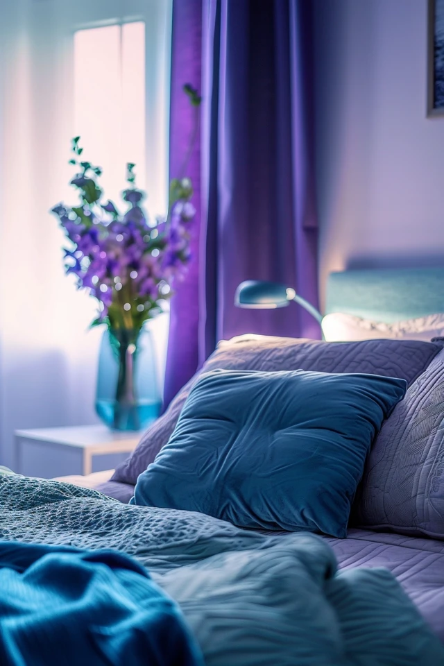
If you love jewel tones, pair a deep navy (like Hale Navy) with a rich eggplant or plum. These colors share a depth and saturation that allows them to hold their own against one another. This high-contrast, dark approach is excellent for creating a “cocooning” effect, which is highly effective for deep sleep.
For a lighter, airier aesthetic, look at periwinkle and lilac. These are lighter tints that have a lot of white mixed in. They reflect light beautifully and make small rooms feel larger. However, to keep this from looking too sweet, you need to anchor it with neutral grays or crisp whites.
Designer’s Note: The “Daylight Test”
I cannot stress this enough: blue and purple are the most unstable colors when it comes to lighting conditions. A purple that looks elegant in the morning might turn brown or gray in the evening.
Before committing to a paint color, paint a 2-foot by 2-foot square on every wall in the room. Watch how the color shifts from morning sunlight to artificial evening light. I once had a “soft violet” turn neon pink under 3000K LED bulbs, forcing a last-minute repaint.
Implementing the 60-30-10 Rule
When working with two strong colors, the 60-30-10 rule is your safety net. This rule dictates that 60% of the room should be a dominant color, 30% a secondary color, and 10% an accent shade.
In a blue and purple bedroom, I usually recommend using blue as the 60% dominant color because it is generally more neutral to the eye. This could be your wall color, a large area rug, and the main bedding. Blue recedes visually, making the walls feel further away and the room larger.
Your 30% secondary color would be purple. Use this for the upholstered headboard, curtains, or accent chairs. Purple advances visually, so using it on furniture draws the eye to specific focal points in the room without overwhelming the senses.
The final 10% is your accent, and this is where you break up the cool tones. A room full of only blue and purple can feel physically cold. Use warm metallics like unlacquered brass, copper, or warm wood tones for this final 10%. A gold mirror or walnut nightstands provide the necessary warmth to balance the cool palette.
Furniture Selection and Materiality
The materials you choose for your furniture will dictate the style of the room. Because blue and purple are cool tones, they risk looking sterile if you pair them with glossy white furniture or chrome.
I almost always lean toward natural wood tones to ground this palette. If you are going for a “California Cool” or Scandi vibe with lighter blues and lavenders, use white oak or birch furniture. The pale, warm grain cuts through the pastel tones and adds organic texture.
For moody, dark navy and amethyst rooms, choose dark walnut or mahogany. The deep reds in these woods complement the purple tones perfectly. If you are a renter or on a budget, you don’t need to buy new furniture; vintage dressers can be sanded and stained, or even painted a matte black for a modern edge.
Common Mistakes + Fixes: The “Flat” Room
The Mistake: Using flat cotton bedding, flat wall paint, and standard microfiber furniture in blue and purple.
The Fix: Texture is the antidote to boredom. If your walls are matte blue, choose a velvet purple headboard. Use a chunky knit throw blanket. Incorporate a woven jute rug under the soft area rug. When the lights go down, texture creates shadows that make the room feel expensive.
Lighting: The Critical Factor for Cool Tones
Lighting a blue and purple room requires specific attention to color temperature. Cool colors absorb light, meaning a navy room requires significantly more lumens (brightness) than a white room to function.
Avoid “Daylight” bulbs (5000K) at all costs in a bedroom like this. They will cast a blue tint over everything, making your relaxing sanctuary feel like a hospital ward or a dentist’s office.
Stick to “Soft White” or “Warm White” bulbs in the 2700K to 3000K range. The yellow undertone in this light neutralizes the blue slightly, making the room feel cozy rather than cold.
Layering Your Light Sources
- Ambient Light: A central chandelier or flush mount. Ideally, this is on a dimmer switch.
- Task Light: Sconces or table lamps for reading. Ideally, the bottom of the shade should be at eye level when you are sitting up in bed (roughly 24–26 inches off the mattress).
- Accent Light: Consider a small uplight behind a large plant or a picture light over artwork. This creates depth in the corners of the room.
Window Treatments and Textiles
Window treatments are a prime opportunity to introduce your secondary color (the 30%). If your walls are blue, floor-to-ceiling purple drapes can look stunning. However, getting the height right is non-negotiable for a professional look.
Your curtain rod should be mounted at least 4 to 6 inches above the window frame—or all the way to the ceiling molding if possible. This draws the eye up and makes the ceiling feel higher. The curtains should “kiss” the floor or puddle slightly; they should never hover 2 inches above the ground.
When selecting fabric, consider light filtration. Blue and purple pigments can fade over time with harsh UV exposure. Ensure your drapes have a high-quality liner. This not only protects the fabric but adds volume, making the curtains hang with those deep, professional pleats.
Rug Sizing and Placement
A common error is choosing a rug that is too small, creating a “postage stamp” effect. The rug anchors the color story.
For a Queen bed, you typically need an 8′ x 10′ rug.
For a King bed, opt for a 9′ x 12′ rug.
Designer Rule of Thumb: You want at least 18 to 24 inches of rug extending from the sides and the foot of the bed. This ensures that when you step out of bed, your feet land on the soft texture, not the cold floor. In a blue/purple room, I love using a vintage-style rug that incorporates both colors along with hints of beige or rust to tie the room together.
Styling Accessories and Art
Accessories are where you can introduce personality without breaking the bank. In a blue and purple room, artwork is essential for bridging the gap between the two shades.
Look for large-scale art or a gallery wall that contains both your blue and purple shades, plus that third accent color (gold, mustard, or terracotta). This serves as a “Rosetta Stone” for the room, visually explaining to the brain why these colors belong together.
Don’t forget greenery. Plants are a neutral in interior design. A large Fiddle Leaf Fig or a Snake Plant adds a burst of vibrant green that contrasts beautifully against navy or lavender walls. The organic shape breaks up the straight lines of the furniture.
Managing Clutter and Practicality
If you have kids or pets, practicality must come first. Dark blue velvet sounds lovely until you realize it acts as a magnet for white dog hair.
For pet owners, look for “performance velvet” or tight-weave linens in mid-tone colors. A heathered blue or a textured plum will hide lint and fur much better than a solid, flat navy.
Always ensure you have a “drop zone.” A small tray on the nightstand for jewelry or a bench at the foot of the bed for throwing clothes helps maintain the serene vibe. Clutter creates visual noise that ruins the calming effect of cool colors.
What I’d Do: A Real Project Mini-Checklist
If I were designing a blue and purple bedroom today, here is the exact order of operations I would follow. This ensures you don’t paint yourself into a corner—literally or figuratively.
1. select the “Hero” Fabric first.
I never pick paint first. There are thousands of paint colors but limited fabric options. I would find a patterned duvet, a rug, or curtain fabric that features the blue and purple tones I love.
2. Pull paint swatches from the fabric.
I would take that fabric to the paint store and pull 3-4 blue options and 2 purple options that match the threads in the fabric.
3. Test the paint.
I would paint samples on the wall and observe them for 24 hours. I would check them with the specific light bulbs I plan to use (3000K).
4. Plan the layout.
I would measure the room to ensure the bed fits on the main wall with at least 30 inches of walking clearance on either side.
5. Purchase major furniture.
I would buy the bed and nightstands. I’d aim for wood tones (Walnut) to warm up the cool palette.
6. Install window treatments.
I would mount the rods high and wide (extending 6-10 inches past the window frame on each side) to maximize light.
7. Layer the bedding.
I would mix a solid blue duvet with lavender euro shams and a chunky knit throw in a neutral cream or grey.
Final Checklist
Before you finalize your decor purchases, run through this quick list to ensure the room will function as well as it looks.
- Contrast Check: Do I have enough warmth (wood/brass) to balance the cool blue and purple?
- Lighting Check: Do I have at least three sources of light (overhead, bedside, accent)?
- Texture Check: Do I have at least three different textures (e.g., wood, velvet, linen)?
- Rug Size: Does the rug extend at least 18 inches past the bed on all sides?
- Scale: Are the bedside lamps tall enough for reading?
- Palette: Did I stick to the 60-30-10 rule to prevent color chaos?
FAQs
Can I use blue and purple in a small bedroom?
Absolutely. Dark cool colors can actually blur the corners of a room, making the walls recede and the space feel larger. If you prefer light colors, stick to pastels like periwinkle and lilac, which reflect light and create an airy feel.
What metal finishes look best with this combination?
Warm metals are best. Unlacquered brass, gold, and brushed bronze provide a necessary temperature contrast to the cool walls. Chrome or silver can look very modern, but they can also make the room feel chilly if you don’t add enough wood textures.
How do I keep the room from looking like a teenager’s bedroom?
Avoid high-gloss finishes and neon brights. Stick to “dusty” or “muted” versions of the colors (e.g., slate blue instead of electric blue, plum instead of bright purple). Incorporate sophisticated materials like linen, velvet, and natural wood.
Is it okay to paint the ceiling?
Yes! In a bedroom, painting the ceiling the same color as the walls (color drenching) creates a cozy, enclosed feeling that is perfect for sleep. It also disguises awkward ceiling lines or soffits.
Conclusion
Designing a blue and purple bedroom is about more than just slapping two colors on a wall. It is about creating an atmosphere. Whether you choose deep, dramatic moody tones or light, ethereal pastels, the combination offers a versatility that few other color pairs can match.
By paying attention to lighting temperatures, layering varied textures, and anchoring the space with warm wood tones, you can create a sanctuary that feels professional and inviting. Trust your eye, test your paint, and don’t be afraid to embrace the darker side of the spectrum for a truly restful sleep experience.
Picture Gallery


