
Title: Blue Headboard Bedroom Ideas for a Serene Space
Blue Headboard Bedroom Ideas for a Serene Space
Blue is often cited as the most calming color in the spectrum, making it the premier choice for bedroom design. It bridges the gap between masculine and feminine aesthetics, offering a grounding presence that neutrals sometimes lack. When you anchor a room with a blue headboard, you commit to a focal point that is both sophisticated and restful.
However, selecting the right blue headboard involves much more than picking a favorite shade from a swatch book. You must consider the interplay of fabric textures, the specific undertones of the blue, and how the piece scales within your room’s architecture. A navy velvet headboard creates a completely different mood than a pale chambray linen slipcover.
Be sure to scroll to the end of this article to see the curated Picture Gallery full of inspiring blue bedroom designs.
1. Choosing the Right Blue: Undertones and Lighting
Not all blues are created equal, and lighting is the biggest variable in how your headboard will look once installed. A deep midnight blue can read as black in a room with little natural light. Conversely, a vibrant teal might look neon in a south-facing room with intense afternoon sun.
Understanding Undertones
You need to identify the base of the blue before purchasing. Navy usually has a gray or black base, making it a “near-neutral” that pairs easily with almost anything. Cerulean or cobalt often has a violet base, which is punchier and harder to match with existing furniture.
Teal and peacock blues contain green undertones. These are warmer and work exceptionally well with wood tones like walnut or oak. If your flooring is warm honey oak, a green-based blue headboard will create a harmonious, organic connection.
Lighting Rules of Thumb
If your bedroom faces north, the light will be cool and bluish. Avoid icy blues here, as the room will feel clinical or cold. Opt for a warmer indigo or a textured wool fabric to add heat.
For south-facing rooms, the light is warm and yellow. You can get away with cooler, grayer blues here. The sunlight will naturally warm them up, preventing the space from feeling sterile.
Designer’s Note: The Swatch Test
Never buy a headboard based on a screen image. Order a fabric swatch and tape it to the wall where the bed will go. Observe it in the morning, at noon, and at night with your artificial lamps turned on. The color shift over 24 hours will tell you if you can live with it.
2. Material Matters: Fabric Selection and Durability
The tactile experience of a headboard is just as important as the color. The material dictates the formality of the room and the durability of the piece. As a designer, I always ask clients about their lifestyle before recommending a fabric.
Velvet and Suede
Velvet is the gold standard for a luxe, hotel-like aesthetic. It absorbs light, which gives the color depth and richness that flat weaves cannot achieve. It is soft against the skin if you prop yourself up to read.
However, velvet has a “nap” or direction. If you brush it the wrong way, it looks different. It is also a magnet for pet hair and dust. If you have a white cat and a navy velvet headboard, you will be lint-rolling daily.
Linen and Cotton Blends
Linen offers a relaxed, organic vibe. It is breathable and naturally antimicrobial. This is the ideal choice for coastal themes or “California Casual” styles.
The downside is that linen wrinkles and can stain easily. Pure linen lacks elasticity, so over time, the fabric might sag slightly on the frame. Look for a linen-poly blend to get the look of linen with the durability and structure of a synthetic.
Leather and Faux Leather
Blue leather is a bold, masculine statement. It is incredibly durable and easy to wipe down, making it great for allergy sufferers.
Common Mistake: Buying “bonded leather” to save money. Bonded leather eventually peels and cracks, usually within a few years.
The Fix: Invest in top-grain leather or a high-quality commercial-grade vinyl if the budget is tight.
Durability Checklist
- Rub Count: Look for fabrics with a “double rub” count of at least 15,000 for residential use.
- Cleaning Code: Check the tag. Code “W” means water-based cleaners are safe. Code “S” means solvent only (dry clean). Code “W/S” is the most versatile.
- Weave Tightness: If you have cats, avoid loose weaves like bouclé or linen-look textures, as claws will pull the threads.
3. Mastering Scale and Placement
A blue headboard commands attention, so the scale must be precise. A common issue in DIY design is a headboard that looks like a postage stamp on a large wall, or a monster swallowing a small room.
Height Guidelines
Standard headboards usually stand 48 to 54 inches tall. This height allows you to prop up pillows without hiding the headboard entirely.
If you have standard 8-foot ceilings, a 50-inch headboard is a safe proportion. If you have vaulted or high ceilings (9 feet and up), you need a taller headboard (60+ inches) to draw the eye up and fill the vertical void.
Width and Overhang
Ideally, the headboard should not be the exact width of the mattress unless it is part of a sleigh bed or platform frame. For a custom look, the headboard should extend 2 to 3 inches beyond the mattress on both sides.
This extra width accounts for the bulk of your duvet and comforter. If the headboard is flush with the mattress, your bedding will visually swallow the edges of the frame.
What I’d Do in a Real Project: Wall Integration
If the room is small, I often use a low-profile, channel-tufted headboard that runs the entire width of the wall, incorporating the nightstands. This horizontal line makes the room feel wider and more spacious.
4. Building the Palette: Bedding and Accessories
Once the blue headboard is in place, you need to dress the bed. The biggest fear clients have is that a blue headboard limits their bedding choices. In reality, it simplifies them.
The Crisp White Hotel Look
This is the fail-safe option. Bright white linens against a navy or slate blue headboard create a high-contrast, sophisticated look. It feels clean, expensive, and timeless.
To prevent it from looking boring, focus on texture. Use a white percale duvet, a white chunky knit throw, and white euro shams with a subtle border detail.
The Monochromatic Approach
Layering different shades of blue is a high-level design move. If your headboard is navy, use sky-blue sheets and a denim-colored throw.
The key to monochrome is variance. You need at least three distinct shades of blue so they don’t look like you tried to match them and failed.
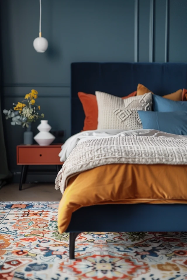
Complementary Accents
Blue sits opposite orange on the color wheel. This means wood tones (which are essentially orange/brown) look incredible next to blue. Leather pillows in cognac or camel add warmth.
Brass and gold metals also pop against blue. If your headboard has nailhead trim, match your lamp bases or curtain rods to that metal finish for cohesion.
Rug Sizing Rules
- Queen Bed: Use an 8’x10’ rug. The rug should start about 6 to 8 inches in front of the nightstands.
- King Bed: Use a 9’x12’ rug. This ensures you have a soft landing on both sides of the bed when you wake up.
- Placement: Never push the rug all the way against the wall behind the headboard. It wastes rug usage under the bed where no one sees it.
5. Lighting and Nightstand Styling
Because blue absorbs light, your lighting plan becomes critical. A dark blue headboard can create a “black hole” effect on that wall if not lit properly.
Lamp Selection
You need contrast. If you put a dark blue lamp next to a dark blue headboard, they blend together.
Option A: Ceramics. A white, cream, or light gray ceramic lamp adds brightness and sculptural interest.
Option B: Metallics. A brass or brushed nickel lamp reflects light and adds a jewelry-like quality to the vignette.
Option C: Glass. Clear glass lamps are excellent for small spaces as they take up zero visual weight.
Sconces vs. Table Lamps
If you are tight on space, wall-mounted sconces are a lifesaver. Swing-arm sconces installed on either side of the headboard free up the nightstand surface for books and water.
Installation Height: Mount sconces so the bulb is approximately 60 to 66 inches from the floor, or eye level when you are sitting up in bed.
Styling the Nightstand
Keep it functional. A tray is a great way to corral small items like glasses or lip balm.
The Rule of Three: Group items in odd numbers. A lamp, a stack of books, and a small plant or clock.
Ensure your nightstand height is level with the top of your mattress. It can be up to 2 inches higher, but never lower. A nightstand lower than the mattress makes the bed look bloated and makes it difficult to reach your alarm.
Final Checklist for Your Blue Bedroom
Before you finalize your purchase or design, run through this checklist to ensure you haven’t missed any critical functional or aesthetic details.
- Swatch verification: Have you viewed the fabric swatch in your room at three different times of day?
- Rub count check: Is the fabric rated for at least 15,000 double rubs?
- Measure twice: Have you taped out the headboard dimensions on your wall to check the height and width?
- Outlet clearance: Will the headboard cover any necessary electrical outlets?
- Bedding coordination: Do you have bedding that contrasts or complements, rather than clashes?
- Nightstand height: Are your current nightstands within 2 inches of the mattress height?
- Lighting plan: Do you have lamps or sconces that provide enough contrast against the blue fabric?
FAQs
Can I mix a blue headboard with black furniture?
Yes, absolutely. Black and blue is a very chic, modern combination. The key is to make sure the blue is distinct enough from the black. A bright navy or teal works well. If the blue is too dark, it might look like a mismatch. Use brass hardware or white bedding to break up the heaviness.
Is a blue headboard too trendy?
Blue is considered a “colored neutral” in interior design. Unlike colors like terracotta or sage green, which trend in and out, blue—specifically navy and light blue—has been a staple in design for centuries. It is a safe, long-term investment.
What color walls go best with a blue headboard?
Crisp whites (like Benjamin Moore Chantilly Lace) create a fresh, nautical or modern look. Warm greiges (like Sherwin Williams Agreeable Gray) soften the look. For a moody vibe, you can “color drench” the room by painting the walls the same shade of blue as the headboard, but in a matte finish to contrast the fabric’s sheen.
How do I clean a velvet blue headboard?
Vacuum it weekly using the upholstery attachment to remove dust. If you spill liquid, blot it immediately with a clean, dry white cloth—never rub. For deeper cleaning, check the cleaning code. If it is “S” coded, call a professional upholstery cleaner.
Conclusion
Integrating a blue headboard into your bedroom is one of the most effective ways to introduce color without overwhelming the space. It provides a grounding element that encourages relaxation and sleep. By paying attention to the undertones of the fabric, the scale of the frame, and the lighting in the room, you can create a space that feels curated and professional.
Remember that design is about balance. Let the headboard be the star, and support it with appropriate textures, lighting, and layout. Whether you choose a deep velvet navy or a breezy linen sky blue, the result will be a serene retreat tailored to your taste.
Picture Gallery


