
Bright Shed Colors Ideas to Enhance Your Backyard
For years, the backyard shed was treated as purely utilitarian. It was a place to store the lawnmower, stack bags of potting soil, and hide away the kids’ bikes. Because of this, homeowners usually painted them in neutral beiges or camouflage greens to make them disappear into the landscaping.
However, in my design practice, I have seen a massive shift toward treating the shed as a focal point. A shed offers a low-stakes opportunity to experiment with color in a way you might be too nervous to try on your main house. For a huge dose of inspiration, make sure to check out the Picture Gallery at the end of the blog post.
Whether you are converting a shed into a home office, a potting station, or simply want a better view from your kitchen window, a coat of bright paint transforms the space entirely. It changes the energy of the garden and acts as a structural anchor for your landscape design. Let’s look at how to choose and execute a bold color scheme for your outdoor structure.
1. The Impact of Bright Colors on Spatial Perception
Color is not just about decoration; it is a tool for manipulating how we perceive space. In landscape design, we often use “visual weight” to balance a yard. A brightly colored shed acts as a visual magnet.
When you paint a structure a bright, warm color like yellow, coral, or red, it creates an effect known as “advancing.” Visually, the object appears closer to the viewer than it actually is. If you have a deep, narrow yard, placing a bright warm-colored shed at the very back can make the space feel more intimate and connected to the patio.
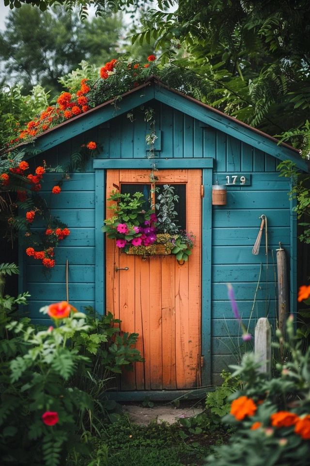
Conversely, cool brights—like turquoise, lime green, or electric blue—tend to recede slightly compared to warm tones, but they still pop against natural foliage. These colors often vibrate against the green of the grass and trees, creating a high-energy atmosphere without feeling heavy.
Designer’s Note: The Lighting Factor
In my projects, the biggest surprise for clients is often how sunlight alters exterior paint. Natural sunlight is significantly brighter than indoor lighting.
- The Rule of Two: A color that looks “bright” on a swatch inside will look “washed out” or pastel outdoors. If you want a truly vivid look, go two shades deeper or more saturated on the color strip than you think you need.
- Test Patches: Never skip this. Paint a 2-foot by 2-foot square on the shed. Watch it at 9:00 AM, 1:00 PM, and 6:00 PM. The golden hour sun can turn a cheerful yellow into a harsh orange if you aren’t careful.
2. Top Trending Bright Color Palettes
Choosing “bright” doesn’t mean you have to use neon. It means choosing high-saturation colors that have personality. Here are the specific palettes I frequently recommend to clients who want to make a statement.
Sunshine Yellow and Crisp White
Yellow is the color of optimism. A yellow shed brings a cottage-garden feel that is timeless yet energetic. It pairs exceptionally well with purple landscaping elements, such as lavender, salvia, or catmint, because purple and yellow are complementary colors on the color wheel.
When using yellow, I lean toward “buttercup” or “daffodil” tones rather than neon lemon. Pair the siding with a high-gloss white trim to keep the look structured. If you have a dark roof (charcoal or black shingles), this contrast looks incredibly sharp.
Coastal Teal and Aqua
You don’t need to live by the ocean to use coastal colors. Teal, aqua, and bright robin’s egg blue work beautifully in backyards that have swimming pools or water features. These colors bridge the gap between the sky and the grass.
For a sophisticated look, avoid pairing aqua with white, which can sometimes look a bit juvenile or “nursery” style. Instead, try pairing a bright teal body with natural cedar wood trim or dark charcoal accents. This grounds the brightness and makes it feel like a modern architectural choice.
Modern Chartreuse and Lime
This is a controversial choice that pays off huge dividends in modern landscapes. Chartreuse is a yellow-green that looks electric against gray hardscaping or concrete pavers. It is the perfect choice for a mid-century modern aesthetic.
Because this color is so close to the color of grass and leaves, it creates a monochromatic layering effect. It doesn’t clash with nature; it highlights it. I recommend using matte black hardware and light fixtures with this color to prevent it from looking like a toy.
Barn Red and Coral
Red is traditional, but we can update it. Instead of the rusty, brown-reds of old barns, look for vibrant cherry reds or warm, pink-leaning corals. A coral shed is unexpected and adds a massive dose of warmth to a yard that might be heavily shaded.
Coral looks stunning when surrounded by lush ferns and hostas. The contrast between the deep, dark greens of shade plants and the warm pink-orange of the shed creates a tropical hideaway vibe.
Common Mistakes + Fixes
- Mistake: Painting the entire shed—roof, trim, door, and siding—the same bright color.
- Fix: Use the 60-30-10 rule. 60% is your bright body color. 30% is a neutral trim (white, gray, natural wood). 10% is an accent, usually the door or shutters.
- Mistake: Ignoring the roof color.
- Fix: If your shed has green shingles, do not paint the siding red unless you want it to look like a permanent Christmas decoration. Coordinate your brights with the fixed roof tone.
3. Integrating the Shed with Your Main House
One of the main concerns homeowners have is that a bright shed will clash with their house. If your main house is a beige vinyl or red brick, can you really have a turquoise shed?
The answer is yes, but you need a connecting thread. You cannot treat the shed as if it exists on a different planet. The goal is coordination, not matching.
Repeat Materials or Finishes
If your main house has copper gutters, install a copper light fixture on the bright shed. If your house has black window frames, paint the window frames of the shed black, even if the shed siding is bright yellow.
This repetition of “jewelry” (hardware, lights, metals) tells the eye that these two structures belong to the same estate, even if their paint colors are wildly different.
The Walkway Connection
The path leading to the shed is the physical connector. Use the same pavers or stone that you use on your main patio. If that isn’t possible due to budget, line the path with plants that appear near the main house foundation.
Spacing and Zoning
If the shed is immediately next to the house, you have less freedom with color. In this scenario, I usually suggest painting the shed to match the house trim, then painting just the shed door a bright color.
However, if the shed is separated by at least 20 to 30 feet of lawn or garden, you have “visual separation.” This distance allows the eye to reset, meaning you can be much bolder with your color choice without it feeling chaotic.
4. Selecting the Right Paint and Finish
Exterior paint has to withstand UV rays, rain, snow, and temperature fluctuations. When choosing bright colors, pigment quality is paramount. Cheaper paints often use less durable pigments, meaning that bright red will fade to a sad pink within two years.
The Finish Strategy
The sheen (shininess) of the paint affects how the color reads and how well it protects the material.
- Satin / Eggshell: Use this for the main body (siding) of the shed. It has just enough sheen to shed water and resist dirt, but it isn’t so shiny that it highlights every dent or knot in the wood. High gloss on siding can look plastic and cheap.
- Semi-Gloss: Use this for the trim, corner boards, and fascia. The contrast in sheen adds definition to the structure.
- High-Gloss: Reserve this solely for the door. A high-gloss door in a contrasting color feels premium and welcoming. It is also easier to wipe down handprints.
Material Considerations
Wood Siding: Wood moves. It expands in summer and contracts in winter. You must use a high-quality acrylic latex paint. Acrylic stays flexible and breathes, whereas oil-based paints can crack as the wood moves. If your shed is cedar, you will need a stain-blocking primer first to prevent tannins from bleeding through your bright paint.
Vinyl Siding: You can paint vinyl, but you must use paint specifically formulated for it (“vinyl safe”). Crucially, you generally cannot paint vinyl darker than its original color, or it may warp due to heat absorption. However, since we are talking about bright colors, you are usually safe, but always check the manufacturer’s specs.
Metal Sheds: These require meticulous prep. You must remove all rust and use a direct-to-metal (DTM) paint. I generally recommend spraying metal sheds rather than rolling them to avoid brush marks.
5. Styling the Surroundings: Plants, Lighting, and Hardware
Once the shed is painted a vibrant hue, you need to dress the set. A bright shed sitting in a patch of dirt looks unfinished. The accessories are what elevate it from “DIY project” to “Landscape Feature.”
Landscaping Layers
I always recommend a garden bed wrapping around at least two sides of the shed. This anchors the structure to the ground.
Pro Measurement: Extend the garden bed at least 30 inches out from the shed walls. This keeps your lawnmower away from your fresh paint and gives plants room to grow without touching the siding.
- The Foliage Contrast: If you painted the shed a dark, bright color (like teal or red), use plants with light, silver, or variegated foliage (like Hostas or Dusty Miller).
- The Flower Echo: If you painted the shed yellow, plant white daisies or yellow Black-eyed Susans to echo the color.
Lighting for Nighttime Appeal
A bright shed can be a beautiful focal point at night, too. Install a gooseneck barn light above the door. If the shed is wired for electricity, this is easy. If not, solar-powered barn lights have improved drastically in quality and can provide a similar look.
Up-lighting is another designer trick. Place a small spot-light in the ground directed at the corner of the shed. This washes the color up the wall and creates ambient light for the backyard.
Hardware Upgrades
Do not put the old, rusty hinges back on your freshly painted shed. New hardware is the jewelry of the project.
If you have a cool-toned shed (blue, green, purple), brushed nickel or galvanized steel hardware looks fresh. If you have a warm-toned shed (red, yellow, orange), matte black hardware provides the necessary contrast and grounding. Avoid brass outdoors unless it is solid brass that will patina, as plated brass tends to pit and peel quickly.
What I’d Do in a Real Project: Mini Checklist
If I were hired to revamp a client’s shed tomorrow, this is the exact workflow I would follow to ensure success.
- Step 1: Check the foundation. Before spending a dime on paint, I ensure the shed isn’t rotting at the bottom. I would clear vegetation 12 inches away from the perimeter.
- Step 2: Pressure wash. I would gently clean the exterior to remove mildew and chalky residue. This is non-negotiable for paint adhesion.
- Step 3: Sample. I would buy three paint samples. I would paint them on the side of the shed facing the house to see how they look from the kitchen window.
- Step 4: Prime. Even if the paint says “Paint and Primer in One,” I would use a separate high-quality exterior primer, especially on raw wood or drastic color changes.
- Step 5: Two Coats. Bright colors often have poor “hide.” I plan for two, sometimes three coats to get that rich, saturated look.
- Step 6: The “Shoe” molding. I often add a PVC trim board along the bottom edge of the shed (the skirt). I paint this a dark gray or black. It hides dirt splash-back from rain and makes the shed look grounded.
Final Checklist
Ready to start painting? Run through this list to ensure you have everything covered.
- HOA Check: Have you confirmed your neighborhood allows bright exterior structures?
- Weather Watch: Do you have a 3-day window of dry weather with temps above 50°F?
- Prep Materials: Scraper, sandpaper (80 and 120 grit), exterior caulk for gaps, and painter’s tape.
- The Paint: High-quality exterior 100% acrylic latex (Satin for body, Semi-gloss for trim).
- Tools: angled sash brush for trim, roller frame and nap appropriate for your siding texture (thicker nap for rough wood).
- Protection: Drop cloths for the grass and pavers.
FAQs
Do I have to sand the shed before painting?
Yes, but you don’t need to strip it to bare wood. You need to “scuff sand” to knock down any loose paint splinters and create a surface the new paint can grab onto. If the old paint is glossy, sanding acts to de-gloss it.
Can I paint a plastic or resin shed?
This is tricky. Most standard paints will peel right off polypropylene sheds. You must use a paint specifically designed for plastic adhesion (often found in spray cans). Even then, high-traffic areas on plastic sheds tend to scratch easily. I generally advise against painting plastic sheds unless they are very old and you have nothing to lose.
How do I choose a door color?
If you want a safe bet, paint the door the same color as your house’s front door. This ties the two structures together perfectly. If you want to be bold, look at the color wheel. Find your shed body color, and look directly across the wheel for its complement.
Will a bright color fade faster?
Generally, yes. Reds and yellows are notorious for fading faster than earth tones due to the breakdown of organic pigments by UV light. To combat this, buy the highest grade of paint available from a reputable paint store (not the budget line). The extra $20 per gallon buys you better UV protection.
Conclusion
Transforming your shed with a bright color is one of the most rewarding weekend projects you can undertake. It requires relatively little material and budget compared to interior renovations, yet the visual payoff is massive. It turns a “storage box” into a destination.
Don’t be afraid of color. The backyard is a place of life, growth, and energy—your structures should reflect that. Whether you choose a sunny yellow or a moody teal, the key is proper preparation and thoughtful landscaping to integrate the look. Grab a brush, pick a bold shade, and reclaim your backyard view.
Picture Gallery


