
Charming Front Porch Ideas for Red Brick House
Red brick homes have an undeniable sense of history and permanence. Whether you have a stately colonial, a mid-century ranch, or a cozy cottage, the brick provides a strong, textural backdrop that you simply cannot ignore.
However, that visual weight can sometimes feel heavy or dark if not styled correctly. The secret to a charming porch lies in how you soften those hard lines and introduce contrasting elements.
If you are looking for visual inspiration, you can visit the Picture Gallery at the end of this blog post.
Understanding the Undertones of Your Brick
Before you buy a single throw pillow or gallon of paint, you have to look closely at your brick. Red brick is rarely just “red.”
It is a complex mix of clay, rust, brown, purple, and sometimes even orange. To choose the right accent colors, you need to identify the secondary colors hiding in the masonry.
Stand back about ten feet from your house on a cloudy day. This lighting gives you the truest representation of color without the distortion of direct sunlight.
Look for the “flecks” of color. Do you see deep charcoal? Burnt orange? Creamy tan? These subtle hues are your roadmap for choosing trim, shutters, and decor.
The Rule of Contrast
The biggest mistake homeowners make is trying to match the brick. Adding red mulch, red cushions, or a reddish-brown door usually results in a muddy, indistinct look.
You want contrast. If your brick is dark and moody, you need lighter elements to lift the facade. If the brick is a washed-out, pale red, you need sharp, dark accents to ground it.
Designer’s Note: The Grout Matters
Real-world lesson: I once had a client who painted her shutters a stark, bright white. It looked jarring because the grout between her bricks was actually a warm, sandy beige.
The Fix: Always coordinate your trim paint with the grout color, not just the brick face. If you have gray grout, go with cool tones. If you have cream grout, stick to warm off-whites like Sherwin Williams Dover White. This ties the whole structure together seamlessly.
Choosing the Perfect Front Door Color
Your front door is the crown jewel of the porch. Against red brick, you have three primary distinct directions you can take, depending on the vibe you want.
1. The Classic High-Contrast
For a timeless, elegant look, you cannot go wrong with jet black or a very deep charcoal.
Why it works: Black acts as a neutral that sharpens the red tones without competing with them. It feels historical and grounded.
Finish recommendation: Use a high-gloss finish. The sheen adds a layer of luxury and reflects light, which helps the door stand out from the matte texture of the brick.
2. The Cool Complementary
If you look at a color wheel, green sits opposite red. This makes them complementary colors, meaning they naturally enhance each other.
However, you don’t want a Christmas red-and-green situation. Aim for muted, earthy greens. Think sage, olive, or a deep hunter green.
Why it works: These colors mimic nature. They bridge the gap between your house and the landscaping, making the home feel settled in its environment.
3. The Unexpected Pop
For a more modern or cottage-style appeal, consider a blue tone. A dusty slate blue or a deep navy looks incredible against red brick.
Why it works: Blue is a cool tone, while brick is warm. This “temperature contrast” creates visual vibration that is very pleasing to the eye.
Common Mistakes + Fixes
Mistake: Choosing a bright, fire-engine red door.
The Fix: If you love red, go for a deep burgundy or wine color that is darker than the brick. It creates a monochromatic look that feels intentional rather than accidental.
Furniture Scale and Material Selection
Red brick is a “heavy” visual material. It has visual weight. Therefore, your furniture needs to have enough presence to hold its own.
Spindly, thin metal bistro sets often get lost visually against a brick backdrop. They look fragile and temporary.
Go Chunky and Substantial
I always recommend furniture with thicker frames. Wicker, teak, or substantial poly-lumber are excellent choices.
If you prefer metal, look for cast aluminum or wrought iron with wide arms and thick cushions. The goal is to balance the mass of the house with the mass of the furniture.
Layout Rules of Thumb
Walkway Clearance: You need a minimum of 36 inches of clear walking path from the steps to the door. Do not block this artery with a rocking chair.
Conversation Groups: If your porch is deep enough (at least 6–8 feet), arrange two chairs angled toward each other. Place a small accent table between them.
The “Knee Test”: When sitting in the chair, your knees should not hit the porch railing. You generally need about 24 to 30 inches of depth for the chair itself, plus another 12 inches for legroom.
Material Durability
For full sun: Avoid dark metal furniture if your porch faces south; it will get scorching hot. Teak or light-colored wicker is better.
For humidity: If you live in a damp climate, wicker can mold. Look for “all-weather wicker” which is actually a synthetic resin wrapped over an aluminum frame. It looks natural but lasts forever.
Softening the Hardscape with Textiles
Brick, concrete, and stone are all hard, cold materials. To make the porch feel “charming” and welcoming, you must introduce softness.
Textiles are the fastest way to change the personality of your porch without renovation.
Layering Rugs
The “double rug” look is very popular right now and works exceptionally well on brick homes.
Step 1: Start with a large, natural fiber rug on the bottom. Jute or sisal looks great, but they rot in the rain. Instead, use a synthetic rug that looks like woven seagrass.
Step 2: Layer a slightly smaller, patterned rug on top. A black and white buffalo check or a geometric print works wonders here.
Sizing Rule: The bottom rug should be wider than your door frame by at least 6 to 10 inches on both sides. A standard 2×3 doormat is almost always too small for a grand brick entrance. Upgrade to a 3×5 or even a 4×6 if space allows.
Cushions and Throws
Invest in high-quality outdoor fabrics. Solution-dyed acrylics (like Sunbrella) are the gold standard because the color goes all the way through the fiber, like a carrot.
Cheaper printed fabrics are like a radish—color on the outside, white on the inside. They will fade within one season of direct sun.
Styling Tip: Use pillows to introduce that “cool” contrasting color we discussed earlier. If you have a black door, use cream pillows with black piping. If you have a sage green door, look for botanical prints.
Lighting and Hardware: The Jewelry
If the door is the focal point, the hardware and lighting are the jewelry. This is where you can define the era of the home.
The Finish Dilemma
What metal finish looks best with red brick?
Oil-Rubbed Bronze or Matte Black: These are the safest and most traditional choices. They blend beautifully with the dark specks in the brick and disappear when not in use.
Polished Brass or Unlacquered Brass: This is for the homeowner who wants charm and sparkle. Brass pops against the red clay tones. It feels classic, like a button on a blazer.
Avoid: Satin nickel or chrome usually looks too cold and modern against traditional red brick. It tends to clash.
Scaling Your Light Fixtures
Designer’s Note: The number one error I see on front porches is “dinky light syndrome.” Builders often install the smallest, cheapest lanterns available.
The Rule of Thumb: Your wall-mounted lanterns should be approximately one-third the height of your front door.
Most front doors are 80 inches tall. That means your light fixture should be around 24 to 26 inches high. If that sounds huge, cut out a piece of cardboard that size and tape it up. You will see that, from the street, it looks perfectly proportioned.
Kelvin Temperature
The color of the light bulb matters. Red brick looks best under warm light.
Buy LED bulbs with a color temperature of 2700K (Warm White) or 3000K (Soft White).
Do not use 5000K (Daylight) bulbs. They cast a blue, sterile light that makes red brick look sickly and institutional.
Landscaping the Porch: Pots and Planters
Greenery is the bridge between the house and the lawn. Against red brick, you need plants that provide high contrast.
Container Selection
Concrete/Stone: The gray tones of concrete planters look sophisticated against red brick. It’s a natural, cooling contrast.
Glossy Black or White: Glazed ceramics work well because the shiny texture contrasts with the matte, rough brick.
Avoid: Terracotta pots. Placing orange clay pots against red clay brick is usually too much of the same warm tone. It looks cluttered.
Plant Palette
Since the house is red, green foliage pops.
Boxwoods and Holly: These provide structure and deep, dark green color that looks expensive and tidy.
White Flowers: White hydrangeas, geraniums, or petunias look fresh and crisp against the red background.
Chartreuse: Plants like Sweet Potato Vine (lime green variety) offer a shocking, vibrant contrast that looks amazing against dark brick.
The “Thriller, Filler, Spiller” Formula
When planting your pots, use this classic design recipe:
- Thriller: A tall, architectural plant in the center (like a spike or tall grass).
- Filler: mounded plants to fill the middle space (like impatiens or begonias).
- Spiller: Trailing plants that hang over the edge (like ivy or creeping jenny).
The “Haint Blue” Ceiling Tradition
If you want true Southern charm, look up. Painting the porch ceiling a soft, pale blue is a design tradition known as “Haint Blue.”
Historically, it was believed to ward off spirits. Practically, it mimics the sky, making the porch feel airier and more open.
It also discourages wasps and birds from nesting, as they allegedly mistake the color for open sky.
Color Pick: Look for a pale, watery blue with a hint of green. Sherwin Williams “Atmospheric” or Benjamin Moore “Palladian Blue” are stunning choices that pair surprisingly well with red brick.
Final Checklist: What I’d Do in a Real Project
If I were hired to revamp a red brick front porch tomorrow, here is the exact order of operations I would follow:
- 1. Deep Clean: Pressure wash the brick (carefully, low pressure) and scrub the concrete floor. You can’t style a dirty porch.
- 2. Edit the Greenery: Trim back any overgrown bushes blocking the porch view. The house needs to breathe.
- 3. Paint the Door: Select a high-gloss black or a deep sage green.
- 4. Upgrade Lighting: Replace the small builder-grade lights with oversized lanterns in matte black.
- 5. Place the Rug: Lay down a 4×6 synthetic seagrass rug.
- 6. Add Seating: Place two black rocking chairs or a teak bench.
- 7. Accessorize: Add two large concrete planters with boxwoods on either side of the stairs.
- 8. final Polish: Install new house numbers in a font that matches the architectural style (serif for traditional, sans-serif for modern).
FAQs
Should I paint my red brick white?
As a designer, I usually advise against this unless the brick is damaged or truly unattractive. Painted brick requires maintenance every 5–7 years. Once you paint it, you can never go back. Instead, try “limewashing” or “German smear” techniques for a softer, old-world look that requires less upkeep.
What color mulch looks best with red brick?
Always use dark brown or black mulch. Never use red mulch. Red mulch competes with the house and makes the landscaping look artificial. Dark mulch grounds the home and lets the plants and brick shine.
Can I mix metals on my porch?
Yes, but do it intentionally. A black door handle pairs well with copper light fixtures. However, try to keep the “temperature” of the metals the same. Mixing chrome (cool) with brass (warm) is harder to pull off outdoors.
How do I make a small stoop look charming?
If you don’t have room for chairs, focus on the vertical space. Use a beautiful wreath, oversized house numbers, and a single, tall planter on one side of the door. A high-quality doormat is essential here.
Conclusion
Styling a red brick home is all about respect. You are respecting the visual weight and history of the material while introducing elements that make it feel like home.
By focusing on scale, contrast, and texture, you can turn a dark or imposing brick facade into a welcoming, charming entry. Remember that the brick is the canvas; the door, lights, and furniture are the art.
Take your time choosing the right undertones, and don’t be afraid to go big with your lighting and planters. The result will be a porch that feels timeless yet distinctly yours.
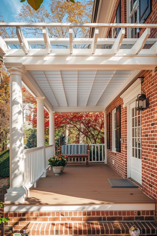
Picture Gallery


