
Chic Backsplash Ideas for Dark Gray Cabinets
Dark gray cabinets have firmly established themselves as the new neutral in modern kitchen design. They offer a level of sophistication and drama that standard white shaker cabinets simply cannot achieve. However, pairing them with the right backsplash is the make-or-break decision that determines if your kitchen feels cozy and curated or dark and cave-like.
I once worked with a client who loved the moodiness of their charcoal cabinetry but panicked once installation began, fearing the room was too dim. We solved this entirely through the backsplash choice—a reflective, high-gloss white ceramic that bounced light around the room. For those seeking immediate visual inspiration, look for the comprehensive Picture Gallery at the end of this blog post.
In this guide, I will walk you through the professional process of selecting a backsplash. We will cover matching undertones, selecting materials that offer durability, and layout tricks that can expand your space visually.
1. Identifying the Undertone: The Crucial First Step
Before you even look at tile samples, you must diagnose the specific “flavor” of gray on your cabinets. Gray is rarely just a mix of black and white; it almost always has an underlying hue. Ignoring this is the most common reason a kitchen color palette feels “off.”
How to test your cabinets:
Place a standard sheet of bright white printer paper against your cabinet door in natural daylight.
- If the gray looks slightly blue or crisp, it is a Cool Gray.
- If the gray looks brownish, mushroom-colored, or beige, it is a Warm Gray.
- If it looks slightly olive or muddy, it likely has Green Undertones.
Designer’s Note: The Temperature Rule
I always teach my junior designers to match temperature first. If you have cool, slate-gray cabinets, avoid “creamy” or yellow-based white tiles, as they will look dirty next to the crisp cabinets. Instead, opt for stark bright whites or cool Carrara marble. Conversely, warm “greige” cabinets look stunning with handmade cream tiles or warm brass accents but clash with icy blue-whites.
Common Mistakes + Fixes
Mistake: Relying on showroom lighting.
Fix: Bring the sample tile and the cabinet door sample into your actual kitchen. Examine them at 8:00 AM, 12:00 PM, and 8:00 PM. Artificial lighting at night can turn a warm gray into a muddy brown, drastically changing how it pairs with your tile.
2. High Contrast: Brightening the Space with White and Marble
The most timeless and resale-friendly approach to dark gray cabinets is a high-contrast white backsplash. This pairing creates a tuxedo-style aesthetic that feels clean and sharp. It is also the best functional choice for smaller kitchens or spaces with limited window access.
The Marble Strategy
Natural stone creates a bridge between the cabinets and the rest of the room.
- Carrara Marble: Features soft gray veining that usually coordinates perfectly with cool or neutral gray cabinets.
- Calacatta Gold: Features warmer, bolder veining with hints of gold and taupe. This is excellent for warming up a space and tying in brass hardware.
- Thassos White: A brilliant, crystalized white marble with very little veining. Use this if you want a modern, minimalist look.
Scale and Sizing Rules
Standard 3×6 inch subway tiles are classic, but they can feel a bit dated in a modern gray kitchen.
To modernize the look, I recommend an elongated subway tile, such as a 2×8 or 2.5×10 inch size. This stretches the visual width of the wall.
For a seamless look, consider a solid slab backsplash. This involves running the same quartz or stone from your countertop up the wall.
What I’d do in a real project:
If the budget allows, I push for the solid slab splash behind the range. It eliminates grout lines in the messiest cooking zone. Standard height for a backsplash is 18 inches from counter to cabinet, but taking a slab all the way to the ceiling around a range hood creates a massive luxury focal point.
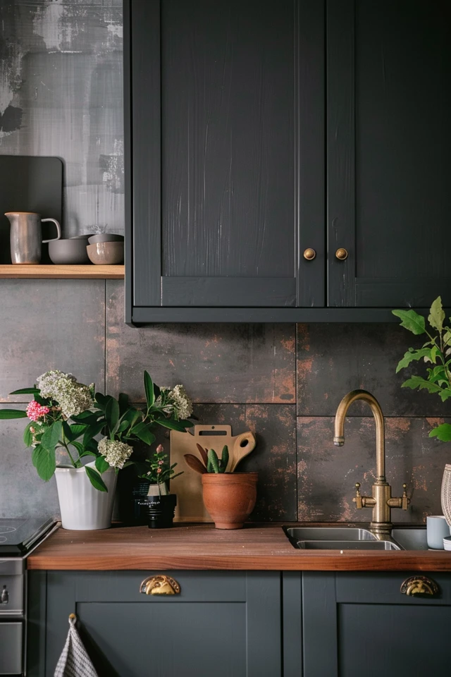
3. Texture Over Color: The “Zellige” and Handmade Look
If you want your kitchen to feel organic and lived-in rather than sterile, texture is your best tool. Dark gray cabinets can sometimes feel heavy or industrial. Pairing them with handmade tiles (often called Zellige) adds softness and reflects light in interesting ways due to the uneven surface.
Why texture works here:
When you have a solid block of color on the cabinets, a flat, matte tile can make the wall look dead. A tile with an undulating surface catches the light, creating movement. This is particularly effective if you have under-cabinet lighting installed.
Installation Realities:
- Grout Spacing: For handmade tiles, we typically skip the standard spacers. We butt the tiles close together (wedge spacers) to create a spacing of about 1/16th of an inch. This requires a skilled installer.
- Edge Finishing: Handmade tiles rarely have bullnose pieces. You will likely need to use a Schluter metal strip or have the installer miter the edges for exposed ends.
Common Mistakes + Fixes
Mistake: Using dark grout with handmade white tiles.
Fix: While contrast is nice, dark grout in the uneven crevices of Zellige tile can look messy and heavy. Stick to a soft gray or “silverado” grout that bridges the gap between the white tile and gray cabinets without outlining every imperfection.
4. Moody and Monochromatic: Tone-on-Tone
For a dramatic, cozy, and ultra-modern vibe, pair dark gray cabinets with a dark backsplash. This technique is often used in “scullery” designs, bar areas, or large kitchens with ample natural light. The goal here is immersion.
Material Options for Dark Splashes:
- Soapstone: Has a beautiful, matte, velvety texture. It is non-porous and incredibly durable. Ideally, oil it occasionally to keep it dark.
- Black Slate: Offers a rustic, cleft texture. Great for farmhouse or industrial styles.
- Dark Basalt: A volcanic stone that offers a consistent, modern gray tone.
The Lighting Constraint
If you go dark on dark, you strictly need to plan your lighting layers.
You must have under-cabinet LED strip lighting. Without it, the space between the counter and the upper cabinets becomes a “black hole,” making food preparation dangerous and difficult.
Aim for a light temperature of 3000K (warm white) to keep the gray from feeling sterile or clinical.
Designer’s Note: Durability for Families
A dark backsplash is a secret weapon for families with kids or heavy cooks. White grout and white tile show every splash of tomato sauce or coffee. A charcoal ceramic tile with dark gray grout is incredibly forgiving. If low maintenance is your top priority, this is the winning combination.
5. Pattern and Layout: Changing the Vibe
The way you lay out the tile is just as important as the tile itself. The pattern directs the eye and influences the style of the kitchen. With solid gray cabinets, you have the visual “quietness” to get creative with the layout without it looking chaotic.
Top Layouts for Gray Kitchens:
- Herringbone: Adds high energy and elegance. It requires about 15% to 20% more material due to cuts. It draws the eye upward, making ceilings feel higher.
- Vertical Stack (Soldier Stack): Very modern and mid-century. It aligns perfectly with the straight lines of shaker or flat-panel cabinets. This is currently very trendy in urban apartments.
- Horizontal Stack: A contemporary twist on the brick pattern. It feels orderly and calm.
Renters and Budget Constraints
If you are renting or on a tight budget, you can still achieve these layouts with peel-and-stick options. Look for “gel” based peel-and-stick tiles rather than flat stickers. The gel adds dimension that mimics real grout lines. Since gray cabinets are neutral, you can easily use a geometric patterned vinyl tile to add personality without permanent commitment.
Final Checklist: Before You Buy
Use this mini-checklist to ensure you are ready to order. I use a version of this for my own client projects to prevent costly returns.
The “Real Project” Checklist:
- The “Prop” Test: Have you propped the tile sample vertically on the counter? Do not lay it flat. Light hits vertical surfaces differently than horizontal ones.
- Countertop Coordination: Does the backsplash clash with the veins in your quartz or granite? If the counter is busy, the backsplash should be quiet.
- Overage Calculation: Did you add 10% for standard cuts or 20% for herringbone patterns? Running out of tile and trying to match a different “dye lot” later is a nightmare.
- Outlet Planning: Have you decided on outlet colors? White outlets on a dark gray slate backsplash will stick out like a sore thumb. Buy gray or black receptacles (and cover plates) to blend in.
- Clearance Check: Measure the distance from your faucet to the wall. Ensure there is room for your chosen tile thickness plus the thinset, especially if you have a tight faucet handle installation.
FAQs
Should the backsplash be lighter or darker than the gray cabinets?
There is no single rule, but “lighter” is safer and more common because it expands the room. Lighter backsplashes create breathing room. However, “darker” or matching (tone-on-tone) creates depth and drama. Avoid going just slightly different; it should look like an intentional contrast, not a near-miss match.
What color metal hardware looks best with gray cabinets and a white backsplash?
Gray is highly versatile.
– Matte Black: Creates a modern, industrial, or farmhouse look.
– Polished Nickel: A warmer silver that looks luxurious and traditional.
– Unlacquered Brass/Gold: Adds necessary warmth to cool grays. This is my favorite pairing to prevent the kitchen from feeling too cold.
Is it okay to mix warm wood shelves with gray cabinets and tile?
Absolutely. In fact, I highly recommend it. Gray and white can feel clinical. Adding floating white oak or walnut shelves breaks up the gray and adds organic warmth. Ensure the wood tone doesn’t clash with your floor stain.
Conclusion
Choosing a backsplash for dark gray cabinets is about balancing the visual weight of the room. Whether you opt for the crisp brightness of white marble, the moody depth of soapstone, or the artisanal charm of Zellige, the key is to respect the undertones of your gray paint.
Remember that the backsplash is the jewelry of the kitchen. It is the place where you can take the most risks because it covers a smaller surface area than the floor or cabinetry. Order your samples, view them in morning and evening light, and trust your instincts.
Picture Gallery


