
Black and White Checkered Floor Design – Chic Tips
There are few design elements as enduring, versatile, and instantly recognizable as the black and white checkered floor. This pattern has graced the halls of Renaissance chateaus, the dining rooms of mid-century bistros, and the entryways of modern farmhouses. It somehow manages to feel both historically grounded and sharply contemporary at the same time.
My first encounter with this design was not in a grand palace, but in a small, windowless powder room that felt incredibly cramped. By installing 12-inch tiles on a diagonal bias, we tricked the eye into pushing the walls outward, turning a closet-sized space into a jewel box. For more visual inspiration on how this pattern transforms spaces, make sure to check out our curated Picture Gallery at the end of the blog post.
If you are considering this look for your home, you need to move beyond just the aesthetic appeal and understand the mechanics of installation and material selection. A checkered floor is a commitment, and getting the scale or material wrong can lead to a result that feels more “fast food” than “high fashion.” This guide will walk you through the practical steps to getting it right.
1. Choosing the Right Material for Your Lifestyle
The “look” of a checkered floor is consistent, but the “feel” and maintenance vary wildly depending on what you buy. Your choice should depend heavily on who lives in the house and where the floor is going.
Marble and Natural Stone
This is the purist’s choice. Usually, this involves pairing a white stone like Carrara or Thassos with a black stone like Nero Marquina or black granite.
- The Look: Organic, soft, and luxurious. The veining ensures that no two squares look exactly alike, which breaks up the visual rigidity.
- The Reality: Marble is porous. If you spill red wine or acidic lemon juice on honed Carrara, it can etch or stain.
- Designer Tip: If you love the look but hate the maintenance, look for a honed finish rather than polished. Honed stone hides scratches better, though it still requires sealing every 6 to 12 months.
Porcelain and Ceramic
For high-traffic zones like mudrooms or family kitchens, porcelain is king.
- The Look: You can find “marble-look” porcelain that is convincingly realistic, or go for solid, matte colors for a graphic punch.
- The Reality: These are virtually indestructible. They don’t absorb water, they don’t stain, and they don’t require sealing.
- Sizing note: Look for “rectified” edges. This means the tile has been mechanically cut to be perfectly square, allowing for extremely tight grout lines (1/16 inch).
Linoleum and Vinyl Tile (VCT)
This is often the go-to for retro renovations, rental makeovers, or budget-conscious projects.
- The Look: It has a distinct nostalgia. It feels softer and warmer underfoot compared to stone.
- The Reality: VCT (Vinyl Composition Tile) requires waxing and buffing to keep that classic shine. Luxury Vinyl Tile (LVT) is lower maintenance but can sometimes look “plastic” if you don’t choose a high-quality brand.
2. Mastering Scale and Orientation
The size of your tile dictates the vibe of the room. A common mistake DIYers make is choosing a tile size that is too small for a large room, creating a dizzying, busy effect.
The Rules of Scale
- Small Spaces (Powder Rooms): You can go small here, perhaps 4-inch or 8-inch squares, but often a standard 12-inch tile actually makes the small room feel bigger.
- Standard Rooms (Kitchens/Baths): The 12×12 inch tile is the industry standard. It is timeless and safe.
- Large Areas (Foyers/Great Rooms): Step up to an 18×18 inch or even 24×24 inch tile. Larger tiles mean fewer grout lines, which looks cleaner and more modern.
Square vs. Diamond (Diagonal) Lay
The direction you lay the tile changes the room’s perceived geometry.
Orthogonal (Square) Pattern:
This is when the edges of the tiles line up parallel with your walls. It feels historic, structured, and somewhat formal. It works best in rooms that are perfectly square. If your walls are crooked (which they are in most older homes), a square layout will highlight that discrepancy.
Diagonal (Diamond) Pattern:
This involves rotating the pattern 45 degrees.
- It draws the eye to the corners of the room, visually expanding the width.
- It hides crooked walls. If a wall is out of square, a diagonal cut makes it much less obvious than a sliver of a parallel cut.
- It feels slightly more dynamic and energetic.
3. The Art of the Layout and Transition
How you start your tile installation matters more than how you finish it. A poor layout results in “slivers”—tiny, awkward cuts of tile at the edge of the room that look unprofessional.
Finding Your Starting Point
Never just start in a corner with a full tile. You must find the center point of the room.
- Measure the width and length of the room to find the exact center.
- Snap chalk lines to mark this center.
- “Dry lay” a row of tiles from the center to the wall.
- If you hit the wall with less than half a tile (a tiny sliver), shift your center point over by half a tile width. This ensures you have nice, chunky cuts at both ends of the room.
Borders and Thresholds
A checkerboard pattern is visually “loud.” Sometimes it needs to be contained.
In grand entryways, I often design a solid border—usually black—around the perimeter of the room.
- The Border Rule: Keep the border roughly 4 to 8 inches wide depending on the room size. This acts as a frame.
- The Benefit: It solves layout issues. You cut the checkerboard field to fit inside the border, meaning you don’t have to worry about how the pattern hits the wall.
Designer’s Note: The Transition Strip
When moving from a wood floor to a checkered tile floor, the transition piece is critical. Avoid bulky metal strips.
Instead, use a “Schluter” metal strip in brass or nickel for a minimal look, or a custom-milled wood threshold that matches your hardwood floor stain. The height difference should be negligible—if the tile is higher, you need a reducer strip to prevent tripping.
4. Grout: The Unsung Hero
You might think you should use white grout with white tiles, or black grout with black tiles. Both are usually wrong for a checkerboard floor.
The Problem with White Grout
White grout on a floor will not stay white. It will turn gray or yellow within months, especially in a kitchen. Furthermore, white grout outlines the black tiles too aggressively, making them look like floating islands.
The Problem with Black Grout
Black grout can stain the white tiles during installation (a disaster known as “picture framing”). It also shows dust and talcum powder residue instantly.
The Solution: Medium Gray
The pro move is to choose a medium gray or charcoal grout.
- It connects the black and white tiles visually, softening the contrast.
- It hides dirt and grime incredibly well.
- It creates a cohesive grid rather than a disjointed pattern.
Sanding vs. Non-Sanded:
If your grout joints are 1/8 inch or larger, use sanded grout. If you have rectified tile with tight 1/16 inch joints, use non-sanded grout to avoid scratching the tile surface.
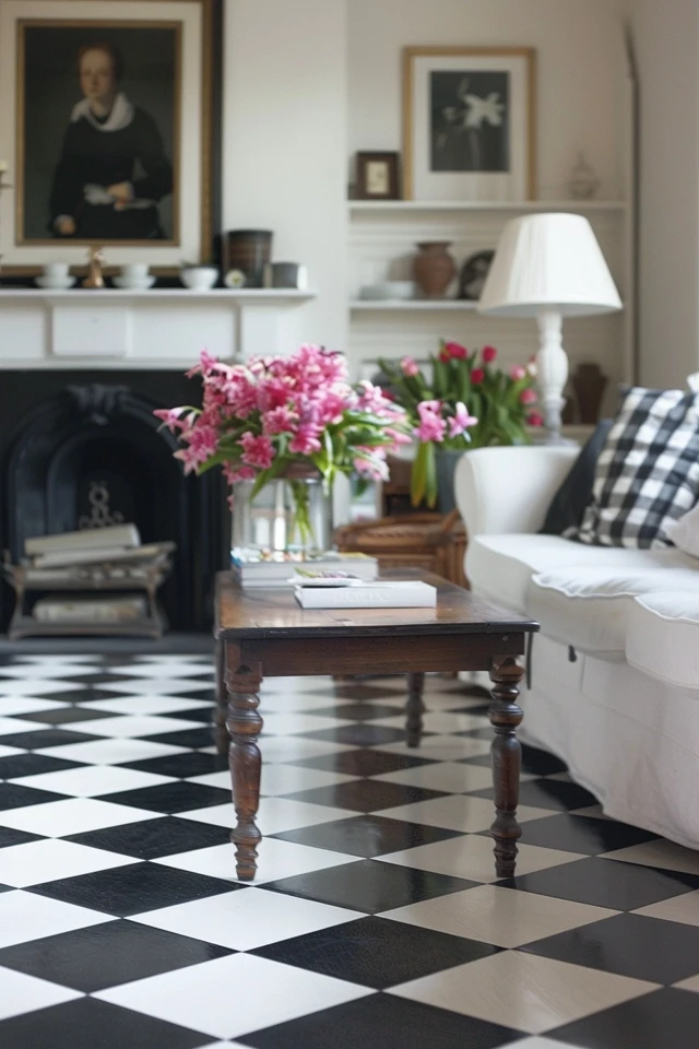
5. Styling the Room: Softening the Contrast
A black and white floor is high-contrast. If you add white walls and black furniture, the room can feel sterile or like a chessboard. You need to introduce warmth and texture to balance the sharpness of the floor.
Warm Wood Tones
Introduce wood elements to bridge the gap.
- In a kitchen, a butcher block island or walnut barstools add essential warmth.
- In a bathroom, a vintage pine vanity or an oak mirror frame prevents the space from feeling “cold.”
Metals and Hardware
Avoid chrome if the room feels too chilly.
- Unlacquered Brass: This is the gold standard for checkered floors. The golden tones pop beautifully against the black and white.
- Polished Nickel: This offers a warmer, richer silver tone than chrome or stainless steel.
Paint Colors
Do not paint the walls stark “Ceiling White.”
Instead, opt for creamy off-whites (like Benjamin Moore White Dove or Swiss Coffee) or go for moody contrast with deep greens or navy blues. The slight yellow/brown undertone in creamy whites softens the starkness of the black tile.
Common Mistakes + Fixes
Mistake: Using a high-gloss finish on a bathroom floor.
Fix: High gloss is a slip hazard when wet. Always choose honed or matte finishes for wet zones. If you inherit a glossy floor, use generous bath mats with rubber backings.
Mistake: Ignoring the baseboards.
Fix: A checkered floor is bold; it needs a substantial anchor. Upgrade your baseboards to at least 5 inches high. Paint them a semi-gloss white or, for a dramatic look, paint the baseboards black to merge with the darker tiles.
Mistake: “Lipping” tiles.
Fix: This happens when one tile edge sits higher than its neighbor. Large format tiles (18″+) are prone to this. Use a “leveling clip system” during installation to mechanically force the tiles to lie perfectly flat and flush.
Final Checklist: Before You Install
Use this mini-checklist to ensure you are ready for the project.
1. Check the Subfloor
Is it rigid? Natural stone requires a very stiff subfloor. If there is bounce when you jump, your stone tiles will crack. You may need to add a second layer of plywood or cement board.
2. Calculate Overage
Do not buy exactly the square footage of the room.
- For a square lay, buy 10% extra.
- For a diagonal lay, buy 15-20% extra. There is significantly more waste with diagonal cuts.
3. Verify Door Clearances
If you are tiling over an existing floor (not recommended, but happens), or adding thick backer board, will your doors still open? You might need to trim the bottom of your doors.
4. Select Your Sealer
If using natural stone or cement tile, buy a high-quality penetrating sealer. Plan to seal the tiles before grouting to prevent the grout color from bleeding into the tile pores.
FAQs
Does a checkered floor make a room look smaller?
Generally, no. A large-scale pattern actually expands the visual space. However, a tiny, busy pattern (like 1-inch mosaics) can sometimes clutter a room visually if the space is already filled with stuff.
Is this trend going to go out of style?
The black and white checkerboard is one of the few true “neutrals” in design history. It has been relevant for centuries. While specific materials (like 1980s shiny ceramic) might date, the pattern itself is timeless.
Can I mix different materials, like marble and slate?
Yes, but be careful with thickness. Different stones often come in different gauges (thicknesses). You will need your installer to build up the mortar bed under the thinner stones so the final surface is perfectly flush.
How do I clean the white tiles?
For porcelain, hot water and a dash of vinegar work wonders. For marble, never use vinegar or bleach. Use a pH-neutral stone cleaner. A steam mop is excellent for deep cleaning grout lines without harsh chemicals.
Conclusion
Installing a black and white checkered floor is a bold design move that pays off in dividends. It provides a foundation that is both sophisticated and playful, capable of elevating a simple rental kitchen or grounding a formal foyer.
The success of this design lies in the details: the scale of the square, the orientation of the layout, and the warmth of the accompanying decor. Don’t fear the pattern. When executed with proper planning and the right materials, it becomes the most hardworking element in your home.
Picture Gallery


