
Title: Chic Blue and Pink Bedroom Ideas for Adults
Introduction
When I tell clients we are considering a blue and pink color scheme for their primary suite, I often see a moment of panic in their eyes. They immediately visualize a nursery or a gender-reveal party gone wrong. However, when executed with the right saturation and texture, blue and pink is one of the most sophisticated pairings in interior design.
The secret lies in moving away from primary crayons and toward complex, muddy tones. Think navy and dusty rose, teal and salmon, or slate blue and mauve. These combinations offer a balance of warmth and cool tones that feels established and intentional rather than juvenile. If you are looking for visual proof that this combo works, make sure to browse our curated Picture Gallery at the end of the blog post for visual inspiration.
In this guide, I will walk you through exactly how to execute this look with a designer’s eye. We will cover paint selection, fabric layering, and the specific measurements you need to make the room function as beautifully as it looks.
Mastering the Color Theory: Saturation and Tone
The biggest mistake DIYers make with this palette is matching the intensity of the colors. If you have a bright sky blue and a hot pink, they will fight for attention. The rule of thumb in design is to vary the visual weight of your colors.
If you choose a deep, moody blue (like a Navy or Midnight), pair it with a lighter, desaturated pink (like Blush or Shell). Conversely, if you want a bold, hot pink accent, ground it with a very pale, gray-based blue.
Here are the three sophisticated combinations I use most often in adult bedrooms:
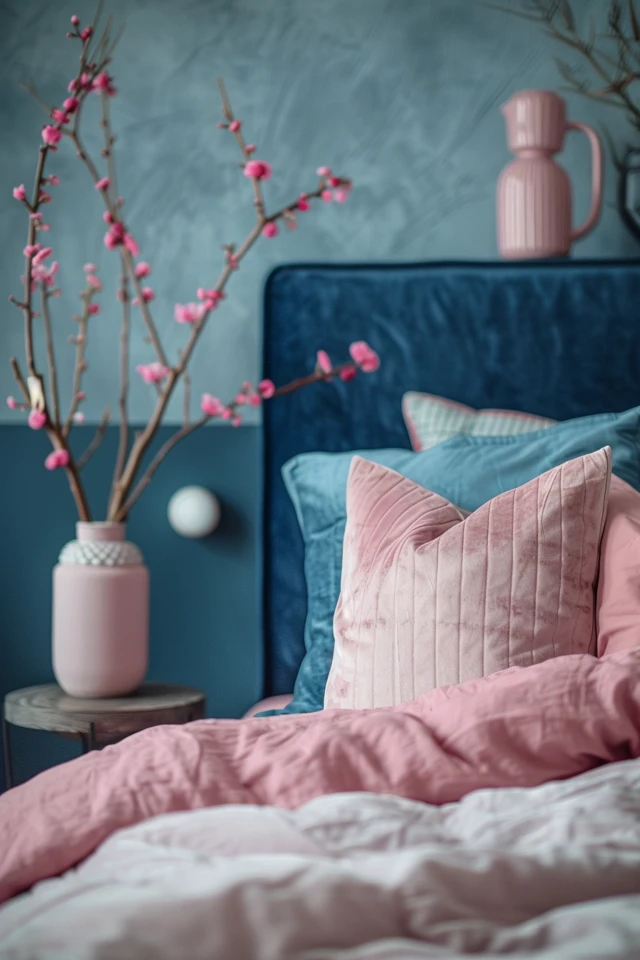
- Navy and Blush: This is the most traditional and safe choice. The dark blue acts as a neutral, similar to black or charcoal, while the blush adds softness without being overly sweet.
- Teal and Coral: This is for the maximalist who loves energy. It works well in coastal or bohemian aesthetics. The key here is to ensure the teal is darker than the coral.
- Slate Blue and Mauve: This is a moody, romantic pairing. Both colors have gray undertones, which makes them blend seamlessly. It is perfect for creating a sanctuary vibe.
Designer’s Note on Paint Finishes
For bedroom walls, I almost exclusively specify a matte or eggshell finish. High-gloss blue paint shows every imperfection in the drywall. Save the semi-gloss or satin finishes for your trim, baseboards, and doors. This subtle contrast in sheen adds depth even if you paint the walls and trim the exact same color.
Balancing Masculine and Feminine Elements
A master bedroom often needs to appeal to two people with different tastes. Pink is traditionally viewed as feminine, while blue reads as masculine or neutral. To keep the room feeling “adult,” you must balance these forces through furniture shapes and materials.
If you select a pink velvet headboard, which is inherently soft and feminine, pair it with structured, walnut nightstands. The clean lines and wood grain of the nightstands will cut the sweetness of the velvet.
Conversely, if you have navy blue walls, which can feel heavy and serious, introduce soft, curved lines in your accent chair or lamps. This is called the concept of “tension” in design. You want the items in the room to have a conversation with each other, not to echo the exact same sentiment.
Material Selection Checklist
To avoid the “showroom” look, mix at least three of the following materials into your design:
- Velvet: Great for headboards or throw pillows. It absorbs light and deepens the color.
- Linen: Perfect for bedding or curtains. It adds a casual, breathable texture that feels expensive but lived-in.
- Leather: A cognac leather bench or ottoman looks incredible against navy blue. It adds warmth and edge.
- Brass or Gold: These metals warm up blue tones. Use them for lighting fixtures and drawer pulls.
- Natural Wood: Walnut or white oak is essential to ground the color palette so it doesn’t feel like a cartoon.
Bedding Layering and Fabric Choices
Your bed is the largest visual element in the room. If you cover a King-sized bed in a solid bright pink comforter, it will swallow the room whole. In high-end design, we rarely use solid-colored comforters in bold shades.
Instead, I recommend keeping the main duvet cover neutral (white, cream, or a very pale gray). Use your blue and pink palette for the accents: the euro shams, the coverlet at the foot of the bed, and the kidney pillow.
The Formula for a Stylized Bed
Here is the layering order I use for almost every project:
- Sheets: crisp white percale or sateen. They are bleach-safe and feel like a hotel.
- Sleeping Pillows: Stacked flat or propped against the headboard.
- Euro Shams: This is where you bring in color. For a King bed, use three Euro shams (26×26 inches). For a Queen, use two. Choose a navy texture or a patterned fabric incorporating both colors.
- Duvet: White or cream linen, folded halfway down to expose the sheets.
- Coverlet/Quilt: Folded at the foot of the bed. This is a great place for a dusty pink velvet quilt.
- Lumbar Pillow: One long pillow (14×36 inches minimum) centered in front of the shams.
Rug Sizing Rules
The rug anchors your color story. A common error is buying a rug that is too small, making the bed look like it is floating on a postage stamp.
For a Queen bed, you need an 8×10 rug. For a King bed, you need a 9×12 rug.
The placement rule is simple: The nightstands should not sit on the rug. The rug should start roughly 6 to 8 inches in front of the nightstands. This ensures that when you get out of bed, your feet land on the rug, and you have plenty of carpet extending past the foot of the bed (usually 18 to 24 inches).
Lighting: The Jewelry of the Room
Lighting can alter how your blue and pink tones read. If you use cool white bulbs (4000K+), your blue will look clinical and your pink will look harsh.
ALWAYS stick to a color temperature between 2700K (warm white) and 3000K (soft white). This warmth makes blue feel cozy and pink feel flattering to skin tones.
Sconce Placement Guide
If you are installing wall sconces beside the bed, height is critical. A standard rule of thumb is to mount the sconce so the bulb is approximately 60 to 66 inches from the floor.
However, this depends on your bed height. If you have a low platform bed, you must lower the sconces. The goal is to have the light source slightly above eye level when you are sitting up in bed reading, so you aren’t staring directly into the bulb.
Metal Finishes
With a blue and pink palette, I prefer unlacquered brass or brushed gold hardware. The yellow undertones in the gold bridge the gap between the cool blues and the warm pinks. Matte black is also a strong choice if you want a more modern, industrial look, particularly if you are using darker navy tones. Avoid chrome, as it can make the room feel too chilly.
Wall Treatments and Paint Placement
You do not have to paint the entire room blue or pink. In fact, for smaller rooms (under 12×12 feet), I usually advise against painting all four walls a dark navy, as it can make the space feel cavernous if the natural light is poor.
The Accent Wall Strategy
If you choose to do an accent wall behind the bed, commit to it fully. Paint the baseboards on that wall the same color as the wall. This makes the ceilings feel higher and the look more custom.
Wallpaper Options
Wallpaper is a fantastic way to merge this color palette without it feeling blocky.
- Chinoiserie: This style often features birds and branches. It is timeless and elegant. Look for a blue background with pink floral accents.
- Geometric: For a more masculine or modern look, a navy and white geometric paper works well. You can then layer pink textiles on top.
- Texture: A navy grasscloth wallpaper adds incredible depth and sophistication. It smells earthy and feels luxurious.
Window Treatments
For drapery, ensure you are hanging the rod as high as possible—ideally 2 to 3 inches below the ceiling molding. This draws the eye up.
The curtain rod should extend 10 to 12 inches past the window frame on each side. This allows the curtains to “stack” against the wall when open, rather than blocking the glass. This maximizes natural light, which is essential for keeping blue and pink looking fresh.
Common Mistakes and Fixes
Even with the best intentions, things can go wrong. Here are the most frequent issues I see with this specific color scheme and how to fix them.
Mistake 1: The “Easter Egg” Effect
The Problem: You chose a pastel baby blue and a pastel baby pink. The room looks like a nursery.
The Fix: You need to introduce “muddy” tones. Repaint the walls a color that has more gray in it. Swap bright pink pillows for a rust or terracotta tone. Add black or dark wood accents immediately to ground the space.
Mistake 2: Ignoring Scale
The Problem: You bought a small pink floral print rug and small blue floral print pillows. The room feels cluttered and dizzying.
The Fix: Mix the scale of your patterns. If the rug has a large-scale pattern, the pillows should be solid or have a tight, small-scale texture. Your eye needs a place to rest.
Mistake 3: Flat Lighting
The Problem: The room relies solely on a ceiling fan light. The corners are dark and the colors look drab.
The Fix: Layer your lighting. You need three sources: ambient (overhead), task (bedside lamps), and accent (a floor lamp or picture light).
What I’d Do in a Real Project: A Step-by-Step Checklist
If I were hired to design a blue and pink bedroom for you tomorrow, this is the exact order of operations I would follow. This ensures you don’t paint yourself into a corner—literally.
- Select the “Hero” Fabric or Rug first. Never pick paint first. There are thousands of paint colors but limited rug options. Find a rug or a patterned pillow fabric that contains the blue and pink tones you love.
- Pull Paint Chips. Match the paint to the “Hero” item. Always buy sample pots and paint a 2×2 foot square on two different walls. Watch how the color changes morning, noon, and night.
- Determine Furniture Layout. Measure the room. Ensure you have at least 30 inches of walking path around the sides and foot of the bed.
- Order Large Furniture. Get the bed frame, dresser, and nightstands on order, as lead times can be long.
- Paint and Wallpaper. Do this while the room is empty.
- Install Window Treatments. Hang the rods high and wide.
- Layer in Rug and Bed. Place the rug first, then assemble the bed on top.
- Style Surfaces. Add lamps, books, and trays last.
FAQs
Q: Can I use blue and pink in a small bedroom?
A: Absolutely. In a small room, I prefer to keep the walls a light, airy neutral (like a warm white) and bring the colors in through a large area rug and the headboard. This keeps the walls receding visually, making the room feel larger, while still packing a punch of color.
Q: My partner hates pink. How do I compromise?
A: Shift the “pink” toward terracotta, rust, or oxblood. These are essentially deeper, earthier versions of pink that read much more gender-neutral. Pair this with a strong navy or denim blue, and use leather accents. It creates a very Ralph Lauren, club-room aesthetic that usually appeals to everyone.
Q: How do I make the room feel cohesive if I have mismatched furniture?
A: Paint can be a unifier. If you have mismatched nightstands, painting them both the same deep blue can tie them together. Alternatively, use matching lamps on mismatched tables to create visual symmetry at eye level.
Q: Is this trend going to look dated in five years?
A: Navy blue is a neutral and has been a staple in design for centuries. Blush pink has also solidified itself as a new neutral over the last decade. As long as you stick to sophisticated, grayed-out tones rather than neon brights, this combination is timeless.
Conclusion
Designing a chic blue and pink bedroom for adults is all about nuance. It requires stepping away from the primary colors of childhood and embracing the rich, complex end of the spectrum. By mixing textures like velvet and linen, ensuring your lighting is warm, and following proper spacing rules for rugs and curtains, you can create a space that feels curated and luxurious.
Don’t be afraid to experiment with darker walls or bolder contrasts. Your bedroom is the last thing you see at night and the first thing you see in the morning; it should be a space that brings you joy and comfort.
Picture Gallery


