
Title: Chic Blue and Pink Bedroom – Ideas for Adults
Introduction
When most people hear “blue and pink,” they immediately think of a nursery or a gender reveal party. It is a common misconception that this color pairing is strictly for children, but when handled correctly, it is one of the most sophisticated combinations in interior design. The contrast between cool, grounding blues and warm, inviting pinks creates a dynamic tension that keeps a room feeling fresh yet cozy.
I have designed primary suites using deep navy and dusted blush that feel incredibly masculine and tailored, as well as guest rooms featuring teal and salmon that feel like boutique hotels. The secret lies entirely in the specific shades you choose and the textures you layer on top of them. You want to avoid primary colors and instead reach for muddy, dusty, or deep tones that feel established and intentional.
For a visual feast of inspiration, scroll down to the Picture Gallery at the end of this post. But first, let’s walk through the practical design rules, measurements, and styling tricks you need to execute this look without it looking like a playroom.
1. Mastering the Color Palette: Tone is Everything
The biggest failure point in this design scheme is choosing colors that are too saturated. “Bubblegum pink” and “royal blue” will almost always look juvenile. To make this work for an adult space, we need to look at the undertones.
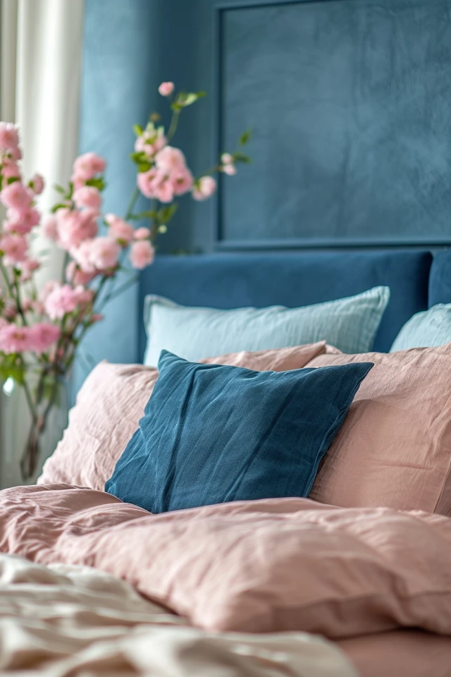
For the blue elements, look for “moody” shades. These are blues that have a bit of gray or green in them. Think Navy, Slate, Teal, or Indigo. These colors recede visually, making the walls feel wider or the furniture feel more grounded.
For the pink elements, we want “earthy” or “cosmetic” tones. Look for Blush, Dusty Rose, Mauve, or Salmon. These shades act almost like neutrals. A dusty pink velvet chair reads much more like a warm beige than a bright neon accent.
The 60-30-10 Rule in Action
To keep the room balanced, I always apply the 60-30-10 rule. This ensures one color doesn’t fight the other for dominance.
- 60% Dominant Color: usually the walls or the largest furniture pieces (like the bed frame). In a moody bedroom, I often use a deep blue here.
- 30% Secondary Color: This is your textile layer. Curtains, bedding, or a large rug. This is where your dusty pinks shine.
- 10% Accent Color: This is the “jewelry” of the room. Metals like brass or gold work beautifully with this combo, or you could introduce a third hue like emerald green or mustard yellow for depth.
Designer’s Note: The “Paint Chip” Trap
I see this happen constantly: a client picks a pink paint from a small swatch, puts it on the wall, and it looks like Pepto-Bismol. Pink intensifies when applied to four walls. Always choose a pink that looks “too gray” or “too brown” on the swatch. Once it reflects off itself in a room, it will warm up to the perfect shade.
2. Textures and Bedding: The “Lasagna” Approach
A blue and pink room falls flat if everything is plain cotton. To make it chic, you need to mix materials. This is especially true for the bedding, which is the focal point of the room. I use a technique I call “lasagna styling”—layering distinct textures to build volume.
If you have a navy velvet headboard (a fantastic choice for durability and style), you shouldn’t use navy sheets. You need contrast.
My Go-To Bedding Formula
- The Sheets: Crisp white or very pale gray percale. This acts as a palate cleanser for the eyes.
- The Duvet: A textural neutral or a subtle pattern. A linen duvet cover in oatmeal or a very pale blush works well here.
- The Quilt/Coverlet: This goes at the foot of the bed. If your walls are blue, make this pink. Velvet or heavy cotton waffle weave adds necessary weight.
- The Pillows: Start with two Euro shams (26×26 inches) against the headboard. Move to your standard sleeping pillows. Finish with one long lumbar pillow (14×36 inches) in a patterned fabric that ties the blue and pink together.
Practical Constraints: Pets and Kids
If you have a dog that sleeps on the bed or kids that jump on it, avoid silk or loose-weave linens for the coverlet. They will snag instantly.
Instead, opt for “performance velvet” or high-quality commercial-grade blends. They clean easily with a damp cloth and hide fur surprisingly well, especially in mid-tone blues.
3. Furniture Selection and Scale
In a dual-tone room, furniture selection is about creating silhouettes. Because the colors are the main attraction, the furniture lines should be relatively clean. However, the scale is where most DIYers get it wrong.
The Bed Frame
The bed dictates the flow. For a chic look, an upholstered bed is generally more forgiving than wood in this color scheme. A navy upholstered bed is a timeless anchor.
If you have a small room (under 12×12 feet), choose a bed frame with legs. Seeing the floor underneath the bed creates an illusion of more space. If you have a massive primary suite, a “to-the-floor” frame or platform bed adds necessary visual weight.
Nightstand Sizing Rules
Nothing ruins a polished look faster than nightstands that are too dinky.
- Height: Your nightstand should be level with the top of your mattress, or up to 2 inches higher. Never lower—it looks cheap and makes reaching for water difficult.
- Width: For a King bed, your nightstand should be at least 24–30 inches wide. For a Queen, 20–24 inches is acceptable.
- Surface Area: Ensure you have enough space for a lamp, a book, and a glass of water. If the table is cluttered, the room feels messy regardless of the colors.
Common Mistakes + Fixes
Mistake: Buying a matching “bedroom suite” (bed, dresser, nightstands all the same wood/style).
Fix: Break it up. If you have a blue upholstered bed, use wood nightstands (walnut looks amazing with blue and pink). If you have a wood bed, paint a vintage dresser in that deep navy tone.
4. Lighting: The Jewelry of the Room
Lighting can change the color of your blue and pink elements entirely. If you use bulbs that are too cool (above 3500K), your blues will look sterile and your pinks will look harsh.
The Golden Rule of Kelvins
For a bedroom, strictly use LED bulbs with a color temperature of 2700K (Soft White) or 3000K (Warm White). This warmth enhances the red undertones in the pinks and makes the blues feel cozier.
Layering Light Sources
You need three layers of light to make the room functional and “finished.”
- Ambient: This is your overhead fixture. A chandelier or semi-flush mount in antique brass is the perfect metallic accent for this palette. Brass warms up the blue and complements the pink.
- Task: Bedside lamps or sconces. If you are renting or short on surface space, wall sconces are a lifesaver. Mount them so the bulb is roughly 60–66 inches off the floor, depending on your bed height.
- Accent: A small floor lamp by an armchair or a picture light over a piece of art.
What I’d Do in a Real Project
If the client allows it, I almost always swap out standard white switch plates for brass or matte black plates. It costs about $10 per switch, takes five minutes, and makes the room look custom-built.
5. Rugs and Window Treatments
The rug is the foundation that ties your blue and pink story together. This is often the best place to introduce a pattern, like a traditional Persian-style print or a modern geometric design.
Rug Sizing Logic
A rug that is too small makes the room look shrunken.
- King Bed: You need a 9×12 rug. This allows 18+ inches of rug to show on either side of the bed and extends past the foot of the bed.
- Queen Bed: An 8×10 is ideal. You can get away with a 6×9 in a very small room, but 8×10 is the designer standard.
- Placement: The rug should not touch the wall. Leave 10–18 inches of bare floor around the edges of the room to “frame” the space. Place the rug perpendicular to the bed, stopping just before it hits the nightstands.
Window Treatments
For a bedroom, you need light control. I prefer a double-layer system.
Install a woven wood shade (bamboo or grasscloth) inside the window frame for texture. Then, mount curtain rods high and wide. The rod should be 4–6 inches above the window frame (or just below the crown molding) and extend 6–10 inches past the sides of the window.
For curtains, this is a great place to use your secondary color. Heavy pink velvet drapes in a navy room are stunning. If that feels too bold, go with an off-white linen curtain with a navy banding tape on the edge.
6. Walls and Paint: Drenching vs. Accents
How much color can you handle? This depends on your natural light and your bravery.
Option A: The Color Drench (High Drama)
Paint the walls, baseboards, and even the ceiling in a mid-tone color like Farrow & Ball’s “Hague Blue” or Sherwin Williams’ “Naval.” This creates a cocoon effect. It is incredible for sleep hygiene because it darkens the room naturally. In this scenario, your pinks come in through the headboard, rugs, and art.
Option B: The Feature Wall (Safe Bet)
Paint the wall behind the bed in your deep blue. Keep the other three walls a warm white (not stark white). This anchors the bed and creates a focal point without darkening the whole room.
Option C: Renter-Friendly Solutions
If you cannot paint, use peel-and-stick wallpaper behind the bed. Look for a large-scale botanical print featuring blues and pinks. This does the heavy lifting of mixing the colors for you.
Designer’s Note: The Finish Matters
For bedroom walls, stick to a Matte or Eggshell finish. High gloss reflects too much light and highlights imperfections in the drywall. However, for trim and doors, a Satin or Semi-Gloss provides durability against scuffs and vacuum cleaners.
Final Checklist: The “Real Project” Workflow
If I were designing your room tomorrow, this is the exact order I would follow to ensure success.
- Measure first: Map out the room. Ensure you have 30–36 inches of walking path around the bed.
- Choose the “Hero” piece: Usually the rug or a piece of art. Pick this first because paint can be custom-mixed to match, but rugs cannot.
- Select the Paint: Sample it on the wall. Watch it change from morning to night.
- Order Large Furniture: Lead times are long. Get the bed and dresser ordered early.
- Layer Lighting: Plan your lamp heights and bulb temperatures.
- Textiles Last: Select pillows, throws, and curtains to bridge the gap between the paint and the furniture.
FAQs
Will a blue and pink bedroom look too feminine for my husband/partner?
Not if you manage the balance correctly. To increase the masculine energy, increase the amount of navy, slate, or charcoal blue. Use pink sparingly as an accent (like a clay-colored leather bench or a single pillow) rather than the main event. Incorporating dark woods like walnut or mahogany also instantly grounds the space and removes the “boudoir” feel.
I have a small bedroom. Should I avoid dark blue walls?
Contrary to popular belief, dark colors can actually make a small room feel larger. Dark corners recede visually, blurring the lines of where the room ends. If you paint a small room white, you are highlighting the corners and defining the box. A dark teal or navy room with good lighting feels infinite and cozy, not cramped.
How do I mix metals in a blue and pink room?
Brass and gold are the natural choices because their warm yellow undertones complement the blue and harmonize with the pink. However, matte black is a great “grounding” metal if the room feels too sweet. I generally avoid chrome or silver in this specific color palette, as it can feel too cold and clinical.
My landlord won’t let me paint. How do I get this look?
Focus entirely on the “vertical real estate.” Use tall, floor-to-ceiling curtains in your desired blue or pink shade. Use a tall headboard. Hang large-scale artwork. These elements cover a significant amount of wall space. A large area rug will cover the generic beige rental carpet. You can transform the vibe without opening a single can of paint.
Conclusion
Designing a chic blue and pink bedroom for adults is about confidence and restraint. It requires stepping away from the bright, candy-colored hues of childhood and embracing the dusty, moody, and deep ends of the spectrum.
By focusing on luxurious textures like velvet and linen, ensuring your lighting is warm and inviting, and adhering to proper furniture spacing, you can create a sanctuary that feels both exciting and restful. Don’t be afraid to experiment with dark walls or bold rugs—paint is reversible, and design is meant to be fun.
Picture Gallery


