
Chic Boho Wall Paint Ideas for a Lively Home
Bohemian interior design has evolved significantly over the last decade. It used to be synonymous with chaotic clutter, tapestries tacked to the ceiling, and stark white walls covered in ivy. Today, “Boho Chic” is a refined, intentional aesthetic that relies heavily on color theory and texture to create a space that feels grounded yet free-spirited.
When I start a consultation with a client who wants a bohemian vibe, they often struggle with the paint selection process. They want warmth, but they are terrified of choosing a color that feels outdated or overwhelming. The secret lies in selecting paints that have “muddied” or “dusty” undertones rather than bright, primary saturation.
This guide will walk you through the exact color palettes, finishes, and application techniques I use in my own design projects to achieve that effortless boho look. If you are looking for visual inspiration, you can visit the picture gallery at the end of the blog post.
1. The Foundation: Mastering Warm Neutrals and Off-Whites
The most common mistake I see in DIY boho projects is painting the walls a sterile, clinical white. True bohemian style is about comfort and warmth, and a bright white with blue undertones will instantly kill that cozy vibe. Instead, you need to look for creamy whites, soft beiges, and greige tones that act as a warm canvas.
When selecting a neutral, you must pay attention to the Light Reflectance Value (LRV). For a main living area, I generally aim for an LRV between 60 and 75. This range reflects enough light to keep the room airy but holds enough pigment to provide depth and contrast against white trim.
Understanding Undertones
In a boho space, yellow, red, or orange undertones are your best friends. Avoid cool grays or whites with blue/purple bases, as they clash with the natural materials typical of this style, such as rattan, jute, and mid-century teak.
Designer’s Note: The “Sheet of Paper” Test
A lesson I learned early in my career involved a “white” paint that looked pink once it was on the walls. To prevent this, always hold your paint chip against a standard sheet of white printer paper. The stark white of the paper will immediately reveal if the paint leans pink, yellow, or green.
Ideal Finishes for Neutrals
For walls in low-traffic areas like bedrooms, I almost always specify a flat or matte finish. Matte finishes soak up the light rather than reflecting it, which creates a velvety, high-end texture that feels very organic. If you have kids or pets, upgrade to a high-quality “washable matte” or an eggshell finish for better durability.
2. Earthy Pigments: Terracotta, Ochre, and Clay
If you are ready to move beyond neutrals, the heart of the boho aesthetic lies in earth tones. These colors mimic natural elements like clay, spice, sand, and dried foliage. They are incredibly grounding and work exceptionally well in living rooms and dining spaces where you want to stimulate conversation and appetite.
Terracotta is perhaps the most quintessential boho color, but it can be tricky. You want to avoid colors that look like “basketball orange.” Look for burnt oranges that have a lot of brown or rust in them. These shades pair beautifully with lush green plants, creating a natural complementary color scheme that feels vibrant yet balanced.
Common Mistakes + Fixes
- Mistake: Painting a small, north-facing room a dark terracotta. Without warm sunlight, the color can look muddy and dead.
- Fix: Use these deeper earth tones in south-facing or west-facing rooms where the golden hour sun will make the walls glow. For north-facing rooms, stick to lighter peach or apricot tones.
The 60-30-10 Rule Adaptation
When using a bold earth tone, I adjust the classic design rule. Let the wall color take up 60% of the visual weight. Use natural wood tones and leather for your 30%. Finally, use cream or brass accents for the remaining 10%. This prevents the “pumpkin” effect where the room feels oversaturated.
What I’d Do in a Real Project
If I am designing a boho bedroom, I love using a deep ochre (mustard yellow) behind the bed. I would pair this with a linen headboard in oatmeal and bedding in sage green. The result is a palette that feels like a sunset—warm, relaxing, and incredibly stylish.
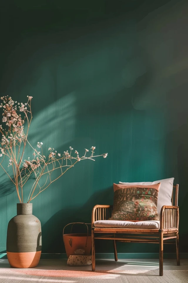
3. Moody Boho: Deep Greens and Teals
There is a misconception that bohemian design always has to be light and airy. “Moody Boho” is a rising trend that embraces darkness to create a womb-like, cozy atmosphere. This is perfect for media rooms, home offices, or small powder rooms.
Deep forest greens, olives, and dark teals serve as a backdrop that makes gallery walls pop. Gold and brass frames look expensive and striking against a dark green wall. Furthermore, dark walls effectively blur the corners of a room, which can actually make a small space feel expansive rather than cramped.
Choosing the Right Green
Avoid primary “grass greens.” You want greens that are cut with grey or brown. Think dried eucalyptus, moss, or hunter green. These shades feel sophisticated and timeless, whereas bright greens can feel juvenile.
Lighting Considerations
Dark walls require a thoughtful lighting plan. You cannot rely on a single overhead fixture. You need layers of light: floor lamps, table lamps, and perhaps sconces. The warm glow of a 2700K lightbulb against a dark teal wall is pure magic.
Designer’s Note: The Ceiling Question
In a moody boho room, I often recommend “color drenching.” This means painting the baseboards, walls, and even the ceiling the same color. It creates an immersive experience and hides awkward architectural angles in attic spaces or older homes.
4. Texture Over Color: Limewash and Plaster Effects
Sometimes, the best boho wall idea isn’t about the color itself, but the texture. If you look at inspirational images of homes in Ibiza, Tulum, or Morocco, you will notice the walls are rarely flat paint. They often have movement, shadows, and depth.
Limewash paint is a mineral-based paint that dries with a chalky, clouded appearance. It creates an instant “old world” charm that flat latex paint cannot replicate. It is breathable, eco-friendly, and naturally resistant to mold, making it great for bathrooms.
The Application Process
Applying limewash is different from regular painting. You don’t use a roller; you use a large block brush and apply it in X-shaped strokes. It requires patience and usually two coats, but the payoff is a wall that looks like living art.
Realistic Constraints: Renters and Cost
Real limewash is expensive and difficult to paint over later (you often have to use a special primer). If you are renting or on a strict budget, you can achieve a similar effect by using a “color washing” technique. This involves mixing a small amount of water or glaze into your latex paint and applying it loosely over a base coat.
What I’d Do in a Real Project
For a fireplace surround or a feature wall behind a sofa, I would use a Roman Clay finish. It is thicker than limewash and applied with a putty knife. It looks like smooth stone or plaster and elevates a generic drywall box into something that feels custom-built.
5. Creative Accents: Painted Arches and Geometric Shapes
If painting an entire room feels like too much commitment, painted arches are a staple of the modern boho style. A painted arch creates a focal point and can visually zone a space. For example, painting an arch behind a desk in a multi-purpose room instantly creates a designated “office” area.
This technique is incredibly budget-friendly because you only need a quart of paint. It allows you to introduce a bold color, like a deep terracotta or a dusty pink, without it overwhelming the space.
How to Scale an Arch
The most common mistake I see is painting the arch too narrow. The arch should extend at least 4 to 6 inches beyond the width of the furniture piece it is framing (like a bed or console table). If it is exactly the same width, it looks cramped and visually uncomfortable.
DIY Pro Tip: The String Method
To get a perfect semi-circle at the top of your arch:
- Determine the center point of your arch width.
- Hammer a small nail or tack into that center point.
- Tie a string to a pencil.
- Tie the other end to the nail, ensuring the length matches the radius of your arch.
- Keep the string taut and draw your curve.
Color Blocking
Beyond arches, consider two-tone walls. A common boho treatment is painting the bottom third of the wall a darker earthy tone and the top two-thirds a creamy white. This grounds the room while keeping the ceiling feeling high.
Final Checklist: Before You Open the Can
Before you commit to your boho transformation, run through this quick checklist to ensure professional results.
1. Sample Correctly
Never pick a color based solely on the tiny paper chip in the store. Buy a sample pot. Paint a large 12×12 inch square on a piece of poster board, not directly on the wall. Move this board around the room to see how it looks in dark corners and near windows.
2. Check Your Existing Furniture
Your wall color must harmonize with your largest furniture pieces. If you have a grey sofa, a warm beige wall might clash (clashing undertones). If you have a cognac leather sofa, almost any warm white or green will look fantastic.
3. Calculate Paint Needs
Measure the width of all walls, add them up, and multiply by the height of the ceiling to get your square footage. One gallon of high-quality paint typically covers 350 to 400 square feet. Always buy 10% more than you think you need for touch-ups.
4. Gather Supplies
Ensure you have painter’s tape, drop cloths (canvas is better than plastic), an angled sash brush for cutting in, and a roller with the right nap. For smooth walls, a 3/8-inch nap is standard. For textured walls, use a 1/2-inch nap.
FAQs
Can I mix warm and cool colors in a boho room?
Yes, but you need a dominant temperature. If your walls are a warm beige, you can use cool blue throw pillows as accents. If you try to mix them 50/50, the room will feel disjointed. I usually recommend keeping the shell (walls and floors) warm for a boho vibe.
What if I have dark wood floors?
Dark wood floors are beautiful with lighter walls. A creamy off-white or a light sage green provides excellent contrast. If you go with a dark wall color on dark floors, you absolutely need a large, light-colored rug to break up the heaviness.
Is grey paint okay for boho?
Standard “builder grey” is generally too cool and industrial for a boho aesthetic. However, “greige” (grey + beige) is a perfect compromise. Look for warm greys that look almost tan in bright light.
How do I paint over a dark color if I want to go back to white?
You must use a high-quality primer. Do not rely on “paint and primer in one” products for drastic color changes. Apply a coat of dedicated stain-blocking primer first, then apply your two coats of white topcoat.
Conclusion
Choosing the right paint color is the most impactful, cost-effective change you can make to your home. Whether you opt for a soothing warm white, a grounding terracotta, or a moody forest green, the goal of boho design is to create a feeling of ease.
Don’t be afraid to experiment. Paint is not permanent. If you try a color and it doesn’t feel right, you can always paint over it. The most important rule in bohemian design is that your home should reflect you—your travels, your taste, and your comfort.
Take your time with the sampling process, consider your lighting, and enjoy the transformation. Your lively, chic boho home is just a few brushstrokes away.
Picture Gallery


