
Chic Pantry Paint Ideas to Revitalize Your Space
Introduction
The pantry is often the hardest-working room in the house, yet it frequently receives the least design attention. We tend to view it strictly as a utility space for stacking canned goods and hiding the air fryer. However, because you likely interact with this space multiple times a day, it deserves to be just as beautiful as the rest of your kitchen.
Paint is the single most cost-effective tool we have to transform a utility closet into a joyful extension of the home. A thoughtful color choice can make a small walk-in feel expansive or turn a shallow reach-in cabinet into a jewel box of design. The right finish can also improve hygiene and cleanability, which is vital in food storage zones.
For plenty of visual inspiration to help you choose the perfect shade, make sure to visit our extensive Picture Gallery at the end of this post.
1. Mastering Sheen and Durability for High-Traffic Zones
Before we even discuss color, we must address the finish. In my professional projects, I treat the pantry like a commercial zone because it endures significant wear and tear. Cans scrape against walls, grocery bags bump corners, and appliances leave scuff marks.
The golden rule for pantry paint is to avoid flat or matte finishes entirely. While matte finishes are trendy for living rooms because they hide drywall imperfections, they are porous and hold onto grease and dust. In a food storage area, this is a hygiene issue.
For pantry walls, I almost exclusively specify a Satin or Eggshell finish. These sheens have enough resin to create a wipeable shell but aren’t so shiny that they highlight every dent in the drywall. If you are painting the actual wooden shelves, you must upgrade to a Semi-Gloss or a dedicated cabinet enamel. Standard wall paint on a horizontal shelf will peel and stay tacky, eventually sticking to your spice jars.
Designer’s Note: The “Sticky Shelf” Incident
I learned this lesson the hard way early in my career. I painted pantry shelves with standard latex wall paint to save money for a client. Two weeks later, the paint had “blocked” (stuck) to the bottom of their small appliances.
Always use a waterborne alkyd enamel for shelving. It cures harder than standard latex and resists blocking. It costs about $20 more per gallon but saves you from having to sand and repaint a year later.
2. The Art of Color Drenching
One of the most effective techniques for small pantries is “color drenching.” This involves painting the walls, the ceiling, the baseboards, and even the shelving the exact same color.
In a small space filled with visual clutter—like cereal boxes, branded labels, and mismatched jars—your eye needs a place to rest. When the shelves contrast with the walls (e.g., white shelves on blue walls), you create a grid pattern that highlights the clutter. When everything is the same color, the architecture recedes.
This technique makes the room feel significantly larger and more cohesive. It also simplifies the painting process since you don’t have to cut in perfect lines between the trim and the wall.
Implementation Strategy
- Choose a mid-tone color: Very light colors show shadows under shelves; very dark colors can make label reading difficult without premium lighting.
- Vary the sheen, not the shade: Use Satin on the walls and Semi-Gloss on the trim and shelves. This adds subtle depth while keeping the monochrome look.
- Don’t forget the brackets: If you have metal brackets, spray paint them to match the wall color or choose a metallic finish that acts as jewelry.
3. Leveraging Lighting and LRV
Most pantries do not have natural light. They are often interior closets lit by a single overhead fixture or, worse, no light at all. This lack of full-spectrum daylight changes how paint colors behave.
In interior design, we look at the Light Reflectance Value (LRV) of a paint color. This is a scale from 0 (pure black) to 100 (pure white). In a windowless pantry, colors with a low LRV will suck up what little light you have, creating a “cave” effect.
However, high LRV whites can sometimes look gray and dingy in shadows. If your pantry relies on artificial light, you need to know the temperature of your bulbs before picking paint.
Matching Paint to Bulb Temperature
- 2700K (Warm White): This light casts a yellow/orange glow. Avoid yellow-based creams, or the room will look like old parchment. Opt for crisp whites or cool greens to balance the warmth.
- 3000K (Soft White): The standard for kitchens. Most colors read true here, but be careful with grays, which may pull purple.
- 4000K (Daylight): This is blue-tinted light. It makes food labels easy to read but can make warm paint colors look pink. It works best with true blues, grays, and stark whites.
Common Mistakes + Fixes
Mistake: Testing paint swatches in the kitchen, not the pantry.
Fix: Your kitchen likely has windows; your pantry does not. Paint a large poster board and tape it to the back wall of the pantry. Close the door (if you normally do) and turn on the pantry light. That is the only way to see the true color.
4. Spacial Perception: Expanding or Cozying the Space
You can use color to manipulate the perceived size of your pantry. If you have a shallow reach-in pantry, your goal is likely to make it feel deeper. If you have a large walk-in that feels sterile, you want to add warmth.
Technique A: The Infinite Recess
For shallow pantries, paint the back wall a dark, receding color like charcoal, navy, or forest green. Keep the side walls and shelves a lighter neutral.
Dark colors recede visually, tricking the eye into thinking the back wall is further away than it actually is. This creates a dramatic backdrop for your dry goods, making pasta jars and flour containers pop.
Technique B: The Jewel Box
For walk-in pantries, treat the space like a powder room. This is a low-risk area to use bold colors you might be scared to use in the main kitchen.
I often encourage clients to use “appetizing” colors in pantries. Warm terracottas, buttery yellows, and sage greens connect psychologically to food and cooking.
What I’d Do in a Real Project: A Mini-Checklist
If I were designing a 5×5 foot walk-in pantry today, this is the workflow I would follow:
- Assess the flooring: If the kitchen wood floor continues into the pantry, I need a color that complements the wood undertone.
- Select a warm neutral for walls: I would likely choose a “greige” (gray-beige) with an LRV around 60. This hides shadows better than white.
- Plan for lighting: I would install motion-sensor LED tape lights under every shelf. This renders the wall color irrelevant for visibility, allowing me to go darker if desired.
- Paint the ceiling: I would paint the ceiling the same color as the walls to blur the boundaries of the room height.
5. Coordinating with Materials and Hardware
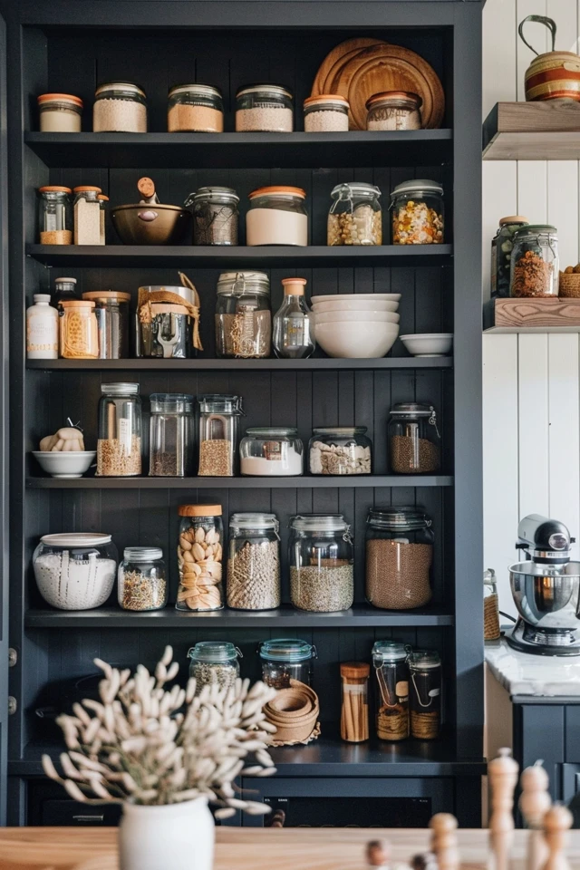
Paint does not exist in a vacuum. It must interact with your shelving materials and storage containers. The most cohesive pantries have a tight material palette.
If you have raw wood or stained floating shelves, you need a wall color that provides contrast. Wood shelving gets lost against beige or tan walls.
Winning Combinations
- Walnut Shelves + Navy Blue Paint: A classic, nautical, and high-contrast look that feels expensive.
- White Oak Shelves + Creamy White Paint: The current “organic modern” standard. It requires texture (baskets, glass jars) to keep from looking boring.
- Wire Shelving + Saturated Color: If you are stuck with standard white wire shelving, paint the wall behind it a deep, saturated color. The white wires will look crisp and intentional rather than like a builder-grade afterthought.
Handling Containers
If your client (or you) uses clear plastic or glass containers, the wall color becomes the background for your food. Pasta, beans, and spices are generally warm-toned (browns, reds, oranges).
Cool-toned wall paints (blues, greens, grays) provide the best contrast for food items. If you paint a pantry orange or red, the food items visually blend into the wall, creating a “muddy” look.
Final Checklist: Before You Open the Can
Use this final review to ensure your pantry project runs smoothly and results in a professional finish.
- Check the Prep: Have you washed the walls with a degreaser (like TSP)? Pantries accumulate invisible grease layers that prevent paint adhesion.
- Primer is Mandatory: If you are painting over a semi-gloss finish or painting raw wood shelves, you must use a bonding primer first.
- Clearance Check: If painting shelves, have you accounted for the thickness of the paint? Tight-fitting drawers or inserts might rub if you add too many coats.
- Cure Time: Are you prepared to leave the pantry empty for 3-5 days? Cabinet enamels dry to the touch in hours but take days to cure hard enough to hold heavy cans without denting.
- Ventilation: Since pantries rarely have windows, do you have a box fan ready to circulate air while painting?
Frequently Asked Questions
Q: Can I use chalk paint in a pantry?
A: I advise against it. Chalk paint is porous and requires waxing to be sealed. In a pantry, wax can melt or become tacky with heat fluctuations, attracting dust and food particles. Stick to waterborne alkyd enamels.
Q: How do I paint the ceiling if I have high shelves I can’t remove?
A: This is common in older homes. Use a “hot dog” roller (a mini 4-inch roller) to get between the top shelf and the ceiling. If the gap is less than 4 inches, you may have to use a brush or an edger tool.
Q: Is there a specific type of paint that prevents mold in food spaces?
A: Yes. Many major paint brands offer “Bath and Spa” lines or specific Kitchen formulations that contain mildewcides. If your pantry is near a dishwasher or lacks ventilation, these are worth the extra investment.
Q: I rent. What can I do besides painting walls?
A: Focus on the shelf edges. You can apply colored washi tape or contact paper to the front lip of the shelves. If your landlord allows it, painting just the inside of the pantry door is a low-impact way to add color that is easy to paint back over when you move.
Conclusion
Revitalizing your pantry with paint is about more than just aesthetics; it is about respecting the rituals of your daily life. Every time you reach for coffee beans or a snack for your children, you interact with this space.
By choosing the right sheen for durability, understanding how lighting affects your color choice, and applying techniques like color drenching, you can elevate a storage closet into a room that brings you joy. It does not require a massive renovation budget—just a gallon of high-quality paint, the right preparation, and a free weekend.
Picture Gallery


