
Chic Sideboard Decorating Ideas for Stylish Homes
The sideboard is often the unsung hero of the home. It serves as a vital storage workhorse, swallowing up everything from holiday linens to errant mail, yet it also offers one of the best surface areas for displaying your personal style. Whether you call it a buffet, a credenza, or a sideboard, this piece of furniture presents a unique design challenge.
Too often, these surfaces become unintentional dumping grounds for keys, unfinished projects, and random clutter. The goal is to reclaim this space and transform it into a curated vignette that elevates the entire room. A well-styled sideboard balances functionality with aesthetics, creating a moment of pause in your living or dining area.
I have spent years styling these surfaces for clients, and I have learned that a few structural rules make the process effortless. If you are looking for visual examples of these principles in action, be sure to check out the Picture Gallery at the end of this blog post.
1. Creating the Backdrop: Art and Mirrors
Before you place a single object on the surface, you must address the wall above the sideboard. This vertical space dictates the scale for everything else you will do. A common error is leaving the wall blank or choosing art that is too small, which makes the furniture look heavy and anchored to the floor.
The Rule of Scale
Your artwork or mirror should generally be about two-thirds the width of the sideboard. If your console is 60 inches wide, aim for a piece of art (or a collection of pieces) that spans roughly 40 inches. This prevents the “floating postage stamp” look where a small frame gets lost above a large piece of furniture.
Hanging Height
In terms of placement, connection is key. The bottom of your frame or mirror should sit roughly 4 to 8 inches above the tabletop. If you hang it too high, the art feels disconnected from the furniture, breaking the visual relationship between the two.
The Leaning Technique
For renters or those who fear drywall anchors, leaning art is a sophisticated alternative. Layering is your friend here. Start with a large, vertical architectural print or mirror leaning against the wall. Then, overlap it slightly with a smaller, horizontal frame in front. This adds depth and creates a casual, “collected” vibe that feels less rigid than a standard gallery wall.
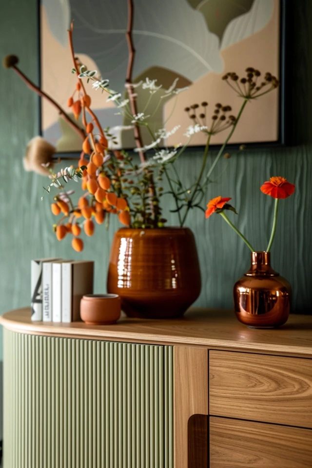
2. The Triangle Method and Visual Weight
Once your backdrop is set, you need to arrange the objects on the surface. The most fail-safe method professional designers use is the visual triangle. This technique prevents the display from looking like a straight line of soldiers and guides the eye effectively across the piece.
Establishing High Points
Start by placing your tallest object on one end. This is usually a table lamp or a tall vase with structural branches. This establishes the peak of your triangle. If you have a lamp on the left, you generally do not want an object of equal height on the right unless you are aiming for strict symmetry.
The Mid-Range and Low Points
On the opposite side, place an object of medium height, such as a sculptural bust, a large candle, or a stack of coffee table books. Finally, fill the center or the gaps with lower items like a decorative bowl or a small tray. When you step back, your eye should travel from high to low to medium in a rhythmic motion.
Balancing Visual Weight
Size isn’t just about height; it is about “weight.” A dark, solid ceramic vase carries more visual weight than a clear glass vessel of the same size. If you have a heavy, dark lamp on the left, you might need a cluster of three lighter objects on the right to balance the scale.
3. Functional Styling for Specific Rooms
A sideboard in a dining room has a different job description than one in an entryway or living room. Your styling choices must reflect the daily realities of the space. Ignoring function is the fastest way to ensure your beautiful vignette gets ruined by daily life.
The Dining Room Buffet
In a dining space, the sideboard often doubles as a serving station during gatherings. Therefore, you must leave negative space. Do not fill every square inch with decor.
- Leave the center clear: Keep the middle 50% of the surface relatively open or styled with easily movable items. This allows you to quickly set down a platter of turkey or a drink station.
- Use trays: A large decorative tray can corral bottles or glassware. When it is time to serve food, you can move the entire tray in one motion to clear space.
- Storage logic: Keep the internal storage for seasonal items, but use the top for things you grab often, like a beautiful water pitcher or cake stand.
The Living Room Media Console
If your sideboard supports a television, the TV acts as your “black hole” focal point. You need to soften this.
- Flank the tech: Place objects on either side of the TV to distract from the screen. However, ensure nothing blocks the infrared sensor for the remote control.
- Low profile decor: Since the TV is already high, avoid tall lamps that compete with the screen. Opt for low, wide bowls or horizontal stacks of books.
- Cable management: This is non-negotiable. Use zip ties or cable sleeves behind the unit. A beautiful sideboard is ruined by a rat’s nest of wires visible underneath.
The Entryway Drop Zone
Here, function reigns supreme. If you do not provide a place for keys, they will end up scratching the wood finish.
- The “catch-all” vessel: Use a substantial bowl or a small woven basket specifically for keys, sunglasses, and wallets.
- Lighting is crucial: An entry sideboard usually needs a lamp on a timer or smart plug so you never walk into a dark house.
- Mirror placement: This is the best spot for a mirror to check your appearance before leaving. It also bounces light into often-dark hallways.
4. Lighting: The Mood Maker
Lighting on a sideboard is arguably more important than the decor itself. It provides the ambient glow that makes a room feel expensive and finished. Overhead lighting can be harsh; a sideboard lamp offers a flattering, mid-level light source.
Lamp Sizing and Scale
A common mistake is choosing a lamp that is too small. A sideboard is a substantial piece of furniture; a tiny bedside lamp will look ridiculous. Look for lamps with a significant base width.
As a general rule, the total height of the lamp should be tall enough that the bottom of the shade is at eye level when you are seated nearby. This prevents glare. If you are standing, the lamp should add significant verticality to your arrangement.
Mixing or Matching?
Should you use one lamp or two?
- One Lamp: Creates an asymmetrical, modern look. Place it on the far left or right. Balance it on the other side with a grouping of objects (like a plant or artwork).
- Two Lamps: creates a formal, traditional, or “grand millennial” look. This offers perfect symmetry and is excellent for long sideboards (over 70 inches).
The Cord Dilemma
Designers hate visible cords. If your sideboard floats in the room (not against a wall), you must run the cord down the leg and secure it with color-matched tape or zip ties. If it is against a wall but the outlet is far away, use a paintable cord cover along the baseboard.
5. Texture, Layers, and the “Life” Element
If your sideboard feels flat or like a furniture showroom, it likely lacks texture and organic elements. Mixing materials is the secret sauce that makes a home feel lived-in and warm.
The Rule of Opposites
Contrast creates interest.
- If your sideboard is sleek, lacquered wood, add rough textures like a stone planter, a woven basket, or matte ceramic vases.
- If your sideboard is rustic, reclaimed wood, add polished elements like a brass lamp, a glass vase, or a glossy tray.
- Hard surfaces need soft touches. Always try to include one “soft” visual element, even if it is just the fabric of a lamp shade or a leather tray.
The “Life” Element
Every vignette needs something organic. This brings energy to the inanimate objects.
- Fresh greenery: A simple glass vase with three large monstera leaves can last for weeks.
- Dried botanicals: For low maintenance, try dried hydrangeas or structural branches.
- Wood and stone: If you can’t do plants, use driftwood or a crystal geode to introduce natural irregularity.
Books as Risers
Coffee table books are not just for reading; they are structural tools. Use them to elevate objects. If a bowl looks too low next to a lamp, place it on top of a stack of two or three books. This changes the height and adds a layer of color and typography to the mix.
Designer’s Note: The Reality Check
In my years of design work, the biggest issue I see isn’t “bad taste”—it is a lack of editing. I once worked with a client who had a beautiful mid-century credenza, but it was covered in twenty small picture frames. It looked like a puzzle.
We removed everything. We hung the favorite six photos in a gallery wall above the piece. On the surface, we placed just one lamp, one large bowl for keys, and a stack of books. The client was shocked at how much larger the room felt.
The Lesson: If you have to move more than three items to dust the surface, you probably have too much stuff. Negative space (empty space) is an active design element. It allows the eye to rest and lets the special pieces actually stand out.
Common Mistakes + Fixes
Even with good intentions, it is easy to miss the mark. Here are the specific corrections for the most frequent errors I encounter.
Mistake 1: The “Lollipop” Effect
The Issue: Using thin, spindly candlesticks or tiny vases on a heavy, chunky sideboard.
The Fix: Choose objects with “mass.” Use a lamp with a wide belly or a vase that feels heavy. The decor must visually stand up to the weight of the furniture.
Mistake 2: Ignoring the Color Palette
The Issue: Using decor that clashes with the room or the wood tone of the sideboard.
The Fix: Follow the 60-30-10 rule. If your room is mostly neutral, let the sideboard decor be the 10% accent color. Ensure the metals (lamp base, picture frames) coordinate with other metals in the room, though they don’t need to match perfectly.
Mistake 3: Pushing Everything to the Wall
The Issue: Lining up all objects in a straight row against the back wall.
The Fix: Pull items forward. Create depth. Place the lamp near the back, but place the small bowl or tray near the front edge. Zig-zag the placement slightly to create a 3D effect.
What I’d Do: A Mini Checklist
If I were styling your sideboard today, this is the exact order of operations I would follow to ensure success.
- Clear the Deck: Remove everything. Wipe down the surface. Start fresh.
- Hang the Anchor: Install the mirror or art first. Ensure it is centered and 4-8 inches above the surface.
- Place the Lighting: Add the lamp(s). Plug them in and manage the cords immediately.
- Build the Triangle: Add the secondary tall item and the medium items to create balance.
- Add the Layer: Stack books or add a tray to ground smaller floating items.
- Insert Life: Add the greenery or floral stems last.
- The Wobble Test: If you have pets or kids, bump the sideboard gently. If anything teeters, use museum wax to secure it.
FAQs
Q: Can I put a TV on a sideboard that is higher than a standard media console?
A: Standard media consoles are usually 20-24 inches high to keep the TV at eye level. Sideboards are often 30-36 inches high. If you mount the TV on the wall above the sideboard, it may be too high for comfortable viewing from a low sofa. However, if you place the TV on the sideboard using its stand, it can work, provided your sofa sits relatively high. Just be mindful of neck strain.
Q: How do I mix wood tones if my sideboard is wood and my floor is wood?
A: Contrast is vital here. If your floors are dark oak, a dark walnut sideboard will disappear. Aim for at least two shades of difference. You can also break up the wood-on-wood look by placing a rug underneath the sideboard or using a table runner (though runners are trending out; a large tray is a more modern buffer).
Q: What if my sideboard is under a window?
A: This is a great layout! You obviously cannot hang art, so the view becomes your backdrop. Do not block the window with a tall lamp. Instead, use two shorter lamps on either end, or focus on low, horizontal styling with books and wide bowls to keep the natural light unobstructed.
Q: Is symmetry or asymmetry better?
A: Symmetry (matching lamps on both ends) is formal, calming, and easier to execute. It works well in dining rooms. Asymmetry (lamp on one side, art leaning on the other) is more casual, dynamic, and modern. It is often better for living rooms and entryways.
Conclusion
Styling a sideboard does not require a degree in interior design, but it does require a thoughtful approach to scale, balance, and utility. By treating this surface as a curated display rather than a storage shelf, you change the energy of the room.
Remember that styling is not permanent. One of the joys of a sideboard is that it is a low-stakes area to experiment. You can swap out the art seasonally, change the greenery weekly, or rotate your collection of books whenever you need a refresh. Start with the “bones”—the lighting and the backdrop—and let the rest evolve with your life.
Picture Gallery


