
Clever Credenza Decorating Ideas for Chic Spaces
One of the most frequent dilemmas I encounter in client homes involves the flat surfaces. We all love the storage potential of a good sideboard or buffet, but the top surface often becomes a magnet for clutter. Without a plan, it turns into a landing strip for mail, keys, and random toys.
To transform this piece of furniture, you need a strategy that blends functionality with high-end aesthetics. It is about creating a vignette that tells a story without screaming for attention. If you want to skip the theory and jump straight to visual inspiration, please know that I have curated an extensive Picture Gallery at the end of this blog post.
In this guide, I will walk you through the exact formulas I use to style credenzas for my interior design clients. We will cover everything from scale and lighting to managing cords and styling for real life.
1. Establishing the Visual Anchor
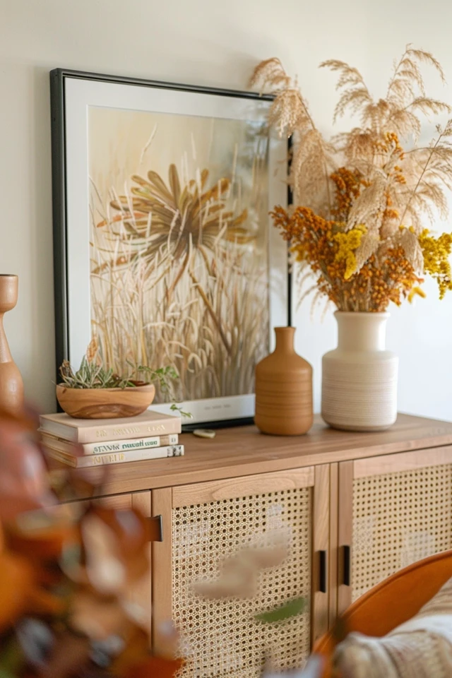
The biggest mistake I see DIY decorators make is using “floating” artwork. This happens when a piece of art is too small for the credenza or hung too high above it.
To create a cohesive look, your artwork or mirror must act as an anchor. It connects the furniture to the rest of the room.
The Rule of Scale
In my projects, I stick to a strict 2/3 rule. The width of your artwork (or gallery wall arrangement) should be roughly two-thirds the width of the credenza.
If you have a standard 72-inch sideboard, your art should be approximately 48 inches wide. If the art is too narrow, the furniture looks heavy and disconnected.
Height Matters
Do not hang your art so high that it feels like a separate entity. The bottom of the frame should sit 4 to 6 inches above the tabletop.
This proximity creates a visual relationship between the object and the art. It allows the eye to travel smoothly from your decor items up to the wall.
Leaning vs. Hanging
For a more relaxed, modern vibe, I often lean artwork directly against the wall. This is excellent for renters who cannot drill holes.
If you lean art, layer a smaller frame slightly overlapping the larger one. This adds depth and prevents the arrangement from looking flat.
Designer’s Note: The “Black Hole” Effect
I recently worked on a dining room where the client had a dark walnut credenza and hung a dark, moody oil painting above it. The result was a “black hole” that sucked the light out of the room.
If your furniture is dark, choose art with a large mat or lighter colors to create contrast. Conversely, a white lacquer buffet looks stunning anchored by a moody, saturated print.
2. Lighting the Vignette
Lighting is not just about visibility; it is about architectural structure. On a credenza, lamps provide height and sculptural interest.
They also offer a mid-level light source that is much more flattering than overhead recessed cans.
The Double Lamp Look
For a formal, symmetrical look, place two identical table lamps on either end of the credenza. This works exceptionally well in dining rooms or long entryways.
Ensure the lamps are substantial enough. I usually look for bases that are at least 24 to 30 inches tall. Tiny bedside lamps will look lost on a large buffet.
The Asymmetrical Approach
For a more modern or eclectic feel, use a single statement lamp on one side. Balance the visual weight on the other side with a grouping of objects, such as a stack of coffee table books or a tall vase.
This “offset” balance keeps the eye moving and feels less rigid than perfect symmetry.
Managing the Cords
Nothing ruins a chic vignette faster than a tangle of black wires hanging down the wall.
Common Mistakes + Fixes:
- The Mistake: Leaving cords dangling visible behind open-leg consoles.
- The Fix: Use clear zip ties to secure the cord to the back of the furniture leg. If the console is against a wall, paint a cord cover the same color as your wall paint to camouflage the line running to the outlet.
3. Styling for Function vs. Form
Before you buy a single vase, you must decide what this surface needs to do. A credenza in a hallway functions differently than one in a media room.
The Dining Room Buffet
In a dining space, the surface often needs to convert into a serving station for holidays or parties.
Keep the middle clear or style it with easily movable objects. I like to use a large, low tray in the center. When it is time to serve dinner, you just lift the tray away to make room for platters.
Tall items, like lamps or candlesticks, should stay on the far ends. This leaves the “work zone” in the center unobstructed.
The Entryway Console
This is a high-traffic zone. You need a dedicated “drop zone” for keys, wallets, and sunglasses.
Use a beautiful bowl or a structured leather tray. Without a specific container, these small items will spread across the surface like clutter.
I also recommend adding a mirror here. It reflects light into often-dark hallways and allows for a final teeth-check before leaving the house.
The Media Console
If your TV is mounted above the credenza, the styling rules change. You do not want tall objects blocking the screen.
Keep decor low and horizontal. Think long, low wooden bowls, stacks of books, or small decorative boxes.
Avoid placing anything shiny or reflective directly under the screen, as the glare from the TV will be distracting.
4. The Art of Layering and Texture
Once the anchor (art) and structure (lighting) are in place, we move to the “smalls.” This is where you inject personality and texture.
The goal is to avoid the “soldier row” look, where items are just lined up in a straight line.
The Visual Triangle
I always aim to create a visual triangle. Imagine a peak (the top of a lamp or art) and base points (smaller objects).
Group items in odd numbers—threes or fives are magic numbers in design. A single object often looks lonely, and two items can look static.
Mixing Materials
To make the space feel curated, mix your finishes. If your credenza is wood, avoid using mostly wooden accessories.
Instead, introduce contrast:
- Stone/Marble: Adds weight and coolness.
- Metal (Brass/Iron): Adds shine or industrial edge.
- Glass/Crystal: Adds lightness and doesn’t eat up visual space.
- Organic: Dried moss, branches, or fresh flowers soften the hard lines.
The Power of Books
Coffee table books are my secret weapon. They act as risers to give height to smaller objects.
Stack two or three large books horizontally. Place a small sculptural object or a magnifying glass on top. This creates a mini-vignette within the larger design.
Designer’s Note: Spine Color
Pay attention to the spine colors. If you want a neutral look, you can face the spines toward the wall (pages facing out) for a uniform cream/white palette. However, I prefer keeping the spines out to show off your interests—just try to group similar colors together.
5. Seasonal and Situational Updates
Your credenza should evolve with your life. It is the easiest place in the home to update because it requires zero renovation.
Pet and Kid-Friendly Styling
If you have toddlers or cats, styling the edge of a credenza is a recipe for disaster.
For these homes, I push all breakable decor back at least 6 inches from the lip. I use “museum wax” to secure wobbly vases to the surface. It holds them tight but peels off without damaging the finish.
Avoid trailing plants that might tempt a cat. Opt for heavy, low-center-of-gravity objects like stone bowls rather than tall, tippy candlesticks.
Rental Hacks
If you are renting and cannot mount sconces, use plug-in sconces with cord covers. They add that high-end “hardwired” look without the electrician bill.
If you cannot hang heavy art, lean a large, lightweight canvas. You can use adhesive command strips to secure the top corners to the wall so it doesn’t slide forward.
Seasonal Swaps
You do not need to buy new decor for every season. Just swap the organic elements.
In spring, fill a vase with flowering branches. In autumn, switch to dried wheat or darker, moody foliage.
Swap out the coffee table books. Bring out books with lighter covers in summer and darker, richer tones in winter.
Final Checklist: What I’d Do in a Real Project
If I were styling your credenza tomorrow, this is the mental checklist I would run through before calling the job done. Use this to audit your own space.
1. Check the Heights
Does the arrangement have highs and lows? If everything is the same height (e.g., all 10 inches tall), the vignette will look flat. I want to see a high point (lamp), a medium point (vase), and a low point (tray).
2. Verify the Depth
Are all items pushed against the wall? Pull some items forward. Layer a small frame in front of a larger one. Place a small bowl in front of a stack of books. Use the full depth of the furniture.
3. The Squint Test
Stand back and squint your eyes. Does one side feel “heavier” or darker than the other? If so, move a dense object to the lighter side or add a dark object to balance it out.
4. The Cord Check
Crouch down. Can you see wires? If yes, zip tie them to the legs or tape them to the underside of the top surface.
5. Negative Space
Did you leave some breathing room? You do not need to cover every square inch. A little empty space allows the eye to rest and makes the decor you do have stand out more.
FAQs
Q: Can I mix metal finishes on my credenza?
A: Absolutely. In fact, I encourage it. If your credenza has brass hardware, adding a blackened steel lamp or a silver tray creates a sophisticated, collected look. Just try to repeat each metal finish at least once elsewhere in the room so it doesn’t look accidental.
Q: How large should a mirror be over a sideboard?
A: Follow the artwork rule. The mirror should be about two-thirds the width of the sideboard. If the mirror is round, the diameter should generally be 30 to 36 inches for a standard buffet. A mirror that is too small will look like a porthole.
Q: What if my credenza is under a window?
A: This is a common layout. You obviously cannot hang art there. Instead, treat the window as the anchor. Keep your styling low so you don’t block the view or the natural light. Use low, wide planters or a horizontal stack of books. Avoid tall lamps that conflict with the window treatment.
Q: How do I style a glass-front credenza?
A: If the doors are glass, the inside storage is part of the display. Treat the interior shelves like a bookshelf. Group items by color, use baskets to hide ugly clutter (like cables or papers), and leave 30% of the shelf space empty. Do not cram it full, or the whole piece will look messy.
Q: Is it okay to put a runner rug in front of a credenza?
A: Yes, especially in hallways or kitchens. A runner defines the zone. Ensure the runner is slightly longer than the credenza itself—usually extending 6 to 12 inches past the furniture on both sides. This grounds the furniture piece.
Conclusion
Styling a credenza is one of the most satisfying quick wins in interior design. It does not require a contractor or a massive budget.
By following the rules of scale, prioritizing lighting, and layering textures, you can turn a clutter-magnet into a focal point. Remember that design is iterative. Put your items out, live with them for a few days, and tweak them until the balance feels right.
Start with your anchor piece, add your light, and then have fun with the layers. Your home should tell your story, and this surface is the perfect blank page.
Picture Gallery


