
Color Blocking Paint Ideas for Vibrant Spaces
Years ago, I worked with a client who had a massive, white-walled living room and a very tight budget. They wanted architectural interest and custom joinery, but the cost of lumber and labor was simply out of reach. We turned to the humble paint can for a solution, using color blocking to mimic the look of wainscoting and distinct “zones” without building a single wall.
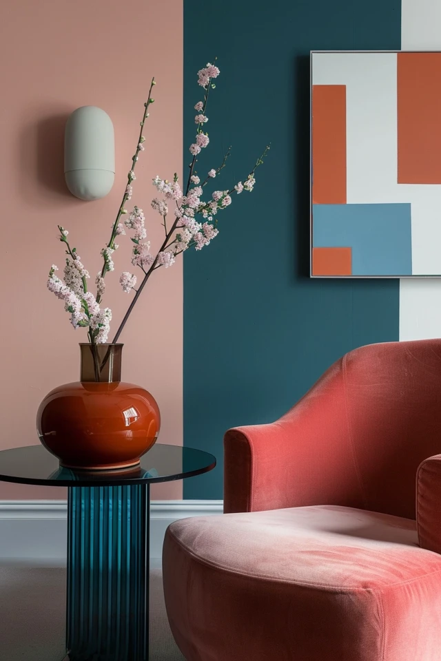
Color blocking is essentially the practice of pairing two or more contrasting blocks of color on a wall to create shapes, zones, or architectural illusions. It is one of the most high-impact, low-cost tools in an interior designer’s arsenal. It solves layout problems, defines open-concept spaces, and acts as a focal point where artwork might be lacking.
This guide will walk you through the technical execution and design principles behind color blocking. If you are looking for visual inspiration, jump to the Picture Gallery at the end of this blog post.
1. Understanding Scale and Placement
Before you buy samples, you must understand how color shapes manipulate the eye. A common misconception is that color blocking is just painting a geometric shape on a random wall. In professional design, every block of color must have a relationship with the architecture or the furniture.
If you paint a block of color behind a sofa to “frame” it, the scale is critical. A good rule of thumb is to extend the color block at least 6 to 10 inches beyond the width of the furniture piece on both sides. If the block is exactly the same width as the sofa, it looks visually cramped and unintentional.
Vertical color blocking can change the perceived height of a room. Painting the bottom third of a wall a darker color and the top two-thirds (including the ceiling) a lighter color creates an airy, open feel. Conversely, bringing a ceiling color down onto the wall by 12 to 18 inches creates a “lid” effect, which makes large, cavernous rooms feel cozier and more intimate.
Designer’s Note: The Floating Shape Error
One of the most common mistakes I see in DIY projects is the “floating shape.” This happens when someone paints a circle or arch in the middle of a wall without anchoring it to a piece of furniture, a light fixture, or a corner.
The Fix: Always anchor your color block. An arch should frame a console table or a bed. A circle should sit behind a pendant light or sconce. Gravity is a visual concept, and shapes that float aimlessly tend to make a room feel unsettled.
2. Zoning Open Concept Floor Plans
Open-concept living is desirable for light, but it is often a nightmare for furniture layout. Without walls, it is difficult to know where the dining room ends and the living room begins. Color blocking is the most effective way to build “invisible walls.”
To define a dining area within a larger great room, wrap a bold color around the corner of the dining zone. You can paint two adjacent walls and even the ceiling above the table to create a “cube” effect. This psychologically separates the space, making it feel like a distinct room.
For home offices tucked into living rooms or bedrooms, use a corner block. Paint the corner where your desk sits in a deep, focusing tone like navy or forest green. Extend the paint 4 feet out from the corner on both walls. This creates a “focus zone” that mentally separates work from relaxation.
Common Mistakes + Fixes
Mistake: Stopping the paint abruptly in the middle of a wall without a termination point.
The Fix: If you must stop a color block on a flat wall, use a vertical trim piece (like a simple 1×2 slat) to cover the transition, or ensure the line is perfectly crisp and aligns with a rug edge or window frame. Alignment is key to making it look expensive.
3. The Faux-Architecture Technique
Not every home comes with charming pre-war molding or high ceilings. Color blocking can fake these details convincingly. The most popular application is the two-tone wall, often called “faux wainscoting.”
Standard chair rail height is usually between 30 and 32 inches off the floor. However, for a modern color-blocked look, I prefer to break this rule. I often tape off the line at 48 inches or even 60 inches high. This higher line draws the eye up and creates a perfect backdrop for artwork, which usually hangs with its center point at 57 to 60 inches.
You can also use color blocking to highlight transitions. Painting a door frame and the door itself in a contrasting color to the walls creates a “portal” effect. For a bold look, paint the inside edge of an archway in a vibrant hue like terracotta or teal, leaving the face of the wall neutral. This adds a sliver of color that is only visible from certain angles.
Realistic Constraints: Texture
If you have highly textured walls (like orange peel or knockdown texture), achieving a crisp line is incredibly difficult. Tape alone will not work because the paint will bleed under the tape into the texture valleys.
The Solution: You must “seal” the tape.
1. Apply your painter’s tape.
2. Paint over the tape edge with the existing base wall color first. This fills the gaps in the texture.
3. Once that is dry, apply your new accent color.
4. When you peel the tape, you will have a perfect line, regardless of how bumpy the wall is.
4. Shapes, Arches, and Creative Motifs
Beyond straight lines, organic shapes like circles and arches introduce softness to boxy rooms. A painted arch behind a headboard is a fantastic solution for small bedrooms where a physical headboard takes up too much depth.
To paint a perfect arch, you do not need expensive stencils. You need a tack, a string, and a pencil. Determine the center point of your arch and the height. Pin the string at the center of the circle’s radius. Tie your pencil to the other end of the string at the desired length. Pull the string taut and draw your curve.
Circles are excellent for highlighting gallery walls. A large, pale ochre circle painted behind a collection of black-and-white photos adds a layer of depth and makes the arrangement look like a curated installation rather than just pictures on a wall.
What I’d Do in a Real Project: The Bedroom
For a primary bedroom lacking focus, I would paint a wide horizontal band (about 40 inches tall) across the entire wall behind the bed.
Color Strategy: I would choose a deep, calming hue like sage green or charcoal.
Integration: I would install wall sconces directly onto this colored band. The contrast between a brass fixture and a dark color block is stunning.
Benefit: This elongates the room visually and grounds the bed without the cost of a velvet headboard.
5. Execution: Sheens, Tape, and Prep
The success of color blocking relies entirely on the crispness of the lines. A wobbly line ruins the illusion immediately. Aside from the “sealing” technique mentioned earlier, the type of tape you use matters.
For standard drywall, a multi-surface tape (usually green) is reliable. However, if you are painting over a freshly painted base coat (less than 14 days old), you must use “delicate surface” tape (usually yellow or purple). Standard tape can pull the fresh base coat right off the drywall, ruining your project.
Sheen compatibility is also vital. In most cases, you should use the same sheen for both colors. If your base wall is eggshell, your color block should be eggshell. Mixing sheens (like a flat wall with a semi-gloss block) highlights imperfections in the drywall and can create weird reflections that ruin the geometric effect.
The “Peel” Timing
Rule of Thumb: Do not wait for the paint to dry completely before peeling the tape. If the paint fully cures, it forms a film. Pulling the tape then can rip that film, causing jagged edges.
Best Practice: Peel the tape while the last coat is still slightly tacky to the touch, usually about 30 to 45 minutes after application. Pull the tape at a 45-degree angle away from the painted edge.
Final Checklist: Planning Your Project
Before you open a can of paint, run through this designer’s checklist to ensure professional results.
1. The “Why” Check
Does this color block solve a problem (zoning, focal point, proportion)? If it’s just for decoration, ensure it is anchored to furniture.
2. The Light Test
Paint large sample swatches (at least 12×12 inches) on the wall. Observe them at morning, noon, and night. A navy blue block might look like a black hole at night if your lighting isn’t adequate.
3. The Measure Up
- Distance from furniture: 6–10 inches overlap.
- Height for faux wainscoting: 32 inches (traditional) or 48+ inches (modern).
- Art placement: Center of art should be 57 inches from the floor, regardless of where the color block line is.
4. The Supply Run
- High-quality painter’s tape (FrogTape is an industry favorite).
- Laser level (essential for long horizontal lines).
- Sash brush (angled brush) for cutting in corners.
- Mini roller for smaller blocked areas to avoid brush strokes.
FAQs
Can I use color blocking in a small room?
Absolutely. In fact, it is often better for small rooms than painting the whole room a dark color. A vertical stripe of color or a half-painted wall adds personality without closing the space in. High-contrast vertical lines can actually make a low ceiling feel higher.
How do I handle corners?
Corners are rarely perfectly straight. Do not rely on the corner of the room to be your straight line. Measure out from the corner and use a laser level to draw your line. Wrap the color just slightly (1/8th inch) onto the adjacent wall if you want a crisp look, or stop it 1 inch before the corner for a modern “panel” look.
Is this rental friendly?
Yes, because it is just paint. However, if you cannot paint, you can achieve similar results using solid-colored removable wallpaper. The geometry rules remain the same, but you will need to be very precise with your X-Acto knife cuts.
How many colors should I use?
For most residential spaces, I recommend sticking to two colors: the base wall color and one accent color. If you are experienced and have a maximalist style, you can introduce a third color, but ensure they have similar undertones (e.g., all warm tones or all cool tones) to prevent visual chaos.
Conclusion
Color blocking is more than a trend; it is a design technique that allows you to manipulate the architecture of your home without demolition. It puts control back in your hands, letting you decide where the eye should focus and how a room should flow.
Whether you are creating a faux headboard in a studio apartment or zoning a massive living area, the principles of scale, alignment, and preparation remain the same. Start with a small project, perhaps a simple arch or a corner block, and master the taping technique. Once you see the power of paint to transform a space, you will likely never look at a blank white wall the same way again.
Picture Gallery


