
Colorful Charm: Painted Coffee Table Ideas to Inspire
When I first started in interior design, I had a client who was terrified of color. She had a perfectly functional, solid oak coffee table that she hated because it felt “heavy” and dated. Rather than spending hundreds on a new piece, we decided to take a risk and paint it a high-gloss emerald green.
The transformation was immediate. That single pop of color became the anchor for the entire living room, proving that you don’t need a massive renovation to change the feel of a space. Paint is the most cost-effective tool in a designer’s kit, and the coffee table is the perfect low-risk canvas to experiment with.
Whether you are looking to salvage a thrift store find or update a piece you have owned for years, a fresh coat of paint offers endless possibilities. If you are looking for visual inspiration, check out our Picture Gallery at the end of this blog post.
Selecting the Right Paint Finish for Durability
The biggest mistake DIYers make is choosing a paint based solely on color without considering the finish. A coffee table is a high-traffic surface. It needs to withstand hot mugs, propped-up feet, and heavy books.
If you have kids or pets, I almost always recommend an alkyd enamel or a high-quality semi-gloss latex. These finishes dry to a hard shell that is easy to wipe down. Flat or matte paints might look trendy, but they absorb oils from fingerprints and are notoriously difficult to clean without leaving shine marks.
Chalk-style paints are popular for that vintage, farmhouse aesthetic. However, they are porous by nature. If you choose chalk paint, you absolutely must seal it with a high-quality furniture wax or a water-based polyacrylic. Without a sealer, a spilled glass of red wine will ruin the piece instantly.
Designer’s Note: The Cure Time Reality
One lesson I learned the hard way involves “cure time” versus “dry time.” Paint might feel dry to the touch in an hour, but it takes up to 30 days to fully cure and harden. If you place a heavy vase on a table three days after painting it, the vase will likely stick to the surface and peel the paint off when you move it. Treat your table with extreme care for the first month.
Color Psychology and Spatial Perception
Color does more than just look pretty; it changes the perceived size and temperature of a room. When painting a coffee table, you are placing a block of color right in the center of your seating arrangement. This creates a focal point that draws the eye immediately.
If you have a small living room, consider painting your table in a cool tone, like slate blue, sage green, or a soft gray. Cool colors recede visually, making the object appear slightly further away and the room feel more spacious. This is a great trick for tight apartments where you want to avoid a cluttered look.
Conversely, warm colors like terracotta, mustard yellow, or deep burgundy advance visually. They make a large room feel cozier and more intimate. If your living room feels cavernous or cold, a warm-colored coffee table can bridge the gap between the sofa and the accent chairs, pulling the arrangement together.
Common Mistakes + Fixes
- The Mistake: Matching the table paint exactly to the wall color.
- The Fix: Avoid this “camouflage” effect unless you are going for a very specific monochromatic avant-garde look. Instead, go two shades darker or lighter than the walls, or choose a complementary color to create depth.
Techniques to Elevate a Basic Table
You don’t have to stick to a single solid color. As a designer, I love using paint to highlight the architecture of a piece. If you have a table with beautiful turned legs but a damaged top, consider a two-tone approach. Paint the base a crisp white or black and strip the top to stain it in a natural wood tone.
Another technique I use for modern spaces is “dipped” legs. Paint the top and the upper 80% of the legs in a neutral color or white. Then, measure four inches from the floor and paint the “feet” in a bright accent color like gold, neon, or navy. This adds a playful, custom touch that looks incredibly high-end.
For those dealing with laminate or non-wood surfaces, you can still paint them, but preparation is non-negotiable. You must use a high-adhesion bonding primer. Without this specific primer, the paint will scratch off with a fingernail.
Real-World Project Checklist: Distressed vs. Sleek
- For a Farmhouse/Cottage Look: Use chalk paint. Once dry, use 220-grit sandpaper to gently rub away paint on the edges, corners, and details where natural wear would occur. Seal with clear wax.
- For a Modern/glam Look: Use high-gloss spray lacquer. You must sand between coats with incredibly fine grit (400+) to get that glass-like finish. This reveals every imperfection, so surface prep must be flawless.
Sizing, Scale, and Placement Rules
Even the most beautifully painted table will look awkward if the scale is wrong. When you paint a table a bold color, you increase its “visual weight.” A bright red table looks physically heavier and larger than a glass or wood table of the exact same dimensions.
Because the color draws attention, you need to ensure the placement follows standard interior design clearances. The ideal distance between the edge of your sofa and the coffee table is 14 to 18 inches. This provides enough room to walk through but is close enough to set down a drink comfortably.
Height is equally critical. Ideally, the table surface should be equal to the height of the sofa seat cushions, or up to two inches lower. Never go higher than the sofa seat, or the room will feel off-balance. If you paint a table that is too small for the space, the color will make it look like a toy.
Designer’s Note: Rug Sizing Logic
If you paint your table a dark or bold color, ensure your area rug is large enough to frame it. The table legs should never sit on the bare floor if you have a rug; they should be fully on the rug. A bold table on a postage-stamp-sized rug emphasizes the smallness of the rug.
Styling Your Newly Painted Centerpiece
Once your table is painted and cured, styling is how you integrate it into the room. The goal is to ensure the new color doesn’t feel like an alien object. You need to bridge the color of the table with other elements in the room, such as throw pillows, curtains, or art.
Use the “Rule of Three” for accessories. Group items in odd numbers, varying their heights and shapes. For example, a stack of books (low and rectangular), a tall vase (high and cylindrical), and a sculptural object (organic shape). This creates a balanced vignette that doesn’t compete with the new table color.
Pay attention to contrast in materials. If you painted the table a high-gloss finish, style it with matte objects like unglazed ceramics, woven trays, or old books. If the table has a flat, chalky finish, introduce shine through glass vases, brass candlesticks, or metallic trays. This contrast keeps the design dynamic.
What I’d Do in a Real Project: The Tray Trick
If the new table color feels too intense, I always use a large serving tray. Placing a large wooden or woven tray in the center of the table breaks up the expanse of color. It grounds the look and provides a neutral zone for your accessories.
Final Checklist: The Professional Process
If I were managing your project, this is the exact workflow I would follow to ensure a professional result that lasts for years.
1. Assess the Material
Is it real wood, veneer, or laminate? If it’s laminate, I need a bonding primer (like STIX or BIN). If it’s mahogany or cherry, I need a shellac-based primer to stop the red tannins from bleeding through the new paint.
2. Clean Thoroughly
I scrub the piece with a degreaser like TSP (Trisodium Phosphate) or a TSP substitute. Furniture accumulates years of invisible furniture polish, oils, and wax. Paint will not stick to Pledge or Old English polish.
3. The Sanding Phase
I don’t sand to remove all old finish, just to “scuff” it. I use 120-grit sandpaper to take the shine off. This gives the primer something to grip. I wipe away all dust with a tack cloth, not a paper towel.
4. Prime and Check
I apply one coat of primer. Once dry, I inspect it. This is when imperfections show up. I fill any dings or scratches with wood filler now, then sand those spots smooth before painting.
5. Paint Application
I apply thin coats rather than one thick one. Thick coats lead to drips and prolonged cure times. I usually do two to three light coats, lightly sanding with 220-grit paper between coats for smoothness.
6. The Topcoat
For coffee tables, I never skip this. I apply two coats of water-based polyacrylic (which doesn’t yellow like oil-based polyurethane). I use a matte or satin finish for a modern look.
FAQs
Do I really need to sand if the paint can says “no prep”?
Yes. As a professional, I never trust “no prep” claims for high-traffic surfaces like coffee tables. You don’t need to strip it to bare wood, but a quick scuff sand ensures the paint bonds mechanically to the surface. It takes ten minutes and saves you from chips later.
How do I fix paint drips after they dry?
If you find a dried drip, do not try to paint over it. Slice the drip off carefully with a razor blade, then sand the area smooth. Wipe away the dust and apply a thin touch-up coat to blend it in.
Can I paint a glass-top coffee table?
Absolutely. The best trick for glass is to paint the underside of the glass. This gives you a perfectly smooth, high-gloss finish on top that is impossible to scratch because the paint is protected by the glass itself. Spray paint works best for this to avoid brush strokes.
What kind of brush should I use?
Invest in a high-quality angled sash brush with synthetic bristles (usually blue or nylon/polyester blend). Cheap brushes shed bristles into your paint and leave deep streak marks. A good brush creates a self-leveling finish.
Conclusion
Painting a coffee table is one of the most satisfying weekend projects you can undertake. It allows you to inject personality into your home without a major financial commitment. By following the proper rules of scale, preparation, and finishing, you can create a piece that looks custom-made rather than homemade.
Remember that design is iterative. If you paint it blue and hate it six months later, you can always sand it down and try terracotta. The freedom to change your mind is the true beauty of painted furniture. Take your time with the prep work, respect the cure times, and enjoy the process of creating a colorful charm that is uniquely yours.
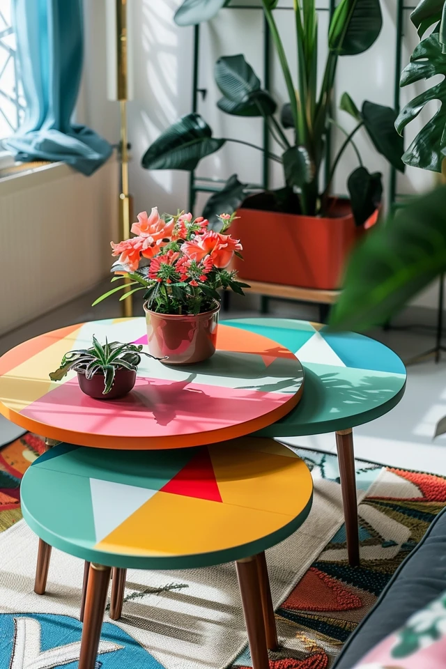
Picture Gallery


