
Colorful Dining Room Ideas: Brighten Your Space
Dining rooms are the perfect candidates for bold design choices. Unlike a living room where you lounge for hours, dining spaces are transient areas used mostly in the evening or for energetic gatherings. This allows you to take risks with color that might feel overwhelming in other parts of the home.
However, moving away from neutral safety nets can feel intimidating. The goal is to create an atmosphere that stimulates appetite and conversation without feeling chaotic or dated. For visual inspiration, make sure to check out the extensive Picture Gallery at the end of this blog post to see these concepts in action.
This guide will walk you through professional strategies for injecting color into your dining space. We will cover paint techniques, textile selection, and the critical measurements needed to make the room function beautifully.
1. Establishing Your Color Palette and Mood
Before buying a single can of paint, you must determine the mood of the room. Color psychology plays a massive role in how food and company are enjoyed.
Warm tones like terracotta, ochre, and deep reds are known to stimulate appetite and conversation. Cool tones like navy, teal, and sage green create a more formal, intimate, and calming atmosphere.
The 60-30-10 Rule
To prevent a colorful room from looking like a carnival, interior designers rely on the 60-30-10 rule. This formula helps you balance your hues effectively.
- 60% Dominant Color: This is usually your walls or the largest surface area. It sets the tone for the space.
- 30% Secondary Color: This supports the dominant color but provides contrast. This is often found in upholstery, curtains, or a large rug.
- 10% Accent Color: This is the “jewelry” of the room. Use this color for artwork, vases, table linens, or a statement light fixture.
Designer’s Note: The “Whole Home” Context
One lesson I learned early in my career involved a client who painted their dining room bright chartreuse. While the color was fun, the dining room was visible from their beige and gray living room. The transition was jarring and made the house feel disjointed.
If you have an open floor plan or wide cased openings, your dining room color must harmonize with adjacent spaces. You do not need to match, but the undertones should relate. If your living room has blue throw pillows, consider a blue dining room wall color to create a visual thread.
2. Paint Strategies: Walls, Ceilings, and Trim
Paint is the most high-impact, low-cost tool in your design arsenal. However, simply painting four walls is not your only option.
Color Drenching
This is a technique where you paint the baseboards, walls, crown molding, and even the ceiling the same color. This works exceptionally well in small dining rooms.
By removing the visual break of white trim, you blur the boundaries of the room. This makes small spaces feel expansive and large spaces feel incredibly cozy. It also disguises unsightly architectural quirks like bulkheads or uneven trim.
The Fifth Wall
If you have neutral walls, consider painting the ceiling a bold color. A deep charcoal or eggplant ceiling can lower the perceived height of a room, making a cavernous dining hall feel intimate.
Conversely, a high-gloss lacquer finish on a ceiling reflects light. This adds glamour and brightens the room, especially during candlelight dinners.
Recommended Finishes for Dining Rooms
Food flies, wine spills, and chair backs scuff walls. The finish you choose matters for longevity.
- Matte/Flat: Avoid this in dining rooms. It is impossible to clean without leaving burnish marks.
- Eggshell: The standard choice. It has a slight velvety sheen and is wipeable.
- Satin: Best for high-traffic dining rooms (like those with kids). It is durable and scrubbable but will show wall imperfections more than eggshell.
- Semi-Gloss: Reserve this strictly for trim, doors, and wainscoting.
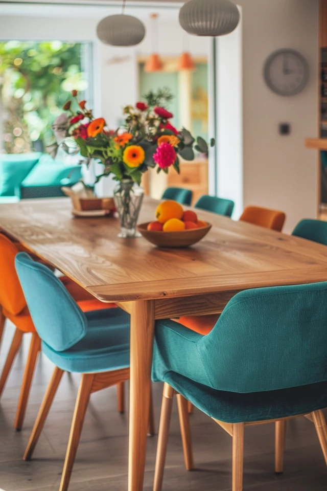
3. Anchoring with Colorful Furniture and Upholstery
If you are renting or prefer neutral walls, your furniture can carry the color weight.
Dining Chairs
You do not need a matching set of wood chairs. Mixing styles and colors is a hallmark of a collected, designer look.
Consider “head of table” chairs in a bold pattern or velvet fabric, while the side chairs remain neutral or wood-toned. This adds hierarchy to the table setting.
Performance Fabrics are Mandatory
When choosing colorful upholstery for dining chairs, you must be realistic about messes. spaghetti sauce on a white linen chair is a disaster; on a navy performance velvet, it is a minor inconvenience.
Look for fabrics labeled “high-performance,” “Crypton,” or “indoor/outdoor.” These fabrics resist staining and liquid absorption. If you have cats, avoid loose weaves like linen or bouclé, as they snag easily. Tight velvets or microfiber are generally cat-friendly.
Common Mistakes + Fixes: Chair Scale
Mistake: Buying vintage colorful chairs that are too low for modern tables.
The Reality: Standard dining tables are 30 inches high. Standard seat height is 18–19 inches. Vintage chairs are often 17 inches or lower.
The Fix: Always measure the “drop” (the distance from the seat top to the table bottom). You need 10 to 12 inches of clearance for legs. If you love a vintage chair, you may need to add a thick, firm cushion to reach the right height.
4. Rugs: The Foundation of Color
A large area rug is often the best starting point for a color palette. It grounds the table and softens the acoustics of the room.
The Golden Rule of Dining Rug Sizing
The most common error I see in dining rooms is a rug that is too small.
The Rule: Your rug must extend at least 24 inches (2 feet) beyond the table on all sides. Ideally, aim for 30 inches.
The Logic: When a guest pulls their chair out to sit down, the back legs of the chair must remain on the rug. If the legs drop off the edge, the chair becomes unstable. It creates a tripping hazard and drives everyone crazy during the meal.
Material Matters
Dining room rugs take a beating.
- Wool: The gold standard. It is naturally stain-resistant due to lanolin, cleans easily, and is durable. It is an investment but lasts for decades.
- Polypropylene: A budget-friendly synthetic. It is essentially plastic, so it is stain-proof and often bleach-cleanable. Great for families with young toddlers.
- Natural Fibers (Jute/Sisal): Use with caution. They add great texture but are highly absorbent. Red wine on a sisal rug is permanent. If you want this look, choose a “sisal-look” wool or synthetic blend.
5. Window Treatments and Lighting
Window treatments are your opportunity to bring pattern and softness into a hard-surfaced room.
Curtain Placement and Sizing
To maximize light and make your ceilings look higher, hang the curtain rod halfway between the top of the window frame and the ceiling molding. If you have standard 8-foot ceilings, hang them as close to the ceiling as possible.
Fullness: Skimpy curtains look cheap. The combined width of your curtain panels should be 2 to 2.5 times the width of the window. If your window is 40 inches wide, you need 80 to 100 inches of fabric width total.
Lighting as a Color Element
Your chandelier is the focal point. While the fixture itself can be colorful (powder-coated metal or colored glass), the light quality affects how your wall colors read.
Kelvin Temperature: For a dining room, always use bulbs between 2700K (warm white) and 3000K (soft white).
CRI (Color Rendering Index): Look for bulbs with a CRI of 90 or higher. This ensures your food looks appetizing and your colorful walls look true to tone rather than muddy.
Chandelier Height Checklist
- Bottom of the fixture should be 30 to 36 inches above the tabletop.
- For ceilings higher than 8 feet, add 3 inches of height for every extra foot of ceiling.
- The fixture width should be roughly one-half to two-thirds the width of the table.
What I’d Do: A Real Project Mini-Checklist
If I were designing a colorful dining room from scratch today, this is the exact order of operations I would follow:
- Select the “Hero” Piece: I usually start with a patterned fabric (for curtains) or a multi-colored rug. This dictates the palette.
- Pull the Paint Color: I pick a secondary color from the “Hero” piece for the walls. I almost never pick the paint first.
- Check the Lighting: I buy sample pots of paint and paint large poster boards. I look at them in the morning, afternoon, and specifically at night with the lights on.
- Layer the Textures: If the walls are flat paint, I add velvet chairs. If the walls are high-gloss, I might use matte leather chairs. Contrast is key.
- Accessorize Last: Artwork and centerpieces are selected only after the major furniture is in place to ensure the scale is correct.
Final Checklist: Ready to Transform?
Before you begin your renovation, ensure you have these boxes ticked:
- Measure the Room: Have exact dimensions of the floor plan.
- Check Clearance: Ensure you have at least 36 inches of walkway space between the table edge and the wall (or buffet). 42-48 inches is preferred for main traffic paths.
- Swatch Test: Have you tested your paint color on at least two different walls?
- Rug Sizing: Is your chosen rug 24+ inches wider than the table on all sides?
- Fabric Durability: Are your chair fabrics rated for heavy use or treated for stain resistance?
- Lighting Dimmers: Have you installed a dimmer switch? Mood lighting is non-negotiable in a colorful dining room.
Frequently Asked Questions
Can I use dark colors in a small dining room?
Absolutely. Small dining rooms are actually the best places for dark colors. Deep navy, charcoal, or forest green blurs the corners of the room, creating an illusion of infinite space. It creates a “jewel box” effect that feels expensive and intentional.
How do I mix wood tones in a dining room?
Avoid trying to match woods perfectly; it often looks like a catalogue set. Instead, mix tones but keep the undertones consistent. If your floor is a warm oak, a walnut table (also warm) works well. Avoid mixing cool gray-toned woods with warm red-toned woods (like cherry). A rug acts as a great buffer between a wood floor and a wood table.
What is the best way to add color without painting?
Large-scale art is the answer. A massive canvas or a gallery wall can consume 60% of visual wall space. Combine this with colorful curtains and a vibrant rug, and your beige walls will virtually disappear into the background.
Should my rug match my curtains?
No. They should coordinate, not match. If your curtains have a busy floral pattern, opt for a geometric or solid rug in a color pulled from the curtains. If you match them exactly, the room will feel stiff and dated.
Conclusion
Designing a colorful dining room is about balancing boldness with functionality. By following the 60-30-10 rule, adhering to proper clearance measurements, and selecting durable materials, you can create a space that is as livable as it is beautiful.
Don’t be afraid to experiment. Paint can be covered, and rugs can be moved. The dining room is the place where memories are made over meals, so let the backdrop be as vibrant and engaging as the conversations held there.
Picture Gallery


