
Cream Bedroom Ideas for a Cozy Retreat
Introduction
Cream is often misunderstood in the design world. Many people mistake it for a “safe” default or a builder-grade beige that lacks personality, but I see it differently. When executed correctly, a cream palette is the ultimate power move for a bedroom because it creates an immediate sense of decompression and luxury.
I once worked with a client who insisted she hated neutral rooms because they felt “sterile” and cold. We compromised on a warm cream foundation layered with rich textures like wool and unlacquered brass, avoiding the starkness of bright white entirely. If you are looking for visual inspiration, jump to the end of this post to see the curated Picture Gallery full of cream bedroom examples.
The result was a space that felt like a warm hug the moment you walked in. This guide will walk you through exactly how to build that kind of sanctuary, focusing on the technical details that turn a plain room into a high-end retreat.
Understanding Undertones: The Secret to the Perfect Cream
The biggest mistake homeowners make with cream paint is ignoring the undertone. Cream is rarely just “cream.” It usually leans toward yellow, pink, or green.
If you choose a yellow-based cream for the walls but buy a pink-based cream headboard, the room will look “muddy” or dirty. In professional design, we call this clashing undertones. You need to identify the base of your neutrals before you buy a single gallon of paint.
How to Test Paint Like a Pro
Never paint a swatch directly on your existing wall color. The old color will trick your eye and skew the reading of the new sample.
Instead, paint a large 24×36-inch foam board with your sample color. Move this board around the room at different times of the day. Watch how the morning light (usually cooler) and afternoon light (usually warmer) changes the paint.
Designer’s Note: The North-Facing Room Rule
If your bedroom faces north, the natural light will be cool and slightly blue. If you pick a cream with a green or gray undertone, the room will feel flat and dead.
For north-facing rooms, you must lean into creams with a strong yellow or red pigment (think heavy ivory or linen shades). This counteracts the blue light and artificially warms up the space.
Texture Over Color: How to Layer a Monochromatic Space
When you remove bright colors from a design scheme, texture becomes your new language. A cream room without texture looks like a hospital; a cream room with texture looks like a five-star hotel.
You want to create visual friction. This means placing smooth materials next to rough ones so the eye has something to catch on.
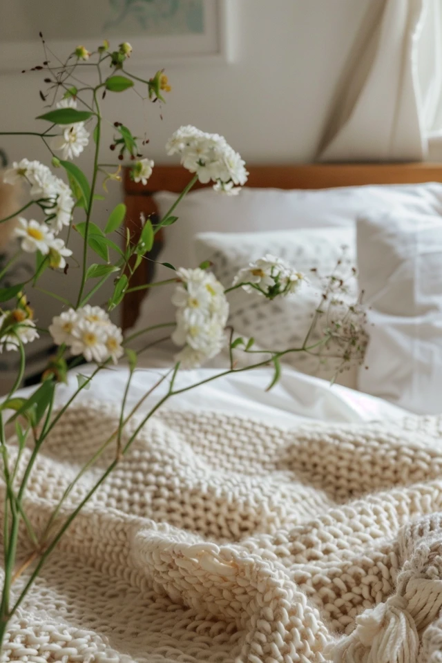
The “Fabric Lasagna” Technique for Bedding
To make a cream bed look inviting rather than plain, you need at least three distinct textures.
- Base Layer: Crisp cotton percale sheets (cool to the touch).
- Middle Layer: A linen duvet cover (adds a slight wrinkle and softness).
- Top Layer: A chunky knit throw or a heavy wool blanket at the foot of the bed.
Common Mistakes + Fixes
Mistake: Buying a matching “bed-in-a-bag” set where the comforter, shams, and skirt are all the same polyester fabric.
Fix: Break up the set. Use the comforter if you like it, but swap the pillow shams for Euro shams in a boucle or velvet fabric. This breaks up the visual monotony.
Scale and Layout: Anchoring the Room
Cream expands a space visually, which is great for small bedrooms. However, if your furniture is too small (dinky), the room will feel unmoored and floating.
You need substantial furniture to ground the airy colors. This provides the necessary weight to make the room feel expensive and intentional.
Rug Sizing and Placement
The rug is the foundation of your “cozy retreat.” A common error is choosing a rug that is too small, making the bed look like an island.
- Queen Bed: Use an 8×10 rug.
- King Bed: Use a 9×12 rug.
The Placement Rule: The rug should start about 6 to 12 inches away from your nightstands. It should not go all the way to the wall behind the headboard. This allows the bed legs to sit firmly on the rug while leaving the nightstands on the hard floor, creating a layered look.
Nightstand Proportions
Your nightstand height is critical for both ergonomics and aesthetics. Ideally, the top of the nightstand should be level with the top of your mattress.
I allow a tolerance of two inches higher or lower. Anything outside that range looks disjointed. If you have a tall pillow-top mattress, double-check your measurements before ordering standard bedside tables.
Lighting: The Temperature Makes or Breaks the Vibe
You can pick the most expensive cream paint and the softest wool rug, but bad lighting will ruin it instantly. In a cream room, light temperature is everything.
Light bulbs are measured in Kelvins. The higher the number, the bluer and harsher the light.
The 2700K Rule
For a cozy bedroom retreat, strict adherence to 2700K (Kelvin) LED bulbs is recommended. This is a warm white light that mimics traditional incandescent bulbs.
If you go up to 3000K, it becomes crisper and more energetic—acceptable for a bathroom, but risky for a relaxing bedroom. Never use 4000K or 5000K (“Daylight”) in a cream bedroom. It will turn your warm ivory walls a sickly blue-gray.
Layering Light Sources
Do not rely on a single ceiling fixture (the “boob light”). It casts unflattering shadows.
1. Ambient Light: A chandelier or semi-flush mount centered in the room.
2. Task Light: Bedside lamps or sconces for reading.
3. Mood Light: A small table lamp on a dresser or a floor lamp in the corner.
Designer’s Note: Sconce Height
If you are installing hardwired sconces beside the bed, a good rule of thumb is to mount them approximately 60 to 66 inches off the floor. This places the bulb at a comfortable height to cast light down onto your book without shining directly in your eyes.
Wood Tones and Contrast
Since the walls and textiles are light, you need contrast to keep the room from washing out. Wood tones are the best way to introduce this warmth without breaking the neutral palette.
Mixing Wood Tones
You do not need to match your nightstands to your dresser. In fact, please don’t. A “matched set” can look dated.
Instead, mix tones that share the same undertone. For example, a warm walnut bed frame looks beautiful with lighter white oak nightstands. The contrast creates depth.
Window Treatments
For a cream bedroom, I almost always recommend drapery over blinds alone. Fabric softens the hard edges of windows and improves acoustics.
Fabric Choice: Heavy linen or velvet in a shade slightly darker than your walls adds sophistication.
Mounting Height: Mount your curtain rod as high as possible—at least halfway between the top of the window casing and the ceiling (or all the way to the crown molding).
Width: Extend the rod 10–12 inches past the window frame on each side. This allows the curtains to stack against the wall when open, exposing the full glass and maximizing natural light.
Real-Life Constraints: Kids, Pets, and Renters
A cream bedroom sounds dangerous if you have a muddy dog or a toddler with sticky hands. However, it is entirely possible if you choose the right materials.
You do not have to sacrifice aesthetics for durability, but you do have to be strategic about your finishes.
Performance Fabrics are Mandatory
If you have pets that sleep on the bed, look for “performance velvet” or fabrics treated with Crypton technology. These resist liquid and release stains easily.
Avoid loose-weave linens or chunky knits on the main upholstery (like a headboard or bench) if you have cats, as these are magnets for claws. Save the knits for throw blankets that can be replaced cheaply.
Paint Finishes Matter
Flat/Matte: Looks velvety and hides wall imperfections, but is very hard to clean. Avoid this if you have kids.
Eggshell: The gold standard for bedroom walls. It has a slight sheen that allows you to wipe off scuffs, but it isn’t shiny.
Satin/Semi-Gloss: Reserve this strictly for trim, baseboards, and doors.
Renter-Friendly Cream Updates
If you are renting and cannot paint the walls, focus on what covers the walls.
Large-scale art and floor-to-ceiling curtains can mask an ugly white or beige wall color. Peel-and-stick wallpaper in a subtle cream texture (like a faux grasscloth) is also a fantastic temporary solution that adds the warmth typical paint would provide.
Final Checklist: What I’d Do in a Real Project
If I were designing your cream bedroom tomorrow, this is the exact order of operations I would follow to ensure success.
- Assess the Light: Determine which direction the windows face. North needs warmer creams; South can handle cooler creams.
- Select the Rug First: It is easier to match a paint color to a rug than a rug to a paint color. Buy the 8×10 or 9×12 rug first.
- Test Paint: Buy 3 samples. Paint them on foam boards. Live with them for 48 hours.
- Measure for Furniture: Tape out the outline of the bed and nightstands on the floor with painter’s tape to ensure the scale feels right.
- Layer the Bed: Buy sheets, a duvet, and a throw blanket in three different textures (e.g., cotton, linen, wool).
- Check Light Bulbs: Swap every bulb in the room to 2700K LEDs.
- Install Curtains: Mount the rod high and wide. Ensure the curtains “kiss” the floor (touching barely) or have a slight “break” (1 inch of fabric on the floor).
FAQs
Can I mix white and cream in the same bedroom?
Absolutely. In fact, mixing white and cream is one of the best ways to keep the room feeling fresh. The key is to make it look intentional. If you have cream walls, use crisp white sheets and a white mat on your artwork. The crisp white acts as a highlighter, making the cream look richer by comparison.
Is gray bedding okay in a cream room?
It can work, but it is tricky. You want to avoid cool, blue-grays, as they will clash with the warmth of the cream. Look for “greige” (gray-beige) or warm taupe shades. These bridge the gap between gray and cream seamlessly.
How do I stop my cream room from looking boring?
Contrast is the cure for boredom. Add black accents—a thin black picture frame, a black metal floor lamp, or dark bronze hardware on the nightstands. Just a few touches of black will sharpen the room and give your eye a place to rest.
What are the best accent colors for a cream bedroom?
Cream is a neutral, so it pairs with almost everything. However, for a “cozy retreat” vibe, stick to earth tones. Olive green, terracotta, rust, warm saddle leather, and navy blue are all excellent choices. Avoid neons or overly bright primary colors.
Conclusion
Creating a cream bedroom is about restraint and discipline. It requires you to resist the urge to fill the space with loud patterns and instead trust in the power of texture, scale, and light.
When you get the undertones right and layer the bedding properly, the result is a space that lowers your heart rate the moment you enter. It becomes a true sanctuary—a place where the chaos of the outside world fades away into a soft, enveloping warmth.
Take your time testing your paint, invest in good lighting, and don’t be afraid to mix your wood tones. Your cozy retreat is well within reach.
Picture Gallery


