
Creative Name Tag Ideas for Any Occasion
There is a specific moment right before a dinner party begins that always raises my heart rate. It is that split second when guests wander into the dining room and hesitate, unsure of where to sit or where to place their belongings. As a designer, I view this not just as a logistical gap, but as a missed opportunity for a design moment.
Name tags and place cards are often treated as afterthoughts, scribbled on scraps of paper or generic stickers as guests arrive. However, when executed with intention, they serve as the first tactile introduction to your event’s aesthetic. I have compiled a comprehensive list of visual examples in the Picture Gallery at the end of this blog post to spark your creativity.
Whether you are hosting an intimate Thanksgiving dinner, a large wedding, or simply organizing your mudroom cubbies, the way you label a space or a seat matters. It establishes order, eliminates social anxiety for guests, and adds a layer of texture to your overall design scheme. Below, I will walk you through professional strategies for creating name tags that are both functional and beautiful.
1. The Formal Tablescape: Classic Cardstock with a Twist
When designing a formal dining room, the place card is the anchor of the individual setting. It bridges the gap between the charger plate and the stemware. The most common mistake I see in DIY place cards is the use of standard printer paper.
Standard copy paper (20lb bond) is too flimsy; it curls in humidity and lacks the stiffness to stand or lie flat gracefully. For a professional look, you must use cardstock that is at least 110lb weight. This thickness provides a rigid, architectural quality that feels expensive to the touch.
Designer’s Note: The “Tent” Rule
If you are using a tent-style fold, ensure the base of the triangle is at least 1.5 inches deep. I once attended a beautifully styled wedding where the place cards kept falling over every time the air conditioning kicked on because the base was too narrow. Stability is part of the design.
Styling the Flat Lay
If you prefer a flat card placed directly on the napkin or plate, consider the negative space. Do not fill the entire card with text. Leave a generous margin around the name to let the texture of the paper breathe.
I often use a technique called “blind embossing” for a subtle, high-end effect. You can achieve this with a simple handheld embosser. It adds a raised texture to the border or monogram without adding ink, keeping the palette monochromatic and chic.
2. Bringing the Outdoors In: Natural & Organic Markers
In landscape-aware interior design, we constantly look for ways to blur the line between the garden and the living space. Using organic materials as name tags is an excellent way to soften a rigid table setting. This works particularly well for summer brunches or autumn harvests.
The Foliage Method
Magnolia leaves are the gold standard here because they are thick, waxy, and hold their shape for days without water. The dark, glossy green side contrasts beautifully with a gold or white oil-based paint marker. Avoid water-based markers, as they will bead up and smear on the waxy surface.
Common Mistake: Picking leaves an hour before the party.
The Fix: If you are using thinner leaves like lemon or salal, cut them 24 hours in advance and submerge them in a water bath to fully hydrate them, then dry them completely before writing. This prevents curling during dinner.
Stone and Mineral Tags
For a modern, elemental look, I love using river stones or slices of agate. This adds significant weight to the table, literally and visually. When choosing stones, look for smooth, dark basalt for white ink, or white marble pebbles for black ink.
From a spacing perspective, keep stones under 3 inches in diameter. Anything larger begins to encroach on the “danger zone” where guests might knock over their water goblets. The stone should sit comfortably above the dessert spoon or to the top-left of the charger.
3. Textile-Based Tags: Velvet, Linen, and Leather
Texture is the secret ingredient in any warm, inviting room. Paper is fine, but fabric adds a layer of luxury that guests physically interact with. I frequently use velvet ribbon as a “name tag” by tying it around the napkin and writing directly on the fabric or attaching a small tag.
The Velvet Ribbon Technique
Velvet absorbs light, which creates a rich depth on a candlelit table. Buy ribbon that is at least 1 inch wide. You can use iron-on vinyl lettering for a crisp look, or a metallic fabric marker for a handwritten touch.
If you are handwriting, stretch the ribbon taut using tape on a hard surface before writing. This prevents the fabric from bunching up under the pen tip. Use a bold, block font rather than cursive, as the pile of the velvet can obscure fine lines.
Leather Scraps for Rustic Elegance
For a more masculine or industrial aesthetic, leather strips make incredible place markers. You can buy vegetable-tanned leather scraps in bulk. Punch a hole in one end and tie it to the napkin ring with twine.
To write on leather, you have two professional options:
- Leather stamping set: This debosses the letters into the hide. It is permanent and very tactile.
- Paint pens: Use an oil-based white marker. It pops against the cognac or dark brown leather.
4. Functional Labeling for Home Organization
Moving away from the dining table, let’s discuss “name tags” in the context of permanent home organization. As a designer, I am often tasked with organizing mudrooms, pantries, and playrooms. The labels here need to be durable and legible from a distance.
The Mudroom Cubby
In a busy family home, assigning specific zones is crucial for maintaining order. For mudroom cubbies, I prefer brass or matte black card holders screwed directly into the millwork. This allows you to slide names in and out as needs change.
Placement Logic:
Mount the name tag on the upper rail of the cubby or the hook strip. Place it at eye level for the adults, not the kids. While the kids need to know where their spot is, the visual clutter of labels should be kept high and uniform to maintain a clean vertical line in the joinery.
Pantry Jars and Baskets
For pantries, consistency is key. If you have mismatched jars, matching labels can unify the look. I avoid chalkboard stickers because the chalk eventually smudges and looks dusty. Instead, opt for white vinyl lettering applied directly to glass canisters.
If you are labeling woven baskets (like Hyacinth or Seagrass), adhesive labels will not stick. Use small wooden tags or acrylic discs tied to the handle with a simple jute string. This preserves the texture of the basket while providing clear identification.
5. Edible Name Tags: A Playful Approach
For holiday gatherings, making the name tag part of the meal is a delightful surprise. It immediately breaks the ice and serves as an appetizer or party favor. This requires coordination with your menu, but the payoff is high.
The Cookie Card
A sugar cookie frosted with royal icing serves as a perfect canvas. Pipe the guest’s name in a contrasting color. If you are not a baker, you can order these custom-made.
Sanitation Note:
Always package the cookie in a clear cello bag or place it on a small piece of parchment paper if it is sitting directly on a napkin. You do not want oil from the cookie staining your linens before the first course is served.
Fruit and Herb Markers
Pears, pomegranates, and lemons hold up well at room temperature. You can write directly on the skin of a pomegranate with a gold marker. For pears, I prefer to pin a small paper banner into the stem using a dressmaker’s pin. Just be sure to warn guests about the pin before they bite into it!
6. High-Volume Events: Weddings and Corporate
When you are dealing with 50, 100, or 200 guests, hand-painting magnolia leaves becomes unrealistic. For large events, legibility and traffic flow become the primary design drivers. The name tag here is usually an “escort card” (telling them which table) or a place card (telling them which seat).
Scale and Fonts
In a dimly lit ballroom or an outdoor tent at dusk, tiny script fonts are a disaster. Guests should not have to squint to find their seats. Use a font size of at least 14pt for the names.
What I’d do in a real project:
I always test the place card under the actual lighting conditions of the venue. If the venue uses warm uplighting, a cream card with pale gold text might become invisible. In those cases, I would switch to a charcoal card with white ink for high contrast.
The “Seek and Find” Display
For the entrance table, avoid laying cards flat in rows. It looks cluttered and makes it hard for people to grab their card without knocking others over. Display them vertically on a board, or use small card holders to stand them upright. Group them alphabetically, not by table number, to speed up the entry process.
7. Common Mistakes and How to Fix Them
Even seasoned hosts make errors when it comes to labeling and place settings. Here are three issues I frequently correct during site visits or consultations.
Mistake 1: Blocking the Sightline
The Issue: You create a tall, elaborate name tag holder or floral arrangement that sits directly in front of the guest.
The Fix: Keep all table décor, including place cards, below 12 inches or above 24 inches. The “conversation zone” between guests across the table must remain clear.
Mistake 2: Using Non-Permanent Ink
The Issue: Using a water-based calligraphy pen on a humid day or near iced drinks. The condensation drips and ruins the name.
The Fix: Always use archival, waterproof ink or oil-based paint markers. Test a scrap piece of paper with a drop of water to ensure it holds.
Mistake 3: Forgetting the Napkin Fold
The Issue: Designing a place card without deciding on the napkin fold first. A long rectangular card might look awkward perched on a chaotic napkin shape.
The Fix: Choose your fold first. A simple rectangle fold works best for laying cards on top. A pyramid fold requires a card to sit on the plate or table surface.
Final Checklist: The Designer’s Toolkit
Before you start crafting your name tags, run through this mental checklist to ensure you have covered the functional bases.
1. The Surface Check
Is the table crowded? If you are serving family-style with large platters, avoid bulky name card holders. Stick to flat cards or napkin rings to save real estate.
2. The Breeze Factor
Are you dining outdoors? Paper tents will blow away in a 5mph breeze. Use weighted objects like stones, heavy acrylic, or tie the tag to the napkin.
3. The Spelling Audit
Nothing kills the mood faster than a guest seeing their name misspelled. Triple-check your list against RSVPs. Make three extra blank cards for last-minute additions.
4. The Light Test
Place a sample card in the room at the time of day the event will occur. Can you read it from a standing position? If not, increase the font weight.
Frequently Asked Questions
What is the standard size for a place card?
The standard folded size is usually 3.5 inches wide by 2 inches high. Flat cards are often the size of a business card (3.5 x 2) or slightly larger squares (2.5 x 2.5). I prefer slightly smaller cards (around 3 inches wide) so they don’t dominate the plate.
Should I include last names on place cards?
For formal events like weddings or corporate dinners, yes, include the last name. For intimate dinner parties at home with friends, first names are sufficient and create a warmer, more casual atmosphere. If you have two “Sarahs,” add the last initial.
Can I use calligraphy if I have bad handwriting?
Absolutely not. Bad handwriting ruins the polish of a tablescape. If your script isn’t up to par, use a distinct, architectural block print (all caps). Alternatively, print them using a high-quality printer on textured paper, or hire a calligrapher for special occasions.
Where does the place card go if I don’t have a charger plate?
If you are placing the dinner plate directly on the table (or a placemat), the place card typically goes above the plate in the 12:00 position. Alternatively, it can rest on the folded napkin which is placed in the center of the setting.
Conclusion
Creating the perfect name tag is an exercise in balance. You are balancing aesthetics with legibility, and creativity with durability. Whether you are using a smooth river stone to ground a natural table setting or a crisp cardstock tent for a formal affair, the goal remains the same: to make your guest feel welcome.
In interior design, we often say that the success of a room is determined by how it makes people feel, not just how it looks. A personalized name tag is a small gesture that signals to your guest that you prepared for them, thought about their comfort, and curated a space specifically for their presence. It transforms a seat into a destination.
I hope these ideas inspire you to look beyond the standard sticker and view name tags as a vital accessory in your entertaining toolkit. With the right materials and a little planning, you can elevate even a casual Tuesday night dinner into a memorable design experience.
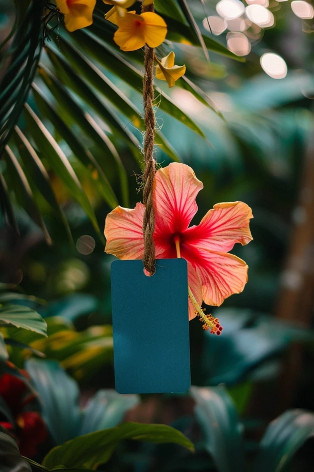
Picture Gallery


