
Elegant Backsplash Ideas with Blue Dunes Granite
Blue Dunes granite is one of those distinct natural stones that commands attention the moment you walk into a kitchen. With its sweeping movement of pewter, cream, and varying shades of blue, it offers a level of depth that engineered quartz simply cannot replicate. However, its complex color palette and high variation can make choosing the perfect backsplash a daunting task for many homeowners.
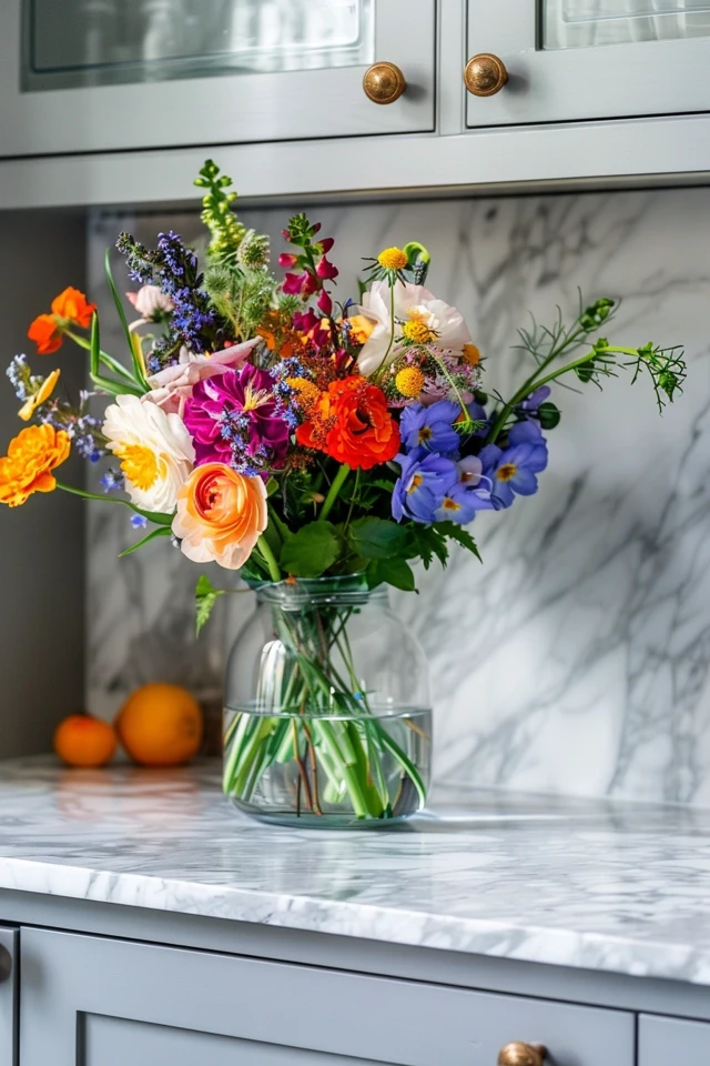
I have stood in many stone yards with clients who fall in love with a slab of Blue Dunes, only to panic later when trying to select a tile that doesn’t clash with it. The key is understanding that this granite acts as the “hero” of the kitchen; the backsplash needs to support it, not fight it for attention. If you are looking for specific visual examples of how these combinations work in real homes, be sure to check out our Picture Gallery at the end of this post.
In this guide, we will break down exactly how to coordinate materials, select the right tile shape, and manage the installation details. Whether you are aiming for a modern farmhouse look or a sleek transitional style, these rules will help you navigate the process.
1. Analyzing the Undertones and Movement
Before you even step foot in a tile showroom, you must understand the specific slab of Blue Dunes you have purchased. Natural stone varies wildly from block to block. Some slabs of Blue Dunes lean heavily into cool steel greys and blues, while others feature warm ribbons of amber and beige.
If your slab has significant amber veining, a warm creamy off-white tile will bridge the gap between the countertop and wood cabinetry. If your slab is predominantly cool grey and blue, a crisp bright white or a soft dove grey tile creates a more cohesive, modern aesthetic.
Lighting Changes Everything
The lighting in your kitchen will drastically alter how the backsplash reads against the granite. I always recommend testing tile samples under your specific lighting conditions, not just in the showroom.
3000K Lighting: This is warm white light. It will pull out the amber and cream tones in the granite, potentially making grey tiles look muddy.
4000K Lighting: This is cool white/daylight. It highlights the blue and grey minerals, making cream tiles look yellow.
Designer’s Note: The Sample Rule
I learned this lesson the hard way early in my career. Never pick a backsplash tile based on a small 2-inch sample chip.
When working with a busy stone like Blue Dunes, you need to buy at least three or four full pieces of the tile. Prop them up against your installed countertop and leave them there for 24 hours. Watch how they look in the morning sun versus artificial evening light before committing.
2. The Full-Height Granite Backsplash
If you want an ultra-luxury look that solves the coordination problem entirely, skip the tile. Running the Blue Dunes granite up the wall to the underside of the upper cabinets is a seamless, sophisticated choice. This is often called a “slab splash.”
This approach creates a dramatic focal point and eliminates grout lines, which makes cleaning grease splatters behind the cooktop incredibly easy. It works particularly well in kitchens with high ceilings or where you want to showcase the natural movement of the stone without interruption.
Implementation Details
When executing a full-height splash, thickness matters. Standard countertops are usually 3cm thick. However, putting 3cm stone on the wall can look bulky and interfere with faucet clearance.
Milling Down: Ask your fabricator to mill the backsplash pieces down to 2cm thickness if possible.
Outlet Placement: A beautiful slab full of holes for electrical outlets looks messy. I recommend using plug mold strips tucked up under the cabinets so the stone remains uninterrupted.
3. Tile Material Selection: Ceramic, Glass, and Stone
If a full slab is out of budget or not your style, tile is the next step. The material you choose dictates the “vibe” of the room. Since Blue Dunes is a natural, earthy material, it pairs best with materials that have organic qualities or simple finishes.
Ceramic and Porcelain
Handmade or “hand-look” ceramic tiles are my top recommendation for this granite. Look for tiles with slight surface undulation (often called Zellige-style, though true Zellige can be difficult to maintain). The texture of the tile adds interest without introducing a competing pattern.
A simple, glossy ceramic tile reflects light, which helps brighten kitchens that use darker variations of Blue Dunes. Avoid matte finishes if your kitchen lacks natural light, as the granite itself absorbs quite a bit of light.
Glass Tile
Glass can be tricky. Standard 1×1 glass mosaics often look dated and too busy against the movement of Blue Dunes.
If you love glass, opt for large-format glass subway tiles (such as 4×12 inches) in a solid color. The transparency of glass adds depth, but ensure the color backing is high quality so the adhesive doesn’t change the look of the tile.
Natural Stone Tile
Mixing stone with stone requires caution. I generally advise against using marble tiles with Blue Dunes granite. The veining in marble usually fights with the speckling in the granite.
However, a solid-colored natural stone, like a honed limestone in a solid beige or a Thassos white marble (which has almost no veining), can work beautifully. The goal is contrast in texture, not competition in pattern.
4. Scale and Pattern Layouts
The size of your tile and how you lay it out is just as important as the color. Because Blue Dunes has a “tight” visual texture (lots of small speckles and lines), you generally want a larger scale tile to provide a place for the eye to rest.
The Classic Subway (Updated)
Standard 3×6 inch subway tile is a safe choice, but it can feel a bit pedestrian. To elevate the look, change the proportions.
Try a 2×8 inch or 2×10 inch tile. The elongated shape feels more modern and elegant. Stacking them in a classic brick pattern is timeless and won’t overwhelm the granite.
Vertical Stacking
For a more contemporary edge, stack rectangular tiles vertically rather than horizontally. This draws the eye upward, making the ceiling feel higher. This linear look contrasts nicely with the organic, flowing waves of the Blue Dunes granite.
Herringbone
Herringbone is beautiful, but it adds a lot of visual energy. If you choose a herringbone pattern, use a grout color that matches the tile exactly. This emphasizes the texture of the pattern without creating jagged visual lines that compete with the granite’s movement.
5. Grout Colors and Spacing
Grout is the unsung hero—or villain—of a backsplash installation. The wrong grout color can ruin an expensive stone and tile combination.
Contrast vs. Blending
With Blue Dunes granite, I almost always recommend blending the grout to the tile color.
High Contrast: White tile with dark grey grout creates a grid pattern. When placed next to the swirling patterns of Blue Dunes, this creates visual chaos.
Low Contrast: White tile with white or off-white grout creates a subtle texture. This allows the granite to remain the focal point.
Spacing Standards
The width of your grout line dictates the feel of the installation.
1/16 Inch: Use this for rectified tiles (tiles with machine-cut, straight edges). It creates a tight, seamless, modern look.
1/8 Inch or wider: Use this for handmade tiles with irregular edges. It accommodates the size variations in the tile but results in a more rustic appearance.
Common Mistakes + Fixes
I have seen many DIY projects go sideways because of small oversights. Here are the most frequent errors and how to solve them.
Mistake 1: Ignoring the “Bossy” Element
Homeowners often fall in love with a patterned cement tile and try to force it to work with Blue Dunes.
The Fix: Acknowledge that the granite is the “boss.” If the counter has a pattern, the wall should be solid. If you want a patterned wall, you should have chosen a solid quartz counter. Stick to solid colors for your tile.
Mistake 2: The “White” Clash
Selecting a stark, cool white tile when the granite has creamy, warm amber undertones. The tile makes the granite look dirty, and the granite makes the tile look clinical.
The Fix: Bring a cabinet door and a chunk of your granite to the tile store. Look for “warm whites” or “soft creams” that bridge the gap between the cabinet color and the stone.
Mistake 3: Stopping the Tile Too Early
Ending the backsplash in line with the upper cabinets, leaving a weird gap of painted drywall near the window or sliding door.
The Fix: Ideally, run the tile to the end of the countertop, or to the nearest window casing. If there is no logical stopping point, use a metal Schluter strip for a clean, professional edge.
What I’d Do in a Real Project: The Checklist
If I were designing a kitchen with Blue Dunes granite today, this is the exact workflow I would follow to ensure success.
1. Secure the Slab: I would visit the stone yard and tag the specific slab. I would take a high-quality photo of it and ask for a small sample piece to take with me.
2. Audit the Kitchen: I would measure the distance between the counter and the upper cabinets (standard is 18 inches). This helps determine if a large format tile will fit without awkward cuts.
3. Select the Finish: If the granite is polished (shiny), I would lean toward a matte or satin finish tile to create texture contrast. If the granite is leathered (matte), I would choose a glossy tile to bounce light.
4. The “Squint Test”: I would set up the granite sample and potential tiles in the kitchen. I would step back 10 feet and squint. If the tile disappears and lets the granite shine, it’s a winner. If the tile pattern pops out and fights the stone, it goes back.
5. Order Over-age: I would order 15% extra tile. With complicated cuts around outlets and corners, running out of tile mid-project is a nightmare you want to avoid.
FAQs
Can I mix metals with Blue Dunes Granite?
Absolutely. Blue Dunes is versatile. It pairs exceptionally well with Champagne Bronze or Brushed Gold hardware, as these pull out the amber deposits in the stone. It also looks crisp with Matte Black or Polished Nickel. Avoid Chrome if your stone is very warm, as it can feel too cool.
Does Blue Dunes granite need to be sealed?
Yes. Like most natural granites, it is porous. It should be sealed upon installation and resealed roughly once a year. A good test is to pour a few drops of water on the surface; if it beads up, the seal is good. If it soaks in and creates a dark spot, it is time to reseal.
Is a backsplash necessary if I have a 4-inch granite splash?
Many older homes have a standard 4-inch piece of granite running up the wall. If you want a modern look, I highly recommend carefully removing that 4-inch splash and tiling from the countertop deck all the way up to the cabinets. Keeping the 4-inch splash and tiling above it creates a disjointed, dated look.
What paint colors go with Blue Dunes?
Since Blue Dunes is earthy, stick to warm neutrals. Sherwin Williams “Alabaster” or Benjamin Moore “Revere Pewter” are excellent choices. For a moody, dramatic look, a deep navy blue like Hale Navy can look stunning on an island base or lower cabinets.
Conclusion
Blue Dunes granite is an investment in natural art for your home. It brings warmth, movement, and a connection to the outdoors that is hard to beat. While it demands a bit more thought during the design process than a plain white surface, the payoff is a kitchen with genuine character and depth.
By keeping your backsplash simple, paying attention to undertones, and respecting the scale of the room, you can create a space that feels both elegant and inviting. Remember, the best design feels effortless, even if it took a little extra work to get there.
Picture Gallery


