
Elegant Navy Blue and Gold Living Room Tips
There is something inherently regal about pairing navy blue with gold. It creates a space that feels moody, sophisticated, and incredibly timeless all at once. I remember one of my very first projects involved a small, boxy living room that felt completely devoid of character. We drenched the walls in a deep midnight blue and brought in brushed brass accents; suddenly, that boring box felt like a high-end boutique hotel lounge.
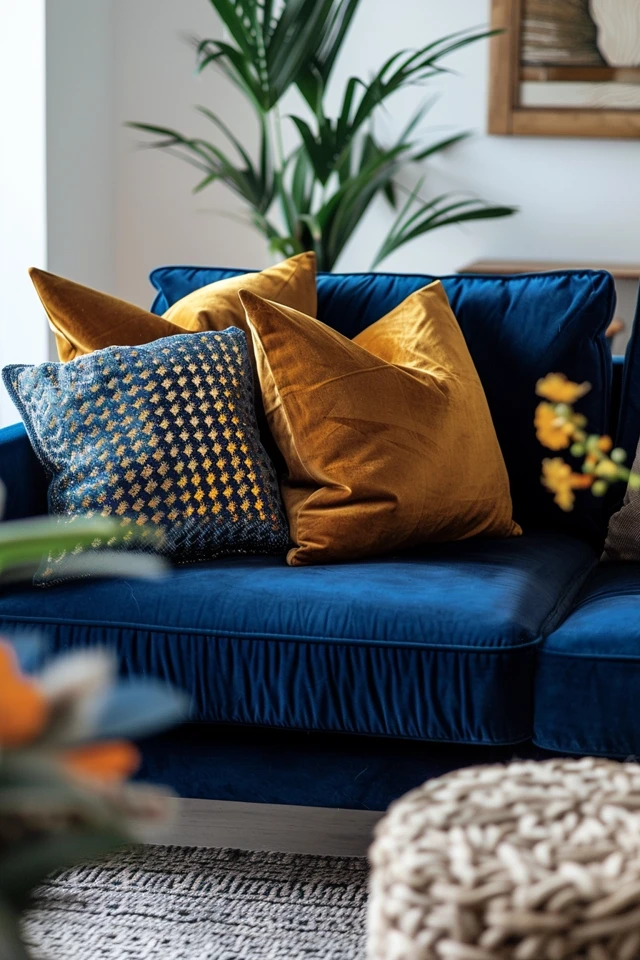
However, this color combination requires a delicate hand to keep it from looking like a sports team mascot or a dark cave. If you are looking for visual inspiration, you can visit the Picture Gallery at the end of the blog post. It takes more than just buying a blue sofa and a gold lamp to make this aesthetic work cohesively.
In this guide, I am going to walk you through the practical steps of designing this look. We will cover paint undertones, metal finishes, lighting constraints, and the specific measurements you need to make the room flow. Whether you are doing a full renovation or a weekend refresh, these tips will keep your project on track.
1. Establishing the Foundation: Paint and Undertones
The success of a navy and gold room starts with the walls. If you choose the wrong navy, your room might end up looking purple or teal once the sun hits it. Paint colors are rarely “pure,” and navy blue is notorious for having strong undertones.
When selecting your paint, you must sample it on all four walls. Observe the color in the morning, afternoon, and evening artificial light. I always recommend painting a large 2×2 foot swatch rather than a tiny patch.
Here is the rule of thumb for undertones:
- If your room faces north: The light will be cool and blue. You need a navy with slightly warmer (red or violet) undertones to prevent the room from feeling icy.
- If your room faces south: You get warm, intense light. You can get away with a truer, deep navy or even one with slight gray undertones to cool it down.
- If you have limited natural light: Pay attention to the Light Reflectance Value (LRV). For a moody room, an LRV between 5 and 10 is the sweet spot. Anything lower might look like black.
Designer’s Note: The Finish Matters
A common mistake I see homeowners make is choosing the wrong sheen for dark colors. Dark walls show every imperfection in the drywall. If you use a semi-gloss or satin finish, you will see every bump and roller mark.
For navy walls, I almost exclusively use a matte or flat finish. This creates a velvety, rich texture that absorbs light rather than reflecting it. If you have kids or pets and are worried about washability, look for “scuff-X” or washable matte formulas. They offer the durability of an eggshell finish without the shine.
What about the trim?
You have two main options here. You can paint the trim crisp white for a traditional, nautical look. Or, for a more modern and seamless appearance, paint the baseboards, crown molding, and door frames the exact same navy as the walls but in a satin finish. This technique, known as color drenching, makes ceilings feel higher and the room feel more expansive.
2. The Golden Rule of Metals
Gold is not a single color. In the design world, “gold” can range from a bright, lacquered yellow-gold to a deep, antique bronze. Mixing these haphazardly is the quickest way to make a room look cheap.
For a navy living room, I strongly prefer brushed brass or unlacquered brass over shiny, polished gold. Polished gold can sometimes look plastic against a dark background. Brushed finishes have a warmth and texture that feels more organic and high-end.
Mixing Metals
You do not have to stick to gold exclusively. In fact, using 100% gold hardware, legs, and lamps can look a bit intense. I like to follow the 80/20 rule for metals. Make 80% of your metal finishes gold (or brass) and 20% matte black.
Matte black acts as a grounding agent. It creates a bridge between the deep navy and the bright gold. For example, you might have a brass chandelier and brass curtain rods, but choose a side table with matte black legs.
Hardware and Fixtures Checklist:
- Curtain Rods: If your walls are navy, a brushed gold rod draws the eye up and frames the window beautifully.
- Cabinet Pulls: If you have built-ins, swap standard knobs for knurled brass hardware. The texture adds a tactile luxury.
- Picture Frames: Thin gold gallery frames pop incredibly well against dark blue paint. Keep the frames thin to avoid overwhelming the art.
3. Furniture Selection and Material Balance
Navy and gold is a heavy, dramatic palette. To prevent the room from feeling suffocating, you need to introduce materials that offer relief and contrast. If you have navy walls and a navy velvet sofa, the sofa will disappear into the background.
The Sofa Strategy
If you are renting and cannot paint the walls, a navy blue velvet sofa is your best friend. It brings the color story in without the commitment. However, if your walls are already navy, I recommend choosing a sofa in a contrasting neutral.
A cognac leather sofa is a classic partner for navy walls. The orange undertones in the leather sit opposite blue on the color wheel, creating a perfect complementary vibration. Alternatively, a performance linen sofa in oatmeal or light gray creates a fresh, airy contrast.
Wood Tones
Wood brings warmth that paint and metal cannot. With navy and gold, walnut is the superior wood choice. The richness of walnut holds its own against the dark paint. Oak can sometimes look too yellow or washed out unless it is a very specific white oak tone.
Rug Sizing and Selection
In a dark room, the floor is your biggest opportunity to reflect light. I usually steer clients toward lighter rugs in this aesthetic. A cream wool rug with a subtle gray pattern works wonders to brighten the space.
Rug Rules of Thumb:
- Size Matters: The biggest error is a rug that is too small. In a living room, at least the front two feet of all your furniture pieces should sit on the rug.
- Clearance: Leave about 12 to 18 inches of bare floor visible around the perimeter of the room. This looks intentional, not like wall-to-wall carpeting.
- Durability: If you choose a light rug to contrast the navy, ensure it is a material that cleans well. Wool is naturally stain-resistant. If you have pets, consider a high-quality polypropylene blend that looks like wool but can be hosed down.
4. Lighting Design for Dark Interiors
Lighting is the most critical functional element in a navy room. Dark walls absorb light, meaning a single overhead bulb will leave the corners of the room in shadow, making the space feel gloomy rather than cozy.
You need to create layers of light. I aim for three distinct sources of light in any living room, but in a dark room, I often aim for four or five.
Kelvin Temperature
Before you buy a single lamp, check your lightbulbs. For a navy and gold room, you want a Kelvin temperature between 2700K and 3000K.
- 2700K: Warm and cozy, enhances the gold tones.
- 3000K: Crisp and neutral, keeps the navy looking true blue.
- 4000K+: Avoid this. It will make your navy walls look flat and harsh, like a dentist’s office.
Layering Plan
1. Ambient: This is your overhead fixture. A gold sputnik chandelier or a brass drum shade works well here. Ensure the bottom of the fixture is at least 7 feet off the floor if people walk under it.
2. Task: Floor lamps near reading chairs. A gold pharmaceutical floor lamp is a stylish, functional choice.
3. Accent: This is where the magic happens. Picture lights mounted above artwork add a gallery feel. Sconces (even plug-in ones) flank a sofa beautifully.
4. Fill: Table lamps on side tables or consoles. Use shades lined with gold foil for a warm, reflected glow, or crisp white linen shades to diffuse maximum light.
5. Layout and Spacing Guidelines
Even the most beautiful colors will fail if the room feels cramped. Good design is largely about mathematics and flow. When arranging your navy and gold furniture, keep these measurements in mind.
Walkways
Traffic paths should be clear. You need a minimum of 30 inches to walk comfortably between furniture pieces, though 36 inches is ideal. In a dark room, clutter feels more oppressive, so maintaining these clear paths is vital for visual breathing room.
The Coffee Table
The distance between the edge of your sofa and the coffee table should be between 14 and 18 inches. This is close enough to set down a drink but far enough to preserve legroom.
If you choose a glass-top coffee table with a gold base, it will help the room feel larger because it takes up less “visual weight.” If you have a large navy room, a solid wood or marble block table can help ground the space.
Curtain Placement
To maximize light, hang your curtain rod high and wide.
- Height: Mount the rod 4 to 6 inches above the window frame, or all the way to the ceiling molding.
- Width: Extend the rod 8 to 12 inches past the window frame on each side. When the curtains are open, they should rest against the wall, not cover the glass. This lets every bit of natural light pour in.
Designer’s Note: The “Too Much Gold” Trap
I recently consulted on a room where the client had gold legs on the sofa, a gold coffee table, gold side tables, and gold lamps. It looked chaotic.
If your coffee table has a heavy gold base, choose side tables made of wood or stone. If your lamps are heavy on brass, perhaps your coffee table should be wood. Distribute the gold accents in a triangle around the room so the eye moves around the space, rather than clustering everything in one spot.
Final Checklist: The “What I’d Do” Summary
If I were stepping into your home today to execute this design, here is the checklist I would run through to ensure we are on the right track:
- Test the paint: I have painted a 2×2 swatch on two different walls and checked it at night.
- Check the finishes: I have confirmed my metal finishes are consistent (mostly brushed brass) and not clashing.
- Verify the rug size: The rug is large enough to slide under the front legs of the sofa and chairs.
- Lighting audit: I have at least three sources of light, and the bulbs are 2700K-3000K.
- Texture check: I have included at least one natural element (wood, leather, stone) to warm up the blue and gold.
- Edit accessories: I have removed clutter. Navy rooms look best with curated, larger decor pieces rather than many small trinkets.
Frequently Asked Questions
Can I use navy blue in a small living room?
Absolutely. It is a myth that dark colors make small rooms look smaller. In reality, dark colors blur the edges and corners of a room, creating an illusion of depth. It can make a small room feel infinite and cozy, rather than cramped. Just ensure your lighting is on point.
Is this color combination kid-friendly?
Navy is one of the most forgiving colors for families. It hides denim transfer, pen marks, and general grime much better than beige. However, be careful with the gold. Plated gold can scratch. I suggest “living finishes” or solid brass hardware that develops a patina over time, as it handles wear and tear better than cheap plating.
What other accent colors work with navy and gold?
If you want to add a third color, look to nature. Deep forest green looks luxurious. Burnt orange or rust provides a high-energy pop. Dusty pink or blush creates a softer, more feminine vibe. Stick to the 60-30-10 rule: 60% Navy, 30% Neutral/Gold, 10% Accent Color.
How do I keep the room from feeling cold?
Texture is the answer. Use velvet pillows, chunky knit throws, leather accents, and natural wood. Avoid using too many sleek, cold surfaces like glass, acrylic, or chrome. The tactile elements add the physical warmth the color palette might lack.
Conclusion
Designing a living room with navy blue and gold is a bold choice that pays off immensely when done correctly. It signals confidence and an appreciation for classic aesthetics. The key is to respect the power of the dark paint by balancing it with warm metals, appropriate lighting, and varying textures.
Don’t be afraid to commit to the look. The most common regret I hear from clients isn’t that they went too dark, but that they didn’t go dark enough or stopped halfway. Trust your measurements, sample your paints, and enjoy the process of creating a space that feels truly sophisticated.
Picture Gallery


