
Elevate Your Space: Vertical Shower Accent Tile Ideas
Designing a bathroom often feels like a puzzle where functionality fights with aesthetics. You want a space that feels expansive and luxurious, but you are often working with tight square footage and standard ceiling heights. This is where the vertical shower accent tile becomes your secret weapon.
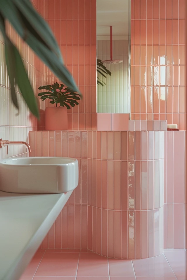
Think of a vertical accent strip as the architectural equivalent of wearing pinstripes or high heels. It draws the eye upward, instantly tricking the brain into perceiving higher ceilings and a grander sense of space. If you need immediate visual inspiration, you can find our curated Picture Gallery at the end of this blog post.
In my years designing residential baths, I have found that a well-placed vertical tile feature offers the highest return on investment for visual impact. It allows you to introduce expensive materials—like mother-of-pearl or high-end marble—without blowing the budget on the entire room. Let’s dive into how to execute this look like a pro.
Why Choose a Vertical Layout?
The primary reason we choose vertical accents over horizontal bands is optical height manipulation. Most standard bathrooms have 8-foot ceilings, which can feel oppressive once you add a tub, a vanity, and shower glass. A vertical line cuts through the visual “noise” and creates a lift.
Beyond the height illusion, vertical accents feel inherently more modern. Horizontal bands, often called “borders” or “listellos,” were ubiquitous in the 1990s and early 2000s. While they have their place, they tend to chop the room in half visually.
A floor-to-ceiling vertical stripe provides a clean, uninterrupted focal point. It serves as an anchor for the eye. This is particularly effective in small shower stalls where you need to create a sense of depth without cluttering the walls with decor.
Placement Strategies: Where the Line Goes Matters
The most common question clients ask me is, “Where exactly should the stripe go?” You cannot just slap it on a wall randomly. It needs to relate to the architecture or the plumbing fixtures.
The Waterfall Effect (Centered on Fixtures)
This is the most classic approach. You align the vertical accent tile directly behind the showerhead and control valve. This highlights the “business” end of the shower and creates a dedicated zone for water flow.
Ideally, the width of this accent should be substantial enough to frame the fixtures. I usually recommend a width of 12 to 18 inches. If your shower control plate is 7 inches wide, a 4-inch strip of tile will look anemic and unplanned.
The Off-Center Balance
Sometimes, centering the tile on the fixtures isn’t possible due to stud placement or plumbing constraints. In these cases, use the Rule of Thirds. Place the vertical accent on the opposing wall or off-center to balance the visual weight of the shower door.
If you have a built-in bench, running the vertical accent down the wall and across the bench seat creates a stunning “waterfall” visual. This connects the vertical and horizontal planes beautifully.
The Niche Integration
If you are framing out a shampoo niche, consider running your vertical accent right through it. This creates a seamless look.
However, this requires precise math. You want the niche to be exactly the width of your accent strip or perfectly centered within it. A typical niche is 12 inches high by 24 inches wide, but for a vertical accent, a tall, narrow niche often looks better.
Material Selection and Scale
Selecting the right material for your accent is about contrast. If your main field tile is a simple white subway or large-format porcelain, your accent needs to bring texture or color variation.
Glass Mosaics
Glass reflects light, which adds brightness to a dark shower. Vertical linear mosaics are popular, but be careful with “busy” patterns. If the mix has too many colors, it can look dated quickly. Stick to tone-on-tone blends.
Natural Stone
Marble, traverse, or pebble tiles add organic warmth. I love using a herringbone marble mosaic as a vertical strip. It adds a geometric complexity that contrasts nicely with rectangular field tiles.
Textured Porcelain
3D or “fluted” tiles are currently having a major moment in design. A vertical strip of fluted tile in the same color as the surrounding wall adds depth without visual chaos. This is perfect for a minimalist “spa” aesthetic.
Designer’s Note: The “Lippage” Lesson
Here is a lesson I learned the hard way on one of my first projects.
The Lesson:
I specified a thick, handmade ceramic field tile (about 3/8″ thick) and paired it with a thin glass mosaic accent (about 1/8″ thick).
The Problem:
When the contractor installed them, the glass mosaic sat much deeper in the wall than the surrounding tile. It looked like a mistake, and the sharp edges of the thick tile were exposed.
The Fix:
Always check the thickness (gauge) of your materials. If your accent tile is thinner than your main tile, your installer must “build out” the substrate with extra thinset or a backer board shim to make the faces flush.
Coordinating With Field Tile
Your accent tile does not live in a vacuum. It must play nice with the “field tile”—the tile covering the rest of the shower walls.
The 70/30 Rule
Think of the shower surface area. Roughly 70% to 80% should be your neutral field tile. The accent should take up no more than 20% to 30%. Any more than that, and you lose the “accent” effect; it just becomes a busy wall.
Transition Profiles
How you transition between the accent and the main tile defines the quality of the finish. Do not rely on grout to fill the gap.
Use metal edging profiles (like Schluter strips) in a finish that matches your plumbing fixtures. If you have matte black faucets, use a matte black metal edge profile. This creates a crisp, intentional frame around your vertical strip.
Budget and Installation Tips
Vertical accents can actually save you money if planned correctly. By using a very expensive tile only in a narrow 12-inch strip, you get the luxury look for a fraction of the cost.
However, installation labor may increase. Vertical layouts often require more cuts, especially if the accent falls in the middle of a wall rather than starting at a natural grout line of the field tile.
Calculate for Waste
When ordering accent tile, the standard “10% overage” rule might not be enough. Because the strip is narrow, you might end up with a lot of unusable scraps.
I recommend ordering 15% to 20% extra for accent tiles. It is better to have a leftover box for future repairs than to run short and find out the dye lot has changed.
Grout Lines Matter
If your field tile has a 1/16-inch grout line, try to match that spacing in your accent tile. Drastically different grout line widths can make the installation look messy.
Common Mistakes + Fixes
Mistake 1: Stopping Short of the Ceiling
Many homeowners stop the tile at the shower head height (roughly 7 feet) while the ceiling is at 8 or 9 feet.
The Fix:
Always run your vertical accent tile all the way to the ceiling line or crown molding. Stopping short creates a visual “stump” that ruins the height illusion.
Mistake 2: Ignoring the Floor
Choosing an accent wall tile that clashes with the shower pan floor.
The Fix:
The safest bet is to use the same mosaic from your vertical accent on the shower floor. This creates a “waterfall” effect where the wall tile spills onto the floor, connecting the surfaces.
Mistake 3: The “Sliver” Cut
Planning the layout so that you end up with a tiny, 1-inch sliver of field tile right next to your accent strip.
The Fix:
Dry lay your tiles on the floor before installation. Adjust the width of the accent or the starting point of the field tile to ensure you have substantial tile pieces on both sides of the strip.
What I’d Do in a Real Project: A Mini Checklist
If I were designing your bathroom today, this is the exact workflow I would follow:
- Step 1: Determine the Focal Point. I would stand at the bathroom door. What is the first wall I see? That is where the vertical accent belongs.
- Step 2: Check the Plumbing Center. I would measure exactly where the shower valve and head are located. If they aren’t perfectly centered on the wall, I would widen the accent strip so the fixtures still fall within it comfortably.
- Step 3: Select the Metal Edge. I would buy a sample of the metal transition strip and hold it against the faucet finish to ensure they don’t clash.
- Step 4: Lighting Check. I would ensure there is a recessed light or sconce positioned to wash light down the face of the accent tile. Texture without light looks flat.
Final Checklist
Before you grout that first tile, run through this final list:
- Height: Does the design go floor-to-ceiling?
- Thickness: Is the accent tile flush with the field tile?
- Waterproofing: Is the niche fully waterproofed before tile goes in?
- Scale: Is the strip wide enough (min 12 inches) to make an impact?
- Color: Did you check the tile color in the room’s actual lighting (not just the showroom)?
FAQs
Does vertical tile make a shower look bigger?
Yes. Vertical lines draw the eye upward to the ceiling. This reduces the feeling of being in a box and enhances the perceived volume of the room.
Can I use peel-and-stick tile for a shower accent?
Generally, no. Showers are high-moisture environments. Even “water-resistant” peel-and-stick products often fail in direct wet zones. Stick to porcelain, ceramic, glass, or sealed natural stone set with thinset mortar.
How wide should a vertical accent strip be?
There is no hard rule, but strictly aesthetically, I prefer between 12 and 18 inches. Anything narrower than 6 inches looks like an afterthought. Anything wider than 24 inches starts to look like a feature wall rather than an accent strip.
Should the accent tile be lighter or darker than the main tile?
Both work, but they achieve different things. A darker accent adds depth and drama. A lighter accent (or one with glass/shimmer) adds brightness and airiness. Choose based on how much natural light the room receives.
Conclusion
A vertical shower accent is more than just a decorative choice; it is a structural design tool. It organizes the visual elements of your bathroom, corrects perceived proportions, and offers a canvas for personal expression.
By paying attention to the technical details—like tile thickness, transition profiles, and proper placement relative to fixtures—you can achieve a look that feels custom and high-end. Remember to measure twice, account for waste, and always respect the lighting in the room.
With these guidelines, you are ready to transform a standard daily shower into an elevated experience.
Picture Gallery


