
Title: Elevate Your Space with Chair Rail Paint Ideas
Introduction
Chair rails are often dismissed as a dated architectural feature found in dusty dining rooms, but they are actually one of the most versatile tools in a designer’s arsenal. When utilized correctly, this simple strip of molding allows you to manipulate the visual proportions of a room, add architectural weight to a bland box, or introduce bold color without overwhelming the space. If you are looking for visual inspiration, please note that there is a curated Picture Gallery at the end of the blog post.
I remember walking into a client’s colonial-style home in Connecticut where they were desperate to rip out the existing woodwork to make the house feel “modern.” Instead of demo, I convinced them to keep the chair rail but change the paint strategy from a traditional white-on-yellow to a moody, monochromatic color drench in slate blue. The result transformed the room from grandmotherly to high-end boutique hotel, all for the cost of a few gallons of paint.
Whether you are dealing with existing trim or installing new molding, the paint application dictates the vibe. This guide will walk you through professional strategies to elevate your home using chair rails, covering everything from sheen selection to spatial perception.
1. The Classic Split: Anchoring the Room with Two-Tone Walls
The most common application for a chair rail is separating two distinct wall colors. However, doing this successfully requires an understanding of visual weight.
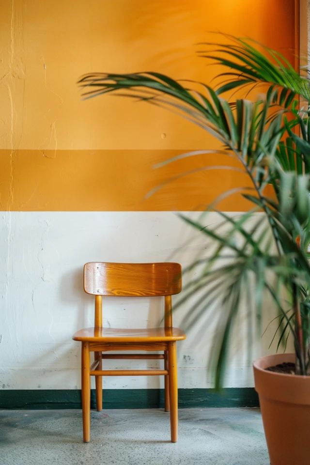
Dark Bottom, Light Top
This is the safest and most functional approach. By placing a heavier, darker color below the rail (wainscoting area) and a lighter color above, you “ground” the room. This mimics the natural world, where the earth is darker than the sky, creating a subconscious sense of stability.
From a practical standpoint, this is ideal for high-traffic areas like hallways, entryways, and dining rooms. Darker colors like charcoal, navy, or forest green hide scuff marks from shoes, vacuums, and dining chairs much better than white paint.
Light Bottom, Dark Top
Flipping the script creates a more intimate, cozy atmosphere. Painting the upper section a deep, rich hue brings the ceiling down visually, which is excellent for rooms with uncomfortably high ceilings or spaces intended for evening use, like a formal living room or den.
Designer’s Note: Handling the Rail Color
When doing a two-tone wall, the biggest question is: what color do I paint the rail itself?
- The Traditional Route: Paint the rail the same white or neutral as your baseboards and crown molding. This creates a crisp graphic line that clearly defines the separation.
- The Integrated Route: Paint the rail the same color as the bottom section. This effectively raises the height of your wainscoting visually and looks much more custom and built-in.
2. Monochromatic Styling and Color Drenching
If you want a modern look, forget about contrasting colors entirely. Color drenching is a technique where we paint the walls, the chair rail, the baseboards, and sometimes even the door casings the exact same color.
This technique instantly updates dated molding. When the chair rail blends into the wall, it becomes a textural element rather than a graphic divider. This adds depth and shadow without breaking up the vertical lines of the room.
Why this works for small spaces:
Breaking a room in half with a horizontal line stops the eye and can make a room feel smaller or shorter. By painting everything one color, the eye travels uninterrupted from floor to ceiling.
Suggested Colors for Drenching:
- Warm Greige (e.g., Benjamin Moore Revere Pewter): Creates a soft, enveloping feel without being too dark.
- Deep Olive: Adds a nature-inspired sophistication that pairs beautifully with wood furniture.
- Terracotta or Clay: brings warmth and energy, turning the molding into a subtle shadow line.
Common Mistakes + Fixes
Mistake: Using the exact same sheen for everything in a monochromatic room.
Fix: Even if the color is the same, vary the finish. Use eggshell or matte on the drywall surfaces, but switch to satin or semi-gloss for the chair rail and trim. This subtle contrast highlights the architecture and makes the trim easier to clean.
3. Mastering Sheen and Finish Durability
Choosing the right paint finish is just as important as choosing the color. Chair rails exist to protect the wall from chairs—hence the name. They take a beating.
The Rule of Durability
For the chair rail itself, you need a hard, durable finish. I almost exclusively specify a Satin or Semi-Gloss finish for chair rails.
- Satin: Offers a soft glow. It is forgiving of minor surface imperfections in the wood but is scrubbable. This is my go-to for modern or transitional homes.
- Semi-Gloss: Reflects more light and is highly durable. It creates a more traditional, “crisp” look.
- High-Gloss: A bold design choice. It creates a glass-like finish that highlights the curves of the molding. However, prep work must be perfect, as gloss shows every dent and scratch.
Mixing Sheens for Impact
A sophisticated way to use paint is to keep the color identical above and below the rail but change the sheen.
Try painting the wall above the rail in a Flat/Matte finish, and the wall below the rail (and the rail itself) in Semi-Gloss. This mimics the look of expensive lacquered woodwork or wainscoting without the cost of installing paneling. It adds a subtle, luxurious layer of texture to the room.
4. Proportions and Placement: The Technical Rules
Before you dip your brush, you must ensure the chair rail is positioned correctly. If you are painting existing rail, you have to work with what you have, but if you are installing or moving rail, you must follow the rule of thirds.
The Height Rule
A common amateur mistake is placing the chair rail too high. It should never split the wall perfectly in half (e.g., 4 feet up on an 8-foot wall). This makes the ceiling feel low and the room feel static.
The Golden Ratio:
Ideally, the chair rail should sit at roughly the bottom third of the wall height.
- 8-foot ceilings: Install between 30 and 32 inches from the floor.
- 9-foot ceilings: Install between 32 and 36 inches from the floor.
- 10-foot+ ceilings: You can push to 38-40 inches, but be careful not to lose the human scale.
What I’d Do in a Real Project: The Dining Room Test
When laying out a dining room, I always measure the backs of the client’s specific dining chairs. The chair rail should ideally sit slightly lower than the top of the chair back, or exactly at the point where the chair would contact the wall. If the rail is floating way above the chairs, it looks disconnected.
5. Creative Applications: Wallpaper and Accent Rails
Chair rails are the perfect boundary line for mixing materials. One of my favorite high-impact, low-effort designs involves wallpaper.
Pattern on Top, Solid on Bottom
Installing a busy, colorful wallpaper above the chair rail and painting the bottom section a solid color is a classic move. It prevents a bold pattern from overwhelming the room.
The trick to cohesion:
Pull a specific color from the wallpaper pattern and color-match your paint for the bottom section and the rail. Do not just use generic white. If the wallpaper has a small emerald green leaf, paint the wainscoting emerald green. This anchors the pattern and makes the design feel intentional.
The “Contrast Rail” Trend
For a quirky or industrial look, try painting the chair rail a high-contrast color that is different from both the top and bottom walls.
- Example: White walls on top and bottom, but a matte black chair rail. This creates a sharp, graphic “stripe” around the room.
- Example: Pale blue walls with a neon red or bright orange chair rail in a kid’s room.
Renter-Friendly Solutions
If you are renting and cannot paint the trim, focus on the wall space. Use removable wallpaper above the rail and leave the wall below neutral. This draws the eye up and away from generic beige landlord trim.
Final Checklist: Before You Paint
Here is the exact mental checklist I run through before finalizing a paint plan for a room with chair rails.
- Check the Condition: Is the current paint oil-based or latex? If the old trim has a shiny, oil-based finish, you cannot paint latex directly over it without sanding and a high-bond primer. If you skip this, the paint will peel off in sheets.
- Caulk lines: Are there gaps between the rail and the wall? Run a bead of paintable acrylic latex caulk along the top and bottom edge of the rail for a seamless look. This makes the difference between a DIY look and a pro finish.
- Lighting check: Test your paint samples above and below the rail. Light hits the upper wall differently than the lower wall. The same gray might look blue at eye level and muddy near the floor.
- Furniture Height: Measure your console tables and sofa backs. Ensure the rail doesn’t awkwardly intersect with your key furniture pieces.
- Sample the Sheen: Buy a quart of the satin and semi-gloss to test. Sometimes “Satin” in one brand is dull, while in another it is quite shiny.
FAQs
Q: Can I paint the chair rail a darker color than the walls?
A: Absolutely. This creates a “picture frame” effect. It works particularly well in historic homes or when trying to highlight intricate woodwork profiles. A dark gray rail on creamy white walls looks very architectural.
Q: Should the chair rail match the crown molding and baseboards?
A: In traditional design, yes. Keeping all trim (crown, rail, base) the same color unifies the space. However, in modern design, you can break this rule. You might paint the baseboards and rail a dark color to match the floor or lower wall, while keeping the crown molding white to match the ceiling.
Q: How do I paint chair rails without getting paint on the wall?
A: Use high-quality painter’s tape (like FrogTape) and press the edges down firmly with a putty knife or credit card to prevent bleed. Alternatively, use a high-quality angled sash brush (2 inch or 2.5 inch) and practice “cutting in” by hand. I prefer cutting in by hand as it leaves a smoother edge once you master the technique.
Q: Does a chair rail make a room look smaller?
A: It can if the contrast is too harsh or the placement is too high. High contrast (like black and white) cuts the visual height. To prevent the room from shrinking, keep the tonal difference between the top and bottom sections subtle, or use the “monochromatic drenching” technique mentioned earlier.
Conclusion
Chair rails are far more than just wall bumpers; they are architectural tools that define the scale and mood of a room. Whether you choose to highlight them with contrasting colors, hide them with monochromatic drenching, or use them as a bridge between wallpaper and paint, the possibilities are vast.
The key to a professional finish lies in the preparation and the proportions. Respect the architecture of the room, choose the right sheen for durability, and don’t be afraid to step away from the standard white-trim-on-colored-walls approach. By treating your molding as a deliberate design element, you can elevate your space from standard builder-grade to a custom, curated home.
Picture Gallery


