
Expressive Sad Painting Ideas for Artistic Souls
Art is rarely about matching the sofa perfectly. It is about provoking an emotion, capturing a memory, or setting a specific atmospheric tone in a room. While many homeowners gravitate toward bright landscapes or cheerful abstracts, there is a profound beauty in “sad” or melancholic art.
I often tell my clients that a home needs shadow just as much as it needs light to feel grounded. Expressive, moody paintings bring depth and sophistication that happy-go-lucky prints simply cannot achieve. They invite contemplation and create a focal point that feels personal and lived-in.
Whether you are an artist looking for inspiration to paint, or a collector looking to style a moody piece, this guide covers the practical side of emotive art. If you are looking for visual inspiration, make sure to check out the curated Picture Gallery at the end of this blog post.
1. The Spectrum of Melancholy: Choosing Your Subject
When we talk about “sad” paintings in interior design, we aren’t necessarily talking about depressing imagery. We are looking for “emotive weight.” This distinction is crucial for keeping your home feeling like a sanctuary rather than a dungeon. The goal is to evoke solitude, reflection, or quiet beauty.
Abstract Expressionism
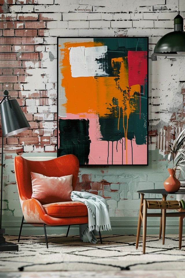
Abstracts are often the safest and most versatile entry point for moody art. Think of Mark Rothko’s darker color field paintings. You don’t need a literal subject to convey sadness. Look for canvases that utilize heavy, chaotic brushstrokes or, conversely, vast empty spaces of color.
In a modern living room, a large-scale abstract using charcoal, deep indigo, or muddied violet acts as an anchor. It doesn’t tell a specific story, which allows the viewer to project their own emotions onto it. This prevents the art from feeling “stale” over time.
Figurative Solitude
Another powerful direction is the “lonely figure.” This could be a silhouette walking in the rain, a person sitting by a window, or a portrait where the subject looks away from the viewer.
From a design perspective, these pieces work best in intimate spaces. I love placing figurative, melancholic art in reading nooks, home offices, or bedroom corners. These are spaces designed for privacy, making them the perfect context for art that depicts solitude.
Atmospheric Landscapes
Nature has a way of capturing sadness beautifully. Stormy seas, fog-covered forests, or barren winter fields are classic choices. These pieces bridge the gap between traditional landscape design and emotional expression.
If you are painting this yourself or commissioning a piece, focus on the horizon line. A low horizon line with a massive, heavy sky can feel oppressive (in a good, artistic way), while a high horizon line focuses on the texture of the earth.
2. Color Palettes and Texture: The Designer’s Toolkit
The success of a moody painting relies heavily on the color palette. As a designer, I avoid “pure” colors when aiming for a sophisticated, sad aesthetic. You want colors that have been “greyed down” or muddied.
The Power of Grey Undertones
Bright blue is happy; slate blue is contemplative. Bright yellow is energetic; ochre is nostalgic. When selecting or creating art, look for complex hues.
- Desaturated Greens: Think dried moss or sage. These connect to nature but feel dormant.
- Inky Blues: Navy and midnight blue are inherently calming and deep.
- Warm Greys: Avoid sterile, cool greys. Warm greys (greige) feel more like an old memory.
Texture is Mandatory
In high-end design, texture is the secret ingredient that prevents dark art from looking flat. A “sad” painting that is completely smooth can sometimes look like a poster.
Look for impasto techniques where the paint is applied thickly. The ridges in the paint catch shadows, adding literal darkness to the metaphorical darkness of the piece. If you are creating the art, try mixing sand or modeling paste into your acrylics.
Designer’s Note:
A lesson from a past project: I once had a client who bought a very expensive, very dark, smooth oil painting. We hung it on a matte dark wall. It completely disappeared. It looked like a hole in the room.
The Fix: We reframed it in a thick, gold-leaf floater frame and moved it to a wall with Venetian plaster. The contrast in texture (smooth paint vs. textured wall) saved the installation.
3. Scale and Placement: Rules of Thumb
Nothing ruins the emotional impact of a painting faster than poor placement. If a painting is meant to be sad and intimate, hanging it too high or too small makes it look apologetic.
The Eye-Level Rule
The center of your artwork should be 57 to 60 inches from the floor. This is the gallery standard. For moody art, I actually prefer leaning toward 57 inches. A slightly lower placement feels more grounded and invites the viewer to step closer.
Furniture Relationships
If you are hanging an expressive piece above a sofa or console table, the artwork should span roughly 2/3 to 3/4 the width of the furniture below it.
- Example: If your sofa is 84 inches wide, your art (or group of art) should be roughly 56 to 63 inches wide.
- Spacing: Leave 4 to 8 inches between the bottom of the frame and the top of the sofa back. Any higher, and the art feels like it is floating away.
The “Leaning” Look
For a casual, artist-studio vibe, skip the hammer and nails. Large, melancholy paintings look incredible leaned against a wall, sitting on the floor, or propped up on a mantel.
This technique is particularly great for renters who cannot drill holes. It also adds a layer of “undone” elegance that suits the sad aesthetic. If you lean art on the floor, ensure it is at least 30 inches tall so it doesn’t look like clutter.
4. Lighting: Bringing Shadows to Life
Lighting is the most critical technical element when dealing with darker, moodier art. Dark paint absorbs light, meaning a sad painting will look like a black blob after sunset if you don’t light it correctly.
Color Temperature Matters
You must match the lighting temperature to the art.
- 3000K (Warm White): Best for paintings with earth tones, ochres, and reds. It enhances the warmth.
- 4000K (Neutral White): Better for blues, greys, and high-contrast black and white pieces. It keeps the whites crisp.
Avoid 5000K (Daylight) bulbs in residential settings; they are too clinical and will make moody art look harsh.
The Picture Light
For the most elevated look, install a picture light above the frame.
- Size: The light should be about 1/2 the width of the picture (frame included).
- Placement: Mount it centered above the frame. If the painting is very tall (over 40 inches), ensure the light arm extends far enough out to cast light down the center, not just on the top edge.
Common Mistakes + Fixes
Mistake: Relying on ceiling recessed cans (pot lights) to light art.
Fix: Ceiling cans cast shadows from the frame onto the canvas. Instead, use a directional gimbal light in the ceiling specifically aimed at the art, or use a wireless, battery-operated picture light if you don’t have hardwiring.
5. Integrating Melancholy into the Room Design
Once you have your expressive painting, how do you style the rest of the room so it doesn’t feel like a haunted house? It is all about balance.
Balance with Warmth
If you hang a large, sad, grey painting, balance it with warm materials elsewhere in the room. Use walnut wood tones, unlacquered brass hardware, or cognac leather. The warmth of the materials counteracts the coolness of the art.
Soft Textiles
Melancholic art often feels “hard” or “heavy.” Soften the room with plush textiles.
- Velvet: A velvet sofa in a jewel tone creates a luxurious, moody vibe that complements the art.
- Wool/Boucle: Nubby textures add coziness. A chunky knit throw blanket nearby tells the subconscious that the room is safe and warm, even if the art is sad.
Wall Color Integration
Do not feel pressured to paint your walls white. In fact, moody art often looks better on mid-tone walls.
- Tone-on-Tone: If your painting is primarily dark blue, try a wall color that is a lighter, dustier version of that blue. This creates an immersive experience.
- Dark on Dark: Placing a dark painting on a charcoal or black wall is a bold, dramatic move. To make this work, the frame must be contrasting (gold or light wood) to separate the art from the wall.
“What I’d Do in a Real Project” Checklist
If I were styling a room specifically around a piece of expressive, sad art today, here is the exact workflow I would follow:
1. Assess the Lighting First
Before I even hammer a nail, I check the light. Is there direct UV sunlight that will fade the paint? If yes, I move the spot. Is there an outlet nearby for a plug-in art light?
2. Select the Frame
For sad art, I usually avoid standard black frames.
- Option A: A raw oak floater frame. The natural wood adds organic warmth to a sad subject.
- Option B: A vintage, ornate gold frame. This adds a sense of history and romance.
3. Measure the Sightline
I stand where the client will mostly stand (or sit). I adjust the height so the art connects with the viewer’s gaze naturally.
4. Anchor the Piece
I never let the art float alone on a giant wall. I anchor it with a console table, a bench, or a pair of sconces on either side. This creates a vignette rather than just a hanging object.
5. Check the Reflection
I stand at different angles to ensure overhead lights aren’t creating a glare on the dark paint. If they are, I tilt the painting slightly forward at the top (using a felt bumper behind the top of the frame).
FAQs
Is “sad” art bad for Feng Shui?
Not necessarily. In Feng Shui, art represents energy. While you might want to avoid violent or chaotic imagery in the bedroom (which should be for rest), melancholic art that depicts water or quietude can be very grounding. It depends on the specific emotion the piece evokes for you.
Can I mix sad art with happy family photos?
I generally advise separating them by zones. Keep the hallway or family room for lively family photos. Use the living room, office, or dining room for moodier, artistic pieces. Mixing them on the same gallery wall can send conflicting visual signals.
What if my room is small? Can I still use dark art?
Absolutely. In a small powder room or entry, a massive dark painting can create a “jewelry box” effect. It adds grandeur. Don’t be afraid of large scale in small spaces; lots of tiny art creates clutter, but one large piece creates impact.
How do I clean textured oil paintings?
Never use water or cleaning sprays. For textured, moody art, dust can settle in the ridges. Use a soft, natural artist paintbrush (clean and dry) to gently dust inside the crevices. Do not use a feather duster, as the quills can scratch the paint.
Conclusion
Embracing expressive, sad painting ideas for your home is a sign of design maturity. It shows that you value the full spectrum of human emotion, not just the surface-level highs. A home that allows for shadow, reflection, and quiet beauty is a home that truly supports the soul.
Remember that the goal is not to bring the mood down, but to add depth. By paying attention to lighting, scale, and texture, you can turn a melancholic canvas into the most stunning feature of your home. Trust your gut—if a piece moves you, there is a place for it.
Picture Gallery


