
Fresh Green Kitchen Backsplash Ideas to Inspire
Green is often considered nature’s neutral, and it has finally claimed its rightful place in kitchen design. Whether you are craving the moody drama of deep emerald or the calming whisper of soft sage, a green backsplash can ground your space unlike any other color. To spark your imagination, I have curated a stunning Picture Gallery at the end of the blog post with real-world examples.
I remember a project last year where the homeowner was terrified of leaving the “safe zone” of white subway tile. We compromised on a handcrafted, moss-green ceramic tile, and the result completely transformed the energy of the home. The kitchen went from sterile to soulful instantly, proving that green is versatile enough to work in modern farmhouses, mid-century lofts, and traditional cottages alike.
In this guide, we are going to look beyond just picking a pretty color swatch. We will cover the technical details of tile selection, grout pairing, and layout strategies that separate a DIY look from a professional installation.
1. Choosing the Right Shade: Lighting Is Everything
The most common mistake I see homeowners make is choosing a green tile in a showroom without testing it in their kitchen. Green is incredibly sensitive to light temperature and the time of day. A tile that looks like a fresh mint in the store can turn a muddy swamp color in a kitchen with poor natural light.
Before you commit, order at least three to five full samples—not just chips. Tape them to your backsplash area and observe them in the morning, afternoon, and evening with your artificial lights turned on.
If your kitchen faces North, the light will be cooler and bluer. A green with blue undertones (like teal) might feel too cold here. In these spaces, I usually lean toward olive or chartreuse tones to inject warmth. Conversely, South-facing kitchens get warm, golden light, which makes almost any green look vibrant and alive.
Designer’s Note: The Kelvin Scale
Pay attention to your light bulbs. If you install a stunning emerald backsplash but use 5000K (daylight/blue) bulbs, the tile will look harsh and clinical.
- I recommend 3000K LED bulbs for kitchens with green elements.
- This temperature mimics warm halogen light and brings out the richness in the green pigment.
- Avoid anything under 2700K unless you want the green to look yellow or brown at night.
2. Material Selection: Balancing Aesthetics and Reality
Once you have your color family, you must choose a material that fits your lifestyle. As a designer, I always ask clients: “How much do you actually cook?” Your answer dictates whether we look at porous natural stones or bulletproof porcelain.
Glazed Ceramic and Porcelain
This is the workhorse of kitchen design. Glazed tiles are non-porous, meaning spaghetti sauce splatters and grease will wipe right off without staining.
- Pros: Affordable, zero maintenance, endless color variety.
- Cons: Can look flat or mass-produced if you choose a standard finish.
- My advice: Look for “variated” glazes where the pigment pools at the edges. This adds depth and makes the installation look custom.
Zellige and Handcrafted Clay
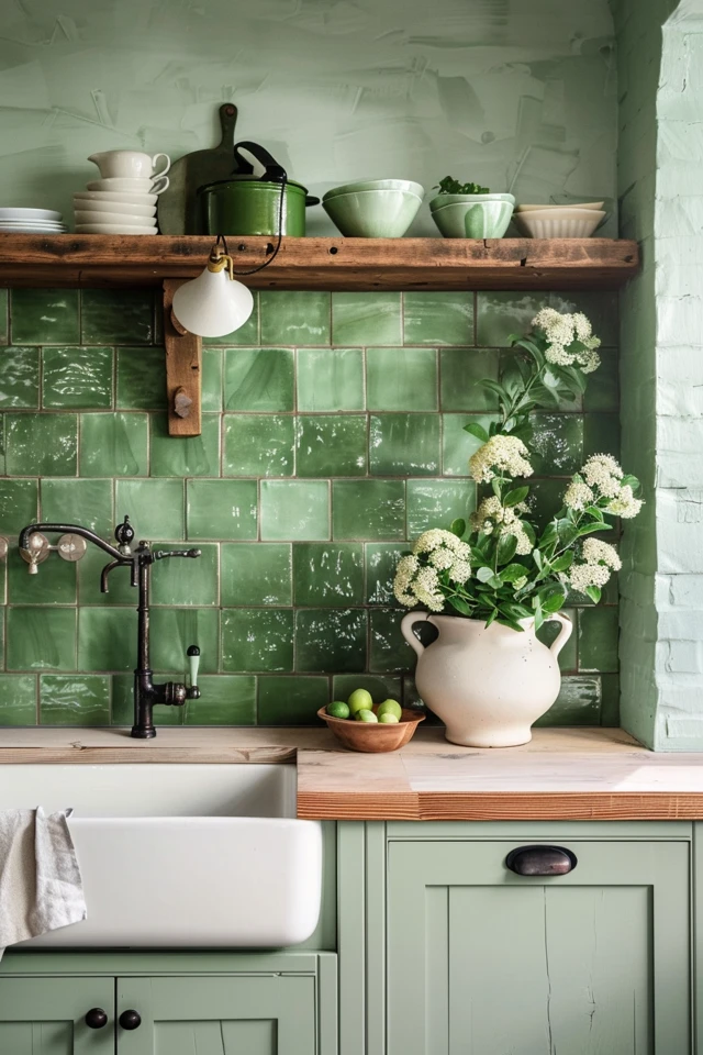
Zellige tiles from Morocco are trending heavily right now. They feature irregular edges and varying thicknesses, which creates a shimmering, water-like texture.
- Pros: Incredible texture and light reflection; instant character.
- Cons: They are a nightmare to clean if you are a messy cook. The uneven surface can trap grease, and the edges are often sharp.
- My advice: If you love this look but hate scrubbing, use it in a bar area or pantry rather than behind a heavy-duty range.
Glass Tile
Green glass tile offers a more modern, translucent look. It adds depth because you are looking through the glass to the color on the back.
- Pros: Reflects light, making small kitchens feel larger.
- Cons: If not installed perfectly, you can see the trowel marks behind the glass. It can also look dated if you choose the skinny horizontal mosaics popular in the early 2000s.
- My advice: Stick to larger format glass bricks (like 3×12 inches) for a contemporary feel.
3. Layout Patterns and Scale
The way you lay out your green tile is just as important as the tile itself. The pattern dictates the visual rhythm of the room. Using a standard 3×6 inch tile in a different layout can completely change the style from traditional to modern.
The Vertical Stack
This is currently my favorite layout for green tiles, especially in homes with standard 8-foot ceilings.
- Stacking rectangular tiles vertically draws the eye upward.
- It feels mid-century modern or contemporary.
- It works exceptionally well with darker greens like forest or hunter green, creating a structured, architectural look.
Classic Brick Bond (Subway)
This is the safest choice, but it risks looking generic. To elevate a green subway tile:
- Use a 50% offset (the standard brick look) for a cottage or farmhouse feel.
- Use a 1/3 offset for a slightly more dynamic, updated traditional look.
- Choose a longer tile, such as a 2×8 or 2×10, rather than the standard 3×6. The elongated proportion feels more elegant.
Herringbone
Herringbone adds massive energy and movement.
- It is excellent for a focal point, like the area behind the range.
- However, be aware of the “waste factor.” Herringbone requires more cuts, so you need to order 15-20% extra material rather than the standard 10%.
- Labor costs for herringbone are usually 20-30% higher because it takes longer to install correctly.
Common Mistakes + Fixes
Mistake: Stopping the backsplash at an awkward height.
Fix: Standard backsplash height is 18 inches from the counter to the bottom of the upper cabinet. If you have an open wall with a range hood, take the tile all the way to the ceiling. Stopping it halfway up the wall cuts the room in half visually and looks unfinished.
4. The Overlooked Detail: Grout Colors
I have seen beautiful handmade green tiles ruined by the wrong grout choice. Grout is not just a glue; it is a design element that creates lines. Those lines form a grid that your eye will register immediately.
High Contrast (White Grout)
If you use bright white grout with dark green tile, you are emphasizing the shape of the tile.
- This creates a busy, graphic look.
- It is great for geometric shapes or very clean, modern spaces.
- Warning: White grout shows grease and tomato stains instantly. You must seal it aggressively.
Low Contrast (Matching Green or Grey Grout)
Using a grout that is slightly lighter or darker than the green tile softens the look.
- This makes the wall look like a cohesive texture rather than a grid.
- It is more sophisticated and timeless.
- For a sage green tile, I often specify a “warm gray” or “greige” grout.
- For emerald tile, a charcoal or dark gray grout adds drama and hides dirt effectively.
Designer’s Note: Spacing
For handmade-look tiles, keep the grout lines tight. I usually request a 1/16-inch or 1/8-inch spacer. Anything wider than 1/8 inch starts to look like a checkerboard and cheapens the aesthetic.
5. Coordinating with Cabinetry and Hardware
Green is a “social” color—it interacts strongly with wood tones and metals. To get the “magazine look,” you have to treat the kitchen as a whole composition.
Hardware Pairings
- Unlacquered Brass or Gold: This is the gold standard for green. The warmth of the brass complements green beautifully. It feels organic and luxurious.
- Matte Black: Pairs well with lighter greens like mint or sage to ground the space. It adds a modern, industrial edge.
- Polished Nickel: Good for a very traditional or historic home, but can feel a bit cold against warm olive tones.
Cabinet Colors
- White Cabinets: Crisp and classic. A green backsplash becomes the star of the show. Ensure your white isn’t too cool; a creamy white (like Benjamin Moore White Dove) usually sits better next to green than a stark white (like Chantilly Lace).
- Wood Tones: Walnut or white oak cabinets with a green backsplash create a “biophilic” design—bringing the outdoors in. This is very calming and trendy right now.
- Green-on-Green: Painting the cabinets the same shade as the backsplash is a bold move. It creates a monochromatic, immersive experience. If you do this, vary the sheen levels (e.g., matte cabinets, glossy tile) to keep it interesting.
Final Checklist: What I’d Do in a Real Project
If I were managing your kitchen renovation today, here is the exact workflow I would follow to ensure success:
1. Measure and Budget
- Measure the width x height of the backsplash area in inches. Divide by 144 to get square footage.
- Add 15% for waste (cuts and breakage).
- Set a budget that includes tile, grout, spacers, caulk, and labor.
2. Order Samples
- Order 3 different green options and 1 white option (as a control).
- Order small samples of grout sticks to hold up against the tile.
3. The “Mock-Up” Phase
- Place the tiles on your counter for 48 hours.
- Put your coffee maker or toaster in front of them. Does it look cluttered?
- Check the color at 8:00 PM with the lights on.
4. The Pre-Install Meeting
- Walk the installer through the layout.
- Specify where you want the cuts (usually in the corners, not in the center of the wall).
- Confirm the grout color and spacing width before they open the bag.
FAQs
Does a green backsplash lower resale value?
Generally, no. Soft greens like sage and moss act similarly to neutrals. Deep, aggressive greens are more specific, but if the material is high quality (like ceramic or stone), it adds value. Peel-and-stick or cheap plastic tiles lower value regardless of color.
How do I clean a textured green backsplash?
For Zellige or textured ceramic, avoid sponges that can snag on rough edges. Use a soft bristle brush and a mixture of warm water and a pH-neutral cleaner. Avoid acidic cleaners (like vinegar) on natural stone or unsealed cement tiles, as they can etch the surface.
Can I use green backsplash in a small kitchen?
Absolutely. In a small kitchen, I recommend using a glossy finish. The reflection bounces light around the room. Stick to lighter shades like seafoam or celery if you are worried about the room feeling cave-like.
What countertop pairs best with green tile?
If your green tile has heavy variation or a complex pattern, keep the countertop simple. A solid white quartz or a quiet marble with minimal veining works best. Butcher block is also a fantastic partner for green, enhancing the nature-inspired vibe.
Conclusion
Choosing a green backsplash is a commitment to personality. It signals that you view your kitchen as a living space, not just a utility room. Whether you choose a rugged, handmade tile that celebrates imperfection or a sleek, glass stack that feels architectural, the key is balancing the color with the right lighting and supporting materials.
Don’t be afraid to mix samples until it “clicks.” When the right green meets the right light, you will know immediately. Trust your gut, measure twice, and enjoy the process of bringing a little bit of the outdoors into your home.
Picture Gallery


