
Granite Countertops: Chic Backsplash Pairings
Granite countertops are the workhorses of the American kitchen. They are incredibly durable, heat-resistant, and offer a natural depth that quartz sometimes struggles to replicate. However, because granite is a natural stone formed by cooling magma, it often features busy patterns, speckling, and movement. This makes choosing the perfect backsplash one of the hardest parts of a kitchen renovation.
I recently worked with a client who fell in love with a slab of “Fantasy Brown” granite. It was stunning, swirling with creams, grays, and faint greens. But she made a classic mistake before calling me: she bought a multi-colored glass mosaic backsplash that competed aggressively with the stone. The kitchen felt chaotic rather than serene. We had to return the tile and start over with a calmer, cream-colored ceramic that allowed the granite to be the focal point.
Finding that balance is exactly what this guide is about. We are going to navigate the tricky waters of undertones, pattern scale, and finishes. If you are looking for visual inspiration, you can find our curated Picture Gallery at the end of this blog post.
Decoding Your Granite: Movement and Visual Weight
Before you look at a single sample of tile, you must understand the “personality” of your stone. Granite generally falls into three categories regarding visual weight: consistent (speckled), veined (marble-like), or dynamic (heavy movement).
If you have a dynamic granite like “Alaska White” or “Magma Gold,” your countertop is the star of the show. In design, if the counter is screaming, the backsplash must whisper. Pairing a busy granite with a patterned cement tile is a recipe for visual fatigue.
Conversely, if you have a consistent, low-movement granite like “Absolute Black” or “Steel Grey,” you have much more freedom. These counters act as a solid anchor, allowing you to have fun with a geometric backsplash layout or a textured handmade tile.
Designer’s Note: The “Squint Test”
When you are standing in your kitchen, step back about ten feet and squint your eyes at your countertops. What is the one dominant color you see? It might look gray up close, but from a distance, it might read as taupe or even green. This dominant blur is the color family you need to stick to for your backsplash to ensure harmony.
The Elevated Subway Tile: Beyond the Basic White Brick
Subway tile is the most common recommendation for granite, and for good reason. It provides a quiet backdrop that doesn’t fight with the speckling of the stone. However, many homeowners worry that standard 3×6 white subway tile feels too generic or “builder-grade.”
The secret to making subway tile look chic is playing with proportion and texture. Instead of the standard flat 3×6 inch tile, look for an elongated size. A 2.5×10 inch or a 2×8 inch tile looks significantly more modern and elegant. It elongates the visual width of your kitchen, making the backsplash area feel more expansive.
Texture is another game-changer. “Zellige” style tiles, or tiles with a handcrafted, uneven surface, catch the light beautifully. This organic texture mimics the natural variation found in granite, tying the two materials together without introducing a competing color pattern.
Common Mistakes + Fixes
- The Mistake: Using a high-contrast grout with subway tile against busy granite.
- The Fix: Match your grout color to the tile color. If you have cream tile, use cream grout. This minimizes the grid pattern. When the grid is too visible, it creates a visual “net” that clashes with the organic veins of the granite.
Glass and Natural Stone: Mixing Materials Correctly
Glass tile was incredibly popular in the early 2000s, specifically in thin, linear mosaic strips. While that specific look has become dated, glass as a material is actually fantastic for granite pairings.
Large-format glass tiles or single-color glass subway tiles offer a translucent quality. This adds depth to the room without adding “heaviness.” If you have a small kitchen with dark granite (like Uba Tuba or Tan Brown), a light, glossy glass tile will reflect under-cabinet lighting and brighten the workspace.
Mixing stone with stone is a more advanced move. If you want a tumbled travertine or marble backsplash, you must be careful. The grain of the backsplash stone must not clash with the grain of the countertop.
Usually, I advise against mixing real marble tile with granite countertops. Marble is soft and elegant; granite is hard and speckled. They often look like they belong in two different houses. However, a solid limestone or slate backsplash can work if the granite has an earthy, matte finish.
What I’d Do in a Real Project:
- For dark, speckled granite: I would choose a glossy, handmade ceramic tile in a light greige or off-white. The gloss contrasts the visual density of the dark stone.
- For light, veined granite: I would choose a matte finish tile. Since the stone is already reflecting light and has movement, a matte backsplash grounds the space.
Color Theory: Pulling the Right Undertone
The biggest challenge with granite is that it is rarely one single color. A slab of “Santa Cecilia” has gold, brown, black, and distinct garnets (dark red spots). Which color do you pull for the backsplash?
The rule of thumb is to pull the secondary or tertiary color, not the main background color. If you match the main background color, the kitchen can look “muddy” or washed out.
For example, if you have a white granite with gray and blue veins, do not just pick a plain white tile. Look for a soft gray or a very pale slate blue that matches the veining. This highlights the unique features of the stone rather than blending everything into a white oblivion.
Lighting plays a massive role here. Standard warm kitchen lighting (2700K to 3000K) will pull out the yellow and brown tones in granite. Daylight bulbs (4000K) will highlight the blues and grays.
Designer’s Note: The 48-Hour Rule
Never buy tile based on how it looks in the showroom. Showrooms use fluorescent industrial lighting. You must bring the sample home and prop it up on your counter for 48 hours. Look at it in the morning sun, in the afternoon shadow, and at night with your kitchen lights on. You will be surprised at how much the color shifts.
Layout Patterns and Grout Lines
If you choose a simple tile color to let your granite shine, you can add interest through the layout pattern. The way you stack the tile changes the vibe of the room entirely.
Herringbone Pattern:
This is a classic V-shape pattern. It adds significant elegance and movement. However, use caution. If your granite has “wild” movement, a herringbone pattern might be too much geometry. This works best with quieter granites. Note that herringbone requires about 15-20% more material due to the cuts required at the edges.
Vertical Stack:
This involves stacking rectangular tiles straight up and down rather than offsetting them like bricks. This is a very modern look. It is excellent for kitchens with low ceilings or bulky upper cabinets, as the vertical lines draw the eye upward.
Standard Running Bond (Brick):
This is the timeless choice. To make it feel more custom, consider the spacing. Standard spacing is often 1/8 of an inch. For a tighter, more seamless look, ask your installer for a 1/16-inch grout line. This minimizes the grid and makes the wall look like a wash of color.
Real World Constraint: The Outlet Issue
When planning your layout, look at your electrical outlets. If you have outlets every two feet, a complex pattern like a herringbone can look messy because the pattern gets interrupted constantly. A standard brick layout is much more forgiving around outlets and switches.
Final Checklist: The Selection Process
When I am finalizing a design for a client, I run through a specific checklist to ensure we haven’t missed anything. Use this list before you place your order.
1. The “Bossy” Check
Look at the room. Is the floor patterned? Is the granite busy? Is the cabinetry glazed or distressed? If you answered “yes” to two of those, the backsplash must be solid and simple.
2. The Height Measurement
Standard distance between the countertop and the bottom of the upper cabinets is 18 inches. Ensure your tile size divides somewhat evenly into this space to avoid tiny slivers of tile at the top. For example, three rows of 6-inch tile fit perfectly (mathematically), but in reality, you need room for grout.
3. The Finish Coordination
Does the tile finish clash with the counter finish?
- Polished Granite + Glossy Tile = High glam, very reflective.
- Polished Granite + Matte Tile = Balanced, sophisticated.
- Honed (Matte) Granite + Glossy Tile = textural interest, highly recommended.
- Honed Granite + Matte Tile = Very rustic or industrial.
4. The Edging Plan
How will the backsplash end? If your cabinets end but the counter continues, you need a plan for the raw edge of the tile. Do not rely on grout to fill the side. Order the matching “bullnose” or pencil pieces, or use a metal Schluter strip that matches your faucet finish (brass, chrome, black) for a clean, modern edge.
FAQs
Q: Can I use peel-and-stick tile over existing tile if I’m renting?
A: Yes, absolutely. Granite is durable, so it likely won’t be replaced in a rental. High-quality vinyl peel-and-stick tiles can look surprisingly realistic. The key is to clean the existing backsplash thoroughly with a degreaser (TSP) so the adhesive sticks. Look for “gel” stickers that have a 3D texture, rather than flat stickers.
Q: Is it okay to not have a backsplash at all?
A: Technically, you can use washable paint, but it is not recommended behind the sink or stove. Water damage and grease splatters will ruin the drywall eventually. If you want a minimalist look, consider a 4-inch “splash” made of the same granite as the counter, and then paint above it. However, a full tile backsplash is currently more desirable for resale value.
Q: My granite is outdated (Baltic Brown). How do I modernize it?
A: Do not try to match the brown circles. Instead, look for a warm, creamy white subway tile. Use a matching cream grout. This brightens the dark stone. Then, update your hardware to matte black or brushed brass. This distracts the eye from the dated pattern of the stone and refocuses it on the modern finishes.
Q: What is the best grout for a kitchen backsplash?
A: I always recommend an epoxy or urethane grout, or a high-quality acrylic grout. Unlike traditional cement grout, these are stain-resistant and do not require sealing. Kitchen backsplashes face spaghetti sauce and grease; you want a grout that wipes clean easily.
Conclusion
Pairing a backsplash with granite countertops is an exercise in restraint and balance. Because granite is a natural material with inherent variation, it demands respect. It usually wants to be the protagonist of your kitchen story.
By choosing the right undertone, playing with tile scale, and paying attention to texture rather than just color, you can create a kitchen that feels curated and high-end. Remember to trust your eyes over the trends. If a combination feels peaceful to you in your specific lighting, it is the right choice.
Take your time with the samples. Tape them up. Live with them. The right pairing will click into place, making your granite look even more beautiful than the day it was installed.
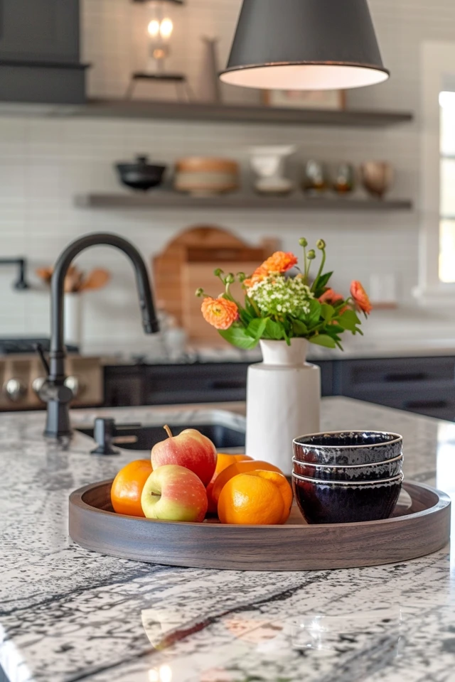
Picture Gallery


