
Honey Oak Kitchen Backsplash Ideas & Tips
Introduction
Honey oak cabinets are one of the most common features in American homes, yet they are often the most debated. For years, homeowners felt the pressure to paint them white to match fleeting trends. However, as a practicing interior designer, I have seen a massive shift recently. People are embracing the warmth and durability of natural wood again. The secret to loving your honey oak kitchen isn’t covering the wood; it is choosing the right supporting actors to make the cabinets shine.
I recently worked with a client who bought a 1990s home and was convinced she needed a gut renovation to get rid of the “orange” wood. When we looked at her budget, a full remodel wasn’t feasible. Instead, we swapped the laminate countertops for a quiet quartz and installed a soft, sage green ceramic backsplash. The transformation was immediate. The green neutralized the orange tones, making the wood look rich and intentional rather than dated.
If you are struggling to find the right tile to pair with your wood cabinetry, you are in the right place. We are going to look at color theory, material textures, and layout tricks that balance the strong personality of oak. You can find a full Picture Gallery at the end of this post to visualize these concepts.
The Science of Undertones: Working With the “Orange”
The biggest challenge with honey oak is the prominent orange or yellow undertone. In design school, we learn that you essentially have two paths when dealing with a strong color: harmony or contrast. Understanding which path you want to take will dictate every backsplash choice you make.
If you choose harmony, you are selecting colors that sit next to orange on the color wheel. These include creams, warm whites, and beiges. This approach quiets the kitchen down. It makes the space feel cohesive, bright, and airy. This is usually the best route for small kitchens or spaces that lack natural light.
If you choose contrast, you are looking across the color wheel to blues and greens. These cool tones balance the warmth of the wood. When you place a slate blue tile next to honey oak, the wood suddenly looks less “orange” and more like a neutral brown. This is a high-impact designer trick we use to make dated cabinets look instantly modern.
Designer’s Note: The Lighting Factor
One lesson I learned the hard way involves LED lighting. I once specified a beautiful cream tile for a client with oak cabinets. It looked perfect in the showroom. However, the client had installed “Daylight” bulbs (5000K) in their kitchen. The cool blue light clashed with the warm cabinets and made the cream tile look sickly yellow.
Before you commit to a backsplash, check your bulbs. Honey oak usually looks best with Soft White (2700K) or Warm White (3000K) lighting. This range complements the wood grain without making it look radioactive.
White and Cream: The Modern Minimalist Approach
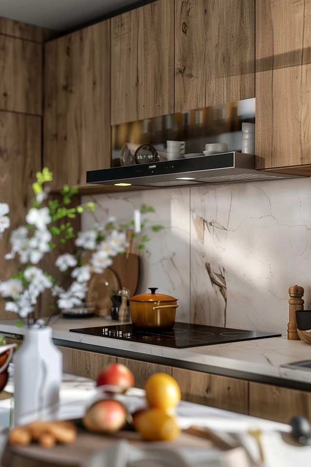
Going with a white backsplash is the safest bet, but “safe” can quickly turn into “boring” if you aren’t careful. The key to successfully pairing white tile with honey oak is avoiding stark, hospital-bright whites. A pure white subway tile can make creamy oak cabinets look dingy by comparison.
Instead, look for “soft white” or “warm white” tiles. These shades have a tiny drop of yellow or gray in them that bridges the gap between the bright tile and the warm wood. Handcrafted tiles, like Zellige or Cloe styles, are exceptional here. The variation in tone from tile to tile adds depth that a flat, machine-made tile lacks.
Texture is your best friend when working with neutrals. Since you aren’t using color to create interest, you must use shape or surface variation. A beveled subway tile or a glazed brick adds shadows and highlights. This prevents the kitchen from looking flat.
Grout Selection for White Tiles
Do not use bright white grout with off-white tile. It will make the tile look dirty. For honey oak kitchens, I almost always recommend a “warm gray” or “biscuit” colored grout.
This slight contrast highlights the pattern of the tile without being overwhelming. It also ties in nicely with the grain of the wood. Keep your grout lines tight—usually 1/16 of an inch—for a cleaner, more modern look that doesn’t scream “retro.”
Cool Tones: Blues and Greens for Balance
If you want to modernize honey oak, blue and green are the heavy lifters. These colors are natural opposites to orange, which means they tone down the brassiness of the wood. This combination is rooted in nature—think of trees against a blue sky or grass. It feels inherently right to the human eye.
Sage green is currently the top contender for oak kitchens. It is soft enough to act as a neutral but has enough pigment to create a design statement. A matte sage subway tile arranged in a vertical stack can make a standard builder-grade kitchen look custom.
For a moodier or more traditional look, consider navy or slate blue. Darker colors ground the space. If you have light countertops (like white quartz or Corian), a dark blue backsplash creates a stunning “sandwich” effect that defines the work zone.
The “Gray” Danger Zone
Homeowners often default to gray because it is trendy, but be very careful. Cool, icy grays often clash horribly with honey oak. The combination can feel disjointed, like the top half of the kitchen belongs to a different house than the bottom half.
If you must use gray, lean toward “greige” (gray-beige) or warm stone colors. Put the tile sample next to the cabinet door. If the gray brings out the purple or blue tones in the sample, it’s too cool. If it looks brownish or muddy, it is likely a safe match.
Natural Stone and Textures
Natural stone backsplashes can look incredibly high-end with oak, provided you respect the “busyness scale.” Honey oak has a very prominent grain pattern. It is visually busy. If you pair it with a busy, heavily veined granite or marble backsplash, the two surfaces will fight for attention.
Soapstone or dark slate are wonderful options here. They are solid, matte, and organic. A dark charcoal slate tile creates a calm void that allows the wood warmth to pop without competition. It feels rustic and sophisticated simultaneously.
Travertine is another material that is making a comeback, but it requires caution. Because travertine is beige and pitted, it can sometimes look too similar to the oak, creating a “beige blob” effect. If you use travertine, ensure it is significantly lighter or darker than your cabinet stain to create necessary contrast.
Standard Measurements and Placement
When installing stone or tile, standard placement rules apply.
- Height: The standard distance between the countertop and the upper cabinets is 18 inches. Ensure your tile purchase accounts for this area plus 10% for cuts and waste.
- The Side Splash: As a designer, I almost always advise removing the 4-inch granite backsplash piece if you are installing tile. Tiling on top of that 4-inch strip looks dated. Remove it, repair the drywall, and tile from the countertop up.
- Ending Point: The backsplash should end in line with the upper cabinets, not the countertop. If your countertop extends past the upper cabinets (for a bar overhang, for example), ending the tile at the cabinet line usually looks cleaner.
Pattern Play: Layouts That Update the Look
Sometimes the material is right, but the layout is what dates the kitchen. Standard running bond (brick pattern) subway tile is classic, but it is also expected. Changing the pattern is a low-cost way to make the kitchen feel designed.
Vertical Stack:
Stacking rectangular tiles directly on top of one another draws the eye upward. This is fantastic for kitchens with 8-foot ceilings, as it creates an illusion of height. It feels strictly modern and helps offset the traditional vibe of the oak.
Herringbone:
This is a classic pattern that adds elegance. However, use this with caution in honey oak kitchens. Because the pattern involves many angles, it is visually energetic. If your wood grain is very heavy, a herringbone pattern might look chaotic. Use a low-contrast grout to soften the lines if you choose this layout.
Square Tile (Grid):
Square tiles (think 4×4 or 5×5 Zellige) laid in a straight grid are very trendy right now. This offers a charming, European cottage aesthetic. It works beautifully with honey oak to create a relaxed, “unfitted” kitchen vibe.
Common Mistakes + Fixes
Mistake: Using small glass mosaic tiles.
Why: Those 1×1 inch glass mix tiles were very popular in the early 2000s. Installing them now dates the kitchen to that specific era instantly.
The Fix: Switch to a larger format ceramic tile. If you love shimmer, choose a glazed ceramic with a high-gloss finish rather than glass.
Mistake: Ignoring the floor.
Why: You aren’t just matching the cabinets; you are matching the floor too. If you have oak floors and oak cabinets, a busy backsplash is too much.
The Fix: If floor and cabinets are both wood, your backsplash must be solid and calm (white, cream, or solid black) to give the eye a place to rest.
Final Checklist: What I’d Do in a Real Project
If I were walking into your home today to fix a honey oak kitchen, here is the mental checklist I would run through. You can use this to guide your own renovation.
- Step 1: Audit the Countertops. If the counters are busy granite (like Santa Cecilia), the backsplash must be a solid color. No patterns. If the counters are solid quartz, we can have fun with tile texture.
- Step 2: Check the Lighting. I would immediately swap bulbs to 3000K LEDs to ensure we are seeing true colors.
- Step 3: Sample Selection. I would bring home five samples: a warm white, a cream, a light sage green, a dark slate blue, and a matte black.
- Step 4: The Prop Test. I would prop these samples up against the backsplash area and leave them there for 24 hours. I need to see them in morning coffee light and evening dinner light.
- Step 5: Grout Pairing. Once the tile is picked, I would select a grout that blends, rather than contrasts. High-contrast grout (like black grout on white tile) is usually too harsh against the soft warmth of oak.
FAQs
Should I paint my honey oak cabinets or just replace the backsplash?
Try replacing the backsplash, hardware, and lighting first. Painting cabinets is expensive (usually $5,000+ for a pro job) or labor-intensive to do correctly. A new backsplash and modern black or brushed brass hardware can completely change the look for a fraction of the cost.
Can I use peel-and-stick tile over existing tile?
Yes, especially if you are renting or on a tight budget. Look for “gel” based peel-and-stick tiles rather than flat stickers. They have dimension and look much more realistic. Just be sure to degrease your existing backsplash thoroughly with TSP (Trisodium Phosphate) before applying so they adhere properly.
What metal finish looks best with honey oak?
Matte black is my favorite because it is modern and grounds the space. Brushed gold or brass also looks lovely and brings out the warm tones, creating a monochromatic glow. Avoid polished chrome, which can feel a bit cold and sterile against the wood.
Is subway tile out of style?
Classic 3×6 subway tile never truly goes out of style, but it can look generic. To keep it fresh, opt for a “handmade” look with uneven edges, or change the dimensions to a longer, leaner tile (like a 2×8 or 2×10 size).
Conclusion
Honey oak cabinets are not a curse; they are a sturdy, solid wood foundation that just needs the right styling. By understanding the undertones of your wood and choosing a backsplash that either harmonizes with cream or contrasts with cool greens and blues, you can create a kitchen that feels curated and cozy.
Remember that design is about balance. Since your cabinets bring the warmth and the pattern, let your backsplash bring the calm and the color. Take your time testing samples in your specific lighting, and don’t be afraid to embrace the wood.
Picture Gallery


