
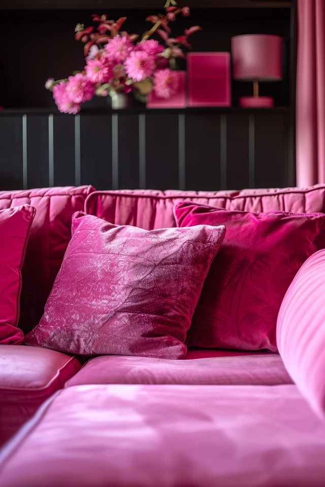
Greetings! Are you looking to create a stunning dark pink color? Look no further—I’ve got you covered with this comprehensive mixing guide. In this article, I’ll walk you through the techniques and secrets to achieve the perfect shade of dark pink. Whether you’re a seasoned artist or a beginner, this guide is designed to help you master the art of color mixing and unleash your creativity.
When it comes to mixing dark pink, selecting the right red pigments is crucial. Different reds have varying color biases that result in different shades of pink. To achieve the dark pink color you desire, it’s essential to understand the characteristics of the red pigments and how they interact with other colors.
Once you have the right red pigment, you can experiment with different mixing ratios to find the perfect balance. Remember, creating the ideal dark pink color is all about finding the right combination of pigments and understanding their color bias. With practice and perseverance, you’ll be able to mix dark pinks that truly stand out and bring your artistic vision to life.
Key Takeaways:
- Choosing the correct red pigment is essential for achieving a dark pink color.
- Red pigments such as Cadmium Red Light, Permanent Alizarin Crimson, and Quinacridone Red are commonly used for mixing dark pink.
- Each red pigment has a unique color bias that affects the shade of pink it produces when mixed with other colors.
- Experimenting with different mixing ratios will help you find the perfect dark pink hue.
- Referring to a color chart can assist you in understanding the color bias and achieving the desired dark pink color.
Now that you have a better understanding of how to achieve a dark pink color, it’s time to grab your brushes and start experimenting. Remember, practice makes perfect, and each stroke brings you closer to mastering the art of color mixing. Happy painting!

Mixing the Perfect Purple
Achieving a bright purple requires careful color mixing. The choice of red pigment plays a crucial role in creating a vibrant purple hue. When mixing red and blue, the color bias of the red pigment will influence the outcome.
The right red pigment for creating a bright purple is Quinacridone Red, as it maintains its vibrant quality when mixed with blue. Other red pigments, such as Cadmium Red Light or Alizarin Crimson, can result in muted or grayish purples.
By selecting the appropriate red pigment, you can successfully mix a bright, vibrant purple.
Understanding Color Bias
“Color bias refers to the tendency of a pigment to lean towards certain colors. In the case of red pigments, the bias can be towards orange or purple, which will impact the resulting mixtures. Understanding color bias is crucial for achieving the desired dark pink tones.”
When it comes to mixing purple, the color bias of the red pigment will determine whether the resulting mixture leans towards a warmer or cooler shade. Quinacridone Red has a balanced color bias that allows it to mix well with blues, creating a vibrant purple with a touch of pink undertone.
On the other hand, using red pigments with an orange bias, like Cadmium Red Light, may result in a warmer purple with red undertones. Similarly, using red pigments with a purple bias, such as Alizarin Crimson, can lead to a cooler purple with blue undertones.
Tips for Mixing the Perfect Purple
If you want to achieve a bright and vibrant purple, here are some tips to keep in mind:
- Start with a high-quality Quinacridone Red pigment for the best results.
- Use small amounts of the red pigment to avoid overpowering the mixture.
- Gradually add blue pigment to the mixture, testing and adjusting until you achieve the desired shade.
- Keep in mind that different brands and shades of red and blue pigments may produce slightly different results, so experimentation is key to finding your ideal purple.
By following these tips and understanding the color bias of your red pigments, you can successfully mix the perfect vibrant purple for your artwork.
The Art of Color Bias
Understanding the concept of color bias is essential for successful color mixing. Each pigment has a bias towards certain colors, which affects the outcome when mixed with other pigments. In the case of creating dark pink, the color bias of red pigments plays a crucial role.
Cadmium Red has an orange bias, which tends to tone down the brightness of the pink when mixed with white. On the other hand, Alizarin Crimson leans towards purple, resulting in a more muted pink when mixed with white.
By referring to a color chart and experimenting with different red pigments, you can determine the best options for achieving the desired dark pink color. Understanding the color bias of each pigment empowers you to mix paints with precision and intention, leading to beautiful and harmonious results.

Experimenting and Referring to a Color Chart
When it comes to mixing dark pink, don’t be afraid to experiment. Try different combinations of red pigments, such as Cadmium Red, Alizarin Crimson, or other shades with distinct color biases. Take note of the outcomes and how they align with your desired result.
A color chart can serve as your guide, providing a visual representation of the different shades that can be achieved by mixing different pigments. It allows you to easily compare and choose the right red pigment to create your desired dark pink hue. Keep the color chart handy as a reference tool throughout your painting process.
“Color mixing is an art in itself. The ability to understand color bias and utilize it effectively opens up a world of possibilities in creating unique shades and tones.” – Artist
Mastering Dark Pink with Color Mixing
With a solid understanding of color bias and the willingness to experiment, you can master the art of mixing dark pink. By combining the right red pigments in different ratios and referring to a color chart for guidance, you can achieve the perfect dark pink for your artwork.
The process of color mixing is both scientific and creative, allowing you to express your unique vision and create stunning visuals. So, embrace the artistry of color mixing and explore the possibilities of dark pink paint mixing.

Conclusion
In conclusion, this ultimate guide to achieving a dark pink color has provided valuable insights into the art of color mixing and selecting the right pigments. By understanding the color bias of red pigments and experimenting with different ratios, you can create a wide range of stunning dark pink tones to enhance your painting projects.
Referring to a dark pink color chart can serve as a helpful reference, allowing you to identify the best red pigment for your desired outcome. Additionally, considering the effect of complementary colors can further enhance the depth and vibrancy of your dark pink hues.
With the techniques and knowledge shared in this guide, you can approach your next painting project with confidence, knowing that you have the tools to mix the perfect dark pink color. Whether you’re creating a vibrant floral artwork or adding a touch of elegance to your abstract masterpiece, the power to achieve beautiful dark pink tones is now in your hands.