
How To Choose Deck Railing Color: Complementing Your Outdoor Space
Designing an outdoor living space is often a game of layers. You start with the layout, move to the hardscaping materials, and finally select the furniture. However, one element frequently gets overlooked until the contractor is standing there with a color deck: the railing. It is a functional safety necessity, but visually, it acts as the eyeliner of your home’s exterior. It frames the view and defines the architectural lines.
I often see homeowners panic at this stage and simply choose white because it feels safe, or they try to color-match the deck boards exactly. Both of these strategies can lead to a design that feels flat or disjointed from the rest of the house. The railing should be treated as a bridge between your home’s architecture and the natural landscape beyond it.
If you are looking for visual inspiration to help guide your choices, make sure to check out our curated Picture Gallery at the end of this post. In this guide, I will walk you through the exact process I use with my clients to select a railing color that enhances curb appeal, respects the view, and stands up to real-world wear and tear.
1. The Palette: Coordinating with Your Home’s Exterior
The most common question I get is, “What should the railing match?” The answer is rarely “the deck floor.” If you match the railing color exactly to the floor, you create a visual “box” effect that closes the space in. Instead, you want to create contrast or harmony with the house itself.
I use a “Rule of Three” for exterior palettes: the body color (siding/brick), the trim color (windows/fascia), and the accent color (doors/shutters). Your deck railing needs to align with one of these three categories or be a neutral connector.
Matching the Trim
The safest and most traditional route is matching your railing to the home’s trim. If you have white window casings and white fascia boards, a white railing makes the deck feel like an extension of the house’s structure. This is particularly effective for Colonial, Cape Cod, and Traditional Farmhouse styles. It creates a seamless transition from inside to outside.
Matching the Window Sashes
For a more modern or custom look, look at the color of your actual window frames (the sash), not the trim around them. Many modern homes feature black or bronze vinyl window frames. Using a railing in dark bronze or textured black to match the window sashes creates a sophisticated, high-end look. It ties the hardware of the house together without overwhelming the siding.
Contrasting the Siding
If you have a neutral house—think gray siding or taupe stucco—you have an opportunity to use the railing as contrast. A dark charcoal railing against a light gray house adds visual weight and grounds the space. Conversely, if you have a dark house (like a deep blue or forest green), a lighter railing can keep the deck from feeling like a dark cave.
Designer’s Note: The “Wood Box” Mistake
I recently consulted on a project where the homeowner installed a cedar deck and used the exact same cedar stain for the railing, balusters, and top cap. The result was overwhelming. It looked like a crate. We fixed it by painting the vertical balusters black while leaving the top rail cedar. This broke up the visual mass and immediately made the deck look larger and more custom.
2. Architectural Style and Material Selection
Your home’s architectural style dictates the materials, which in turn dictate your color palette. You cannot force a color that contradicts the material’s nature. For example, painting a sleek aluminum cable rail bright white often looks plastic and cheap, whereas white painted wood looks classic.
Modern and Contemporary
Modern design relies on clean lines and minimizing visual clutter. The go-to colors here are matte black, dark bronze, and stainless steel.
- Black Aluminum: This is the standard for modern homes. It is sleek and recedes from the eye.
- Stainless Steel Cable: This offers a silver/grey tone that works beautifully with cool-toned siding or concrete elements.
- Glass: While colorless, glass usually requires a top cap and posts. Matching these to the window frames is critical to maintain that minimalist aesthetic.
Traditional and Classic
Traditional homes usually require more visual weight in the railing.
- White Composite/Vinyl: This mimics painted wood without the rot. It pairs perfectly with red brick or blue siding.
- Warm Wood Tones: Pressure-treated pine or cedar stained in warm hues (honey, teak) suits rustic traditional homes.
Rustic and Craftsman
These styles emphasize natural materials. You want colors that look like they came from the earth.
- Dark Bronze: This is softer than black and pairs wonderfully with stone veneers and warm wood siding.
- Redwood/Mahogany Stains: Deep, reddish-brown tones add warmth but require maintenance to keep the color from greying out.
Common Mistake + Fix
Mistake: Using bright white vinyl railing on a rustic log cabin or stone-heavy mountain home. It looks stark and artificial.
Fix: Switch to a dark bronze metal rail or a timber rail stained in a dark walnut. This harmonizes with the natural surroundings rather than fighting them.
3. The “Invisible” Railing: Preserving the View
One of the most counter-intuitive concepts in exterior design is how colors affect visibility. If your deck overlooks a garden, a lake, or a rolling hill, the last thing you want is a railing that acts as a visual barrier.
Many clients assume white is the best choice because it is bright. However, white reflects sunlight. When you look out a window or sit on the deck, your eye stops at the white railing because it is the brightest object in your field of vision. It frames the view, but it also obstructs it.
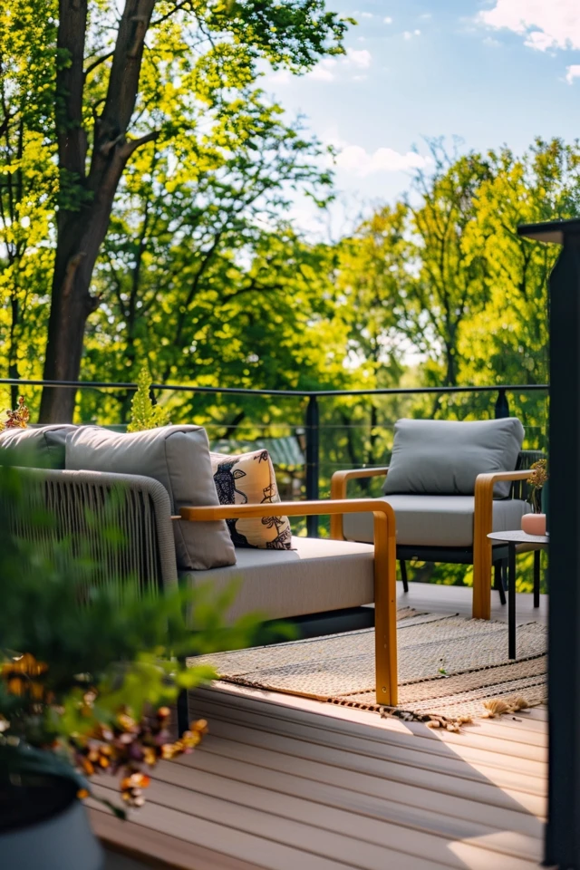
Why Black Works Best for Views
Black or dark bronze absorbs light rather than reflecting it. Because of this, the eye tends to look past the dark color and focus on the brighter view beyond. If you have thin black balusters (spindles), they almost disappear against a backdrop of green grass or blue water.
The Mesh and Cable Factor
If preserving the view is your number one priority, look into:
- Black Cable Railing: Horizontal cables are thinner than wood balusters and virtually vanish.
- Hog Wire/Mesh: Black welded wire mesh is a budget-friendly way to get a modern, transparent look.
Designer’s Note: Measurements Matter
When choosing balusters for a view, pay attention to scale. Standard spacing is usually just under 4 inches to meet code (preventing a 4-inch sphere from passing through). If you use thick 2×2 wood balusters, you are blocking 50% of your view. If you use 3/4-inch round metal balusters at the same spacing, you are only blocking about 15% of the view. The color black enhances this transparency.
4. Lighting, Exposure, and Heat
Color is not static; it changes based on the light source. A railing color you love in the showroom might look completely different under the midday sun or in the shade of a large oak tree.
Sunlight and Fading
UV exposure is a railing killer. Dark colors absorb heat and UV rays, which can lead to fading over time, especially with lower-quality paints or composites.
- Black/Dark colors: Can become hot to the touch in direct sunlight. If you live in a very hot climate (like Arizona or Florida) and have an uncovered deck, a black metal top rail might burn your hands. In these cases, consider a “cocktail rail” (a flat wood board on top of the metal rail) to keep the surface touchable.
- White/Light colors: Remain cooler but can cause glare in bright sun, making it uncomfortable to look out from the deck without sunglasses.
Surrounding Landscape
Look at what is directly behind the railing.
- Against a Forest: Black or bronze blends into tree trunks and shadows. White will pop and look highly defined.
- Against the Sky/Water: If your deck is elevated and the backdrop is mostly sky, a lighter grey or white might blend better than a harsh black line.
What I’d Do in a Real Project
Before committing to a color, I always ask the contractor for a scrap piece of the material or buy a single baluster. I tape it up where the railing will go and observe it at three times of day:
1. 9:00 AM: Morning light is usually cooler and bluer.
2. 12:00 PM: Harsh overhead sun shows the true undertone and glare.
3. 6:00 PM: “Golden hour” makes everything look warmer.
5. Maintenance and Durability Realities
We cannot talk about color without talking about the maintenance required to keep that color looking good. As a designer, I have to be realistic with my clients. If they have three large dogs and two kids, a white wood railing is going to look distressed within six months.
The Dirt Factor
- White Railings: Show everything. Algae, green mold, mud splashes from rain, and dirty handprints are immediately visible. If you live in a humid climate or a wooded area with lots of pollen, a white railing requires pressure washing at least twice a year.
- Black/Bronze Railings: Hide dirt and algae much better. However, they show dust and pollen (yellow on black) during spring.
Finish Durability
- Powder Coated Aluminum: This is the gold standard for low maintenance. The color is baked on and resists chipping. Textured finishes (often called “sand” or “matte”) hide scratches better than glossy finishes.
- Painted Wood: Requires scraping and repainting every 3 to 5 years depending on exposure. Once the paint cracks, water gets in, and the wood rots.
- Stained Wood: Vertical surfaces (balusters/posts) hold stain longer than horizontal decks, usually needing a refresh every 4 to 5 years. Solid stains offer more UV protection than transparent ones.
Designer’s Note: The Scratch Test
If you are considering a dark composite railing, take a key and lightly scratch the sample in a hidden corner. Some dark composites show a white or grey core when scratched. If the material isn’t “capped” or colored all the way through, pet claws or moving furniture will leave permanent light-colored streaks on your dark railing.
Final Checklist: Making the Decision
When I am finalizing a railing choice for a client, I run through this mental flowchart. Use this to confirm your decision.
- Step 1: Check the HOA. Before you fall in love with a modern cable rail, ensure your neighborhood covenants don’t require white pickets. This happens more often than you think.
- Step 2: Identify the Goal. Is the goal to frame the house (Architectural) or disappear into the view (Landscape)?
- If framing: Match the trim or window sashes.
- If disappearing: Choose black, bronze, or cable.
- Step 3: Assess the Heat. Is the deck in full, unshaded sun?
- Yes: Avoid black top rails or add a wood cap.
- No: You are free to choose any color.
- Step 4: The Flooring Contrast. Place your railing sample next to your deck board sample.
- Do they look too similar? If yes, change the railing color or material to create contrast.
- Step 5: The “Inside-Out” View. Stand inside your living room and look out the window. Will the railing color clash with your interior drapes or flooring? It should feel cohesive from the inside, too.
FAQs
Should my railing match my deck floor?
Generally, no. A slight contrast is more visually appealing. If you match them exactly, the deck lacks definition. A common successful pairing is a warm wood floor (like Cedar or Ipe colors) with a cool metal railing (Black or Bronze). This mixes materials and colors for a curated look.
What is the most timeless railing color?
Black is rapidly becoming the new neutral because it mimics the look of wrought iron, which has been used for centuries. However, white is the classic choice for traditional American architecture. If you want to ensure resale value, avoid trendy colors like bright reds, greens, or blues. Stick to black, bronze, white, or natural wood.
Can I mix colors on a railing?
Yes! A “tuxedo” style is very popular. This involves using white posts and top rails, but black metal balusters. This gives you the substantial, classic look of white architecture with the view-preserving transparency of black spindles. It is the best of both worlds.
Does a black railing get too hot for hands?
In direct summer sun, black aluminum can reach temperatures of 140°F or higher. It can definitely be uncomfortable or even burn tender skin. If your deck faces south or west and has no shade, I highly recommend using a composite or wood cap rail (the part you touch) over the metal structure.
Conclusion
Choosing a deck railing color is about balancing three things: your home’s architectural style, the functional needs of the space, and the surrounding environment. It is the finishing touch that can elevate a simple platform into a sophisticated outdoor living room.
Don’t be afraid to go dark to save your view, or to stick with white to honor a traditional home style. Just remember to consider the maintenance and the heat factor before you order materials. By treating the railing as a distinct design element rather than an afterthought, you ensure your outdoor space feels intentional, welcoming, and complete.
Picture Gallery


