
How To Choose Dining Table Color: Complementing Your Decor
Choosing the right dining table is often the most agonizing decision in furnishing a home. It is a substantial financial investment and physically dominates the room, acting as the anchor for all your gatherings. Many clients come to me paralyzed not by the shape or size, but by the finish.
They worry that a dark wood will make the room feel small, or that a glass table will feel too cold. The reality is that the “color” of a dining table involves texture, material, and how it interacts with the light in your specific space. It is rarely just about picking a paint swatch.
For plenty of visual inspiration on how different wood stains and finishes interact with various room styles, be sure to scroll down to the Picture Gallery at the end of this post.
1. Assessing Your Foundation: Floors and Walls
Before you fall in love with a piece in a showroom, you must look down. Your flooring is the largest surface area in the room and the table will sit directly on top of it. This relationship is critical to the flow of the dining area.
The most common mistake I see is trying to match the wood tone of the table exactly to the wood tone of the floor. When you match them perfectly, the table tends to disappear. It looks like it is growing out of the floorboards, resulting in a flat, heavy look.
The Two-Shade Rule
To create necessary contrast, aim for a table finish that is at least two shades lighter or darker than your flooring. If you have dark espresso floors, a bleached oak or light walnut table provides a beautiful lift. Conversely, light maple floors ground beautifully with a rich mahogany or dark stained ash table.
Wall Color Context
Your wall color dictates the mood, and the table color should support that.
- White/Neutral Walls: You have the most flexibility here. A high-contrast dark table creates a focal point, while a light table creates a “Scandi” or minimalist monochromatic vibe.
- Dark/Moody Walls: If your dining room is painted charcoal or navy, a dark table can get lost in the shadows. I often recommend medium-tone woods or metallic bases to reflect light in these spaces.
- Warm vs. Cool Paint: Identify the undertone of your paint. Cool gray walls often clash with the orange hues of honey oak. They pair much better with the ashy tones of weathered oak or walnut.
Designer’s Note: The “Floating” Problem
If you absolutely must have a table that matches your floor color, you need a mediator. This is where the area rug becomes non-negotiable. A rug acts as a visual buffer, separating the two similar wood tones and allowing the eye to distinguish where the floor ends and the table begins.
2. Understanding Material Tones and Undertones
Color in furniture is rarely a single flat hue. Natural materials have complex undertones that can make or break your color scheme. Understanding these subtleties is what separates a DIY look from a professionally designed room.
Wood Undertones
Wood is the most common material for dining tables, but “brown” is not a sufficient description.
- Yellow/Gold Undertones: Common in pine, maple, and natural oak. These bring warmth but can look dated if paired with the wrong beige. They work well in north-facing rooms that need artificial warmth.
- Red/Orange Undertones: Found in cherry, mahogany, and some teak. These are traditional and formal. Be careful pairing these with other red woods; too much red can feel suffocating.
- Ash/Gray Undertones: Seen in weathered oak, walnut, and driftwood finishes. These are currently very popular because they bridge the gap between modern gray palettes and natural textures.
Stone and Glass
If you are avoiding wood, consider how other materials affect the color perception of the room.
- Marble (White/Carrara): Adds brightness and reflects light. It is excellent for rooms with poor natural light. However, be aware that marble is visually “cold” and needs warm textiles (curtains, rugs) to balance it.
- Glass: Ideally, glass has no color, but thick glass often has a green tint at the edge. Glass is the best choice for showcasing a beautiful colorful rug or interesting dining chairs.
- Black Metal/Stone: A matte black table is a silversmith for color. It neutralizes a room. However, it absorbs light, so you will need to increase your chandelier wattage or add sconces.
Common Mistake + Fix
Mistake: Mixing too many dominant wood tones. You have oak floors, a walnut sideboard, and you buy a cherry table.
Fix: Limit the room to two dominant wood tones. If you have a mismatch, try to tie them together with art or a centerpiece that contains both colors. For example, a wooden bowl on the table that matches the sideboard helps the eye connect the dots.
3. Visual Weight and Room Size
Color influences the perceived size of the object. We call this “visual weight.” A dining table is a large volume of space, and its color can make the room feel airy and spacious or cozy and intimate.
Small Spaces
If your dining area is tight, avoid heavy, dark colors. A solid black or dark wenge table stops the eye, making the room feel smaller than it is.
- Go Light: Blonde woods, white lacquer, or glass are ideal. They allow light to travel through or bounce off the piece.
- Glass Tops: A glass table takes up almost zero visual weight. You can fit a larger glass table in a small room than you can a wood table without it feeling crowded.
Large, Cavernous Rooms
In an open-concept home or a large formal dining room, a light-colored table can look like a toy. It might feel insubstantial or “float” away.
- Go Dark: This is where you use color to anchor the space. A dark table commands attention and visually fills the volume of the room.
- High Contrast: If you have a large white room, a dark table provides a necessary visual stop, defining the “dining zone” without needing walls.
Pro-Level Measurements
Regardless of color, the spacing dictates how the color impacts the user.
- Walkways: You need a minimum of 36 inches between the table edge and the wall (or buffet). 42 to 48 inches is ideal.
- Visual Breathing Room: If you choose a very dark, heavy table, try to increase that clearance to 48 inches if possible. The negative space helps offset the heavy color weight.
4. Practical Constraints: Kids, Pets, and Sunlight
As a designer, I never suggest a finish without asking about the client’s lifestyle. The “color” of your table will change if it is covered in dust, scratches, or fingerprints. Durability is a key component of your color choice.
The Dark Finish Dilemma
Many people think dark wood or black tables are safer for messy families. This is a myth. Dark finishes show dust, pet hair, and greasy fingerprints more than any other color.
- If you have a shedding white dog or cat, a dark espresso table will look dirty 10 minutes after you clean it.
- Dark lacquer shows scratches vividly as white lines.
The White/Light Dilemma
White tables, particularly laminates or soft woods, show ink, tomato sauce stains, and wine spills. However, they hide dust incredibly well.
- If you want a light look but have kids, look for “distressed” or “whitewashed” finishes. The texture and color variation hide marker slips and dings much better than a pristine white surface.
Sunlight and Fading
UV rays change the color of dining tables over time.
- Cherry Wood: Gets darker and redder with sun exposure.
- Walnut: Often lightens and can turn slightly yellow or orange.
- Oak: Tends to amber (turn yellow).
If your dining table will sit next to huge south-facing windows, be aware that the color you buy today will shift. A lighter, natural matte finish often ages more gracefully in direct sun than a high-gloss dark stain, which can fade unevenly if you leave a centerpiece in the middle.
Designer’s Note: Real-World Lesson
I once had a client who insisted on a high-gloss black table for a room with huge windows and two toddlers. Within three months, the micro-scratches from wiping up spills and the constant dust made the table look permanently hazy. We swapped it for a textured, medium-tone rustic oak. It hid the crumbs, didn’t show the dust, and added warmth. Function must precede aesthetic.
5. Coordinating with Chairs and Rugs
You should view your dining setup as a composition, not a matching set. The “dining suite” where the table, chairs, and buffet all match perfectly is a dated concept. It looks like a furniture showroom, not a curated home.
The Sandwich Technique
Think of your dining area layers like a sandwich: Floor (Bread), Rug (Condiment), Table (Meat), Accessories (Toppings). You want distinct flavors, not a loaf of bread.
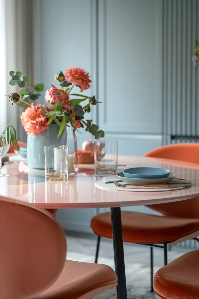
- Dark Table: Pair with lighter chairs or upholstered chairs in a light fabric (beige, light gray, cream). This breaks up the visual mass.
- Light Table: You can go with black, navy, or dark wood chairs to create a graphic pop. A blonde table with black Windsor chairs is a classic, high-contrast look that works in almost any home.
- Wood on Wood: If you want wood chairs with a wood table, try to vary the finish slightly, or ensure the undertones match perfectly even if the darkness level differs.
Rug Sizing and Color
The rug is your opportunity to bridge the color gap.
- Size Rules: The rug must extend at least 24 inches past the table on all sides so chairs don’t catch when pulled out. For a standard dining table, this usually means an 8×10 or 9×12 rug.
- Color Logic: If your floor is dark and your table is dark, choose a light, patterned rug. If your floor is light and your table is light, choose a rug with saturated colors or a dark border to frame the eating area.
Final Checklist: What I’d Do in a Real Project
Before you swipe your credit card, run your choice through this checklist. This is the exact mental process I use for high-end residential projects.
1. The Sample Test
Never buy a custom table without seeing a wood sample in your actual room. Request a finish sample and place it on your floor. Look at it in the morning light, at noon, and at night with your chandelier on. Artificial light can turn a nice walnut green or red.
2. The Contrast Check
Take a photo of your dining space in black and white. Does the table blend into the floor? If they look like the same shade of gray, you don’t have enough contrast. You need to go lighter or darker.
3. The Lifestyle Audit
Be honest with yourself. Do you use placemats every night? Do your kids do homework here? If yes, avoid high-gloss dark finishes and soft stones like marble. Go for matte, textured woods or quartz.
4. The Chair Plan
Do not buy the table until you know what chairs you are using. If you are keeping existing chairs, bring one to the store to hold against the table. If buying new, create a mood board to see how the two colors interact.
FAQs
Should my dining table match my kitchen cabinets?
No, it does not need to match, especially if the dining area is in a separate room. In an open-concept space, they should complement each other but not match. If your kitchen island is navy blue, a wood table adds warmth. If your cabinets are oak, try a table in a different stain or a painted finish to avoid “wood overload.”
Is it okay to mix warm and cool wood tones?
It is possible, but difficult. It requires a bridge element. For example, if you have cool gray floors and a warm oak table, you need a rug that contains both gray and warm beige/gold tones to tie them together. Without the rug, the clash is often too obvious.
What is the most timeless dining table color?
A medium-tone brown, like a natural walnut or a mid-tone oak, is the safest, most timeless bet. It is neither too dark nor too light, hides dust well, and works with both traditional and modern chairs. It is the “blue jeans” of furniture finishes—it goes with everything.
Can I paint my existing table?
Yes, but durability is the concern. Dining tables endure heat, moisture, and friction. If you paint a table, you must sand it, use a high-quality bonding primer, and use an enamel or urethane paint designed for cabinetry. Even then, I recommend using a glass top to protect the painted finish if the table sees daily heavy use.
Conclusion
Choosing a dining table color is about balancing visual weight with practical durability. It is about understanding that your floor, walls, and lighting all participate in how that color reads in your home.
Don’t be afraid of contrast. The most beautiful dining rooms rely on the tension between a dark table and a light rug, or a glass table and heavy velvet chairs. Trust the measurements, respect your lifestyle constraints, and remember that the table is there to support the life lived around it, not just to look good in a photo.
Picture Gallery


