
How To Create A Mood Board On Pinterest: Inspiration Gathering
Starting a design project without a mood board is like going grocery shopping without a list while you are hungry. You will end up with a cart full of things that look good individually but do not make a meal. In interior design, this leads to a room full of expensive furniture that simply does not fit together.
Pinterest is the ultimate tool for avoiding this costly mistake. It allows you to visualize the relationship between colors, textures, and styles before you spend a single dime. However, most people use Pinterest incorrectly by hoarding thousands of disparate images without a filtering process.
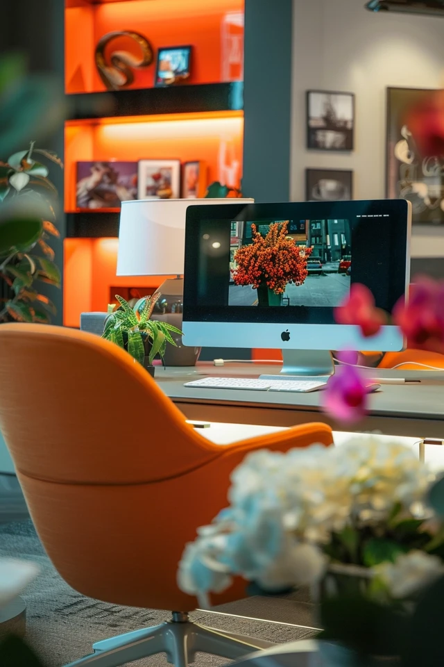
In this guide, I will walk you through my professional process for curating a digital mood board that actually translates to a real-life room. For a visual summary of the concepts discussed here, check out the Picture Gallery at the end of the blog post.
1. Setting the Scope and Identifying Constraints
Before you open the app or type a single keyword, you need to define the parameters of your project. As a designer, I never start searching for “inspiration” until I know exactly what the room needs to accomplish.
If you skip this step, you will fall in love with photos that are physically impossible to recreate in your space. You must be honest about your architecture and your lifestyle.
Analyze Your Architecture
Look at the bones of your room. Do you have eight-foot ceilings or vaulted heights? Do you have wall-to-wall carpet that you cannot remove because you are renting?
If you have standard eight-foot ceilings, pinning images of Parisian apartments with twelve-foot intricate molding will only lead to disappointment. Instead, focus your search on spaces that share your architectural DNA.
Define Your Lifestyle Constraints
Your mood board must be functional, not just pretty. If you have two large dogs and a toddler, pinning white linen sofas is a recipe for disaster.
Write down your non-negotiables before you start pinning. For example: “Must have performance fabrics,” “Need storage for toys,” or “Requires blackout curtains for sleeping.” This acts as a mental filter as you browse.
Designer’s Note: The “Vibe” vs. The Reality
What usually goes wrong: Clients often show me a Pinterest board filled with open-concept, minimalist lofts with concrete floors. Then, they tell me they live in a traditional colonial house and want it to feel “cozy.”
How to prevent it: Distinguish between an aesthetic you appreciate artistically and an aesthetic you actually want to live in. Ask yourself, “Do I want to look at this room, or do I want to sit in this room with a cup of coffee?”
2. The Broad Search Phase: Casting a Wide Net
Now that you have your constraints, it is time to start the search. In this initial phase, do not worry about editing. You are gathering raw data about your own preferences.
Create a new board specifically for the room you are designing. Do not just add these to a generic “Home” board. You need a dedicated workspace for this specific project.
Keywords Matter
The quality of your results depends entirely on your vocabulary. “Living room ideas” is too vague and will give you generic results. You need to use design-specific terminology to find the good stuff.
Try combining a style with a specific element. For example, search for “Mid-century modern walnut sideboard,” “Moody transitional bedroom,” or “Organic modern warm neutral palette.”
Look for “The Feeling,” Not Just Furniture
Don’t limit yourself to photos of interiors. Sometimes the best color palette inspiration comes from a landscape, a piece of art, or a fashion editorial.
If you are drawn to a photo of a foggy coastline, pin it. That image tells you that you like cool greys, muted blues, and soft, diffused lighting.
Common Mistakes + Fixes
Mistake: Pinning only wide-angle full-room shots.
Fix: Pin detail shots. Look for close-ups of joinery, hardware, window treatments, and tile transitions. These details are what make a renovation look high-end.
Mistake: Ignoring the date of the pin.
Fix: Trends move fast. If a pin is from 2014, the specific style (like chevron print or industrial pipe shelving) might feel dated now. Look for fresh content, but verify that the core design principles stand up.
3. The Editing Process: Finding the Red Thread
This is the most critical step that homeowners usually skip. You probably have 50 to 100 pins on your board right now. It likely looks chaotic.
You need to act like a curator. Your goal is to find the “red thread”—the common element that weaves through the images you love.
The Scroll Test
Open your board and scroll through it quickly. What colors jump out at you? Are you seeing a lot of warm terracottas, or are you seeing cool sages?
Are the furniture legs mostly wood or mostly metal? Is the lighting sculptural and modern, or traditional and brass?
Delete the Outliers
Be ruthless. If you have 20 pins of warm, neutral living rooms and one pin of a bright neon maximalist space, delete the neon space. It is an outlier.
Even if you love that individual photo, it does not belong in this project. Keeping it will only confuse your decision-making later.
Identify the Repetitive Elements
Look for the rule of three. If you see the same element in three different photos, it is a genuine preference.
- Texture: Do you keep pinning velvet sofas? That is a clear direction.
- Wood Tone: Are all the floors in your pins light white oak or dark walnut?
- Contrast: Do you prefer high-contrast (black and white) or low-contrast (tone-on-tone beige)?
What I’d Do in a Real Project: Mini Checklist
When I review a client’s preliminary board, I look for these specific consistencies:
- Lighting Temperature: Do they pin warm, moody rooms (2700K lighting) or bright, daylight-filled spaces (3000K-4000K)?
- Rug Sizing: Do they like the rug to disappear under the furniture, or do they like it to frame the space?
- Window Treatments: Are they pinning Roman shades or floor-to-ceiling drapery?
4. Translating Pins to Reality: Scale and Measurements
This is where we move from “inspiration” to “design.” You have to look at a picture on Pinterest and understand the math behind why it looks good.
A photo is a 2D representation of a 3D space. You must decode the scale to reproduce the look.
Analyzing Furniture Scale
Look at the relationship between objects in your favorite pins. For example, look at the coffee table relative to the sofa.
In a well-designed room, the coffee table usually spans about two-thirds of the width of the sofa. It is also usually the same height as the sofa cushions or slightly lower.
If you buy a tiny coffee table for a large sectional because it was “cute,” the room will feel off-balance. Use your pins to study these proportions.
Analyzing Lighting Placement
Lighting is the jewelry of the home, but placement is key. In dining room pins, notice how low the chandelier hangs.
Rule of Thumb: The bottom of a chandelier should generally be 30 to 36 inches above the dining table surface. If you hang it too high, it loses intimacy. If you hang it too low, it blocks conversation.
Rug Logic
Look closely at the rugs in your mood board. You will likely notice a pattern: the front legs of the furniture (at minimum) are sitting on the rug.
This anchors the seating area. If you buy a 5×7 rug for a standard living room, it will float in the middle like a postage stamp. You likely need an 8×10 or 9×12 to replicate the look of those high-end Pinterest images.
Designer’s Note: Understanding Ceiling Height
What usually goes wrong: People fall in love with pendant lights they see in photos of rooms with 10-foot ceilings.
How to prevent it: If you have 8-foot ceilings, you have very little vertical real estate. A large, low-hanging pendant will make the room feel claustrophobic. Look for flush mounts or semi-flush mounts on Pinterest to see how designers make those look chic.
5. Organizing and Finalizing the Mood Board
Pinterest has a “Sections” feature within boards. Use it. It is the best way to turn a mood board into a shopping list.
Organize your refined images into categories: Furniture, Lighting, Hard Finishes (flooring/tile), and Decor/Art.
The “Mix” Verification
Now, open your board again. Does the “Lighting” section talk to the “Furniture” section?
Check your metal finishes. You do not need to match everything perfectly, but they should coordinate. If you have matte black hardware on the doors, a brass light fixture can look beautiful. But if you add chrome legs on the chair and brushed nickel on the curtain rods, it starts to look messy.
The 80/20 Rule: Aim for one dominant metal (80%) and one accent metal (20%).
Add Notes to Your Pins
You can edit the description of the pins you save. Do not leave the default text.
Change the caption to remind yourself why you pinned it. Write notes like: “Love the way the curtains hang high and wide,” or “This wood tone matches our existing floors.”
Hard Finishes and “Boring” Stuff
Don’t forget to pin the boring stuff. Pin images of baseboards, door styles, and outlet placements.
If you are renovating, your contractor will ask you what style of trim you want. Showing them a picture from your board is safer and faster than trying to explain “simple but not too modern” with words.
Final Checklist
Before you start buying, run your board through this final safety check to ensure it is actionable and cohesive.
- The Cohesion Test: If you print out all images and put them on a table, do they look like they belong in the same house?
- The Color Check: Have you identified a 60-30-10 color split? (60% dominant color, 30% secondary color, 10% accent).
- The Texture Balance: Do you have a mix of soft (fabric/rugs) and hard (wood/metal/stone) surfaces?
- The Reality Check: Have you removed images that require architectural features (like floor-to-ceiling windows) that you do not have?
- The Lifestyle Filter: Have you removed fragile or high-maintenance items that don’t fit your current life stage (pets/kids)?
- The Lighting Layer: Does your board include floor lamps and table lamps, not just overhead lights?
FAQs
Q: Can I mix different design styles on one mood board?
A: Yes, absolutely. In fact, most professionally designed rooms are a mix. The key is balance. If you love Mid-Century Modern and Bohemian, aim for a mix where the furniture shapes are Mid-Century (clean lines), but the textiles and accessories are Bohemian (patterned rugs, plants). Don’t try to split it 50/50; pick a dominant style.
Q: How many images should be on my final mood board?
A: Less is more. A working mood board should have about 10 to 15 key images. You might have 50 in your backup folders, but the main board you reference should be tight and curated. This prevents decision fatigue.
Q: What if I can’t find the exact items in the photos?
A: You rarely will. The goal is to replicate the characteristics, not the specific SKU. If you pin a $10,000 Italian sofa, analyze it. Is it the low profile you like? The deep seat? The velvet fabric? Search for those keywords to find a piece within your budget that captures the same essence.
Q: Should I put paint colors on my Pinterest board?
A: You can pin paint swatches for general direction, but never pick a paint color based solely on a screen. Screens are backlit and distort color. Use Pinterest to decide you want “sage green,” but buy real samples to test on your wall.
Conclusion
Creating a mood board on Pinterest is not just about daydreaming; it is a vital part of the planning process. It saves you money by filtering out bad ideas before you pay for them. It saves you time by giving you a clear roadmap when you shop.
By following this process—defining your scope, searching with intent, editing ruthlessly, and analyzing scale—you move from being a passive scroller to an active designer. The result will be a home that feels intentional, cohesive, and uniquely yours.
Picture Gallery


