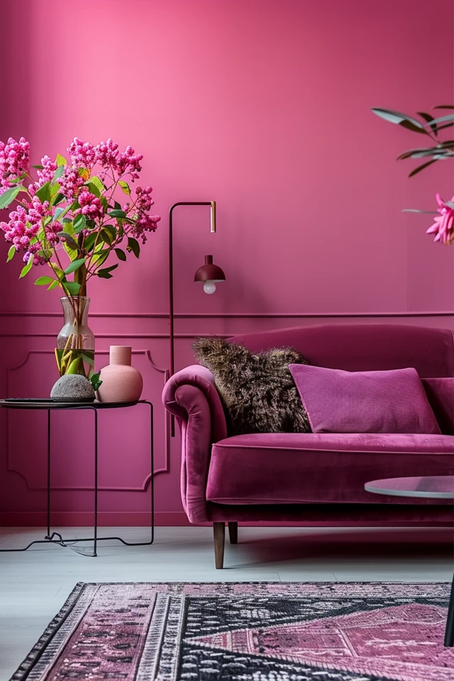
Mixing colors to create the perfect shade of pink can be a challenge. While it may seem simple to mix red and white, the choice of red paint can greatly affect the outcome. Different red pigments have varying undertones and biases, which can result in different shades of pink. For example, Cadmium Red won’t allow you to achieve a hot pink, while Quinacridone Red will give you a bright and vibrant pink. Understanding the color bias of the red pigment is key to creating the desired shade of pink.
Key Takeaways:
- Choose the right red pigment to achieve the desired shade of pink.
- Red pigments have different color biases and undertones that influence the final shade of pink.
- Mix darker red pigments or complementary colors to intensify pink tones.
- Experiment with different ratios and combinations of colors to create your desired darker pink.
- Practice and creativity are essential in achieving vibrant and beautiful pink hues.
Choosing the Right Red Pigment
When mixing pink, it is crucial to select the appropriate red pigment. The choice of red paint can greatly impact the final shade of pink due to the inherent color biases and undertones of different red pigments. Understanding these characteristics is key to achieving the desired pink hue.
For instance, red pigments like Cadmium Red Light tend to have an orange bias. When mixed with white, this can result in a salmon-colored pink. On the other hand, pigments like Quinacridone Red possess a clean and vibrant hue, making them ideal for creating bright and intense pink shades.
By considering the color bias and undertones of red pigments, one can harness their properties to achieve the desired level of brightness and vibrancy in pink colors. This knowledge empowers artists and creators to confidently choose the right red pigment for their artwork.

Mixing Techniques for Darker Pink Shades
If you want to create a darker shade of pink, there are several techniques you can use. One option is to mix a darker red pigment, such as Alizarin Crimson, with white. This will result in a deeper and more intense pink.
Another technique is to mix a small amount of a complementary color with the pink to darken it. For example, adding a touch of green or blue to the pink can create a richer and darker shade. This color blending technique can add depth and complexity to your pink hues.
Experimenting with different ratios and combinations of colors is key to achieving the perfect shade of darker pink. Don’t be afraid to play with color and explore various mixing techniques to find the desired result. Remember, color mixing is an art form, and the possibilities are endless!
Expert Tip:
When using a darker red pigment like Alizarin Crimson, start with a small amount and gradually add it to the white. This will give you better control over the intensity of the pink shade.
- Start with a base of white paint.
- Add a small amount of Alizarin Crimson or another darker red pigment.
- Mix well and observe the resulting shade. If it’s not dark enough, gradually add more red pigment until the desired darkness is achieved.
- Alternatively, mix a small amount of green or blue with the pink to experiment with color blending and create unique shades of darker pink.
Remember, color mixing is an art that requires practice and experimentation. Don’t be afraid to explore different techniques and have fun creating your own stunning pink shades!

Conclusion
Mastering the art of color mixing and achieving the desired shade of pink is possible with the right techniques and a little experimentation. By carefully selecting red pigments and understanding their color biases, you can take control of your creative process. Whether you’re aiming for a vibrant and eye-catching pink or a deeper and more intense shade, these color mixing tips will help you bring your artistic vision to life.
When it comes to choosing the right red pigment, consider the undertones and biases that each pigment possesses. Experiment with different red pigments, such as Quinacridone Red for a bright and intense pink, or Alizarin Crimson for a darker shade. Understanding the characteristics of different pigments will guide you in achieving your desired pink hue.
As you mix your colors, don’t be afraid to explore different techniques. If you’re aiming for a darker pink shade, try blending in a small amount of a complementary color like green or blue. This will deepen the tone and create subtle variations in the final result. Remember, practice makes perfect, so keep experimenting with different ratios and combinations of colors to find the perfect balance.
With these color mixing tips and techniques in your artistic arsenal, you can confidently create vibrant and stunning pink shades that will elevate your artwork to the next level. So grab your brushes, mix your paints, and let your creativity bloom with the beauty of pink.


