
How To Pick A Theme For Your Home: Creating Cohesive Decor
Introduction
Walking into a well-designed home often feels like listening to a great album. Every room has its own personality, yet they all clearly belong to the same artist. For many homeowners, however, achieving this level of continuity feels impossible. You might have a rustic farmhouse kitchen, a mid-century modern living room, and a bedroom that feels like a college dormitory. The result is disjointed and visually exhausting.
Finding a “theme” is not about choosing a rigid category like “Nautical” or “Industrial” and sticking to it slavishly. Instead, it is about developing a consistent design language that creates flow from the front door to the backyard. This involves repeating specific elements—such as color, texture, and scale—to guide the eye smoothly through the space.
In this guide, I will walk you through the professional process of defining your home’s aesthetic. We will cover how to audit your current style, how to respect your home’s architecture, and the specific measurements needed to make furniture fit. For visual examples of these design principles in action, be sure to check out the Picture Gallery at the end of the blog post.
Step 1: Identifying Your Core Design Language
Many people mistake a “theme” for a costume. They think if they choose “coastal,” they need seashells in the bathroom and rope lamps in the hallway. In professional design, we avoid this “theme park” approach. We look for a design language.
Start by looking at what you already own and love, but do not limit this audit to furniture. Look at your closet. If your wardrobe consists of tailored blazers, neutrals, and gold jewelry, you likely prefer a “transitional” or “classic contemporary” aesthetic. If you wear loose linens, earth tones, and chunky knits, your home should likely reflect an “organic modern” or “Bohemian” vibe.
Once you identify your leanings, aim for an 80/20 mix. A room that is 100% one style often feels flat or dated. I generally recommend keeping 80% of the large pieces (sofa, dining table, flooring) in your primary style. Use the remaining 20% for accent pieces in a secondary style to add tension and interest.
Designer’s Note: The “Three-Word” Method
In my projects, I ask clients to pick three words to describe how they want their home to feel, not just how it looks. Examples might include “calm, durable, collected” or “moody, sophisticated, tactile.” Every time you buy a pillow or a chair, ask yourself if it fits all three words. If a chair is “sophisticated” but not “comfortable,” and comfort is one of your words, do not buy it.
Common Mistakes + Fixes
Mistake: Buying matching furniture sets (bed, nightstands, and dresser).
Fix: Break up the set. Keep the bed, but swap the nightstands for a different material (like metal or painted wood) to create a curated look.
Step 2: Respecting the Architecture and Fixed Elements
Before you buy a single gallon of paint, you must listen to the house. A “theme” that fights the architecture will always feel forced. You cannot turn a low-ceilinged 1970s ranch into a soaring Victorian manor just by adding crown molding; it will look out of scale.
Start by measuring your “fixed” constraints. Ceiling height is the most critical vertical measurement. If you have standard 8-foot ceilings, avoid heavy, dark furniture that sits high off the ground, as it will make the room feel claustrophobic. Instead, choose low-profile sofas with backs around 30 to 32 inches high to maximize the visual space above.
Flooring is the second biggest dictator of your theme. If your rental or home has warm, honey-oak floors, trying to force a cool-toned “grey modern” aesthetic will result in a clash. You have two choices: refinish the floors or choose a color palette that harmonizes with the warm wood tones (like creams, greens, or terracottas).
What I’d do in a real project:
- Take photos of all transition points: Stand in the hallway and photograph the view into the bedrooms and living areas.
- Audit the trim: Is the trim modern and square, or traditional and ornate? I usually match the furniture lines to the trim style.
- Check the natural light: I note which direction the windows face. North-facing rooms get cool, blue light, which can make grey paint look depressing. South-facing rooms get warm light, which can make warm whites look yellow.
Step 3: Creating a Whole-Home Color Palette
A cohesive home relies on the “Red Thread” theory. This is a Scandinavian design concept where one subtle element—often a color or material—repeats in every single room to tie the house together.
To do this effectively, use the 60-30-10 rule, but apply it to the whole house, not just one room.
- 60% (Main Color): This is your wall color and large upholstery. In a cohesive home, this should be a neutral (white, beige, greige, or soft grey) that runs through hallways and open spaces.
- 30% (Secondary Color): This adds depth. It might be wood tones, a specific shade of blue, or black accents.
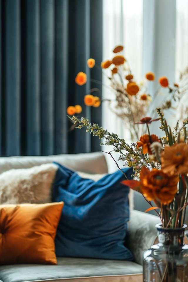
- 10% (Accent Color): This is the “pop.” It appears in throw pillows, art, or a vase.
The trick is to vary the ratios. In the living room, your 60% might be “Swiss Coffee” white walls, with 30% navy blue upholstery and 10% brass accents. In the dining room, you might flip it: 60% navy blue walls, 30% wood furniture, and 10% brass lighting. The ingredients are the same, but the recipe changes.
Lighting Temperature Check
Color changes based on light bulbs. Nothing ruins a theme faster than unmatched lighting. Ensure every bulb in your home is the same color temperature. I strictly use 2700K (warm white) for living and bedrooms, and 3000K (soft white) for kitchens and bathrooms. Never mix them in the same sightline.
Step 4: Materiality, Texture, and Durability
The “feeling” of a home comes from materials, not just colors. If your theme is “Industrial,” your material palette includes leather, raw steel, and concrete. If your theme is “Organic Modern,” your palette includes linen, oak, and boucle.
Consistency in finishes is vital. If you choose matte black door handles downstairs, you generally should not switch to polished chrome upstairs unless there is a very deliberate design reason. However, you can mix metals within a room if you follow a hierarchy. Pick a dominant metal (e.g., brushed nickel) for permanent fixtures like faucets, and an accent metal (e.g., antique brass) for swap-able items like mirrors and cabinet pulls.
Realistic Constraints: Kids and Pets
A beautiful theme fails if it is not livable. If you have dogs or muddy backyards, a “white minimalist” theme requires performance fabrics.
- Fabrics: Look for “Crypton” or high-performance velvets. Avoid rayon or viscose in high-traffic areas; they stain immediately with water.
- Rugs: For living rooms with traffic, use wool or polypropylene. Wool is naturally stain-resistant and durable.
- Rug Sizing Rule of Thumb: A rug that is too small makes a room look cheap. All front legs of the furniture should sit on the rug. In a standard living room, an 8×10 or 9×12 rug is usually required. Leave 12 to 18 inches of bare floor visible around the perimeter of the room.
Designer’s Note: Mixing Woods
You do not need to match wood tones perfectly, but you should match the undertone. Mix warm walnuts with warm oaks. Avoid mixing reddish mahoganies with cool, grey-washed woods. A good rule is to keep wood tones within two to three shades of each other to maintain contrast without clashing.
Step 5: Layout and Flow Between Rooms
Finally, the arrangement of your furniture dictates how the theme is experienced. A cohesive home has a comfortable physical flow. If you have to turn sideways to squeeze past a chair, the design has failed, regardless of how pretty the chair is.
Standardize your pathways. We aim for 30 to 36 inches of clearance for all major walkways. In tight urban spaces, you can cheat this down to 24 inches, but it will feel tight.
The “Sightline” Test
Stand in your kitchen. What do you see? If you see the dining room and the living room, those spaces need to converse. They don’t need to be twins, but they need to be cousins. If your kitchen island has heavy visual weight (like a solid block of stone), balance it in the adjacent living room with a substantial sofa, rather than spindly, lightweight furniture.
Curtain Placement
Window treatments are often an afterthought, but they frame your theme. Hang curtain rods 4 to 6 inches above the window frame (or halfway between the frame and ceiling) to draw the eye up. Ensure the rod extends 8 to 12 inches past the window on each side. This allows the fabric to stack against the wall, not the glass, letting in more light and making the window look larger.
Common Mistakes + Fixes
Mistake: Relying on overhead “boob lights.”
Fix: Create layers of light. Every room needs three sources: ambient (overhead), task (reading lamps/under-cabinet), and accent (picture lights or table lamps). This adds depth and makes your “theme” look expensive.
Final Checklist: Defining Your Home Decor
Before purchasing new items, run through this checklist to ensure your choices align with your new cohesive strategy.
- The “Three Word” Check: Does this item fit my three descriptive words (e.g., Modern, Warm, Durable)?
- The Palette Check: Does this color exist in my 60-30-10 plan? Is it the dominant color or an accent?
- The Scale Check: Have I taped out the dimensions on the floor? Is there at least 30 inches of walking space around it?
- The Material Check: Does this texture work with my lifestyle? (No silk rugs for puppy owners!)
- The Lighting Check: Are the bulbs 2700K or 3000K to match the rest of the house?
- The Flow Check: Does this item clash with the view from the adjacent room?
FAQs
Can I have a different theme for each room?
Generally, no. While you can alter the mood (a moody, dark powder room vs. a bright kitchen), the architectural elements (trim, doors, flooring) and general style (modern vs. traditional) should be consistent. A house that jumps from “Parisian Apartment” in the living room to “Rustic Cabin” in the den feels confusing and disjointed.
How do I combine styles if my partner has different taste?
Find the common ground in specific elements rather than broad labels. Perhaps you both like clean lines (Modern) but he likes dark leather (Industrial) and you like soft textures (Scandi). You can blend these. Use a clean-lined leather sofa (Industrial/Modern) with a soft, wool rug and light oak coffee table (Scandi). This is often called “Transitional” design.
I live in a rental. How can I create a theme without painting?
Focus on the largest surface area you can control: the floor. Large area rugs can hide unsightly rental flooring and set the foundation for your theme. Next, focus on lighting. Swap out basic rental fixtures (store the old ones to reinstall later) and use floor lamps to create atmosphere. Finally, use art. Large-scale art can define a room’s vibe without changing the wall color.
What if I love a trend that doesn’t fit my home’s architecture?
Limit that trend to “movable” items. If you live in a 1920s bungalow but love 1980s neon decor, do not tile your bathroom in neon. Instead, buy a neon art piece or a funky throw pillow. Keep the expensive, fixed elements classic and true to the house, and use accessories to play with trends.
Conclusion
Picking a theme for your home is not about rigidly following a magazine spread. It is about creating a set of rules that simplifies your decision-making process. When you know your color palette, your material preferences, and your sizing constraints, shopping becomes easier and impulse buys disappear.
Start small. Audit one room, define your three words, and fix the lighting. Once you feel the difference that cohesion makes in one space, expanding that logic to the rest of the house becomes an exciting, manageable project. Trust the process, measure twice, and let your home’s natural character guide you.
Picture Gallery


