
Making Your Office Space Look Fun Yet Professional: Decor Ideas
The modern office has an identity crisis. For years, we believed that “professional” meant sterile beige walls, fluorescent lighting, and furniture that looked like it belonged in a dental waiting room. On the flip side, “fun” often gets misinterpreted as chaotic clutter or juvenile decor that makes it hard to focus. The sweet spot lies in the middle: a space that energizes you creatively but still commands respect during a video conference.
I recall a project with a client who was a high-level creative director. She was working out of a room painted “rental white” because she was terrified that adding her personality would make her look less serious to her corporate clients. We completely transformed the space with deep teal joinery and vintage rugs, and she actually reported signing more business afterwards because her background looked confident and established. If you are looking for visual inspiration to bring these concepts to life, check out the Picture Gallery at the end of this blog post.
Creating this balance requires intention. You need to treat your office design with the same rigor as a living room or primary bedroom. It is not just about slapping a poster on the wall; it is about layering textures, understanding lighting temperatures, and mastering scale. Let’s break down exactly how to achieve a workspace that feels vibrant and personal without sacrificing functionality.
1. Anchoring the Room with Color and Pattern
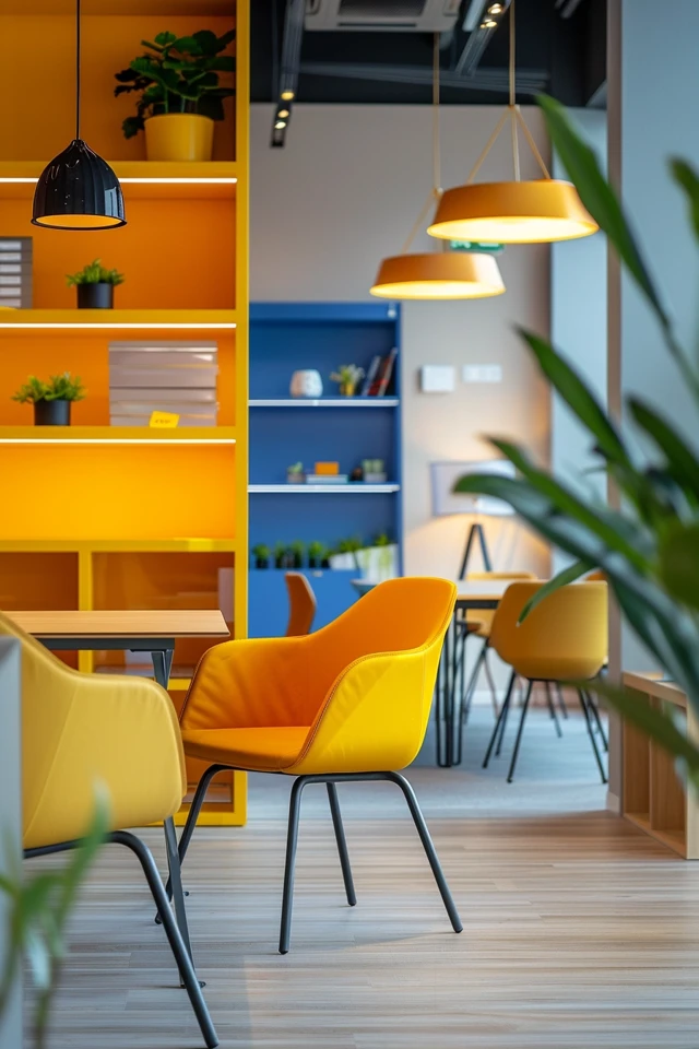
The fastest way to kill the “cubicle vibe” is through color, but this is also where most people make mistakes. To keep it professional, we generally want to avoid high-saturation primary colors (bright red, standard yellow, royal blue) as they can feel aggressive or reminiscent of a playroom.
Instead, opt for “muddy” or complex tones. These are colors that have a bit of gray or brown mixed in. For example, swap a bright lime green for a deep olive or sage. Replace a jarring orange with a warm terracotta or rust. These shades provide the “fun” and energy you want but feel grounded and sophisticated.
If you are renting or hesitant about painting the entire room, color blocking is a fantastic tool. You can paint just the lower third of the wall (a wainscoting effect) or create an arch behind your shelving unit. This defines a zone without overwhelming the senses.
Designer’s Note: The “Zoom Wall” Strategy
In my projects, I always identify the “money wall” first. This is the wall directly behind you when you sit at your desk. This is what your colleagues and clients see.
Do: Use this wall for your main accent color, wallpaper, or curated art.
Don’t: Place a window directly behind you (creating a silhouette effect) or leave this wall blank. A blank wall behind a head says “temporary,” while a styled wall says “established.”
Wallpaper Rules of Thumb
Scale: Large-scale patterns tend to look more modern and less busy on camera than tiny, intricate patterns.
Texture: Grasscloth wallpaper is my secret weapon for offices. It adds zero visual noise but immense warmth and sound dampening.
Application: Peel-and-stick options have come a long way. Look for “matte” finishes; glossy vinyl looks cheap under artificial light.
2. The Desk and Chair: Functionality with Flair
Your furniture is the skeleton of the room. If the bones are bad, the decor won’t matter. The biggest issue I see in home offices is incorrect scale. People often buy desks that are too dainty for the room or massive executive desks that choke the flow of a small apartment bedroom.
Desk Dimensions and Layout
For a professional setup, your desk needs to be deep enough to handle your tech without feeling cramped.
Ideal Depth: If you use an external monitor, look for 30 inches of depth. This allows you to place the monitor at arm’s length (roughly 20-28 inches from your eyes), which is critical to prevent eye strain.
Width: Ensure you have at least 48 inches of width to allow for a lamp, a notebook, and a drink without knocking things over.
To add the “fun” element, move away from standard particle-board office supply desks. Look for dining tables that can double as desks, or vintage writing tables. A Parsons-style table in a high-gloss lacquer or a burl wood finish instantly elevates the room.
The Chair Dilemma
We have all seen those beautiful, tufted velvet chairs that look amazing but ruin your back after an hour.
The Compromise: If you sit for 6+ hours a day, buy a high-quality ergonomic chair (Herman Miller, Steelcase, etc.). To make it look less “corporate,” choose a frame in white or gray rather than black, and select a fabric upholstery rather than standard mesh if available.
The Hack: Throw a sheepskin or a high-quality textured throw over the back of a technical chair. It softens the industrial look immediately.
Common Mistakes + Fixes
Mistake: Floating a desk in the middle of the room without floor outlets.
The Fix: If you want to float your desk (which looks very executive), you must manage the cables. Use a cord cover that matches your flooring color, or anchor the desk to a side wall or sofa table to hide the wires running down. nothing ruins professionalism faster than a rat’s nest of cables.
3. Lighting: The Difference Between distinct and dull
Lighting is where an amateur design usually falls apart. In an office, you have two competing needs: you need bright, cool light to read paperwork and focus, but you want warm, soft light to make the room feel welcoming.
The Layering Technique
You need three sources of light in an office, minimum.
1. Ambient (General): This is your ceiling fixture. Swap out the standard “boob light” flush mount for a semi-flush drum shade or a sputnik-style chandelier. This acts as the jewelry of the room.
2. Task (Focused): This is your desk lamp. For a fun twist, look for mushroom lamps, colorful architectural anglepoise lamps, or vintage brass bankers’ lamps.
3. Accent (Mood): This is often skipped but crucial. A floor lamp in the corner or LED strips behind a shelf adds depth.
Bulb Temperature Matters
For offices, I recommend 3000K to 3500K LED bulbs.
2700K: Too yellow/sleepy for work.
5000K: Too blue/sterile (hospital vibes).
3000K: The “gallery white” standard that is crisp but comfortable.
Video Call Lighting
If you are frequently on video, position your desk lamp to bounce light off a wall in front of you, or use a ring light. Never rely solely on overhead lighting, as it creates dark shadows under your eyes (raccoon eyes). If you wear glasses, position lights slightly higher than your head and to the side to avoid glare on your lenses.
4. Rugs and Textiles: Softening the Edges
Offices are full of hard surfaces: screens, wood desks, metal file cabinets. Textiles are necessary to absorb sound and make the space feel habitable. If your voice echoes when you talk, your office does not sound professional on a call.
Rug Sizing 101
The rug anchors the room. A postage-stamp-sized rug floating in the middle of the floor shrinks the space.
Wall-Facing Desk: If your desk is against a wall, place the rug so the front legs of the desk are off the rug, but your chair is fully on the rug. This prevents your chair wheels from catching on the rug lip constantly.
Material: Avoid high-pile shags. Chair wheels will get stuck, and they are hard to clean. Opt for a low-pile wool, a flatweave, or a printed vintage-style rug. These allow chairs to roll smoothly while adding pattern.
Window Treatments
Ditch the cheap plastic vertical blinds. They scream “temporary office space.”
The Fix: Install curtain rods high and wide. Mount the rod 4-6 inches above the window frame and let it extend 8-10 inches past the sides. This makes the window look huge and maximizes natural light.
Fabric: Velvet or heavy linen curtains add a sense of luxury and help dampen sound. If you need glare control, pair them with a simple solar shade mounted inside the frame.
5. Wall Decor and Personalization
This is the fun part. This is where you display who you are. The goal is “curated,” not “cluttered.”
The Gallery Wall
A gallery wall is a great way to mix personal photos, art prints, and certificates.
Cohesion: To keep it professional, choose one unifying element. This could be that all frames are black, or all mats are white. You can mix the art styles (abstract, photography, typography), but the matching frames will tie it together.
Spacing: Use a level and a ruler. Consistent spacing (usually 2 to 3 inches between frames) is the difference between an art gallery and a dorm room.
Shelving styling: The “Z” Pattern
When styling bookshelves behind you:
Don’t pack them 100% full of books (unless it’s a library look).
Use the “Z” method. Place a block of books on the top left, an object in the middle, and books on the right. On the next shelf down, reverse it. This keeps the eye moving.
Storage: Use matching bins or baskets for the ugly stuff (cables, printer paper). Woven hyacinth or canvas bins hide a multitude of sins while adding texture.
What I’d Do in a Real Project: The “Green” distraction
I always include plants. They act as living sculptures.
Desktop: A small Pothos or ZZ plant.
Constraint Check: If you have cats, skip the lilies and sago palms (toxic). If you have low light, stick to ZZ plants or high-quality faux trees. A dead plant looks worse than no plant.
Final Checklist: Is Your Office Ready?
Before you consider the room finished, run through this designer’s punch list to ensure you have hit the mark on both “fun” and “professional.”
- The “Squint Test”: Stand at the doorway and squint. Does one color dominate too much? Do you see distinct zones of light?
- The Echo Test: Clap your hands loudly. If it rings/echoes, you need more rug, curtains, or canvas art on the walls.
- The Ergonomic Check: Are your elbows at a 90-degree angle when typing? Is the top of your monitor at eye level?
- The Camera Check: Turn on your webcam. Is there a laundry basket visible? Is a light bulb glaring directly into the lens?
- The Cable Sweep: Are there any loose wires dangling where a foot could catch them?
FAQs
How can I make my office fun if I am in a strict rental?
Focus on what you can take with you. Invest heavily in a large, colorful area rug (it covers the boring beige carpet), unique lamps, and art. Use Command strips for gallery walls so you don’t damage paint. Removable wallpaper is also a game-changer for renters; just do one accent wall to keep costs and labor low.
Can I mix metal finishes in an office?
Absolutely. In fact, mixing metals makes a room feel more designed and less “store-bought.” A general rule is to pick a dominant metal (e.g., matte black for 70% of fixtures) and an accent metal (e.g., antique brass for 30%). You might have a black desk frame and chair, but brass lamp bases and drawer pulls.
How do I handle a shared office space?
Zoning is key. If two people share a room, try to give each person their own distinct “zone” using rugs or lighting. If possible, position desks so you aren’t staring directly at each other, which reduces visual distraction. Noise-canceling headphones and acoustic dividers (felt panels) on the desks are essential for maintaining professional focus.
What if my office is actually just a closet or a corner of the living room?
Treat it like a “jewel box.” Paint the inside of the closet (or the nook) a contrasting, deep color to separate it from the living room. Use a sconce light (plug-in options work great) to save desk space. The key is that at the end of the day, you should be able to “close” the office, even if that just means tidying the desk so it blends back into the living area.
Conclusion
Designing an office that bridges the gap between fun and professional is about respecting your own workflow. It is about acknowledging that you are a human being who needs stimulation and comfort, not just a worker bee. By focusing on quality lighting, appropriate scale, and “muddy” colors, you can build a space that feels uniquely yours but still commands the respect your work deserves.
Start with the layout, fix the lighting, and then layer in the personality. You will find that when your environment feels right, the work comes a little easier.
Picture Gallery


