
Mauve Bedroom Ideas: Chic & Soothing Decor Tips
Mauve is having a significant renaissance in interior design, moving far past its somewhat dusty reputation from the 1980s. It is a complex, intellectual color that sits right on the border between violet and pink, often muted with gray to create a sense of calm sophistication. For a dose of visual inspiration, scroll down to the Picture Gallery at the end of the blog post.
When I introduce mauve to clients, I often describe it as a “new neutral.” It possesses the soothing qualities of gray but brings a warmth and personality that pure monochrome spaces often lack. It is particularly effective in bedrooms because it promotes relaxation while maintaining a sense of luxury.
However, getting this color right requires a trained eye for undertones and lighting. If you choose the wrong swatch, your chic retreat can quickly turn into a sugary nursery or a dated guest room. In this guide, I will walk you through the technical steps to mastering this hue, from paint selection to final textile layers.
1. Decoding the Undertones: Finding Your Perfect Shade
Mauve is not a single color; it is a spectrum. The biggest mistake homeowners make is grabbing a swatch that looks nice in the store without analyzing its base. In my design practice, I categorize mauve into two distinct families: cool and warm.
Cool mauves have a heavier gray or blue influence. They read more like a lilac-gray and are exceptionally sophisticated. These shades work best in south-facing rooms that receive plenty of warm, direct sunlight. The natural yellow light of the sun balances the cool tones, preventing the room from feeling icy.
Warm mauves lean closer to a “dusty rose” or have a brown base. These are earthier and cozier. I prefer using these in north-facing rooms where the light is naturally cooler and bluer. The warmth in the paint pigment helps counteract the dull light, making the space feel inviting rather than dreary.
Designer’s Note: The 48-Hour Test
I never let a client approve a mauve paint color without a 48-hour observation period. Paint a large sample board—at least 24 by 24 inches—and move it around the room. Look at it in the morning light, the afternoon sun, and most importantly, under your artificial lighting at night. Mauve is a “chameleon color” and can shift from sophisticated gray to bright purple instantly depending on the light source.
2. The Color Palette: What Pairs with Mauve?
Once you have your wall color, you need to build a palette that grounds the space. If you pair mauve with white furniture and floral prints, you risk creating a “Grandmillennial” look. If that isn’t your goal, you need higher contrast and earthier companions.
The Moody Modern Palette
Pair mauve with charcoal gray, matte black, and deep walnut wood. The darkness of the charcoal cuts through the sweetness of the mauve. In a recent project, we used a dusty mauve on the walls and installed matte black sconces and a charcoal velvet headboard. The result was moody, masculine, and incredibly chic.
The Organic Luxe Palette
For a lighter, airier feel, pair mauve with creamy off-whites (avoid stark hospital white), sage green, and light oak. Green is the complementary color to red/purple on the wheel, which makes sage and mauve a naturally harmonious duo. Use the 60-30-10 rule here:
- 60% Mauve (Walls or major bedding)
- 30% Cream/Oak (Furniture and flooring)
- 10% Sage Green (Throw pillows or plants)
The Metallic Accent Rule
Hardware finishes matter immensely here. Unlacquered brass or brushed gold warms up mauve and feels vintage and expensive. Polished chrome or nickel creates a cooler, more contemporary look. Avoid rose gold; it tends to blend in too much and looks monochromatic in a bad way.
3. Textiles and Textures: The Anti-Flat Factor
A mauve bedroom falls flat if the textures are all the same. Because the color is soft, you need materials that offer visual weight and tactile variation. I always advise mixing at least three distinct textures on the bed alone.
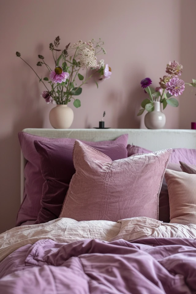
Velvet
Velvet is mauve’s best friend. The fabric’s nap catches the light, showing off the complexity of the color. A mauve velvet accent chair or headboard adds depth that a simple cotton fabric cannot match. If you have pets, look for performance velvet; it is surprisingly durable and easy to clean.
Linen
To keep the room from feeling too heavy or formal, incorporate washed linen. A linen duvet cover in a flax or oatmeal color grounds the design. The natural wrinkles of linen add a “perfectly imperfect” vibe that modernizes the space.
Bouclé and Knits
Introduce a chunky knit throw or a bouclé bench at the foot of the bed. This nubby texture contrasts beautifully with smooth walls. If your room is small, a bench with open legs keeps the sightlines open while adding function.
What I’d Do in a Real Project (Texture Checklist):
- Flooring: A vintage-style wool rug or a sisal rug for grit.
- Windows: heavy linen drapes (lined for blackout) mounted high.
- Bedding: Crisp percale sheets (white) + linen duvet (neutral) + velvet pillows (deep plum or forest green).
- Furniture: A mix of wood and stone (like a marble top nightstand) to add hardness against the soft colors.
4. Lighting Strategy: Correcting the Glow
Lighting is the technical element that will make or break a mauve room. Because purple tones absorb light, a mauve room can feel dark if you don’t layer your illumination correctly. You need to wash the walls with light to keep the color true.
Kelvin Temperature Matters
You must pay attention to the Kelvin (K) rating of your bulbs. For a mauve bedroom, I strictly recommend 2700K to 3000K.
- 2700K: Warm, cozy, relaxing. Enhances the red/pink undertones.
- 3000K: Neutral, crisp. Keeps the color true without turning it blue.
- Avoid 4000K+ (Daylight): This will turn your chic mauve walls into a harsh, clinical violet.
Layering Sources
Do not rely on a single overhead ceiling fan or “boob light.” You need three layers:
- Ambient: A chandelier or semi-flush mount that diffuses light softly.
- Task: Bedside lamps or sconces. Ensure the bottom of the shade is at eye level when you are sitting up in bed (usually 20 inches above the mattress).
- Accent: If you have art on the walls, consider a picture light. Or, place a small uplight behind a floor plant to create shadows.
5. Furniture Scale and Layout
Mauve is a receding color, meaning it can make walls feel further away, expanding the room visually. However, you must scale your furniture correctly so the room feels anchored. One of the most common issues I see is “floating furniture” that feels too small for the space.
The Rug Rule
Your rug anchors the mauve palette. It creates a dedicated zone for sleep.
- King Bed: Use a 9×12 rug.
- Queen Bed: Use an 8×10 rug.
The rule of thumb is that the rug should start about 6 to 12 inches in front of your nightstands and extend at least 18 to 24 inches past the foot of the bed. If you skimp on the rug size, the bed looks like it is swallowing the room.
Nightstand Proportions
Your nightstand should be roughly the same height as your mattress (plus or minus 2 inches). If your bed frame is bulky or upholstered in mauve fabric, choose nightstands with legs to show more floor. This keeps the visual weight balanced. If your bed is on legs, a chest-style nightstand (drawers all the way down) adds necessary weight.
Common Mistakes + Fixes
Mistake: Matching the curtains exactly to the wall color.
Fix: While monochrome can work, it often looks flat in DIY projects. Go one shade darker or lighter than the walls, or choose a neutral cream linen. Hang the curtain rod 4 to 6 inches above the window frame to elongate the ceiling.
Mistake: Using “pure white” trim.
Fix: Pure white can look jarring next to muted mauve. Use an off-white like Benjamin Moore’s “White Dove” or Sherwin Williams’ “Alabaster” for baseboards and molding. This softer transition is much easier on the eyes.
Final Checklist: Your Mauve Master Plan
Before you buy a single gallon of paint or a throw pillow, run through this checklist to ensure you are on the right track. This is the same mental list I use when finalizing a design concept.
- Sample The Paint: Have you painted a 2×2 swatch and viewed it at night with the lights on?
- Check the Bulbs: Are all your lightbulbs between 2700K and 3000K?
- Contrast Check: Do you have at least one dark element (black, charcoal, walnut) to ground the room?
- Texture Count: Do you have at least three different textures (e.g., wood, velvet, linen)?
- Wood Tones: Are you avoiding red-toned woods (cherry/mahogany) which might clash? Stick to walnut, oak, or painted wood.
- Greenery: Do you have a plan for a plant? The green life is essential to make mauve feel fresh.
FAQs
Is mauve considered a dated color?
It was for a long time, but it has returned as a staple in high-end design. The modern version is “dustier” and grayer than the 80s version. Think “dried flower” rather than “bubblegum.”
Can I use mauve in a small bedroom?
Absolutely. Lighter, cooler mauves recede visually, making walls feel further away. If you paint the ceiling the same color as the walls, it blurs the boundary lines and makes the room feel like a cozy, infinite cocoon.
What metal finish looks best with mauve?
Unlacquered brass is the gold standard (pun intended). It provides warmth. Matte black is excellent for a modern, industrial edge. I generally avoid rose gold as it gets lost, and polished chrome can sometimes feel too cold unless the room gets massive amounts of sun.
How do I make the room feel masculine with mauve walls?
Lean into leather and dark woods. A cognac leather bench, dark walnut nightstands, and navy or charcoal bedding will instantly masculinize the space. Mauve essentially acts as a warm gray in this context.
Conclusion
Designing a mauve bedroom is about balance. It requires walking the line between color and neutral, cool and warm. When executed well, it results in a space that feels deeply personal and incredibly restful. It steps away from the safety of “builder beige” without screaming for attention like a bright primary color.
Remember that paint is the least expensive way to transform a room, but it has the highest impact. Don’t be afraid to test a few shades that look “too gray” on the chip; they often come alive on the wall. Trust your eye, follow the rules of lighting and texture, and you will create a sanctuary you love waking up in.
Picture Gallery


