
Mid-century Modern Entryway Ideas: First Impressions
The entryway is the handshake of your home. It sets the tone for everything that follows, offering guests a glimpse into your personal style while serving as the primary drop zone for your daily life. A Mid-century Modern (MCM) aesthetic is particularly effective here because it balances high function with welcoming, organic warmth.
There is a misconception that this design style is stuck in the 1960s or feels like a museum set. In reality, MCM design relies on clean lines, functional furniture, and honest materials that feel incredibly fresh today. Get ready to browse our curated Picture Gallery at the end of the blog post for visual inspiration.
Whether you are working with a sprawling foyer or a tight apartment hallway, the principles remain the same. We focus on flow, light, and a few sculptural elements that do the heavy lifting. Let’s break down how to achieve this look with practical measurements and designer insights.
1. Laying the Foundation: Flooring and Wall Treatments
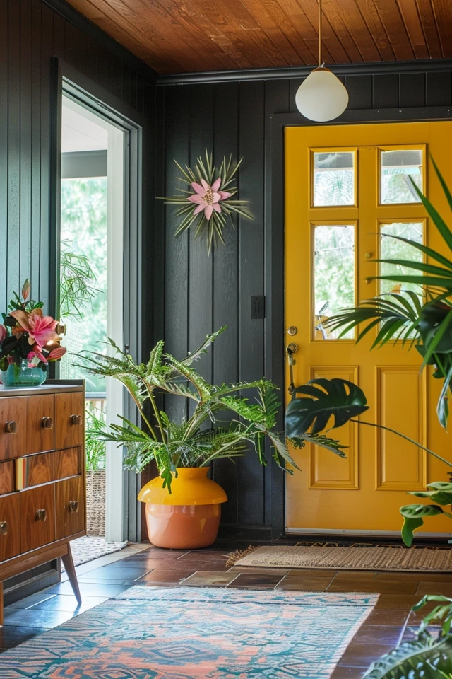
The “shell” of your entryway dictates how the furniture will read. In true Mid-century design, we look for materials that feel natural but structured. If you are renovating, slate tile is a top-tier choice for entryways. It is incredibly durable against mud and water, and the dark gray tones provide a perfect contrast to warm wood furniture.
If replacing flooring isn’t an option, you can manipulate the space with wall treatments. Wood paneling was huge in the mid-century era, but avoid the dark, damp basement look. Opt for vertical wood slats in white oak or walnut. This adds texture and draws the eye upward, making the ceiling feel higher.
For paint, you rarely go wrong with a crisp, warm white to let your furniture shine. However, if you want drama, look at period-correct earth tones. Olive greens, mustard yellows, and deep teals work beautifully as accent walls behind a console table.
Designer’s Note: The “Feature Wall” Trap
I see many homeowners try to do too much in a small foyer. They add wallpaper, a complicated rug, and art, creating visual chaos.
My rule of thumb: Pick one hero surface. If you have a stunning terrazzo floor or a bold geometric rug, keep the walls simple. If your walls feature a bold botanical wallpaper, keep the flooring neutral.
Common Mistakes + Fixes
- Mistake: Using cool-toned gray paint.
Fix: MCM thrives on warmth. Swap cool grays for “greige” or warm whites with yellow undertones (like Benjamin Moore’s Swiss Coffee).
- Mistake: Dark entries with dark walls.
Fix: If you lack natural light, keep walls light. Use dark wood tones only in the furniture to provide contrast without closing in the space.
2. The Anchor Piece: Consoles and Credenzas
The console table is the workhorse of the entryway. In Mid-century design, silhouette is everything. You want pieces that feel “lifted” off the ground. Look for tapered legs (often called pencil legs) or hairpin legs. This negative space beneath the furniture is crucial for maintaining an airy flow, especially in narrow hallways.
Material selection is equally important. Walnut and teak are the gold standards for this era. They offer a rich, amber glow that synthetic materials cannot replicate. If you are on a budget, look for high-quality veneers rather than solid wood, but ensure the grain pattern looks authentic.
Functionality must accompany form. As a designer, I always recommend a piece with at least two drawers. You need a place to hide keys, mail, and dog leashes. A cluttered surface ruins the clean lines of the MCM aesthetic immediately.
Measurements That Matter
- Clearance: You need a minimum of 36 inches of walking path between the console and the opposite wall. 42 inches is ideal for two people to pass.
- Depth: For narrow halls, look for “shallow depth” consoles, typically 10 to 12 inches deep. Standard consoles are 15 to 18 inches.
- Height: The table surface should sit roughly 30 to 36 inches off the floor. This is the natural height for dropping keys without bending over.
What I’d Do in a Real Project
If I am designing a home with kids or pets, I avoid vintage pieces with delicate veneer for the entryway. Instead, I source new, solid wood reproductions. Modern finishes are more forgiving of water rings from wet umbrellas or scratches from keys. I also prioritize “soft close” drawers to prevent that rattling sound every time you leave the house.
3. Lighting: Sputniks, Globes, and Layers
Lighting in a Mid-century entryway serves two purposes: sculpture and illumination. The fixtures from this era are iconic. The “Sputnik” chandelier is the most famous, featuring multiple arms radiating from a center point. It is a fantastic statement piece for high ceilings.
For standard ceiling heights (8 feet), a semi-flush mount globe light is a safer bet. The milk glass diffuses light evenly, preventing harsh shadows. This soft, glowing effect is a hallmark of the style.
Never rely solely on overhead lighting. It creates a ” interrogation room” vibe. You must layer your lighting. Place a sculptural table lamp on your console. Look for ceramic bases with textured glazes or mushroom-shaped metal lamps.
The Golden Rules of Entryway Lighting
- Pendant Height: If you have high ceilings and hang a pendant, the bottom of the fixture should be no lower than 7 feet from the floor.
- Bulb Temperature: This is non-negotiable. Use 2700K to 3000K LED bulbs. Anything higher (4000K+) looks blue and sterile, killing the warm wood tones of your furniture.
- Scale: A tiny light fixture looks cheap in a large foyer. Add the length and width of the room in feet (e.g., 5 + 8 = 13). That sum in inches (13 inches) is the approximate diameter your ceiling fixture should be.
Common Mistakes + Fixes
- Mistake: Oversized table lamps on narrow consoles.
Fix: The lamp shade should not extend beyond the edge of the table. If your table is 12 inches deep, your lamp shade diameter should be 10 inches max.
- Mistake: ignoring the switch location.
Fix: Ensure you can turn on the primary light immediately upon entering. If wiring is an issue, use smart bulbs paired with a wireless motion sensor.
4. Accessories and Styling: The Atomic Touch
Styling is where the “First Impressions” concept really comes alive. This is where you inject personality. The mirror is the most critical accessory. In MCM design, we often see asymmetrical shapes, amoeba curves, or the classic starburst (sunburst) mirror.
A mirror does more than let you check your teeth before leaving. It bounces light around and makes tight spaces feel double the size. When hanging a mirror above a console, the center of the mirror should be roughly at eye level, usually 60 to 65 inches from the floor.
Greenery is essential. Mid-century design is about bringing the outdoors in. A Snake Plant (Sansevieria) or a Monstera looks right at home in a ceramic cylinder pot on a wooden plant stand. These plants add vertical height and organic curves that contrast with the straight lines of the furniture.
Rug Selection and Sizing
Don’t treat the rug as an afterthought. A vintage runner or a geometric pattern rug anchors the space.
- Sizing Rule: Leave at least 4 to 6 inches of floor visible on all sides of the rug. It frames the space.
- Material: For high-traffic entries, wool is king. It cleans easily and lasts decades. Avoid viscose or silk in an entryway; water ruins them instantly.
- Safety: Always use a high-quality rug pad. We don’t want the rug slipping out from under a guest.
Designer’s Note: The “Rule of Three”
When styling the top of your console, use the rule of three. Group items in odd numbers.
1. Vertical: A tall lamp or vase.
2. Horizontal: A decorative tray for keys (catch-all).
3. Bridge: A sculptural object or stack of books to connect the two.
5. Solutions for Small Spaces and Renters
Not everyone has a grand foyer. In city apartments, the “entryway” is often just a patch of wall behind the front door. The Mid-century aesthetic is actually perfect for this because it prioritizes efficiency.
If you don’t have floor space for a console table, go vertical. A wall-mounted floating shelf serves the same purpose without eating up footprint. Look for a shelf with a curved edge to soften the look and prevent hip-bumping bruises.
Hooks are your best friend here. The Eames “Hang-It-All” is a classic design featuring colorful wooden balls on a wire frame. It’s playful, functional, and holds coats, bags, and hats without taking up space.
Renter-Friendly Upgrades
- Peel-and-Stick Wallpaper: Apply a geometric mid-century pattern to the one wall behind your door. It defines the zone without damaging paint.
- Plug-in Sconces: If you don’t have space for a table lamp and can’t hardwire a sconce, buy a plug-in version with a brass arm. It adds architectural interest instantly.
- Carpet Tiles: If the rental flooring is ugly, use carpet tiles to create a custom-sized runner that covers the imperfections.
What I’d Do in a Real Project (Small Space Edition)
In a recent tiny condo project, I used a large round mirror (36 inches) on the wall. Below it, I mounted a very narrow floating drawer unit (only 8 inches deep). I flanked the mirror with two small wall hooks. The large mirror tricked the eye into thinking the hallway was massive, while the floating storage kept the floor completely clear for shoes.
Final Checklist: The Mid-century Entryway
Before you start buying, run your plan through this checklist to ensure you are hitting the right notes for both style and function.
- Flow Check: Is there at least 36 inches of walking space past your furniture?
- Storage Reality: Do you have a specific spot for keys, mail, and at least two pairs of shoes?
- Lighting Temperature: Are your bulbs between 2700K and 3000K?
- Leg Check: Does your furniture have tapered or hairpin legs to keep the look airy?
- Mirror Placement: Is the mirror centered at eye level (approx. 60-65 inches) and not too high?
- Texture Balance: Do you have a mix of wood, metal (brass/black), and soft textiles (rug)?
- Rug Safety: Is there a non-slip pad under the rug?
- Greenery: Is there at least one plant to bring life to the space?
FAQs
Q: Can I mix wood tones in a Mid-century entryway?
A: Absolutely. In fact, you should. Matching everything perfectly looks like a catalog. The trick is to stay in the same “temperature.” Mix warm walnut with warm oak. Avoid mixing warm reddish woods with cool, gray-washed woods.
Q: What is the best paint color for a small, dark entryway?
A: Avoid dark colors if you don’t have natural light; they can make the space feel like a cave. Go for a warm white or a very pale cream. This reflects the little light you have. Add color through art or the rug instead.
Q: Is Mid-century Modern okay for homes with kids?
A: Yes, it is very practical. However, avoid glass-top console tables which show fingerprints and can be dangerous. Stick to wood or stone tops. Also, choose rugs with patterns; they hide dirt much better than solid colors.
Q: How big should my entryway mirror be?
A: A good rule of thumb is that the mirror should be about two-thirds the width of the console table beneath it. If your table is 48 inches wide, a mirror around 30-32 inches wide feels balanced.
Conclusion
Creating a Mid-century Modern entryway is about more than just buying a retro table. It is about curating a space that respects geometry, celebrates honest materials, and welcomes you home with warmth. By focusing on the foundational elements of scale, lighting, and functional flow, you create a first impression that is both nostalgic and perfectly suited for modern living.
Start with your anchor piece, layer in your lighting, and don’t forget the practical storage needs of your household. Design is an iterative process. It is okay to start with the console and build the rest of the room over time as you find the perfect vintage accessories.
Picture Gallery


