
Title: Mid-century Modern Furniture: Must-Have Pieces
Introduction
Mid-century modern (MCM) design has stuck around for decades, and frankly, it is not going anywhere. It hits the sweet spot between functionality and sculpture, offering pieces that look good but are actually meant to be used. When I work with clients, they often want this look because it feels airy, optimistic, and uncluttered without feeling cold.
However, achieving this aesthetic isn’t as simple as buying everything with tapered legs. It requires curating specific silhouettes that anchor the room and dictate the flow of traffic. For plenty of visual inspiration on how to arrange these pieces, make sure to check out the Picture Gallery at the end of the blog post.
In this guide, I will walk you through the non-negotiable furniture pieces that define this style. We will look at specific dimensions, material choices, and how to place these items so your home looks curated, not like a vintage shop explosion.
1. The Statement Lounge Chair
If there is one piece that defines the mid-century ethos, it is the low-slung lounge chair. Whether you are eyeing an Eames style recliner or a Danish teak armchair, this piece serves as a sculptural anchor for your living space.
In a professional layout, I treat the lounge chair as a floating element. Unlike a sofa, which usually hugs a wall or defines a zone, the lounge chair should look good from the back and sides. It needs room to breathe.
The Rules of Scale and Placement
- Clearance is key: These chairs often have a footprint of about 32 to 36 inches wide. You need at least 24 to 30 inches of walking path around them. If the chair swivels, increase that clearance so it doesn’t hit a wall or side table.
- Seat height matters: MCM furniture sits lower than contemporary styles. The average seat height is often 15 to 16 inches, compared to the modern standard of 18 inches. If you place a vintage chair next to a brand new, overstuffed sofa, the chair will look miniature.
- Material contrast: If your sofa is fabric, aim for a leather lounge chair or one with a visible wood frame. This breaks up the “upholstery heavy” look that makes rooms feel stuffy.
Designer’s Note: The “Sit” Test
Many replicas look the part but fail the comfort test. Authentic mid-century design was obsessed with ergonomics. When shopping, sit in the chair for at least five minutes. If the pitch (the angle of the back) forces your chin into your chest or slides you forward, skip it. No amount of style makes up for back pain.
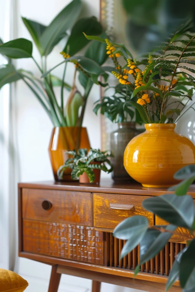
2. The Long, Low Credenza
The credenza (or sideboard) is the workhorse of the mid-century home. It provides essential closed storage while offering a surface for art, lamps, and media. The defining characteristic here is horizontal linearity.
I frequently use these in dining rooms, entryways, and even as media consoles. The goal is to emphasize the width of the room. A long sideboard draws the eye horizontally, making a cramped wall feel expansive.
Selecting the Right Dimensions
- The “Two-Thirds” Rule: If you are using a credenza under a TV, the furniture must be wider than the screen. Ideally, the TV should take up no more than two-thirds of the credenza’s width. If the TV is wider than the furniture, the room will feel top-heavy and unbalanced.
- Leg style: Look for pieces raised on legs rather than sitting flush on the floor. Being able to see the floor underneath the furniture tricks the eye into thinking the room is larger. A clearance of 6 to 8 inches is standard for MCM pieces.
- Depth constraints: Vintage pieces are often shallower (16 to 18 inches deep) than modern media cabinets (20 to 24 inches). Measure your internal components (receiver, gaming console) before buying to ensure they actually fit inside.
Common Mistakes + Fixes
Mistake: Overcrowding the surface.
Fix: Use the “Triangle Rule” for styling. Place a tall lamp on one side, a piece of leaning art in the middle, and a low tray or bowl on the other side. Leave negative space. The top of a credenza is not a shelf for clutter; it is a display surface.
3. The Pedestal Dining Table
In many mid-century homes, dining spaces were smaller or integrated into open plans. The solution was the pedestal table, most famously popularized by Eero Saarinen’s Tulip table.
The genius of this design is the elimination of the “leg forest.” By removing the four corner legs, you reduce visual clutter and allow for more flexible seating arrangements. You can squeeze in an extra chair without anyone straddling a table leg.
Material and Sizing Guide
- Shape selection: In a square room, go round. In a rectangular room, go oval. An oval shape maintains the flow of traffic while maximizing surface area.
- Sizing for flow: A 48-inch round table comfortably seats four people. A 60-inch round seats six, but you need a large room to accommodate it. Always aim for 36 inches of clearance between the table edge and the nearest wall or buffet.
- Marble vs. Laminate: Real marble is porous. If you have kids or drink red wine, it will etch and stain. High-quality laminate or quartz composites offer the same look with zero anxiety. I often specify coated marble or quartz for families to avoid the inevitable “coaster policing.”
What I’d Do in a Real Project
If I am designing a breakfast nook or a smaller dining area, I almost exclusively use a pedestal table. I pair it with chairs that have open backs (like a wishbone chair). The combination of the single base and the see-through chair backs keeps the light filtering through the room, preventing the corner from looking dark or heavy.
4. The Biomorphic Coffee Table
Mid-century design loves a straight line, but it balances that rigidity with organic curves. Enter the biomorphic coffee table—think kidney shapes, palettes, or the iconic Noguchi glass triangle.
This piece is crucial for breaking up the “boxiness” of a living room. If you have a rectangular rug, a rectangular sofa, and a rectangular TV, a curved coffee table softens the entire geometry of the space.
Glass vs. Wood
- The case for glass: A glass-topped table is invisible visual weight. It takes up physical space but not visual space. This is my go-to for small apartments or rooms with heavy, dark rugs. It lets the rug pattern show through.
- The case for wood: If your room feels sterile or cold, a solid wood table adds warmth and texture. Walnut and teak are the standard bearers here.
- Height rules: The table surface should be the same height or 1 to 2 inches lower than your sofa cushion. Standard MCM coffee tables are quite low, often around 15 to 16 inches. Do not pair a high, modern farmhouse sofa (20-inch seat height) with a low vintage table; it will feel like you are reaching down to the floor for your drink.
Family-Friendly Adjustments
If you have toddlers, a heavy glass top resting on a wood base (which is common in this style) can be a nerve-wracking safety hazard. In these cases, I swap the glass for a solid wood kidney-shaped table with rounded, bullnose edges. You get the same aesthetic curve without the shatter risk or sharp corners.
5. Layered Lighting: The Arc Lamp and Sputnik
Lighting in the 1950s and 60s moved away from simple utility and became art. You need at least three light sources in a room to create a proper atmosphere: ambient (overhead), task (reading), and accent (mood).
The Floor Lamp
The oversized arc lamp is a brilliant invention for renters or anyone who doesn’t want to hire an electrician. It allows you to have overhead lighting centered over a coffee table or dining table without a ceiling junction box.
- Placement: Place the heavy base in a low-traffic corner (often behind the sofa) and arc the shade over the seating area.
- Safety: These are heavy. Ensure the base is solid marble or weighted metal so it doesn’t tip if bumped.
The Sputnik Chandelier
This is the “starburst” fixture synonymous with the atomic age.
- Ceiling Height: Only use a pendant or chandelier if you have at least 7 feet of clearance underneath it (unless it is over a table). For 8-foot ceilings, look for semi-flush mount Sputniks to get the look without hitting your head.
- Bulb selection: This is where people mess up. These fixtures often have 12+ bulbs. If you use standard 60-watt bulbs, you will blind yourself. Use low-wattage LED bulbs (equivalent to 15 or 25 watts) and install a dimmer switch. Always choose “Warm White” (2700K to 3000K). Anything higher (4000K+) will look like a hospital operating room.
Designer’s Note: Avoiding the Museum Look
The biggest risk with this style is creating a “time capsule.” You do not want your home to look like a movie set from Mad Men.
The Rule of Mix: I generally suggest an 80/20 split. 80% of your pieces can be mid-century modern (or inspired), but mix in 20% from other eras.
- Add a chunky, woven Moroccan rug to offset the sleek wood legs.
- Throw in some contemporary abstract art.
- Use lush, velvet pillows to soften the structured lines of the furniture.
This tension between eras makes the design feel authentic and personal, rather than catalog-perfect.
Final Checklist: Before You Buy
Use this checklist when you are standing in a vintage store or hovering over the “checkout” button online.
- Check the joinery: Are the drawers dovetailed? (Interlocking wood teeth). This is a sign of quality. If they are stapled or glued, it’s low-end production.
- Smell check: Vintage furniture can hold odors. Open drawers and sniff the upholstery. Musty smells are very hard to remove from old foam and raw wood.
- Measure the path: Can you actually get that 8-foot credenza through your hallway and around the corner?
- Wood tones: Do not try to match all your wood tones perfectly. It looks artificial. Instead, mix walnut with oak, or teak with brass accents. Just ensure the undertones (warm vs. cool) are harmonious.
- Leg check: Count the legs in the room. If the sofa, two chairs, sideboard, and TV stand all have high, tapered legs, the room will look like it is ready to run away. Swap one piece for something with a plinth base or a skirt to ground the space.
FAQs
Q: Can I mix Mid-century Modern with IKEA furniture?
Absolutely. Many IKEA designs are actually Scandinavian modern, which shares the same DNA as MCM. The key is to upgrade the hardware or legs on the IKEA pieces to make them blend better with higher-end vintage items.
Q: Is vintage better than reproduction?
Not always. Vintage has soul and holds value, but 60-year-old foam and webbing often need replacing, which is expensive. High-quality reproductions offer modern durability and fabrics that are stain-resistant, which is often a better choice for households with kids or pets.
Q: How do I clean vintage teak?
Never use standard furniture polish sprays (like Pledge) on oil-finished teak. It ruins the finish. Use a specific teak oil once a year to hydrate the wood. for daily cleaning, a damp cloth is all you need.
Q: My room is dark. Will walnut furniture make it darker?
It can. If you have low light and dark floors, walnut might disappear. In this case, opt for lighter woods like ash or oak, or choose MCM pieces that are painted or have metallic accents to reflect light.
Conclusion
Building a mid-century modern collection is about patience and precision. These must-have pieces—the lounge chair, the credenza, the pedestal table, the organic coffee table, and sculptural lighting—form the skeleton of a great room.
Focus on scale and silhouette first. Get the layout right, ensure there is enough negative space for the legs to show, and don’t be afraid to mix in a little texture to warm things up. When you buy pieces with good bones and classic lines, you are investing in furniture that will outlast the trends.
Picture Gallery


