
Title: Mid Century Office Decor: Elevate Your Workspace
Introduction
Mid-century modern design has remained a staple in interior architecture for over seventy years because it perfectly balances form and function. This style is not just about nostalgia; it is about creating clean lines, organic curves, and a connection to nature that boosts productivity. When designing a home office, this aesthetic offers a clutter-free environment that feels warm rather than sterile.
I have spent years helping clients transform spare bedrooms and awkward corners into executive-level workspaces using these principles. The key is to look past the “retro” label and focus on the quality of materials and the logic of the layout. If you are looking for visual inspiration, you will find a curated Picture Gallery at the end of this blog post to spark your creativity.
In this guide, I will walk you through the exact steps I use to build a mid-century office from the ground up. We will cover everything from sourcing the right desk to the specific Kelvin temperature your light bulbs should be. Whether you are working with a tight budget or hunting for authentic vintage pieces, these rules apply universally.
1. The Foundation: Selecting the Desk and Chair
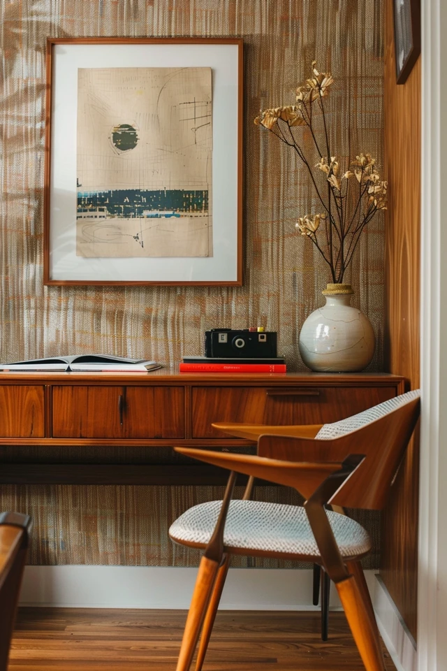
The desk is the anchor of any office, and in mid-century design, it is often a sculptural element. You want to look for pieces made of warm woods like teak, walnut, or rosewood.
A “floating” desk is ideal for this style. This means the desk is finished on all sides, allowing you to position it in the center of the room rather than pushing it against a wall. This command position improves the flow of the room and reduces visual weight.
If you are working with a smaller footprint, look for a desk with tapered legs. The negative space created by thin, angled legs makes the floor visible underneath, tricking the eye into thinking the room is larger than it is.
The Ergonomic Reality Check
Here is a hard truth many design blogs skip: authentic mid-century chairs are often terrible for eight-hour workdays. While an Eames fiberglass shell chair looks incredible, it offers zero lumbar support for long-term sitting.
I recommend buying a modern ergonomic chair that borrows mid-century aesthetic cues rather than a vintage original. Look for chairs with ribbed leather upholstery (reminiscent of the Aluminum Group chairs) or high-quality fabric in grey or cognac.
Designer’s Note: The Desk Height Rule
A standard desk height is between 29 and 30 inches. If you buy a vintage piece, get your tape measure out before you buy.
Many antique desks from the 1950s and 60s were scaled smaller, sometimes as low as 27 inches. This can cause significant knee-crowding if you have a modern adjustable chair. Always verify the clearance from the floor to the bottom of the drawer.
2. The Palette: Wood Tones and Bold Accents
Mid-century design is famous for its specific color theory. The base of your design should always be neutral and earthy.
Start with your wood tones. Walnut is the quintessential choice for this era, offering a rich, dark warmth. Oak and teak are lighter alternatives that work well in smaller, dimmer rooms.
Once you have your wood base, you need to layer in accent colors. The classic choices are mustard yellow, olive green, burnt orange, and teal.
How to Mix Wood Tones
A common panic point for my clients is matching the wood of the desk to the floor or the shelving. You do not need to match them perfectly. In fact, you shouldn’t.
If your floors are a light oak, a dark walnut desk provides necessary contrast. If everything matches, the room looks flat and one-dimensional. The goal is to stay in the same temperature family (warm woods with warm woods), but vary the darkness.
Paint and Wall Treatments
For wall paint, crisp whites are a safe backdrop that lets the furniture shine. I often use warm whites like Benjamin Moore’s “White Dove” to avoid a clinical feeling.
If you want more drama, consider a dark moody accent wall in charcoal or navy. Wood paneling is also historically accurate, but avoid the cheap sheets from the 70s. Slatted wood walls or walnut veneer panels add texture and sound dampening.
Common Mistakes + Fixes
Mistake: Overloading the room with bright “retro” colors like turquoise and bright red.
Fix: Apply the 60-30-10 rule. 60% of the room should be wood tones and neutrals. 30% can be a secondary color like olive green. Use the bright pop colors for only 10% of the decor (like a vase or a throw pillow).
3. Lighting: Sculpture Meets Function
In mid-century interiors, lighting serves a dual purpose: it illuminates the work and acts as art.
You need three layers of light: ambient, task, and accent. Never rely solely on the overhead recessed lights, as they create harsh shadows on your face during video calls.
The Ambient Layer
For your main overhead fixture, look for a Sputnik chandelier or a globe pendant. These fixtures draw the eye upward and establish the style immediately.
Ensure the fixture is hung correctly. The bottom of the chandelier should be at least 7 feet off the floor if you are walking under it.
The Task Layer
Your desk lamp is a prime opportunity for style. The “mushroom” lamp is a classic silhouette that provides excellent downward light without glare.
Alternatively, an articulating brass architect lamp adds a touch of industrial utility. Brass and matte black are the best finishes to mix with walnut wood.
The Designer’s Rule on Bulbs
The color of the light bulb changes how your wood furniture looks.
Do not use Daylight bulbs (5000K). They will make your warm wood furniture look sickly and green.
Do use Soft White or Warm White (2700K – 3000K). This spectrum enhances the red and orange undertones in wood and leather.
4. Textiles and Window Treatments
Because mid-century furniture has hard lines and exposed legs, you need textiles to soften the space.
Rug Sizing and Placement
A rug defines the “zone” of your office. The biggest error I see is buying a rug that is too small (the “postage stamp” effect).
Sizing Rule: The rug should be large enough that at least the front legs of all major furniture pieces (desk, guest chair, credenza) sit on it. Ideally, all legs should fit.
Clearance: Leave about 12 to 18 inches of bare floor visible between the edge of the rug and the walls.
For materials, stick to natural fibers. A low-pile wool rug or a flatweave geometric pattern works best. High-pile shag rugs are period-accurate but are a nightmare to roll an office chair over.
Window Dressings
Heavy, ornate drapes do not belong here. You want to maximize natural light.
I recommend semi-sheer linen curtains or simple roller shades. If you need blackout capabilities, use a double rod with a sheer layer closest to the glass and a solid linen panel on the outside.
Mounting Tip: Mount your curtain rod 4 to 6 inches above the window frame and extend it 6 to 10 inches past the sides. This makes the window look massive and lets in more light when the curtains are open.
5. Storage and Shelving: The Credenza
Clutter is the enemy of mid-century design. The philosophy relies on clean, unbroken lines.
The solution is the low credenza. Unlike tall modern bookcases, a long, low credenza provides massive storage without looming over you.
Look for units with sliding doors to hide printers, paper shredders, and wifi routers. The top of the credenza serves as a secondary surface for styling, books, or a coffee station.
Modular Shelving Systems
If you need vertical storage, look for wall-mounted modular shelving units. These usually feature metal vertical rails with adjustable wood shelves.
Because they mount to the wall and have no legs, they keep the floor space open. This visual trick is essential for small offices (10×10 feet or smaller).
Styling Your Shelves
Do not stuff shelves full of books from end to end. Mid-century styling requires “negative space” (empty space).
Stack some books horizontally and lean others vertically. Intersperse them with organic objects like ceramics, wood carvings, or vintage cameras.
What I’d Do in a Real Project
If I were styling a client’s shelves today, I would use the “Triangle Rule.”
1. Pick three objects of similar color or material (e.g., three brass items).
2. Place them on different shelves in a triangular formation (top left, middle right, bottom center).
3. This forces the eye to travel around the whole shelving unit.
6. Biophilic Design: Bringing the Outdoors In
Mid-century architecture often blurred the lines between indoor and outdoor spaces. In an office, plants are not optional; they are a design material.
Plants add organic chaos to the rigid geometric lines of the furniture. They also improve air quality and reduce stress.
The Best Plants for the MCM Look
Snake Plant (Sansevieria): Architectural and vertical. It mimics the tapered legs of the furniture. It is nearly unkillable and tolerates low light.
Monstera Deliciosa: The “Swiss Cheese Plant” is iconic to the era. It needs bright, indirect light and space to spread out.
Rubber Tree (Ficus Elastica): With dark, glossy leaves, it complements walnut wood beautifully.
Planter Selection
Avoid plastic nursery pots. Use ceramic cylinders in white or matte black.
For a true period look, use a planter on a wooden stand. Elevating the plant keeps the floor visible and adds height variance to the room.
Scale and Placement
Corner Strategy: An empty corner is a dead zones. Place a large floor plant (4-5 feet tall) in the corner to soften the shadows.
Desk Strategy: Use a small succulent or trailing pothos on the corner of your desk. It creates a visual break from the computer screen.
Final Checklist: The Designer’s Protocol
Before you start buying, run through this checklist to ensure you are staying true to the function and style.
- Measure the Traffic Flow: Ensure you have at least 30 to 36 inches of walking space behind your desk chair.
- Check the Outlet Locations: Do not block outlets with the heavy credenza unless you have cut a hole in the back panel for cords.
- Verify Lighting Temperature: Buy 2700K or 3000K LED bulbs for every fixture in the room.
- Test the Chair Height: Measure your desk clearance to ensure your chair arms fit underneath.
- Audit Your Textures: Do you have wood, metal, soft fabric, and something green? If one is missing, add it.
- Cable Management: Use velcro ties to strap cords to the back of desk legs. Visible wires ruin the “floating” look.
FAQs
Can I mix mid-century decor with other styles?
Absolutely. Mid-century modern plays very well with Scandinavian design (due to the wood focus) and Bohemian styles (due to the plants and textiles). It also blends with Industrial design if you focus on the metal elements. Avoid mixing it with highly ornate styles like Victorian or heavy Farmhouse, as the lines will clash.
Is mid-century furniture suitable for small rooms?
It is actually one of the best styles for small rooms. The furniture is generally smaller in scale than contemporary overstuffed furniture. The defining feature of “leggy” furniture allows you to see the floor and walls, which makes the room feel airier and larger.
How do I deal with wires on a floating desk?
This is the biggest logistical challenge. I recommend a floor outlet if you are renovating. If you are renting, run a cord cover along the floor that matches your flooring color. Route all cables down one desk leg (the one furthest from the door) using zip ties or cable sleeves so they appear as a single line rather than a spiderweb.
Real vintage vs. reproduction: Which is better?
For case goods (desks, credenzas, shelves), vintage is often better quality for the price, as you get solid wood or thick veneer. For upholstery (sofas, office chairs), modern reproductions are often better because foam degrades over time, and vintage ergonomics are rarely up to modern comfort standards.
Conclusion
Creating a mid-century modern office is about more than just buying a retro desk. It is about curating a space that feels open, warm, and intentional. By focusing on natural materials, proper lighting layers, and sensible layouts, you create a workspace that respects the past while functioning perfectly for the present.
Remember to prioritize comfort alongside aesthetics. Your office should be a place where you enjoy spending time, not just a showroom. Take your time sourcing pieces, measure twice, and let the organic beauty of the materials speak for themselves.
Picture Gallery


