
Minimalist color palettes help create a calm and chic setting. White is key in minimalist design. Colors like White Heron OC-57, Chantilly Lace OC-65, and White Dove OC-17 give off a timeless feel.
Adding neutrals like taupe and gray makes a room feel like a cozy cabin. You can also spice things up with a little color. A splash of red or a monochromatic theme can make your space feel alive.
If you want to be daring, try jewel tones. Colors like Beau Green 2054-20, Bronze Tone 2166-30, and Starry Night Blue 2067-20 can make a big statement. Black can also work wonders, giving a chic and sharp look. Choosing the right finish, like satin or ultra-flat, also matters. It adds depth to your minimalist space.

The Impact of Color in Minimalist Design
Color is key in minimalist design. It makes things look good and creates a smooth look. We often think of minimalism with colors like white and gray, but other colors can help too.
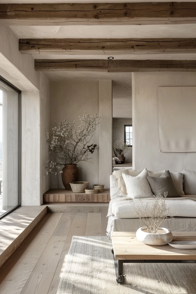
These calm colors form the base in minimalist design. They make us feel peaceful. When you use them, it’s like having a blank canvas. This lets other parts of your design stand out. This type of color scheme makes a room feel calm and elegant.
Making everything one color is another cool way to do it. This means using light and dark shades of one color. It blends everything together nicely. This method keeps your design simple but interesting.
Using black and white or dark and light colors is also a good idea. It makes things look sharp. The contrast makes different parts of the room stand out. This can make your design really catch the eye.
Adding a bright color can really make your room pop. It could be a bold chair or colorful art. This color stands out against the neutral background. It brings energy and fun to the room.
When picking colors for your design, think about the feeling you want. Each color has a different effect on our mood. With the right choices, you’ll make a space that feels peaceful yet stylish.
In the end, color is very important in minimalism. It makes your space look nice and reflects your taste. Whether you go simple with colors or add some flair, color helps make your minimalist space appealing.

Choosing the Right Minimalist Color Palette for Your Website Design
When designing a website, the color palette is key for a minimalist look. You need to do research and think about your audience’s age and culture.
Colors can change how people feel and see things. White makes a site look open and clear. Black can make it look fancy. Blue is calming and trusted while green is peaceful. Red grabs attention and makes a site lively.
Use grey as a base for a simple, elegant design. Then, add pops of bright colors. Or, pick ocean blue for trust or sunset colors for both energy and calmness.
Keep your website’s goal in mind when picking colors. Soft tones work for wellness sites. Bright colors fit well for online shops. Choose wisely to meet your website’s needs.

Conclusion
Minimalist color palettes are crucial for a calm, timeless look. They use neutral tones like white, beige, and grey. These colors make a peaceful and beautiful base for minimalist styles.
Monochromatic means using only one color in different shades. Contrasting colors or tones, like dark and light, also make things interesting. They add depth and make the space look put together.
In a minimalist design, you usually see neutral colors. But, a little pop of vibrant color can really bring it to life. Adding bold colors can make a room feel exciting and add a touch of your personality.
Choosing colors carefully for a website is key. You should think about who will look at the site and what you want them to feel. Learning about your audience can help you pick the right colors. This way, your site will be calm, stylish, and appealing to those who visit.