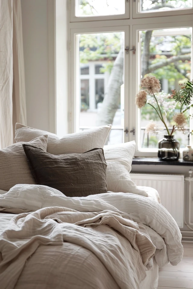
Minimalist textiles mix sleek patterns and subtle textures for a touch of grace. They greatly enhance any room’s elegance. The use of texture and color is key in minimalist design. They bring in interest, warmth, and depth. By including natural materials like wood and leather, and textiles like wool, spaces feel cozy and inviting.
Using a limited color palette, with some colors added sparingly, can also make a room lively and interesting.
Minimalist textiles are vital for a well-rounded minimalist home. Be it a bold design or a soft texture, these pieces shape a space’s look and feel.
Keep reading to learn how patterns and textures play a big role in making a minimalist home welcoming.

Adding Texture in Minimalist Home Design
Texture is key in making a minimalist home design stand out. Adding natural materials and textiles brings warmth, depth, and interest.
Use natural materials like wood, stone, and rattan to introduce texture. They not only look nice but also add a nature-inspired aspect. Try adding wooden furniture, such as a coffee table, for a cozy feel.
Textiles, including wool, linen, and cotton, also enhance texture. Items like throw pillows, blankets, and rugs made from these materials make your space welcoming. Go for neutral textiles to keep your design clean yet inviting.
Feel like getting creative with texture? Textured wallpapers might be your thing. They bring a lot of visual interest to your walls. Just make sure to pair them with simple furniture and decor to maintain balance.
Experiment with textile mixes for a dimensional effect. Adding a faux fur throw or some accent pillows can make your space feel luxurious and dynamic. This way, you keep the minimalist look without losing interest.
However, remember to keep a good texture balance. Too many different textures can clutter your home. Also, always choose textures that work well together to avoid a design mismatch.

Adding Color in Minimalist Home Design
Minimalist designs often stick to neutral colors. Yet, you can add color carefully to liven up your space. By picking two or three main colors that go well together, you make your home look balanced and unified.
First, start with neutrals like white, black, and gray. These colors offer a clean and timeless look. They make your space feel calm, letting other pieces stand out.
Next, add color with things like textiles, decorations, and art. These can instantly make your space more interesting. You might add colorful throw pillows, rugs, or curtains. This helps break up the neutral colors and adds life to your space.
You can also play with patterns. Choose bright patterns or shapes for things like wall art. This makes a big visual impact. Including textured art with bold colors also adds character to your space.
But be careful not to use too much color. You’ll want to keep the minimalist vibe. The key is to use color wisely. Don’t overdo it or the space might feel cluttered or cold.
Adding Colorful Accents
Colorful accents can really change your minimalist space. A vibrant piece of furniture or art can be an eye-catcher. This adds interest to a mostly neutral room.
Plants and flowers are also great for adding color. They bring a bit of nature inside. Pick plants with colorful leaves or flowers that match your color scheme.
Minimalism and color can go hand in hand. With careful planning, a mainly neutral space can be full of life. Balanced pop of color can show off your style in a minimalist home.

Conclusion
Texture and color matter a lot in minimal home design. They make the place feel inviting and well-balanced. Using natural materials and only a few colors keeps a home looking simple yet warm. This way, it’s not boring.
Adding small bits of bright color and texture can make a big difference. Think about using soft items like wool or cotton for pillows and blankets. You could also add wallpapers with a special feel, furry details, and mix materials. This can liven up the space.
In a minimal home, finding the right amount of color and texture is key. You don’t want too much or too little. A good mix of items that don’t cost a lot can still make your place look great. To find these items, you can visit Zebaworld.com.

