
Modern Gray Exterior House Paint Ideas Unveiled
Choosing an exterior paint color is one of the most high-stakes decisions a homeowner can make. Unlike painting a powder room, where a mistake costs fifty dollars and a Saturday afternoon, painting an exterior is a massive investment of time and money. If you are just looking for visual inspiration, you can skip ahead to the Picture Gallery at the end of this blog post. However, if you want to understand the science behind why some gray houses look chic while others look like gloomy concrete blocks, keep reading.
I distinctly remember a project early in my career where a client insisted on a swatch that looked like a perfect, soft stone gray in the store. Once we applied it to the entire southern façade, the afternoon sun hit it, and the house turned a shocking shade of lavender. We had to repaint the entire side the next day.
That experience taught me that gray is rarely just gray. It is a complex color heavily influenced by the environment, materials, and light. In this guide, I will walk you through the professional process of selecting a modern gray that adds value and curb appeal to your home.
The Science of Undertones and Natural Light
The biggest mistake homeowners make with gray paint is ignoring the undertone. Every gray paint has a base color—usually blue, green, or violet—that will reveal itself once placed under natural light. To get a “modern” look, you generally want to avoid the violet undertones, as they tend to look dated and unintentional.
Lighting direction changes everything. If your house faces North, the light will be cool and bluish. This will amplify any blue undertones in your gray paint, potentially making the house look icy or uninviting. For North-facing homes, I always specify a “warm gray” or “greige” to counteract that cool light.
Conversely, South-facing light is warm and intense. It can wash out lighter colors, making them look white. If you want a house that actually reads as gray in bright southern exposure, you need to choose a color two shades darker than what you think you want on the swatch.
Designer’s Note: The White Paper Test
Never look at a gray paint chip against a colored wall or your existing exterior color. Your eyes will trick you. To see the true undertone, hold the paint chip against a piece of bright white printer paper. Suddenly, that “neutral” gray might clearly look green or pink.
Coordinating with Fixed Elements
Unless you are doing a full gut renovation, your home has fixed elements that are not changing. These usually include the roof shingles, stone or brick veneers, and the driveway pavers. Your paint color must marry these elements, not fight them.
If you have a brown or warm-toned roof, a cool, icy gray paint will clash. It creates a visual dissonance that makes the house feel disjointed. For brown roofs, you must lean into warm grays or taupe-based grays. These bridge the gap between the earth tones of the roof and the modern aesthetic you want.
For homes with traditional red brick, you have two modern options. One is to paint the brick (which is permanent), or choose a deep, charcoal gray for the siding. The darkness of the charcoal neutralizes the high energy of the red brick, creating a sophisticated, industrial-modern palette.
Common Mistakes + Fixes
- Mistake: Ignoring the driveway color. A red clay paver driveway will make a green-based gray paint look significantly greener due to the theory of complementary colors.
- Fix: Bring your paint samples outside and lay them directly on the driveway and hold them against the roof. Step back ten feet. If they vibrate visually, it’s the wrong match.
Modern Gray Color Palettes and Combinations
Modern design often relies on contrast. When working with gray exteriors, we usually categorize the look into three distinct vibes: The Dark Moody, The Soft Scandi, and The Crisp Industrial. Each requires a different approach to saturation.
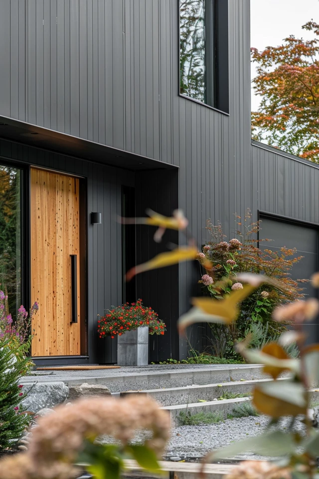
The Dark Moody (Charcoal and Black): This is a massive trend in modern exterior design. We use deep charcoals that border on black. This works exceptionally well on contemporary architecture or mid-century modern homes. The key here is to keep the trim dark as well. Painting the trim white on a dark charcoal house can look too busy and “zebra-striped.”
The Soft Scandi (Pale Gray and Wood): This look utilizes very light, misty grays. The goal is an airy, organic feel. To keep this from looking like a generic flip house, we introduce natural wood elements. A stained cedar garage door or wood-wrapped columns prevent the pale gray from feeling sterile.
The Crisp Industrial (True Gray and Metal): This is a medium-tone gray with very little undertone. It pairs perfectly with black framed windows and metal roofing. This is a safe, timeless choice that works on almost any architectural style, from Farmhouse to Colonial.
What I’d Do in a Real Project: The 60-30-10 Rule
- 60% Body Color: Your main gray shade (siding, stucco, or brick).
- 30% Secondary Color: This is usually the trim, soffits, and garage doors. In modern design, this often matches the body color or is slightly darker.
- 10% Accent Color: The front door, shutters (if applicable), or landscape pots. This is where you can add a pop of color or a rich wood stain.
Understanding Light Reflectance Value (LRV)
This is the most technical part of choosing paint, but it is vital for the longevity of your home. LRV is a measurement from 0 (absolute black) to 100 (pure white) that tells you how much light and heat a color absorbs or reflects.
Dark grays have a low LRV (usually under 20). They absorb a tremendous amount of heat. If you have vinyl siding, painting it a dark charcoal with a low LRV can actually cause the siding to warp and buckle under the sun’s heat. Many paint manufacturers now make “vinyl-safe” colors that mimic dark shades but reflect the heat, but you must verify this before buying.
For stucco or wood, heat build-up is less of a structural issue but can speed up fading. If you choose a dark gray for a South-facing wall, expect to repaint it sooner than you would a light gray. It is the price you pay for that dramatic modern aesthetic.
Sheen and Finish Strategies
The color is only half the battle; the sheen determines how the house “feels” and how well it hides flaws. In interior design, we often use eggshell for walls, but exteriors follow different rules. Generally, we want to minimize shine on the main body of the house.
Flat or Matte Finish: I recommend flat paint for the main body, especially for stucco or older wood siding. Matte finishes absorb light, which effectively hides imperfections, cracks, and uneven textures. However, standard flat paint can be harder to clean. Look for a high-quality acrylic latex flat that is formulated for washability.
Satin Finish: This is the “safe” middle ground. It has a slight luster that helps shed water and resist mildew better than flat paint. It is a great choice for newer fiber-cement siding (like Hardie board) where the surface is uniform.
Semi-Gloss or Gloss: Reserve this strictly for trim, shutters, and front doors. The contrast in sheen between a matte body and a glossy door adds a layer of sophistication. It also makes these high-traffic areas much easier to wipe down.
Designer’s Note: The Renter’s Constraint
If you are renting a home or on a strict budget, you likely cannot repaint the whole exterior. You can still modernize a beige or dated house by painting just the front door and shutters a deep, modern charcoal gray. It distracts the eye from the dated siding and creates a focal point.
Landscaping as the Final Layer
A gray house needs greenery to come alive. Without landscaping, gray can feel cold and industrial. The secret is to use foliage texture to soften the hard lines of the architecture.
Against a dark charcoal house, vibrant greens pop incredibly well. Think about plants with bright, lime-green foliage like Hostas or Japanese Forest Grass. The contrast is electric and makes the house look custom-designed.
For lighter gray homes, you need depth. Dark green evergreens, boxwoods, or plants with purple foliage (like Loropetalum) anchor the house to the ground. If you have a light gray house and use wispy, dry-looking plants, the whole property can look washed out.
Don’t forget the hardscaping. If you have a gray house and a gray concrete driveway, break it up. Line the driveway with brick pavers or install planter boxes in a warm wood tone or Corten steel (rusted metal). The warmth of the rust or wood is crucial to balance the cool tones of the paint.
Final Checklist: The Decision Process
Before you sign a contract with a painter or buy twenty gallons of paint, run through this checklist. I use a version of this on every exterior project I manage.
- Check HOA Restrictions: Before falling in love with a color, ensure your neighborhood allows it. Some strictly forbid dark exteriors.
- Identify Fixed Elements: note the undertones of your roof and stone. Are they warm (brown/tan) or cool (black/gray)?
- Select 3 Candidates: Pick three variations of gray. One lighter, one darker, and one distinct undertone (blue-gray or green-gray).
- The Sample Test: Buy quart samples, not just small distinct cards. Paint a 4-foot by 4-foot square on both the North and South sides of the house.
- The 24-Hour Watch: Look at those samples in the morning, high noon, and sunset. Eliminate any that turn purple or green.
- Check LRV Compatibility: Confirm the paint is safe for your substrate (especially vinyl).
- Plan the Trim: Decide if you are doing high contrast (white trim) or the “color drench” (matching trim).
FAQs
What is the most popular gray for modern exteriors right now?
Currently, warm charcoals and deep hues often referred to as “Iron” or “Peppercorn” tones are trending. These provide drama without being harsh black. On the lighter side, “greige” (gray-beige) remains popular because it feels warmer and more welcoming than sterile cool grays.
Should I paint my gutters to match the house or the trim?
In modern design, we almost always paint the downspouts to match the siding (body) color so they disappear. We do not want to highlight plumbing. The horizontal gutters along the roofline usually match the trim or fascia board.
Does gray paint fade faster than other colors?
Inorganic pigments (like earth tones, beiges, and lighter grays) are generally more fade-resistant than organic bright colors like blues or reds. However, very dark grays will show fading sooner than light grays simply because the contrast between the original color and the faded color is more obvious.
How do I stop my gray house from looking like a concrete bunker?
Texture and warmth are the answers. Incorporate wood elements, such as a stained front door, cedar shutters, or wood porch columns. Use copper lighting fixtures or warm brass hardware to add “jewelry” to the exterior. Ensure your landscaping is lush and layered.
Conclusion
Updating your home’s exterior with a modern gray palette is one of the most effective ways to increase curb appeal and property value. While the endless sea of swatches can feel intimidating, the process is manageable when you break it down by science and sunlight. Remember that gray is a chameleon; it changes based on what is next to it and how the light hits it.
Take your time with the sampling process. The cost of three sample cans of paint is negligible compared to the cost of repainting a house. Trust your eyes, watch the weather, and don’t be afraid to embrace a darker, moodier tone if your architecture supports it. With the right undertone and finish, your home will stand out as a timeless, sophisticated example of modern design.
Picture Gallery


