
Modern Gray Exterior House Paint Ideas Unveiled
Introduction
Selecting the perfect gray for your home’s exterior is rarely as simple as picking a swatch off a rack. I once worked with a client who fell in love with a small paint chip that looked like a sleek, industrial cement gray in the store. Once we put it on the entirety of her two-story colonial, the afternoon sun hit it, and the house turned an undeniable shade of lavender.
Gray is a chameleon color that changes drastically based on the surrounding landscape, the angle of the sun, and the materials it sits next to. It is the ultimate modern neutral, but it requires a strategic eye to ensure the result looks sophisticated rather than accidental. Make sure to check out the Picture Gallery at the end of the blog post for visual inspiration.
In this guide, I am going to walk you through the specific design principles I use to select modern gray palettes for real projects. We will cover everything from managing tricky undertones and navigating Light Reflectance Values (LRV) to pairing your paint with wood and stone. Whether you are updating a mid-century ranch or a contemporary new build, this deep dive will help you make a confident decision.
1. Decoding the Undertones: Why Gray Isn’t Just Gray
The biggest mistake homeowners make is assuming gray is a neutral color without temperature. In reality, almost every gray paint has a mass tone (the color you see immediately) and an undertone (the color that reveals itself in different lights).
If you are aiming for a modern aesthetic, you generally have three categories: warm grays (greige), cool grays (blue/green base), and true neutrals. True neutrals are incredibly rare and hard to find. Most modern exteriors lean toward warm grays because they bridge the gap between traditional beige and contemporary industrial styles.
The “Sheet of Paper” Test
To identify the undertone of a gray paint, hold the swatch against a stark white piece of printer paper. The contrast will immediately reveal the hidden hues. If the gray looks slightly brown or muddy, it is warm. If it looks crisp or chilly, it is cool.
Designer’s Note: The 4×4 Rule
The Lesson: Never rely on small peel-and-stick samples or the small quart pot painted in a one-foot square.
The Fix: In my projects, I require the contractor to paint a 4-foot by 4-foot square on two different sides of the house (North and South). We look at these large swatches in the morning, at noon, and at dusk. This is the only way to catch a “surprise” blue or purple undertone before you commit to purchasing 20 gallons of paint.
2. Mastering Material Pairings: Wood, Stone, and Metal
Modern design relies heavily on texture rather than ornamentation. When you paint a house gray, the paint acts as a canvas that allows other materials to shine. The success of a modern gray exterior often depends on what is happening right next to the paint.
Coordinating with Stone and Brick
If your home has existing masonry, that is your non-negotiable starting point. Stone usually has a mix of gray, cream, rust, or tan. Your paint color must pull from one of the darker tones in the stone to anchor the house.
Common Mistake: Trying to match the paint exactly to the main color of the stone.
The Fix: Go two shades darker or lighter than the stone. You want contrast. If the stone is a mid-tone gray and the paint is a mid-tone gray, the house will look muddy and indistinct.
The Warmth of Wood
Cold gray paint needs warmth to prevent the home from looking like a concrete bunker. I frequently introduce natural cedar or walnut-stained accents. This could be in the form of a front door, a garage pergola, or soffits.
What I’d Do in a Real Project:
- Siding: deeply saturated charcoal (like Iron Ore or Kendall Charcoal).
- Accents: Horizontal slat cedar fencing or cladding near the entrance.
- Metals: Matte black house numbers and lighting fixtures.
- Balance: Ensure the wood tone is repeated at least twice (e.g., the front door and the garage header) to create visual rhythm.
3. Light vs. Dark: Choosing Your Visual Weight
The Light Reflectance Value (LRV) of paint tells you how much light a color reflects. This is not just technical jargon; it dictates how hot your house gets and how large it looks from the street.
The Case for Dark Gray (LRV 5-20)
Dark, moody grays are the hallmark of modern exterior design. They make a home look smaller visually but more substantial and grounded.
However, there is a functional trade-off. Dark paints absorb heat. If you live in a climate with intense sun, like Arizona or Florida, a black-gray exterior can raise the surface temperature of your siding significantly. This can cause vinyl to warp or wood to dry out faster.
The Case for Light Gray (LRV 40-60)
Light grays feel airy and expansive. They reflect sunlight, keeping the home cooler. A light gray with a crisp white trim is timeless, but for a modern twist, pair light gray siding with dark charcoal or black trim.
Designer’s Note: The Fade Factor
The Lesson: Dark colors fade faster than light colors due to UV exposure.
The Fix: If you are committed to a dark charcoal exterior, invest in high-quality inorganic pigments or “fade-resistant” technology lines offered by major paint brands. Expect to repaint the south-facing side of your house 2-3 years sooner than the rest of the home.
4. The Trim and Fenestration Strategy
In traditional design, the rule is simple: Body is one color, trim is white. Modern design breaks this rule entirely. How you handle the trim (fascia, window frames, door casings) defines the architectural style.
The “Drench” Method
One of the most popular modern techniques is painting the trim, gutters, and downspouts the exact same color as the siding. This creates a monolithic, sculptural look. It effectively hides “ugly” elements like gutters and makes the house feel larger and more unified.
The High-Contrast Frame
If you have black window sashes (the actual frame holding the glass), you have an opportunity for high contrast.
My Rule of Thumb:
- If your windows are black vinyl or aluminum: You can paint the window trim (the wood around the window) a dark gray to match the window, making the opening look larger.
- If your windows are standard white vinyl: Do not paint the trim black. It creates a “raccoon eye” effect where a thick black line surrounds a white square. Instead, paint the trim a light gray or the same color as the body to blend the white sash in gently.
5. Lighting and Landscape: The Finishing Touches
Your paint job does not exist in a vacuum. It interacts with the greenery of your landscaping and the artificial light of your fixtures.
The “Green” Reflection
Large trees or a lush lawn will reflect green light onto the first story of your home. If you choose a gray with a subtle blue undertone, the green reflection can turn it teal. If you choose a warm greige, the green reflection can make it look muddy.
Common Mistake: Planting shrubs too close to a freshly painted wall.
The Fix: Keep foundation plantings at least 2.5 to 3 feet away from the exterior wall. This allows air circulation to prevent mold on your paint and minimizes color casting from the leaves.
Fixture Placement and Scale
Modern gray exteriors demand modern lighting. Small “coach lights” look lost on a bold charcoal background.
Specific Measurements:
- Size: Your exterior sconces should be approximately 1/4 to 1/3 the height of the door opening. Most people buy lights that are way too small.
- Placement: The center of the light source should be roughly 66 to 72 inches from the ground (or floor of the porch).
- Finish: Matte black or brushed brass pops beautifully against gray. Avoid oil-rubbed bronze if your gray is very cool-toned, as the reddish undertones of the bronze will clash.
Final Checklist: Before You Buy
Before you hire the painters or buy the gallons, run through this final checklist to ensure you haven’t missed a critical step.
- HOA Check: Have you reviewed your Homeowners Association guidelines? Many have strict rules about LRV limits or approved palettes.
- The Roof Factor: Does the gray clash with your roof? If you have a brown shingle roof, a cool blue-gray will look terrible. Stick to warm greiges. If you have a black or gray roof, you have more flexibility.
- Sample Verification: Have you painted 4×4 swatches on the North, South, East, and West sides?
- Wet vs. Dry: Did you wait for the sample to dry completely? Paint usually dries darker than it looks when wet.
- Texture Consideration: Remember that stucco absorbs light and looks darker/flatter, while smooth lap siding reflects more light and looks brighter.
FAQs
Should I paint my gutters the same color as the house or the trim?
For a modern look, paint your gutters and downspouts the same color as the siding (the body of the house). You want these utility elements to disappear, not stand out as architectural features. The only exception is if you have copper gutters, which are meant to be displayed.
What is the best sheen for exterior gray paint?
Generally, I recommend a flat or matte finish for the main body of the house, especially if you have older siding or stucco. Flat paint hides imperfections. For the trim and doors, use a satin or semi-gloss finish. This provides a subtle contrast in texture and makes those high-traffic areas easier to clean.
Does gray paint make a house look older or newer?
It depends on the shade. Cool, icy grays can sometimes look dated (think late 90s). Warm, earthy greiges or deep, dark charcoals look very current and modern. The key to looking “new” is often the lack of contrast in the trim—keeping things monochromatic feels more contemporary.
How do I stop my gray house from looking purple?
Purple undertones usually come from grays that are actually desaturated blues or reds. To avoid this, look for grays that have a dedicated green or brown undertone. Comparing your swatch against a true black or a pure white piece of paper will usually expose the purple before it ends up on your walls.
Conclusion
Choosing a modern gray for your exterior is about balancing architecture, environment, and material. It is about understanding that a swatch on a counter looks different than a two-story elevation under the midday sun.
When done correctly, a gray exterior provides a sophisticated, timeless backdrop that elevates your landscaping and architectural details. It allows you to play with wood textures and metal finishes without the house feeling busy. Take the time to sample, watch the light, and trust the process.
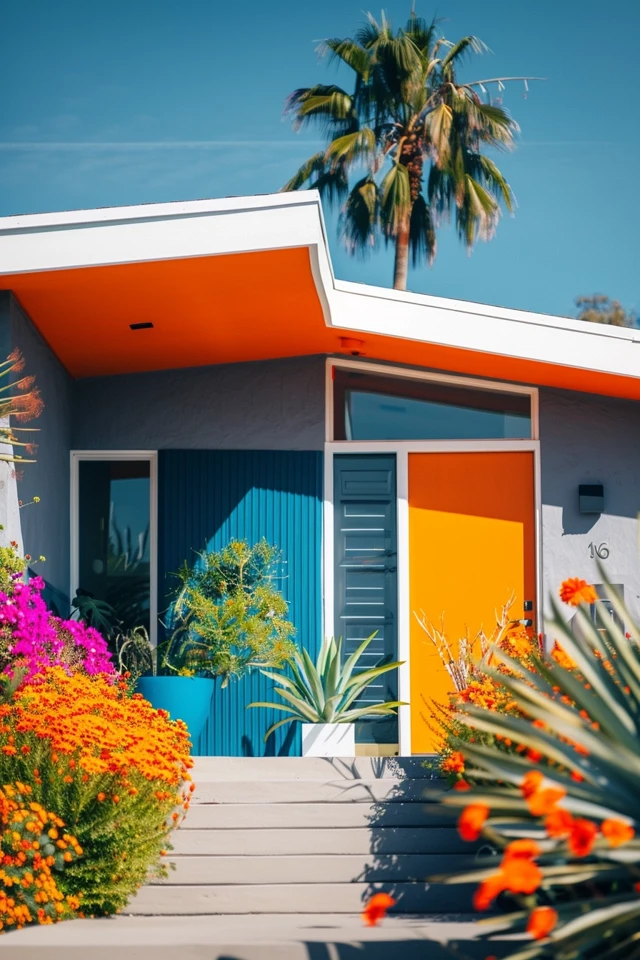
Picture Gallery


