
Have you ever walked into a room and instantly felt a sense of calm wash over you, or perhaps a burst of energy that made you want to dance? The colors in our environment have a remarkable ability to evoke emotions and shape our moods. As an online interior design enthusiast, I believe that selecting the perfect color palette is a pivotal moment in transforming a space from ordinary to extraordinary.
Whether you’re exploring virtual interior design, e-design services, or remote interior design consultations, the power of digital technology allows us to bring our vision to life from the comfort of our homes. Through online platforms, we can tap into the world of digital interior decorating and access a treasure trove of inspiration, guidance, and tools that make the process seamless and enjoyable.
Key Takeaways:
- Choosing the right color palette is essential for creating style and harmony in a room.
- Existing elements in the space can guide the selection of a color palette.
- Online tools like Coolors, Pantone, Canva, and Color hunt can simplify the process of selecting and experimenting with color palettes.
- Paint manufacturers like Sherwin-Williams, Glidden Paints, and Benjamin Moore offer their own online tools for selecting color palettes.
- Adding color to your space can be done through various elements like fabrics, artwork, accessories, and natural elements.
The Importance of Existing Elements in Color Palette Selection
When it comes to selecting a color palette for your space, it’s crucial to consider the existing decor elements. These elements, such as furniture, flooring, or architectural features, play a significant role in guiding your color palette selection and ensuring a cohesive and harmonious design. By incorporating existing features and hiding undesirable elements, you can create a visually appealing and personalized space that reflects your style.
One essential step in color palette selection is to identify the existing decor elements that you want to incorporate or highlight. For example, if you have a beautiful green marble fireplace or a stunning herringbone hardwood floor, these elements can serve as a focal point for your design scheme. Taking pictures of these features will help you visualize how they can be integrated into your color palette.
However, it’s not just about incorporating existing features; it’s also essential to find ways to hide or modify undesirable elements. For instance, if you have bad flooring that you want to conceal or temporarily cover, there are various solutions available, such as using area rugs or floor decals that complement your desired color palette.
Additionally, if you have outdated or unappealing kitchen cabinets, repainting them in a color that aligns with your palette can transform their look and hide any imperfections. This way, you can customize your existing elements to suit your design vision.
By considering the existing decor elements and incorporating or modifying them as needed, you can create a color palette that seamlessly blends with the space, making it feel cohesive and well-designed. It’s all about finding inspiration, highlighting the features you love, and transforming any undesirable elements into assets that contribute to the overall aesthetic.

| Existing Element | Incorporation Strategy |
|---|---|
| Green marble fireplace | Highlight by using complementary colors or a monochromatic scheme |
| Herringbone hardwood floor | Choose colors that enhance the richness and warmth of the floor |
| Undesirable flooring | Hide with area rugs or floor decals that complement your desired color palette |
| Outdated kitchen cabinets | Repaint in a color that aligns with your palette to refresh their appearance |
By incorporating existing features and creatively hiding or modifying undesirable elements, you can create a color palette that not only elevates the aesthetics of your space but also reflects your personal style. Let your existing decor elements inspire you and guide your design choices as you embark on your color palette selection journey.
Using Online Tools for Color Palette Selection
When it comes to choosing the perfect color palette for your interior design project, online tools can be your secret weapon. With the help of online color generators, color viewers, and color selection apps, you can explore a world of endless possibilities. Let me introduce you to some of my favorite online tools that will transform your color selection process into a breeze.
Coolors: Unleash Your Creativity
Coolors is an innovative online tool that allows you to create custom color palettes effortlessly. With just a few clicks, you can generate beautiful color schemes that suit your style and preferences. Coolors offers various features like browsing color libraries, experimenting with different shades and harmonies, and even extracting colors from photos. Whether you’re a professional designer or a DIY decorator, Coolors provides a user-friendly interface that will unleash your creativity.
Pantone: A World of Inspiration
If you’re looking for inspiration and want to stay up-to-date with the latest color trends, Pantone is the place to be. This renowned color authority offers an online color viewer that allows you to explore their extensive color library. From classic hues to cutting-edge shades, Pantone provides a world of inspiration for your color palette selection. Whether you’re designing a modern space or aiming for a timeless look, Pantone will guide you in the right direction.
Canva: Turn Your Vision Into Reality
Canva is not just a design platform; it’s also a valuable tool for choosing your color palette. With Canva’s color selection feature, you can easily experiment with different color combinations and create custom palettes that match your vision. Whether you’re designing a flyer, a social media post, or a mood board, Canva provides an intuitive interface that allows you to turn your ideas into reality.

Color Hunt: Discover Hidden Gems
If you’re on the lookout for unique and eye-catching color palettes, Color Hunt is the place to explore. This online platform offers a curated collection of beautiful color schemes created by designers from around the world. With Color Hunt, you can browse different categories and discover hidden gems that will make your space stand out. Whether you’re after a bold and vibrant palette or a soft and serene combination, Color Hunt has you covered.
These online tools, including Coolors, Pantone, Canva, and Color Hunt, offer a wide range of features that simplify the process of selecting a color palette. From generating custom palettes to exploring color libraries and experimenting with different shades and harmonies, these tools provide endless possibilities for your interior design projects.
Utilizing Color Tools from Paint Manufacturers
When it comes to selecting a color palette for your interior design project, don’t overlook the convenient and user-friendly color tools provided by top paint manufacturers such as Sherwin-Williams, Glidden Paints, and Benjamin Moore. These online tools are designed to assist you in creating harmonious and visually pleasing color schemes that perfectly complement your space.
Using these color tools is as simple as uploading photos or utilizing sample images to create custom palettes. You can explore an extensive range of coordinating paint colors and save your palettes for future reference. Additionally, these tools offer the remarkable ability to visualize how the chosen colors will look in your specific room.
Explore and Experiment with Color Options
With the color tools offered by paint manufacturers, you have the opportunity to explore various color options and make informed decisions when it comes to painting your walls. These tools provide a wealth of options that allow you to experiment with different hues, shades, and tones until you find the perfect combination that matches your vision.
Whether you’re aiming for a bold and dramatic look or a soft and serene ambiance, the color tools from Sherwin-Williams, Glidden Paints, and Benjamin Moore empower you to unleash your creativity and achieve your desired aesthetic.
By leveraging these tools, you can eliminate the guesswork and confidently select colors that bring your vision to life. Say goodbye to the indecisiveness and uncertainty that often accompanies the color selection process. With the help of these innovative resources, you can create an interior space that truly reflects your unique style and personality.
I love how the color tools from paint manufacturers like Sherwin-Williams and Benjamin Moore offer a seamless and intuitive way to explore a wide range of color options. It’s so convenient to be able to visualize how different paint colors will look in my space before actually committing to them. These tools have made the color selection process so much more enjoyable and stress-free!
Tips for Choosing an Interior Color Scheme
Choosing an interior color scheme is a personal and subjective process that allows you to express your unique style and preferences. Instead of immediately selecting a paint color, I recommend starting with the existing room elements as your inspiration. This can include furniture, fabrics, or even tiles. By basing your paint colors on these elements, you can create a cohesive and harmonious look throughout the space.
When considering your chosen colors, it’s important to think about the value or lightness and darkness. Striving for a balance between different values will help create visual interest and prevent overwhelming the room with too much of one color. You can achieve this balance by using colors with different saturations and depths to add depth and dimension to your space.
A critical aspect of selecting an interior color scheme is considering the impact of lighting. Both natural light and artificial light sources play a significant role in how colors appear in your space. Natural light can enhance or soften colors, while artificial lighting can create different moods. It’s essential to observe how your chosen colors interact with the lighting conditions in your room, ensuring that they look as intended under various lighting scenarios.
“Starting with room elements when choosing an interior color scheme allows you to build a cohesive and harmonious look throughout the space.” – Maria Andrews, Interior Designer
The Importance of Personal Style
When choosing an interior color scheme, it’s essential to let your personal style shine through. Your space should reflect who you are and what you love. Consider the overall aesthetic you want to achieve, whether it’s modern, traditional, minimalist, or eclectic. Your color choices can greatly contribute to the atmosphere and vibe of the room, so trust your instincts and select colors that resonate with your personal taste.
Remember, interior design is not a one-size-fits-all approach. What works for one person may not work for another. Embrace the subjective nature of color choices and have confidence in your decisions.
Starting with Room Elements
To create a cohesive color scheme, it’s helpful to start with the room elements that already exist. Consider the furniture pieces, fabrics, and tiles you have in the space. These elements can serve as a foundation for your color palette. By selecting colors that complement and harmonize with these elements, you can create a unified and visually pleasing look.
“Starting with room elements when choosing an interior color scheme allows you to build a cohesive and harmonious look throughout the space.” – Maria Andrews, Interior Designer
Striving for Color Balance
Color balance is crucial when creating an interior color scheme. Striking the right balance between different colors will help create a harmonious and visually appealing space. Consider using a mix of warm and cool colors, light and dark tones, and different saturations to achieve this balance. Experiment with contrasting colors or complementary color schemes to add depth and interest to your room.
Considering Lighting
Lighting plays a significant role in how colors appear and interact with each other. Natural light can enhance or soften colors, while artificial lighting can dramatically impact the overall ambiance. When choosing colors, consider the lighting conditions in your room. Take note of how colors look during different times of the day and under different lighting scenarios. This will ensure that your chosen colors maintain their intended visual impact and balance.
| Personal Style | Starting with Room Elements | Color Balance | Considering Lighting |
|---|---|---|---|
| Reflects your unique style and preferences | Complement and harmonize with existing elements | Mix warm and cool colors, light and dark tones | Consider natural and artificial lighting conditions |
| Creates a cohesive and visually appealing space | Foundation for a unified and pleasing look | Experiment with contrasting colors and saturation | Maintain visual impact and balance under different lighting |
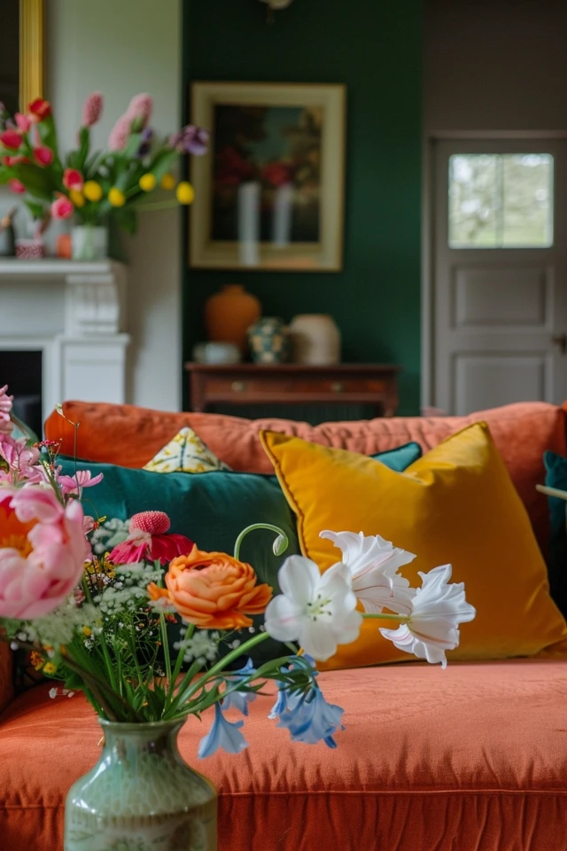
Adding Color to Your Space
Incorporating color into your interior design can breathe life into any space, even if you prefer a neutral background. There are several creative ways to add color and transform the overall look and feel of a room.
One approach is to introduce color through small touches, such as pillows, throws, rugs, and window treatments. These colorful accessories not only add vibrant pops of color but also bring pattern and texture into the room. They can serve as focal points or complement existing color schemes, creating a dynamic and visually appealing atmosphere.
Another way to incorporate color is through artwork and accessories. Hang colorful paintings or prints on your walls, or display decorative pieces such as vases, sculptures, or figurines. These vibrant accents can instantly brighten up a space and add a personal touch to your interior design.

Natural elements like flowers or plants can also infuse color into your space. Place fresh floral arrangements in colorful vases or add potted plants in vibrant planters. Not only do they introduce color, but they also bring a sense of freshness and nature into the room.
Using fabrics and textiles is another effective way to add color to your space. Incorporate vibrant curtains, colorful upholstery, or patterned rugs to liven up the room. These textiles can create visual interest and help tie together different elements within the space.
One of the benefits of adding color to your space is the ability to manipulate the sense of space. Lighter colors can make a room appear more open and spacious, while deeper tones can create a cozy and intimate atmosphere. By strategically using color, you can influence the perceived size and mood of a room.
Whether you prefer subtle touches of color or bold bursts of vibrancy, incorporating color into your interior design allows you to personalize your space and create a unique ambiance. Don’t shy away from adding color to your home; embrace the transformative power it holds.
Creating a Cohesive Color Scheme in Open Floor Plans
Designing a cohesive color scheme in open floor plans can be both challenging and rewarding. In these versatile spaces, it’s important to consider how colors transition between different areas and how they can be used to define distinct zones. By letting the architecture guide your design choices and using various elements like rugs and casework, you can achieve a harmonious and visually pleasing aesthetic.
Leveraging Architectural Elements for Smooth Transitions
Instead of dressing every space in the same tones, you can use architectural elements to enhance color transitions. By strategically placing rugs and casework, you can visually separate different areas and create a sense of flow. For example, a rug can mark the boundary between your living room and dining area, while a carefully positioned bookcase can serve as a natural divider. These elements not only help define the purpose of each space but also contribute to the overall coherence of your color scheme.
Embracing Monochromatic Schemes and Consistency
Another effective strategy for creating a cohesive color scheme in open floor plans is to embrace monochromatic schemes or use a consistent palette of three colors throughout the space. A monochromatic scheme involves using different shades and tones of a single color, which creates a sense of unity and harmony. Alternatively, you can select three colors that work well together and apply them consistently across the open floor plan. This approach ensures a balanced and visually connected space.
By using rugs and casework strategically, you can create transitions between different areas, and applying a monochromatic scheme or using a consistent color palette, you can achieve a cohesive and visually appealing color scheme in open floor plans. Letting the architecture guide your design choices will help you create a harmonious space that flows seamlessly from one area to another.
| Benefits of a Cohesive Color Scheme in Open Floor Plans | Examples of Transitional Elements |
|---|---|
| Achieves a harmonious aesthetic | Rugs |
| Defines distinct areas within the open floor plan | Casework |
| Makes the space visually connected | Bookcases |
| Enhances the flow between different areas |
Conclusion
Choosing the right color palette is an essential aspect of interior design, as it sets the mood and ambiance of your space. By incorporating existing elements, utilizing online color tools, and considering lighting and personal preferences, you can create a cohesive and visually appealing color scheme that reflects your unique style.
Online interior design platforms offer a wide array of color selection tips and tools to simplify the process. These tools allow you to experiment with different color combinations, extract colors from images, and create custom palettes. Additionally, paint manufacturers like Sherwin-Williams, Glidden Paints, and Benjamin Moore provide online color tools that enable you to visualize how different paint colors will look in your space.
Adding color to your space can be done through various elements such as fabrics, artwork, and accessories. By strategically incorporating bursts of color, you can transform a neutral background into an inviting and vibrant space. Finally, when designing in open floor plans, it’s crucial to create a cohesive color scheme that transitions seamlessly between areas, utilizing architectural elements and monochromatic schemes.
With these tips and resources at your disposal, you can confidently navigate and select the perfect color palette for your interior design project. Remember to trust your instincts, experiment, and most importantly, have fun as you bring color and life into your space.
FAQ
Why is choosing a color palette important for interior design?
Choosing a color palette is essential for creating style, harmony, and consistency in a room’s decor.
How can I incorporate existing elements into my color palette?
You can incorporate existing elements by highlighting them or finding ways to hide or modify them using temporary solutions or repainting.
Where can I gather inspiration and narrow down my color choices?
You can gather inspiration and narrow down your color choices using platforms like Pinterest and creating mood boards.
What online tools can help me select a color palette?
Online tools such as Coolors, Pantone, Canva, and Color hunt provide easy ways to select and experiment with color palettes.
How can I visualize the overall color scheme with existing elements in my space?
Taking pictures of existing elements and furniture pieces can help you visualize how they fit into the overall color scheme.
What online tools do paint manufacturers offer for selecting color palettes?
Paint manufacturers like Sherwin-Williams, Glidden Paints, and Benjamin Moore offer their own online tools for selecting color palettes.
How can I use color to enhance my interior design?
You can introduce color through pillows, throws, rugs, window treatments, artwork, accessories, and natural elements like flowers.
How can I create a cohesive color scheme in an open floor plan?
You can create a cohesive color scheme by using architectural elements, rugs, casework, bookcases, or applying a monochromatic scheme.
What are some tips for choosing an interior color scheme?
Consider starting with room elements, balancing different values, considering lighting, and reflecting your personal style and preferences.