
Neutral Bathroom Tile Ideas for Timeless Style
Designing a bathroom is one of the most expensive investments you will make in your home. Unlike a bedroom where you can swap out a rug or repaint a wall in an afternoon, a bathroom renovation involves plumbing, waterproofing, and permanent installation. Because of the labor and cost involved, choosing a design that will look good ten or even twenty years from now is crucial.
I often tell my clients that while paint colors can change with the seasons, your hard finishes should remain steadfast. I once worked with a homeowner who insisted on bright turquoise subway tile in 2012. By 2018, they were desperate to rip it out because it felt dated and overwhelmed the small space. A neutral palette offers flexibility, allowing you to change the mood of the room with towels, art, and hardware rather than a demolition crew.
If you are looking for visual inspiration to guide your renovation journey, we have curated a comprehensive Picture Gallery at the end of this blog post to help you visualize these concepts. In the meantime, let’s dive into the practical rules, materials, and layouts that professional designers use to create neutral bathrooms that never feel boring.
Understanding the “New Neutral” Palette
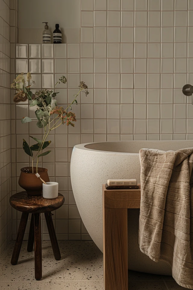
When people hear “neutral,” they often fear “sterile” or “hospital-white.” However, in professional interior design, neutral simply refers to a foundation that mimics organic elements found in nature. This includes warm taupes, creamy off-whites, soft charcoals, and sandy beiges.
The key to a successful neutral bathroom is avoiding a flat, one-dimensional look. If your floor, walls, and vanity are all the exact same shade of flat white, the room will feel dead. You must layer different tones. For example, if you choose a bright white wall tile, pair it with a vanity that has a warm wood grain or a floor tile in a soft greige (gray-beige).
Understanding Undertones
Every neutral tile has an undertone. This is the subtle color that comes through under different lighting conditions. A gray tile might have blue undertones (cool) or brown undertones (warm).
Designer’s Note: Never mix cool and warm undertones blindly. If your marble vanity top is a cool Carrara (blue/gray veins), do not pair it with a creamy, yellow-based beige floor tile. They will clash and make the room look dirty. Always bring samples home and look at them in your specific bathroom lighting, not just the showroom showroom fluorescent lights.
Texture Over Color: How to Create Interest
Since we are stripping away bright colors, we must replace that visual interest with texture. Texture is the secret sauce that makes a neutral spa bathroom feel expensive and luxurious. Without it, the space feels commercial.
Zellige and Hand-Made Look Tiles
One of my favorite ways to add character is using Zellige-style tiles. These are Moroccan-style ceramic tiles that have an imperfect, handcrafted surface. Because the surface is uneven, the light catches each tile differently, creating a shimmering, rippled effect.
Even if you choose a simple white square Zellige tile, the variation in glaze and surface depth adds incredible richness. It feels historic and lived-in immediately.
Matte vs. Glossy
Contrast is king. If you use a glossy subway tile on the shower walls, consider using a matte finish for the floor. This interplay between shiny and flat surfaces keeps the eye moving.
Common Mistake: Using glossy tiles on a bathroom floor.
The Fix: Always check the COF (Coefficient of Friction) or DCOF rating. For bathroom floors, you want a matte or honed finish with a DCOF of 0.42 or greater to prevent slipping when wet.
Natural Stone Textures
If you are using porcelain that mimics stone, look for “rectified” tiles with a textured grain. Smooth, printed porcelain often looks fake. High-quality porcelain should have a tactile feel that mimics the slate or limestone it is copying.
Material Selection: Porcelain vs. Natural Stone
Choosing the right material is a balance between your aesthetic goals and your lifestyle reality. In my projects, I start by asking who is using the bathroom.
Natural Stone (Marble, Limestone, Travertine)
Nothing beats the real thing for timeless appeal. Marble, particularly honed Carrara or Calacatta, is the gold standard for high-end bathrooms. It feels cool to the touch and has a depth that manufactured products struggle to replicate.
However, stone is porous. It requires sealing upon installation and regular re-sealing every 6 to 12 months. If you dye your hair at home, use harsh cleaning products, or have young children who might leave wet towels on the floor, natural stone might etch or stain.
Porcelain
For 90% of households, porcelain is the superior choice. It is impervious to water, doesn’t require sealing, and is incredibly hard to chip.
What I’d do in a real project: I often use a “look-alike” porcelain for the main floor and shower walls because it is durable and cheaper. Then, I splurge on real natural stone for the vanity countertop or a small mosaic accent niche. This gives you the feeling of luxury where you touch it, without the maintenance headache on the floor.
Ceramic
Ceramic is generally softer and more porous than porcelain. It is excellent for wall applications (like subway tile) but generally not recommended for floors in high-traffic family bathrooms. It can crack if a heavy perfume bottle or hair dryer is dropped on it.
Layout Strategies for Timeless Appeal
The shape of the tile and how you lay it out can change the entire perception of the room’s size. A standard 3×6 inch subway tile is a classic, but the layout dictates the style.
The Vertical Stack
If you have low ceilings (standard 8-foot), consider stacking rectangular tiles vertically rather than the traditional brick pattern. This draws the eye upward and makes the ceiling feel higher. It also looks more modern and cleaner than the traditional offset.
Large Format Tiles
For a seamless, spa-like look, move toward larger tiles. We are moving away from 12×12 squares. Standard large-format sizes are now 12×24 or even 24×48 inches.
Fewer grout lines mean less cleaning and less visual clutter. If you have a small bathroom, using large tiles can actually make the space feel bigger because the floor isn’t broken up by a grid of grout.
Herringbone
Laying rectangular tiles in a herringbone pattern adds instant sophistication. It works beautifully for floor tiles or a feature wall behind a vanity.
Designer’s Note on Budget: Herringbone layouts require more cuts and generate more waste. Installers also charge more for this pattern because it takes longer to set correctly. Expect to order 20% extra material for herringbone, compared to 10-15% for standard layouts.
Grout: The Unsung Hero of Design
Grout color can make or break your neutral tile installation. It is a design element, not just a gap filler.
High Contrast vs. Low Contrast
High Contrast: White tile with dark gray grout. This highlights the pattern of the layout. It creates a busy, graphic look. This is great for a vintage or industrial vibe but can be visually tiring in a small space.
Low Contrast: White tile with white or light gray grout. This makes the surface look continuous. This is the best choice for a calm, spa-like atmosphere.
The “Warm Gray” Secret
I almost never use pure white grout on floors. Even with the best sealer, it will eventually discolor to a yellowish or brownish tone due to foot traffic and moisture.
Instead, I specify a “warm gray” or “silverado” grout for white floor tiles. It disguises dust and dirt much better than white, but it isn’t as harsh as black or charcoal.
Grout Spacing
The standard spacing for a modern look is 1/16 of an inch. This requires “rectified” tile (tile that has been mechanically cut to be perfectly straight). If you are using handmade tiles with irregular edges, you will likely need a wider grout joint (1/8 or 3/16 inch) to accommodate the size variations.
Styling the “Boring” Out of Neutral
Once your neutral tile is installed, the styling brings the personality. This is where you can follow trends because these items are replaceable.
Hardware Metals
Mixed metals are very popular and add warmth. If you have gray-toned neutral tiles, use Unlacquered Brass or Polished Nickel hardware to warm up the space. Matte Black hardware creates a modern, high-contrast punch that works well with white subway tile.
Wood Accents
Wood is essential in a neutral bathroom. A floating oak vanity, a teak stool in the shower, or woven bamboo shades add organic warmth that softens the coldness of tile.
Textiles
Invest in high-quality textiles. Waffle-weave towels, a thick cotton bath mat, and a linen shower curtain add layers of softness. Because your background is neutral, you can swap these from crisp white in the summer to moody charcoal or forest green in the winter.
Common Mistakes + Fixes
Mistake: Ignoring Slip Resistance
Homeowners often fall in love with a polished marble mosaic for the shower floor.
The Fix: Shower floors need “grip.” Use small tiles (penny rounds or 2-inch hexagons) for the shower floor. The high volume of grout lines provides the necessary traction for bare, soapy feet.
Mistake: Poor Transition Planning
The tile floor ends up being much higher than the hallway carpet or hardwood, creating a trip hazard.
The Fix: Calculate the “stack height” (subfloor + mortar + tile thickness) before buying materials. You may need a specific transition strip (like a Schluter metal profile) or a marble threshold to bridge the gap smoothly.
Mistake: Bad Lighting Placement
Placing downlights directly over a textured wall tile.
The Fix: While this can highlight texture, if the tile installation isn’t perfect, “wall grazing” light will cast shadows on every single uneven lip (lippage). Keep heavy downlights away from the wall edge unless your tiler is a master craftsman.
What I’d Do: A Real Project Checklist
If I were designing a neutral bathroom for a client today, here is the exact checklist I would follow to ensure success:
1. Order Samples
- I would order at least 3 full-size samples of the floor and wall tile. Tiny 2-inch chips are useless for judging color variation.
- I would place them in the bathroom and look at them in the morning, afternoon, and night (artificial light).
2. Measure Twice
- I would calculate the square footage of the floor and walls.
- I would add 15% for waste on standard layouts.
- I would add 20% for waste on herringbone or diagonal layouts.
3. Select the Grout
- I would choose a high-performance, stain-resistant grout (like epoxy or urethane) for the shower floor.
- I would pick a color that matches the darkest tone in the tile to hide future stains.
4. Plan the Niche
- I would verify that the shower niche is tall enough for standard shampoo bottles (minimum 12 inches high).
- I would ensure the niche shelf is slightly pitched forward so water drains off and doesn’t pool.
5. Layout Review
- On the first day of installation, I would meet the tiler.
- We would “dry lay” the tiles on the floor to minimize awkward slivers of tile near the walls or vanity.
Frequently Asked Questions
Does neutral tile lower the resale value of a home?
No, quite the opposite. Highly specific or colorful tile choices are risky for resale because they are taste-specific. A well-executed neutral bathroom acts as a blank canvas, allowing potential buyers to envision their own style in the space. It is generally considered the safest investment for ROI (Return on Investment).
How do I clean textured Zellige tiles?
Because of the uneven surface, standard sponge mopping can sometimes miss spots. I recommend using a soft-bristle brush with a pH-neutral cleaner for a deep clean. Avoid harsh acidic cleaners (like vinegar) if you have natural stone or cement-based grout, as the acid can eat away at the finish over time.
Can I mix different shapes of neutral tile?
Absolutely. In fact, you should. A common formula is:
1. Large format rectangle for the main floor (grounding).
2. Vertical stack subway for the walls (height).
3. Small geometric mosaic (hex or penny) for the shower floor (grip).
Keeping them in the same color family creates cohesion, while the shapes provide the design interest.
Is gray tile going out of style?
Cool, blue-based grays that were popular in 2015 are trending down. However, warm grays (greige), taupes, and earthy limestone tones are timeless. If you want longevity, steer toward warmer, earthier neutrals rather than icy, industrial grays.
What is the best tile size for a small bathroom?
Contrary to popular belief, small tiles can make a small room feel smaller because of the visual clutter of grout lines. A medium-to-large tile (like a 12×24) creates a sense of expansiveness. Just ensure the tile isn’t so huge that you only fit two full tiles across the room, which looks awkward.
Conclusion
Creating a timeless, neutral bathroom is not about playing it safe or being boring. It is about building a quiet, high-quality foundation that allows you to live comfortably in the space for decades.
By focusing on texture, layering different shades of warm whites and greys, and investing in quality materials like porcelain and stone, you can design a sanctuary that outlasts fleeting trends. Remember that the tile is just the canvas; your lighting, hardware, and textiles are the art.
Take the time to plan your layout, choose the right grout, and verify your slip resistance. These technical details are what separate a DIY look from a professional finish.
Picture Gallery


